
- 2026

process
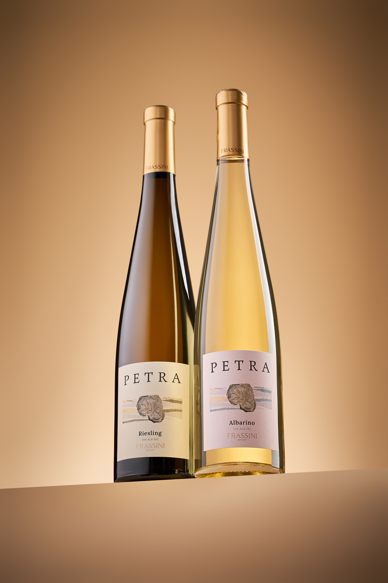
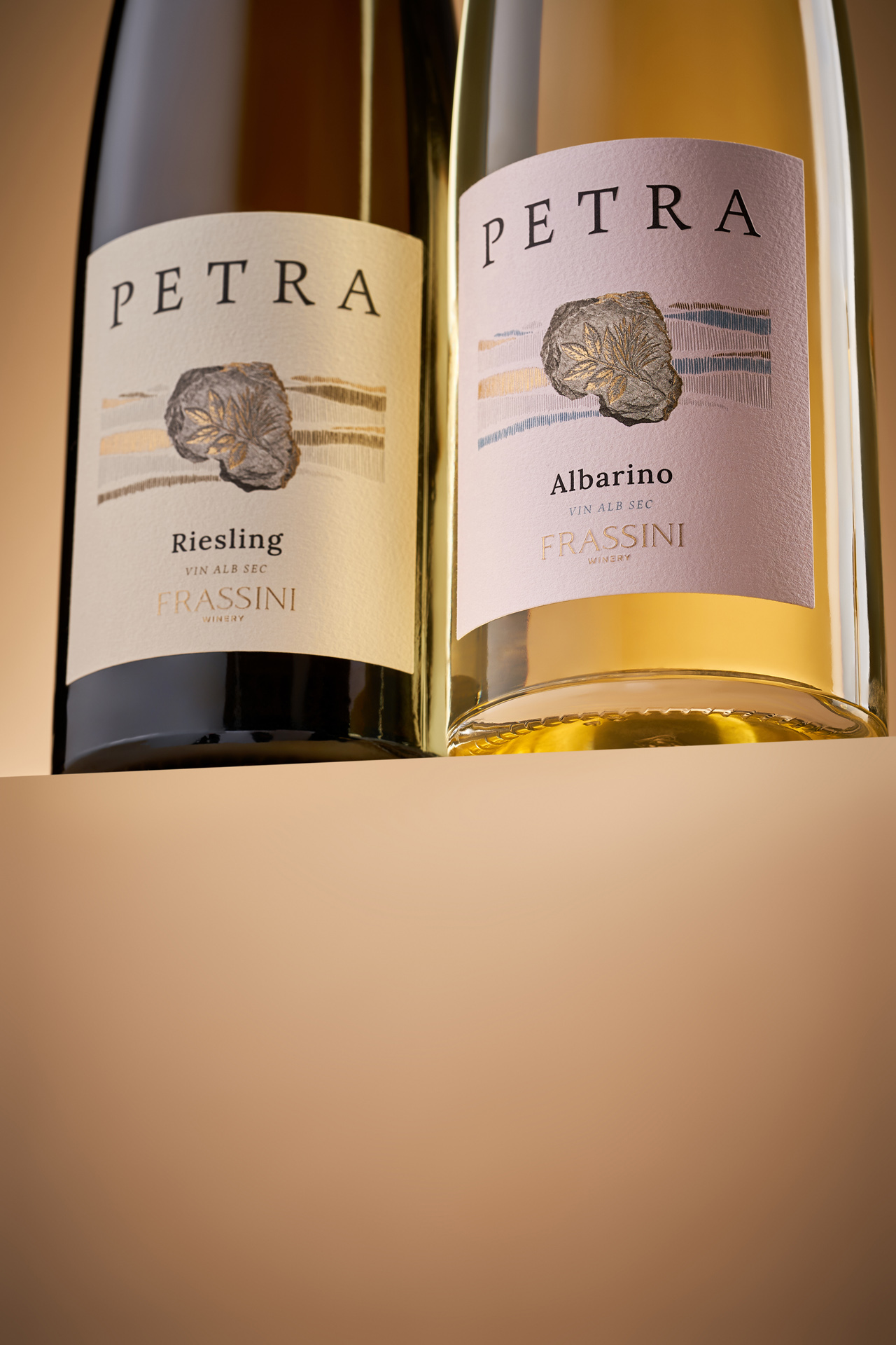
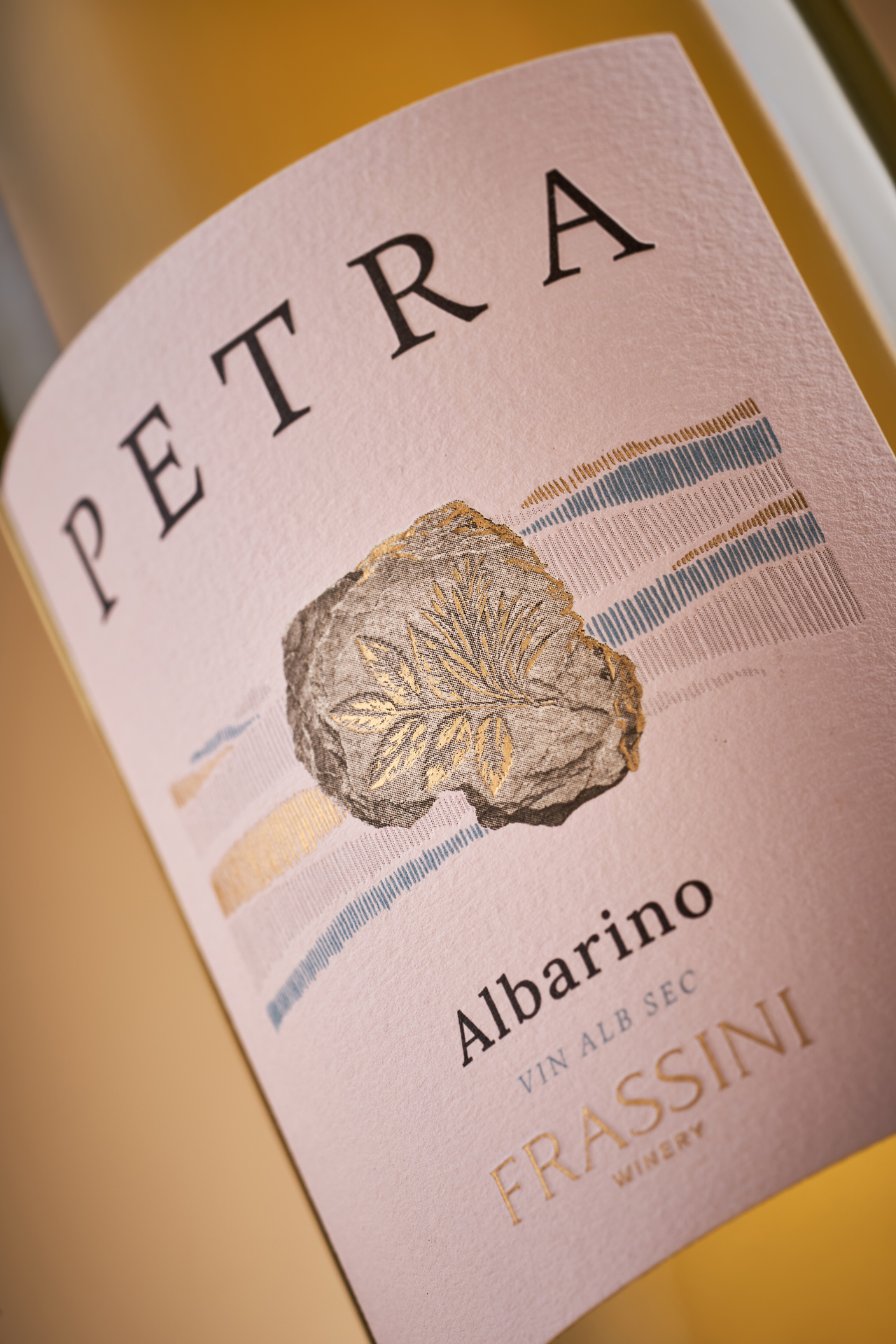
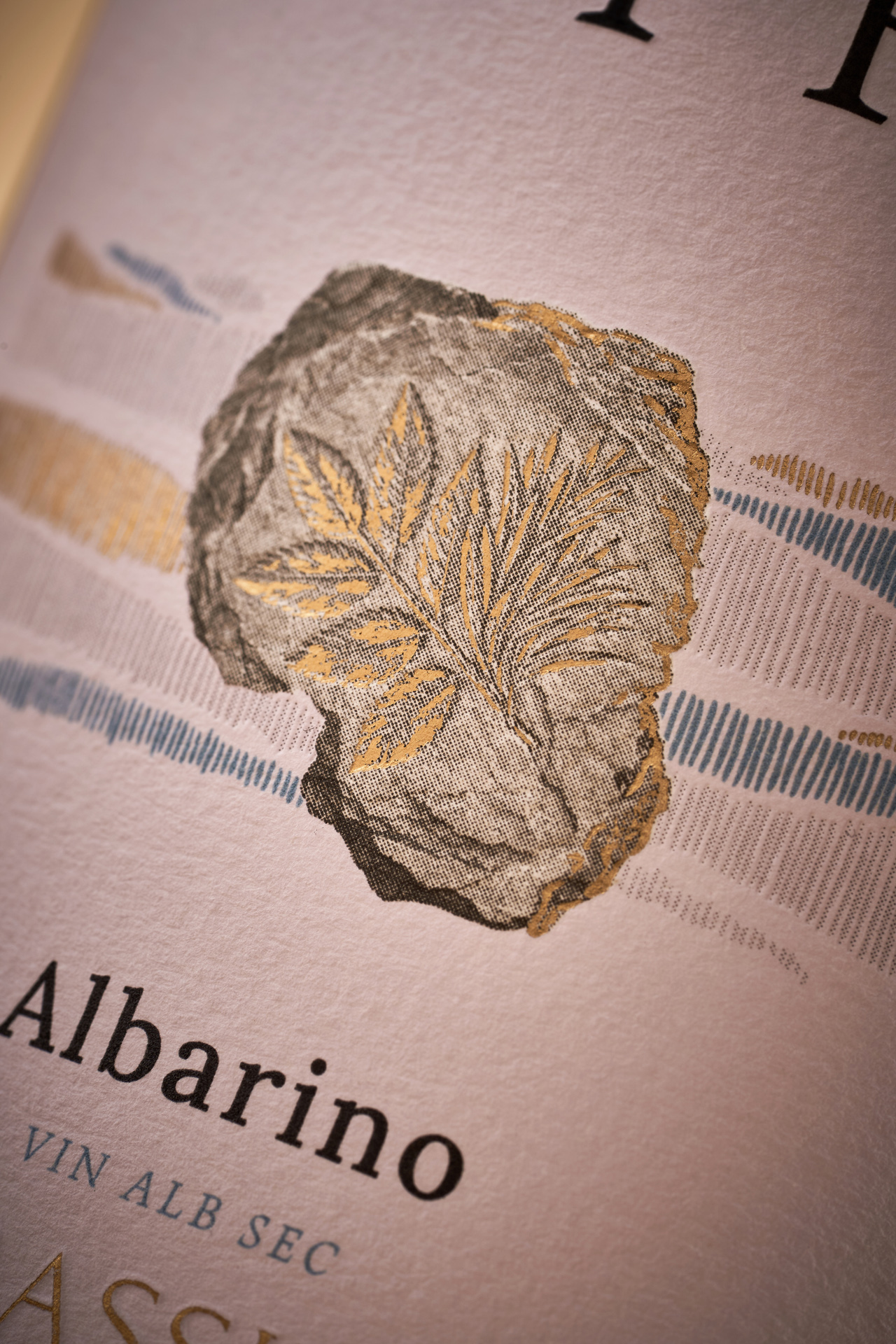
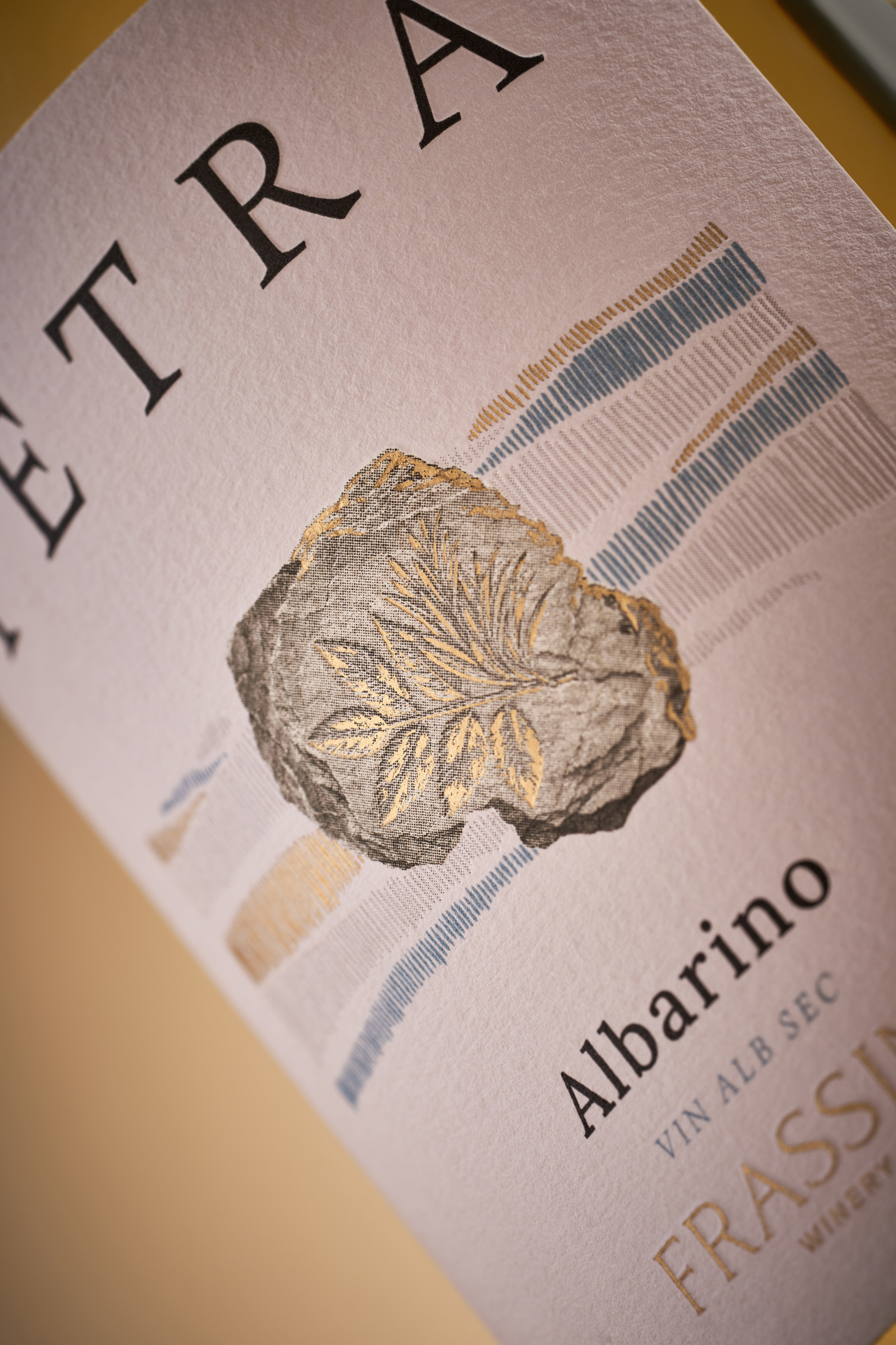
Petra is a white wine collection from Frassini, a young winery built on generations of winemaking experience. The visual identity of Frassini is rooted in a simple natural symbol - an ash leaf, referencing the trees that grow around the winery’s vineyards. For the Petra collection, our task was to reinterpret this established element and connect it to the name Petra, meaning “stone”. The challenge was to communicate a sense of heritage and connection to the land without relying on traditional or vintage visual codes.
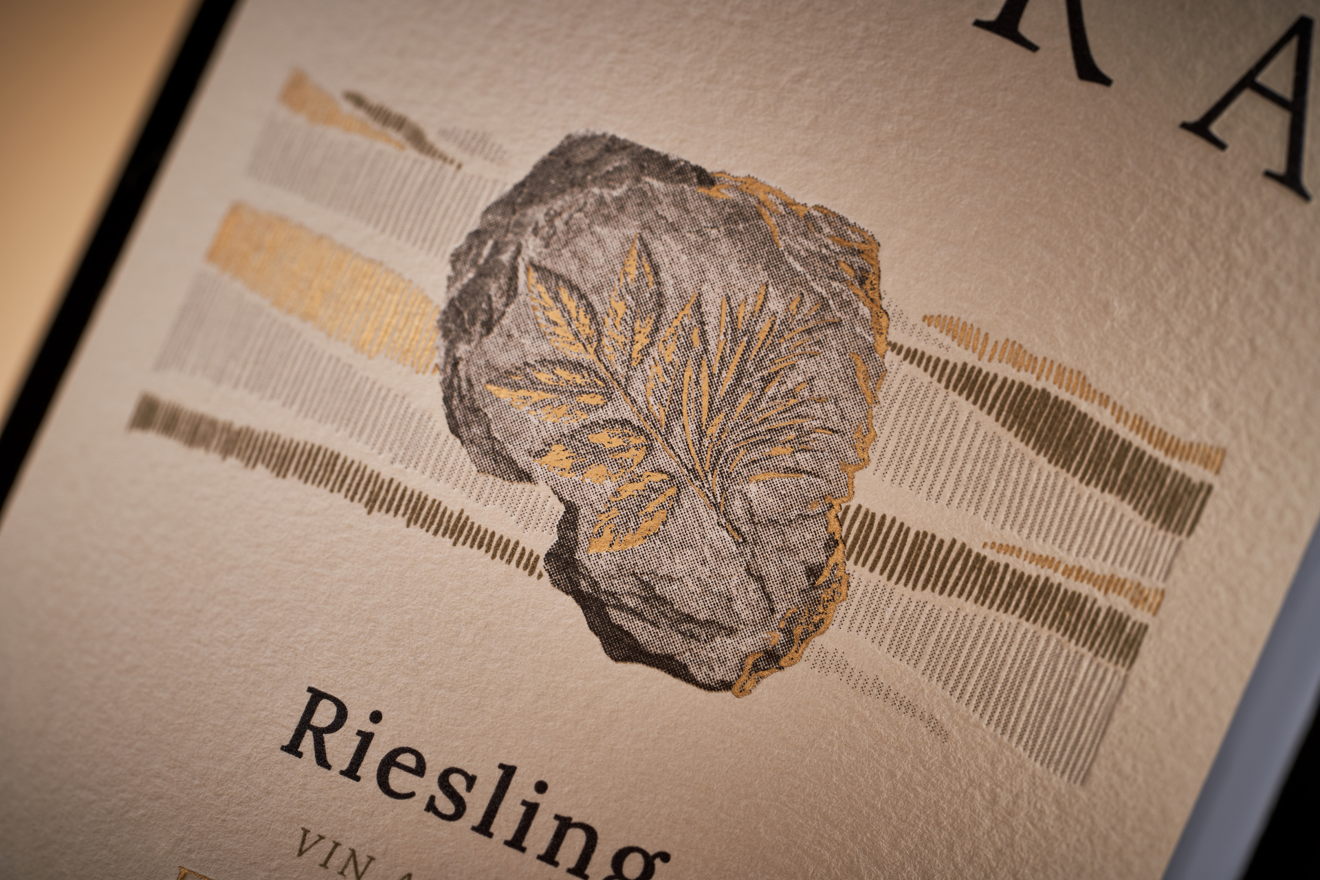
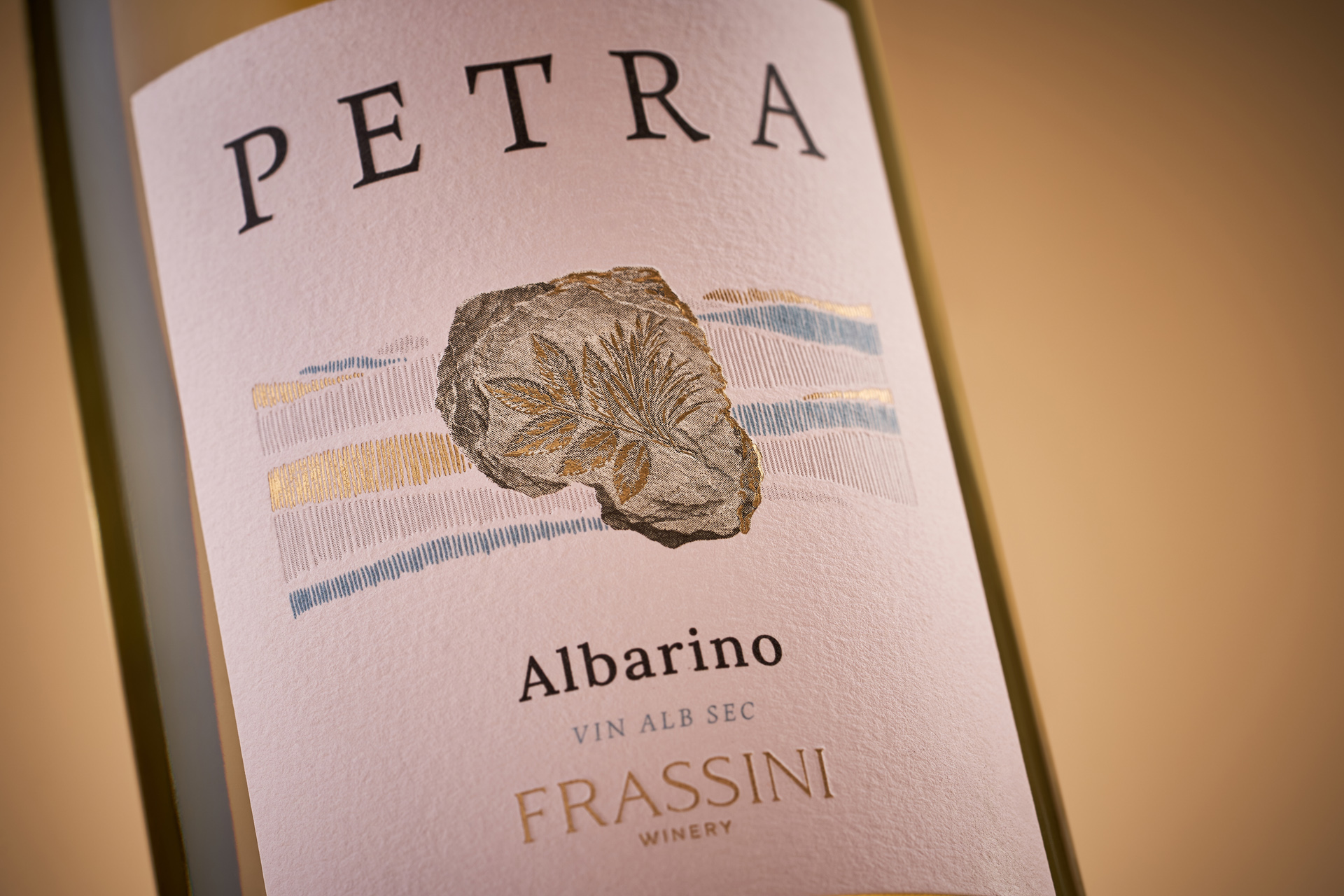
We transformed the ash leaf into the image of an ancient fossil, turning a familiar brand symbol into something that suggests time, place and accumulated knowledge. Combined with a restrained composition and contemporary typography, the fossil becomes the defining visual element of the labels. The result brings together the natural origins of the brand and the idea of time, giving Petra a fresh and contemporary character while maintaining a tangible connection to the land and the winemaking experience behind the collection.