- 2020
process
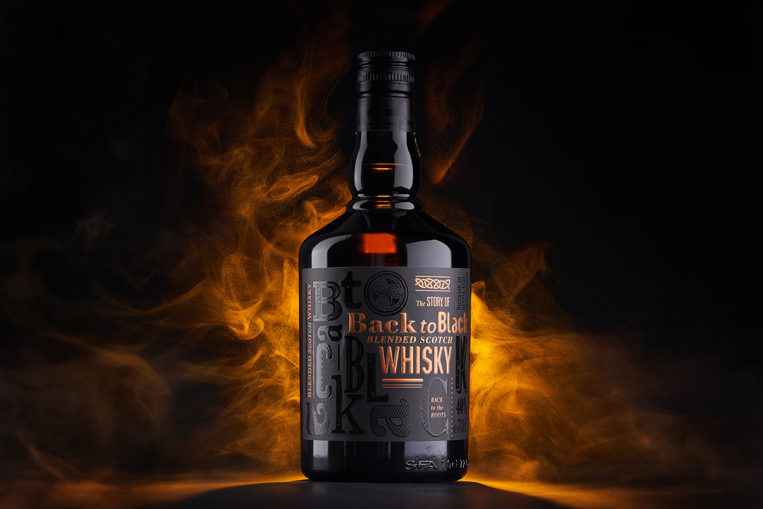
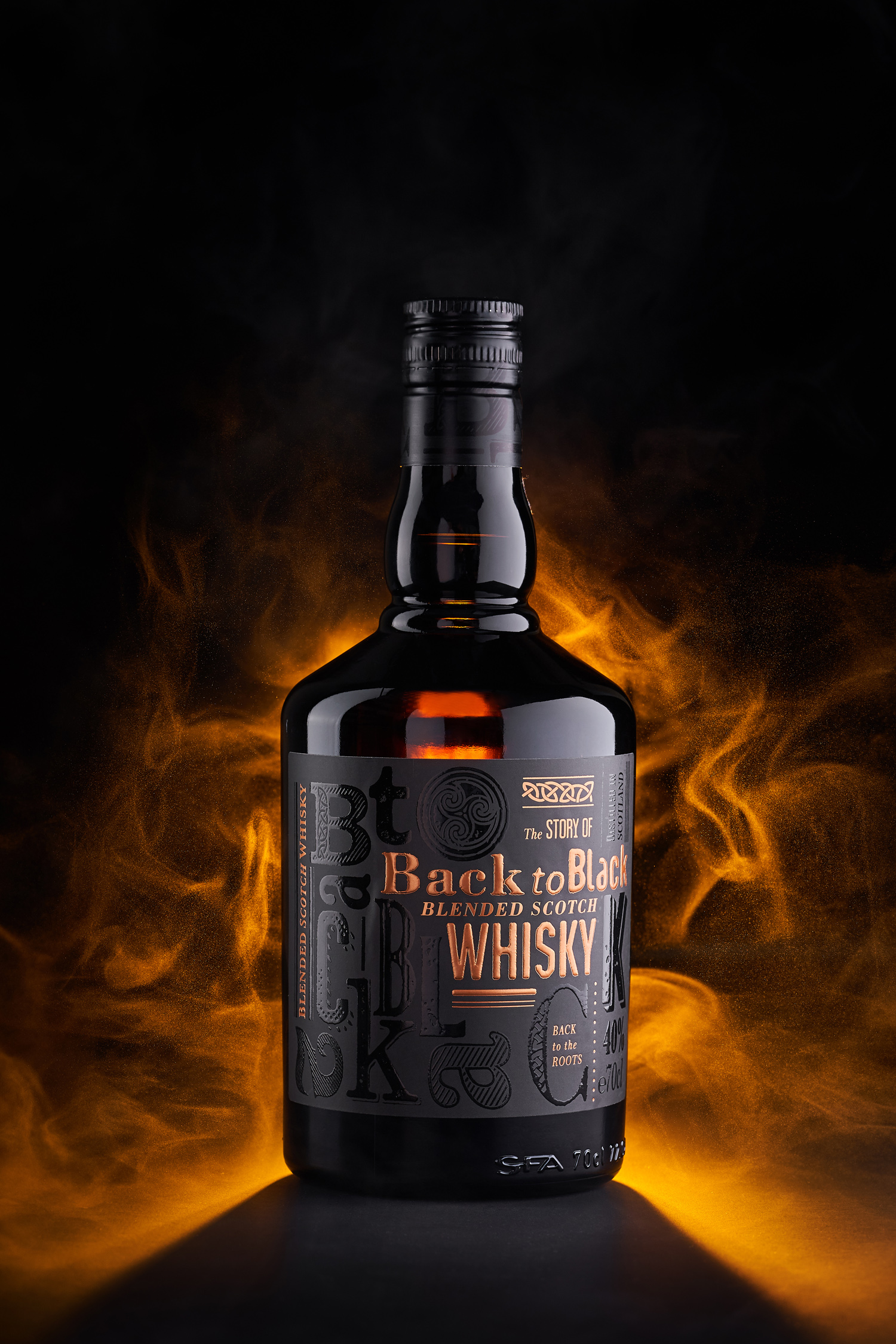
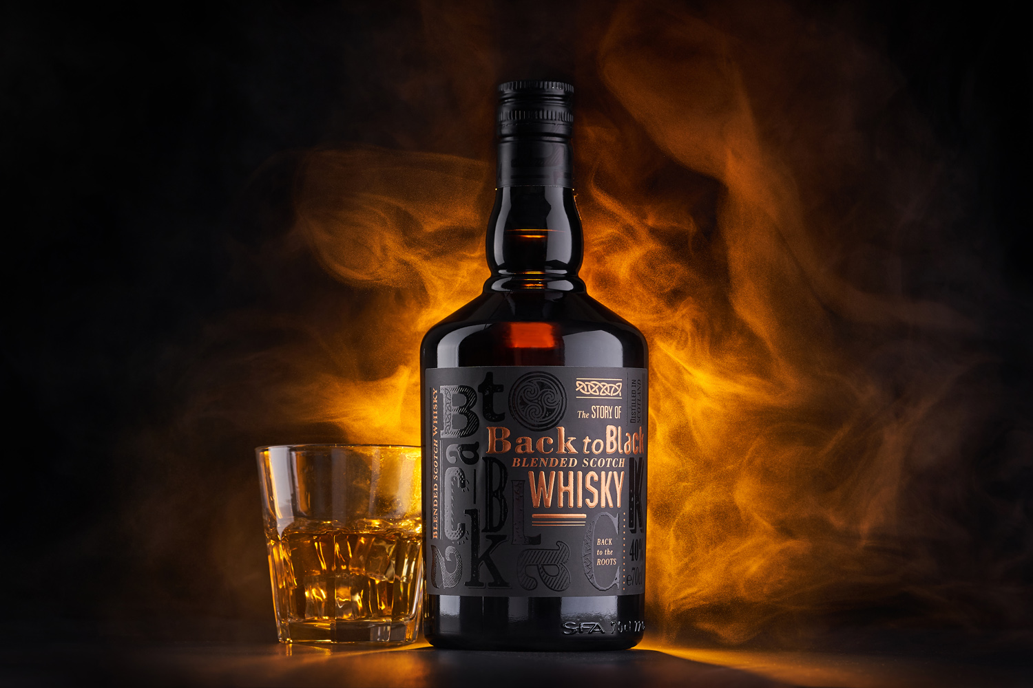
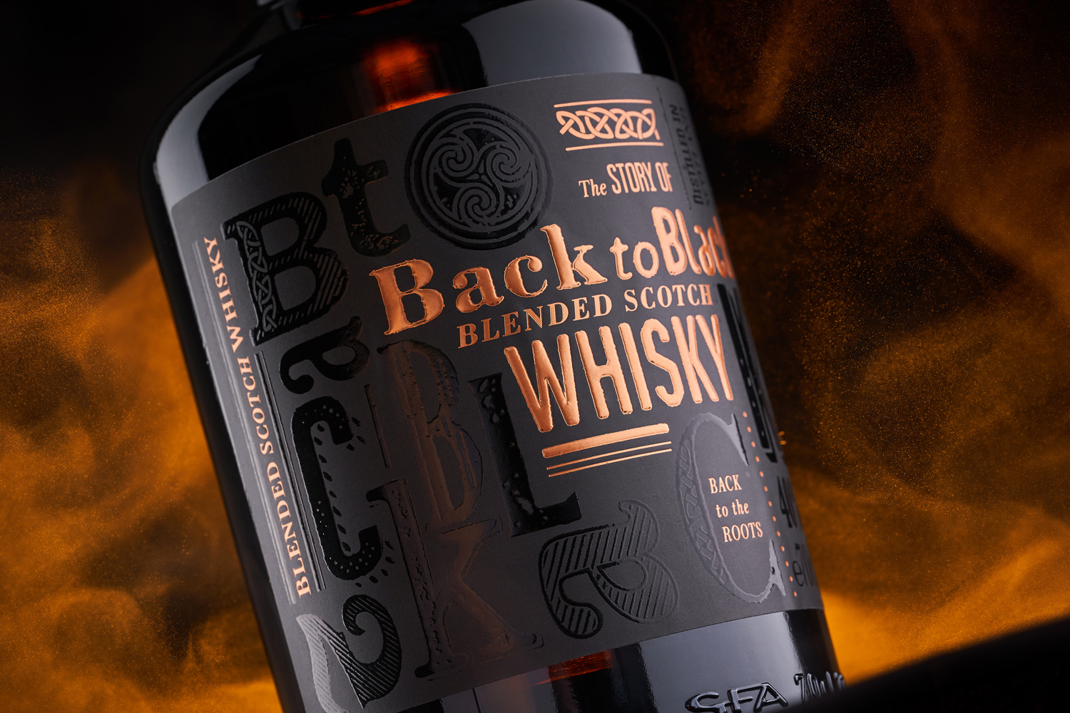
Back to Black is a new creation from the Artisan Spirits Box collection, which comprises quality and genuine spirits crafted in various styles. The general meaning of the expression “back to black” is getting back to the roots, to the source, a possibility to revision something from scratch. The product itself is a revisioned blended scotch whisky, a true classic presented in a new way. That’s why we’ve decided to make the label design for the Back to Black whisky as a blend between old-school elements and modern techniques.
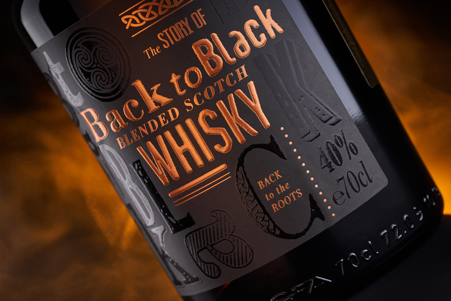
The packaging design for Back to Black scotch whiskey is based on the intense use of old typography letters that were applied during the printing process of posters, newspapers, and numerous other printed products. Being one of the oldest instruments of movable type, these elements have a certain old-school charm to them that sets the tone for the overall composition. However, we wanted to avoid the typical style of a vintage poster, which we did by applying a range of modern post-printing techniques during the label’s production process.