- 2020
process
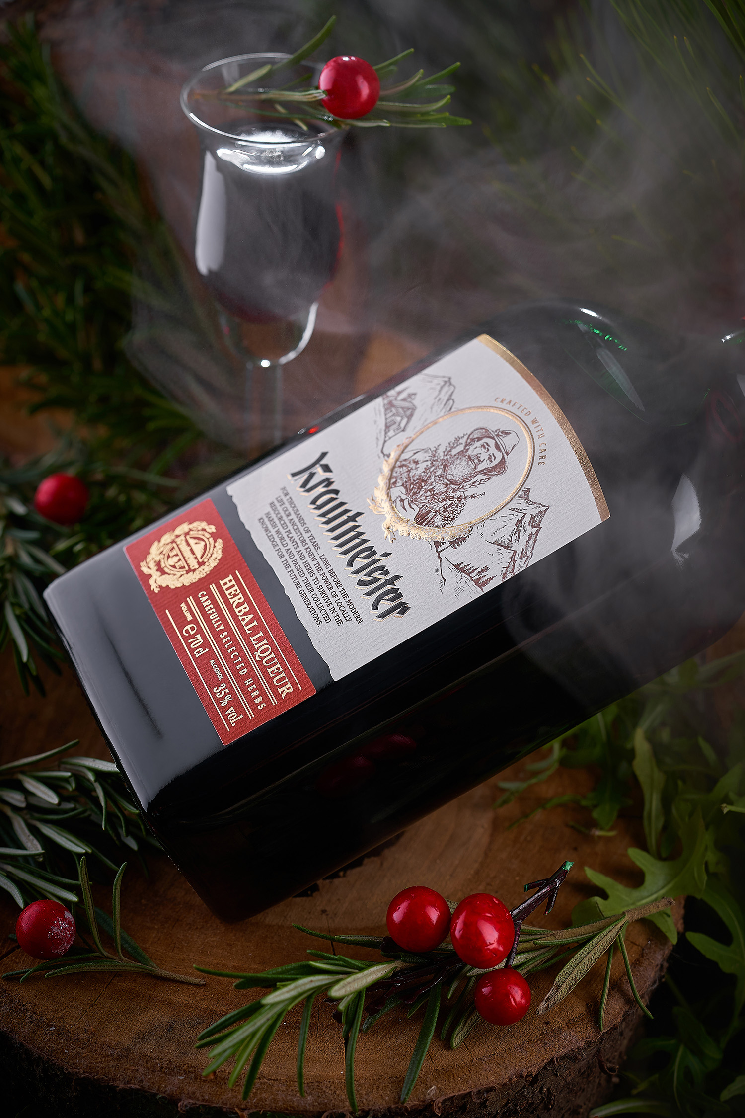
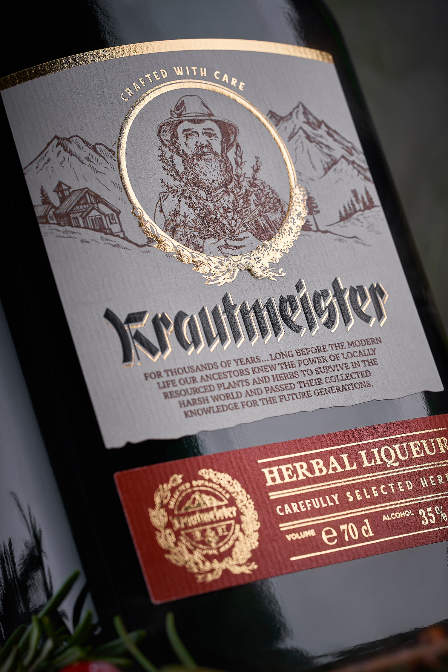
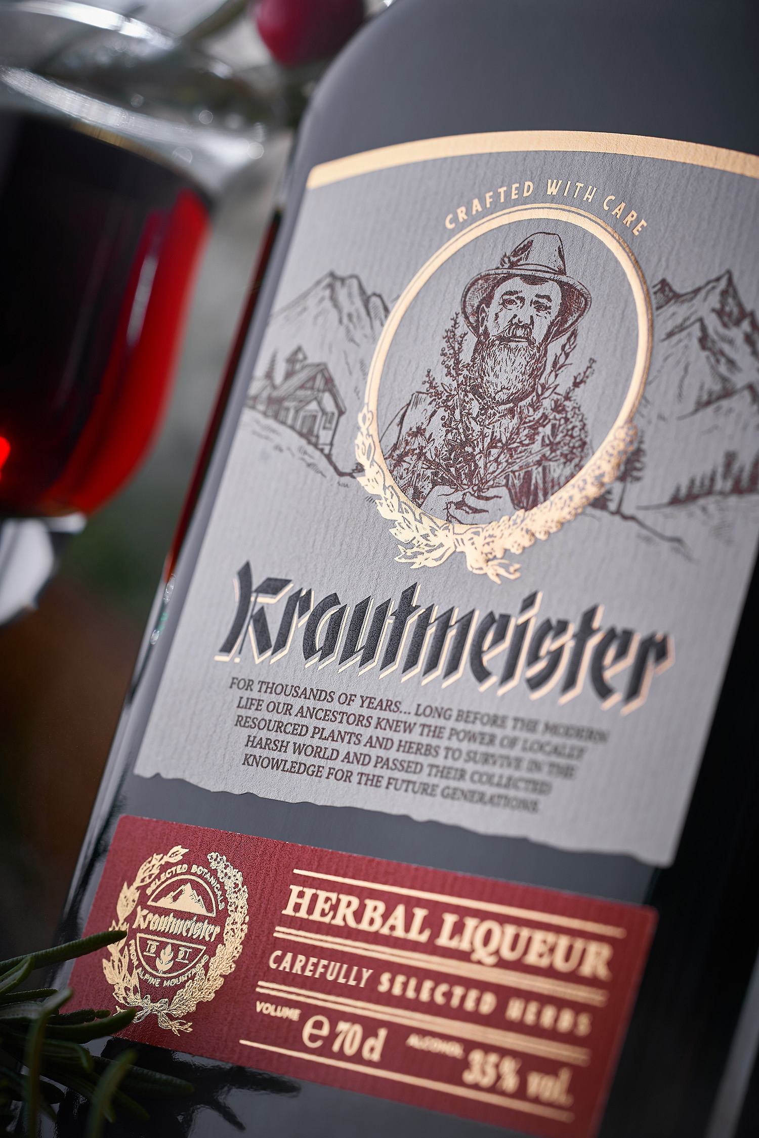
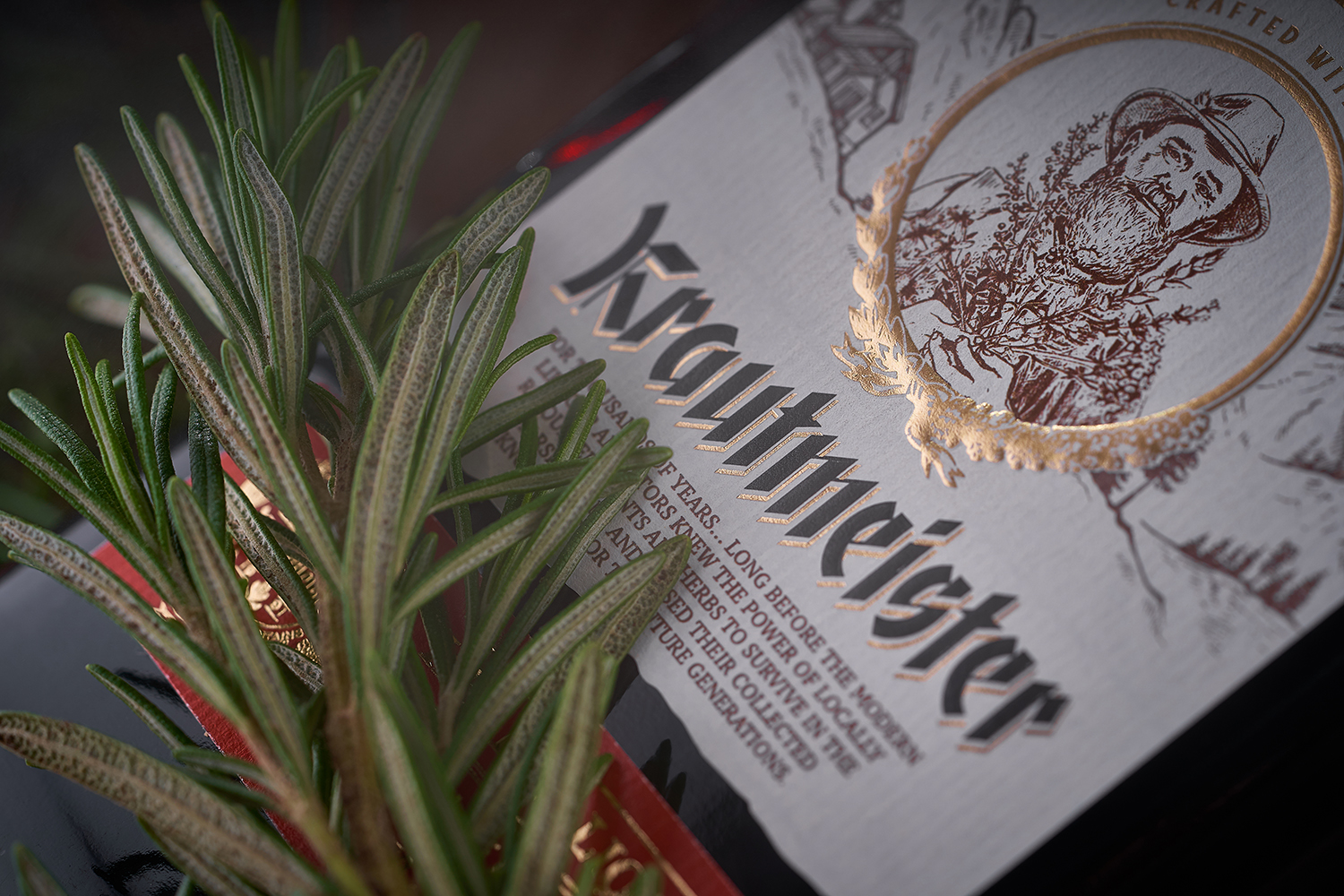
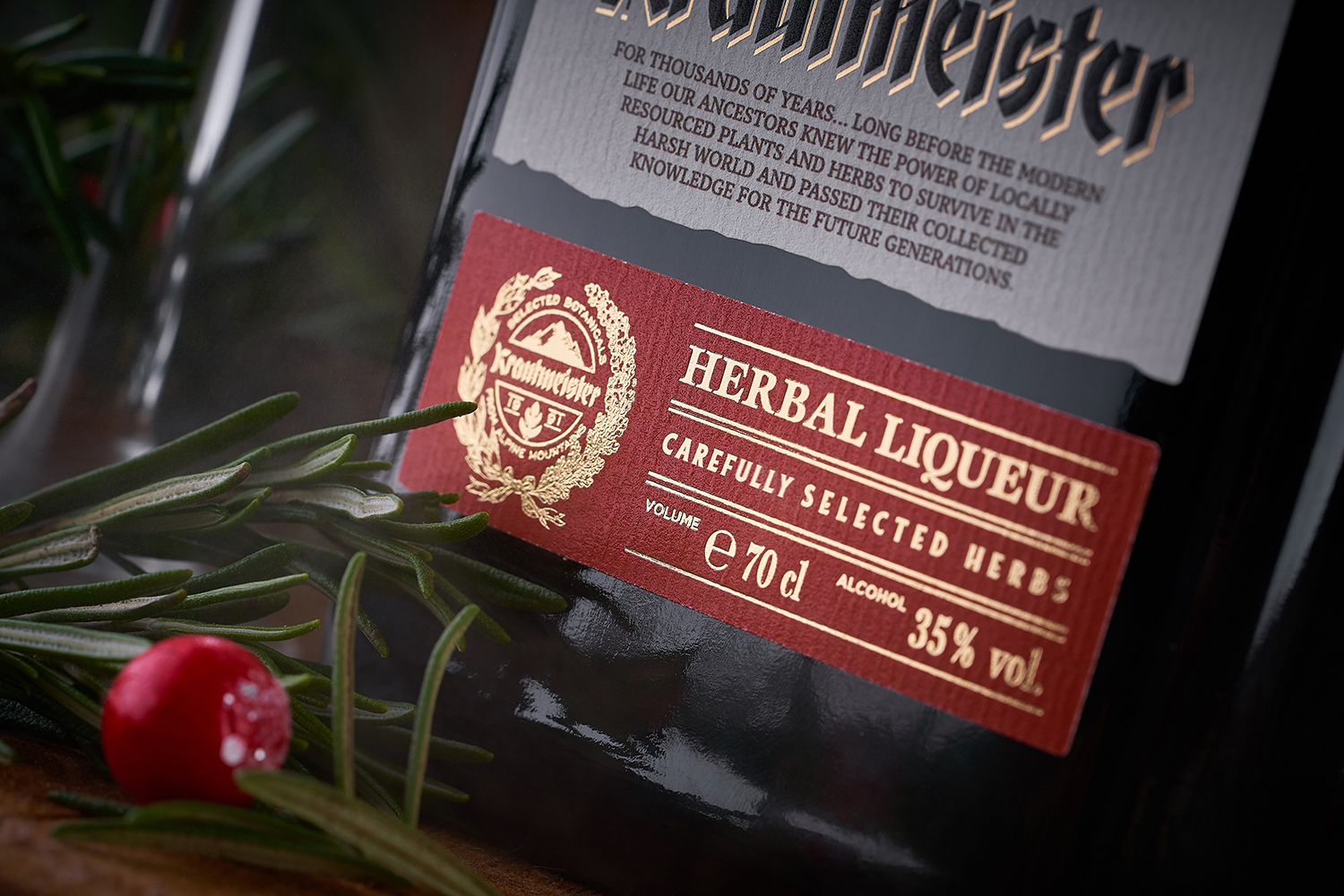
Krautmeister is a new product from the Belgian company Sodiko, a long-time client of our studio. The main feature of this drink is the use of a special mix of herbs and spices that lends a unique and intense flavor to the product. In order to precisely highlight the peculiarity of this herbal liqueur, we had to create a packaging design that would correspond to the traditions of visual identity of similar drinks. Natural and high quality ingredients, craftsmanship and experience of herbalists - these are the main aspects we’ve focused on while developing the label design for Krautmeister liqueur.
The central element in the label design for the Krautmeister herbal liqueur is a stylized image of the herbalist (ger. krautmeister), which personifies the traditional approach to crafting this drink. The image is complimented by a landscape that depicts the place of origin for herbs used in this liqueur. The name of the product is inscripted with a special gothic typeface, while the informational elements further employ a stricter style, which in conjunction emphasizes the traditionalism and German origin of this product. Selective application of gold foil stamping gives the label an additional visual appeal.