process
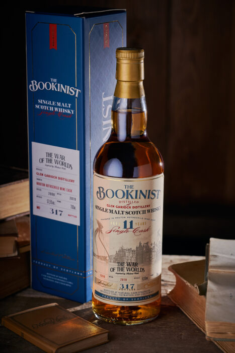
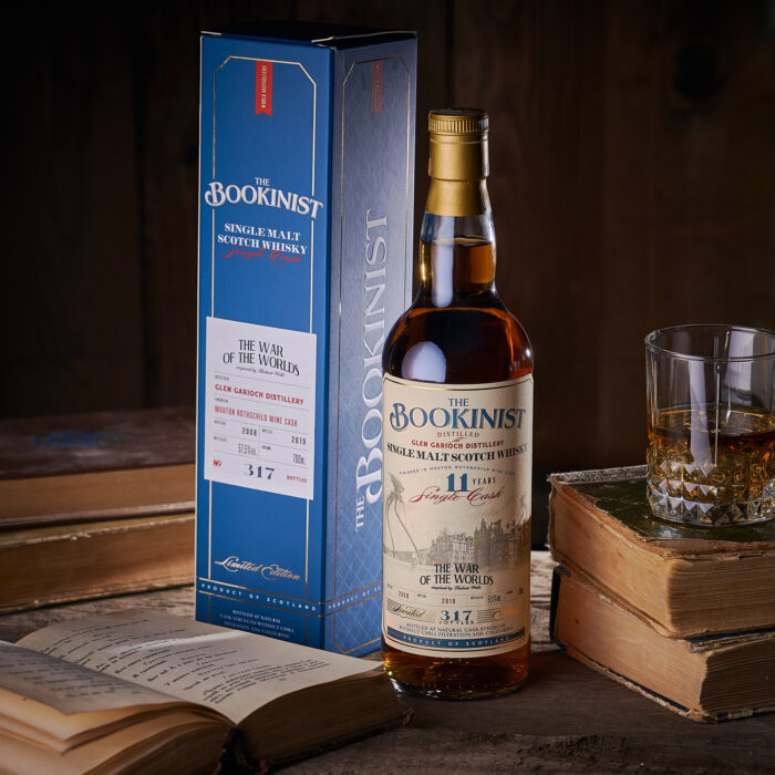
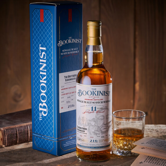
A good whisky, like a good book, captivates you from the very first page, reveals its structure as the plot develops, and remains in memory long after the story ends and the binding hides the words "the end". It was this allegory that formed the basis for the private whisky collection The Bookinist, which comprises unique single barrel whiskies sourced from the best distilleries in Scotland, each available at only several hundred bottles. Here, each whisky is a separate, complex and fascinating story that begs to be studied thoughtfully, at the pace it sets. And where the nature of each copy, available in a very limited quantity, corresponds to a certain literary work. The first edition in the series includes two iconic classic novels - The Karamazov Brothers and The War of the Worlds - which requires a meaningful and attractive cover. This was exactly our task for this project.
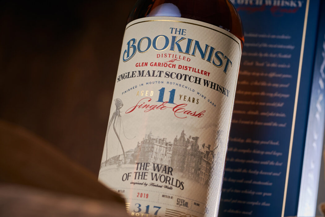
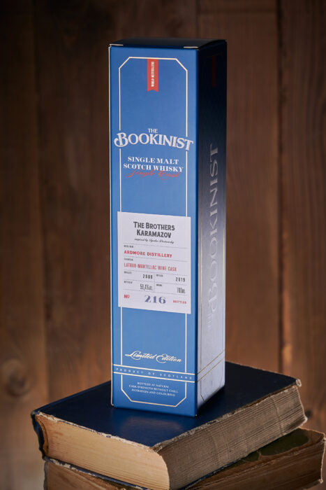
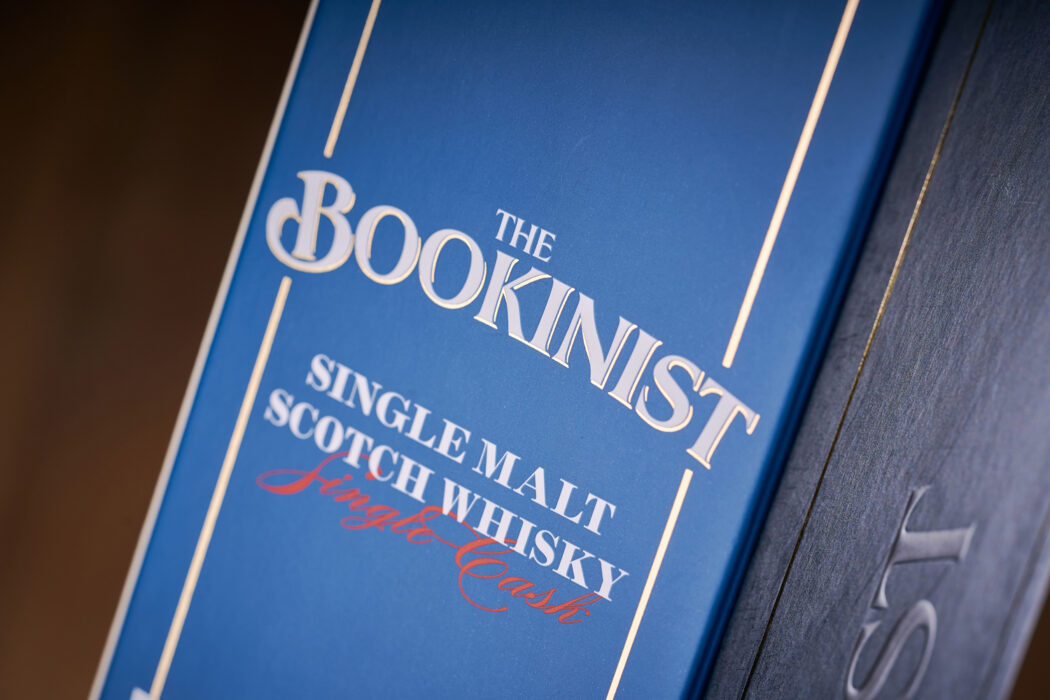
The label design for The Bookinist whisky collection series brings together two equally significant aspects that, when combined, create a single complex image. First, of course, is the illustration that conveys the main idea of the work underlying each separate product. Each drawing has been carefully thought out and handcrafted in order to set the right mood when you handle the whisky for the first time. Second is the general aesthetic and execution of informational elements of the label, which correspond to the spirit of classic vintage Scotch whisky, with its distinct font and compositional solutions. Together these two aspects create a visual image that instantly identifies the drink as a traditional, yet unique whisky with a bright and complex character. A stylish gift box, which resembles a book spine and carries additional informational elements that provide more details about the bottle within, complements the overall visual composition and enhances the feeling of exclusivity and uniqueness of the product.


