
- 2026

process
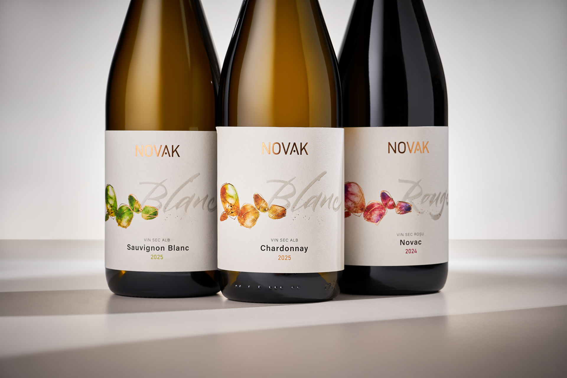
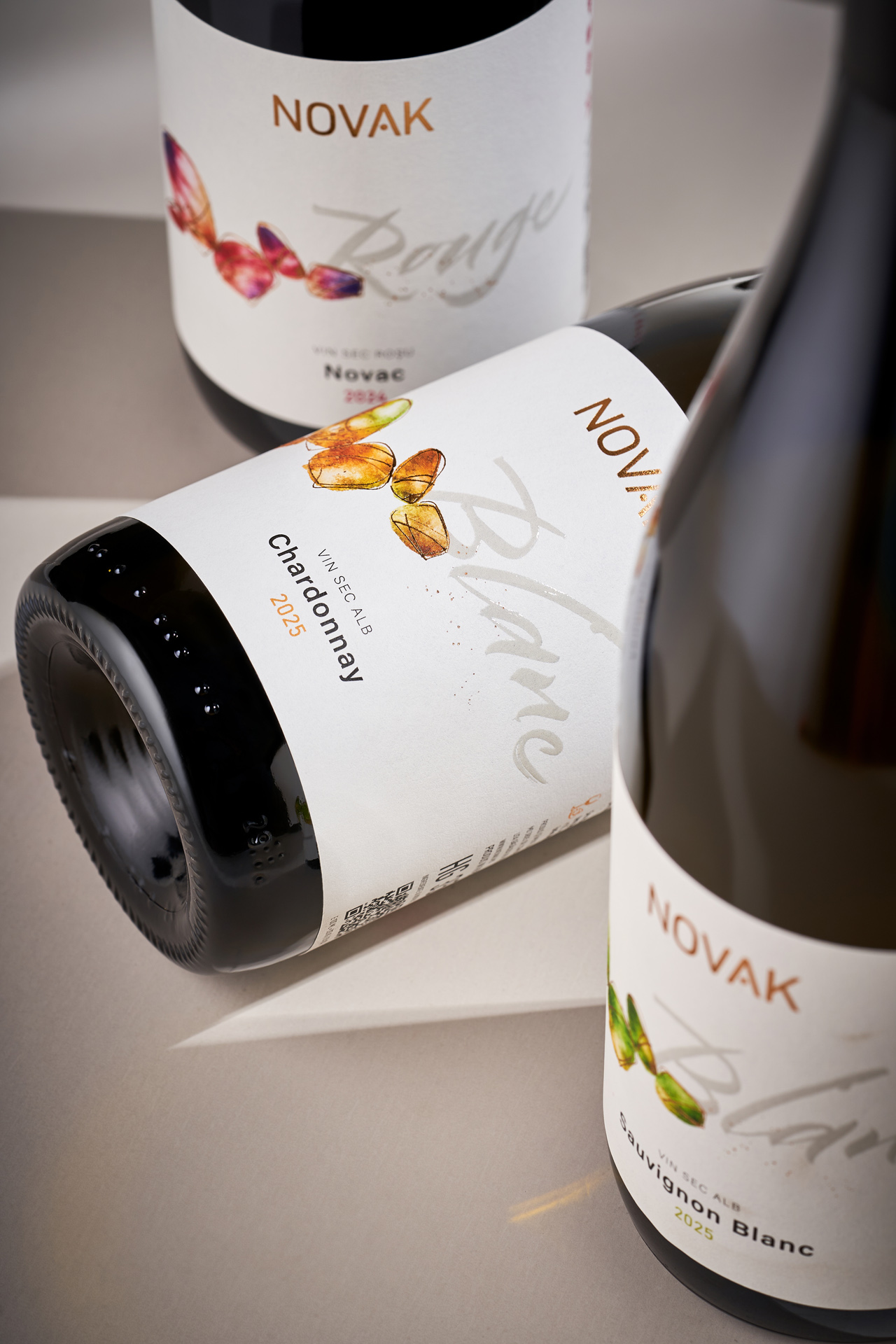
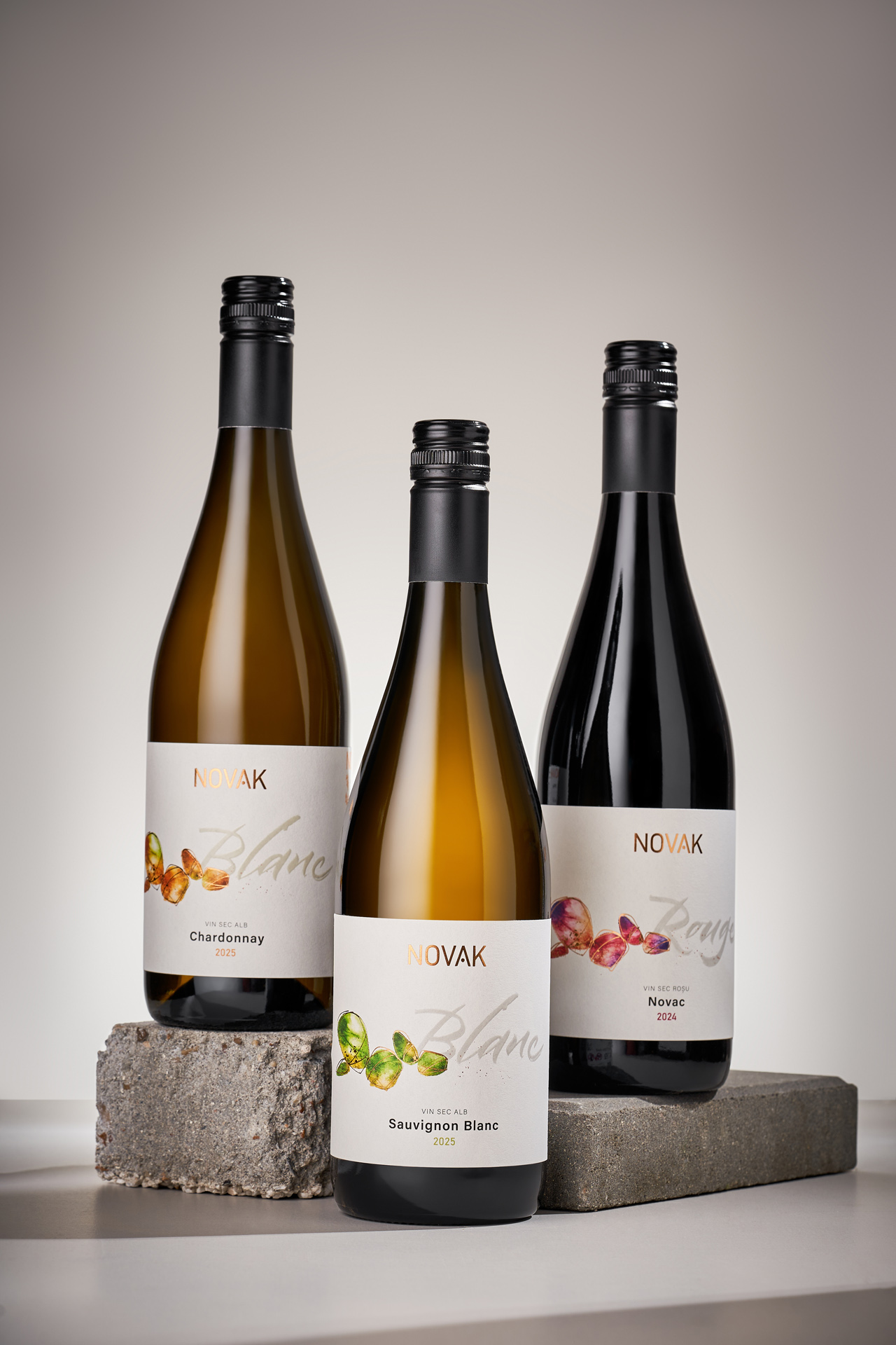
The Novak Winery collection of international grape varieties represents another stage in the natural evolution of the brand. As the portfolio expanded, there was a need to clearly distinguish the indigenous and international varieties by developing two separate visual branches. The foundation for the classic range came from a design previously created by our studio for a limited-edition orange wine. The project proved successful, but the wine itself quickly sold out and never returned to the portfolio. Rather than leave a strong visual asset behind, we decided to give it a new life.
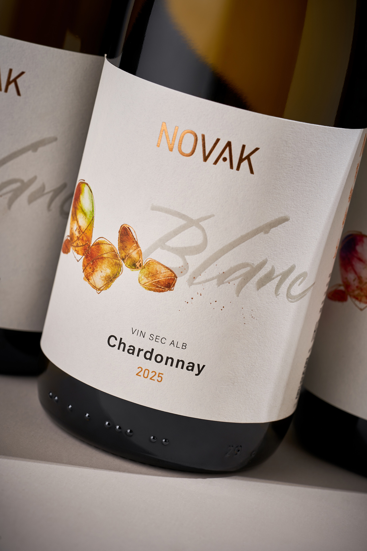
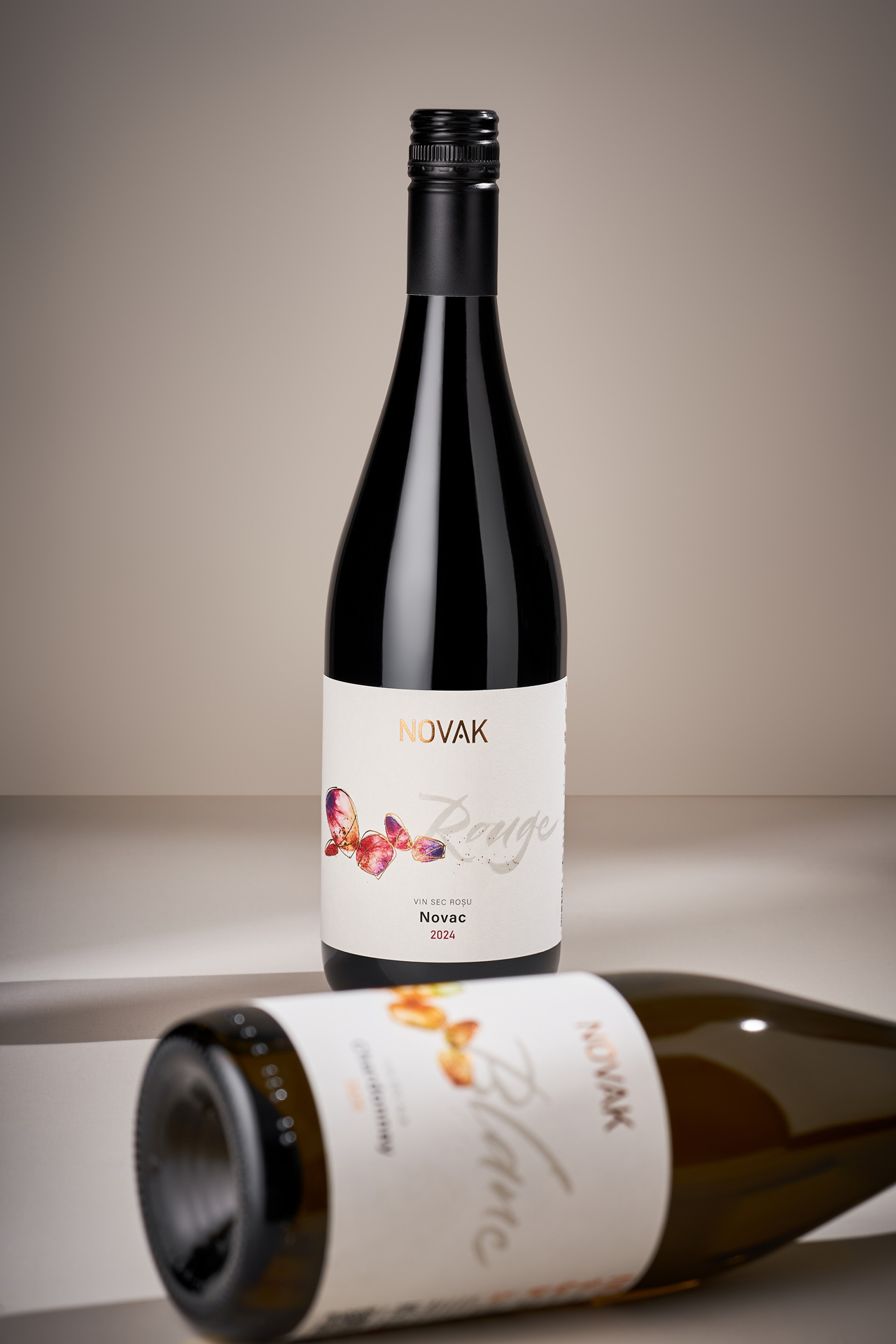
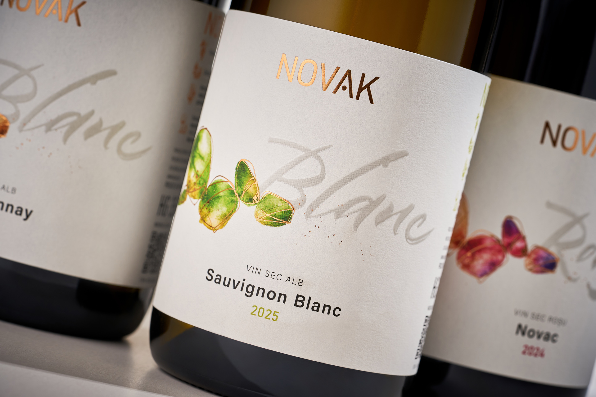
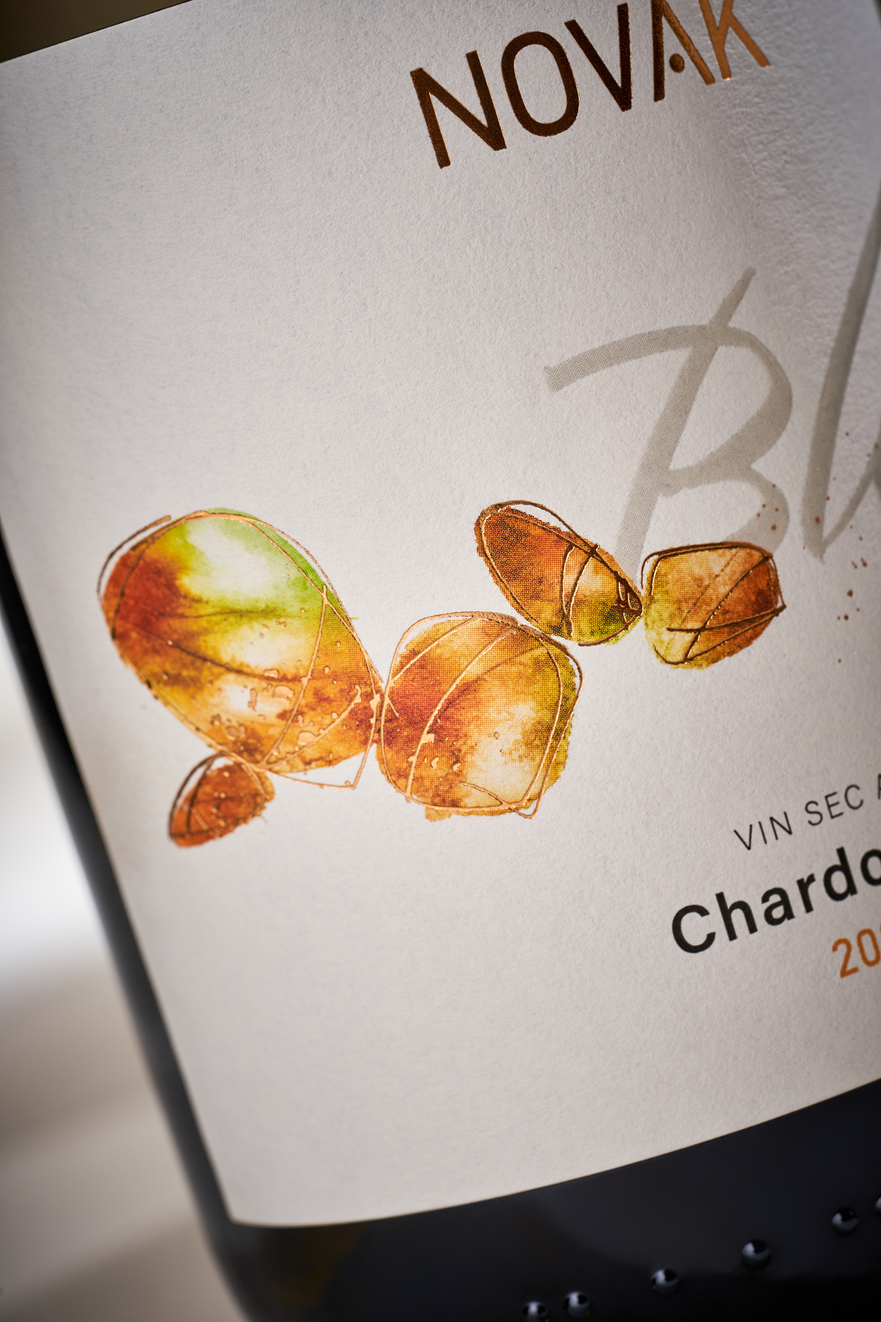
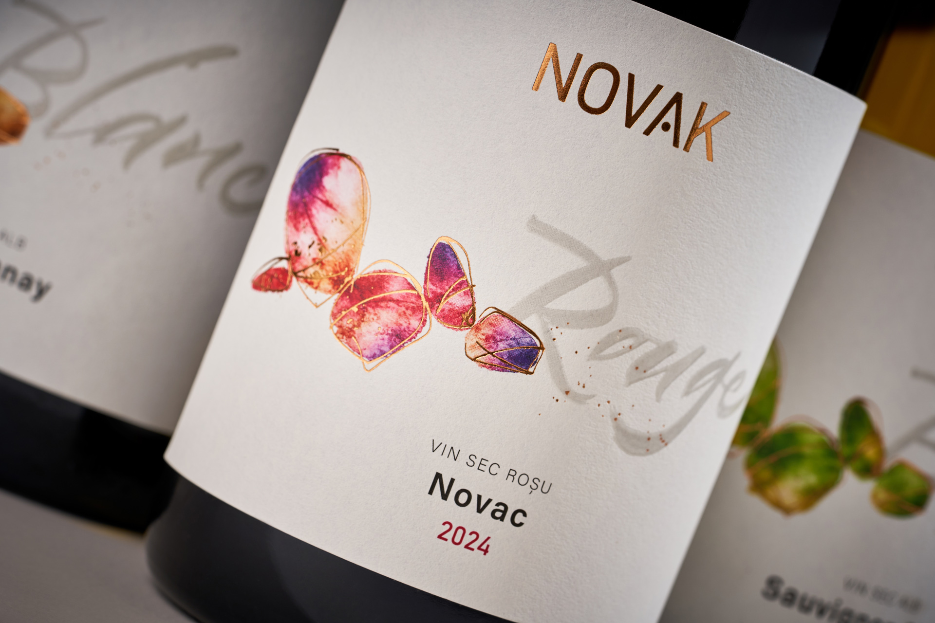
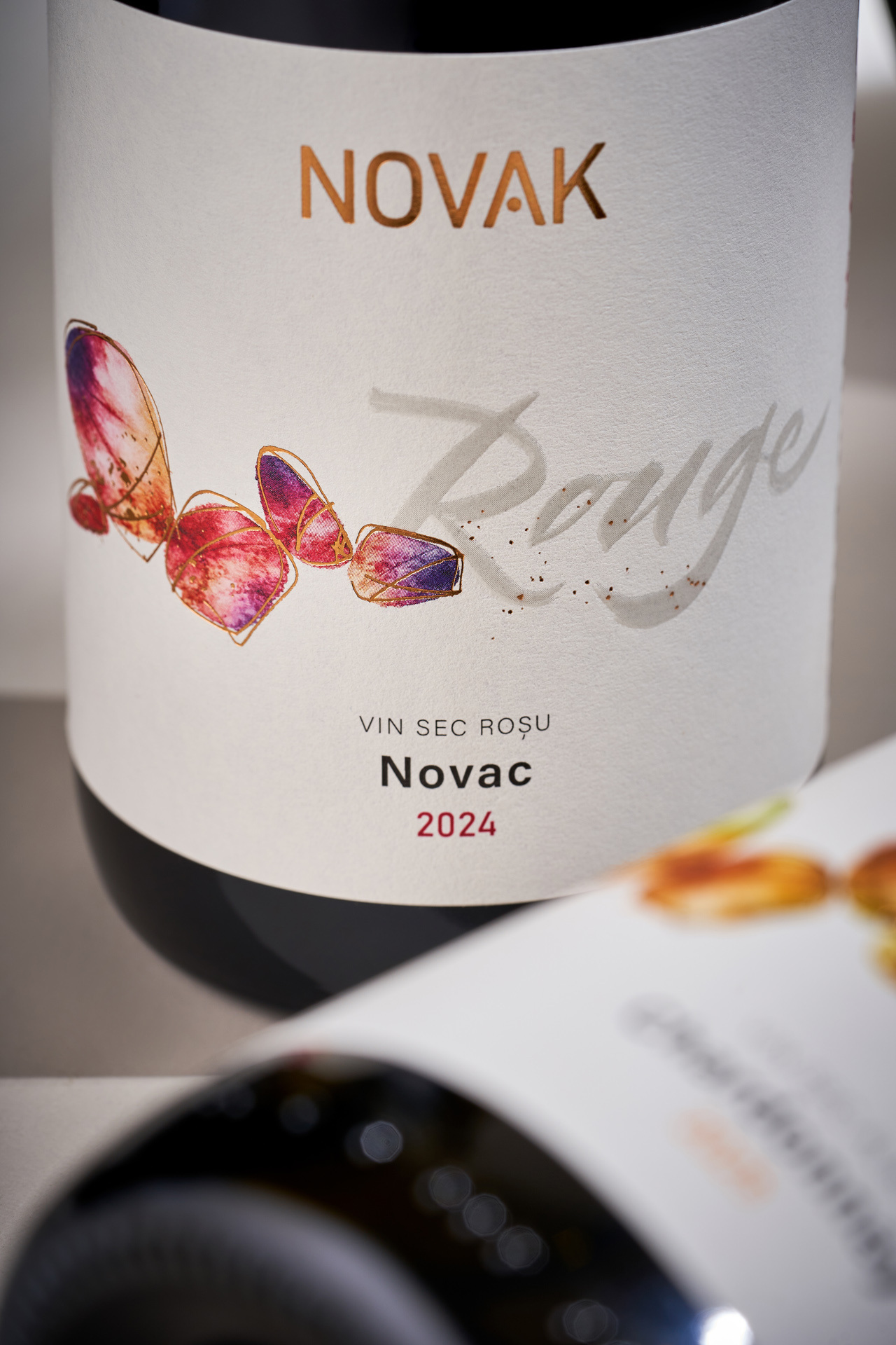
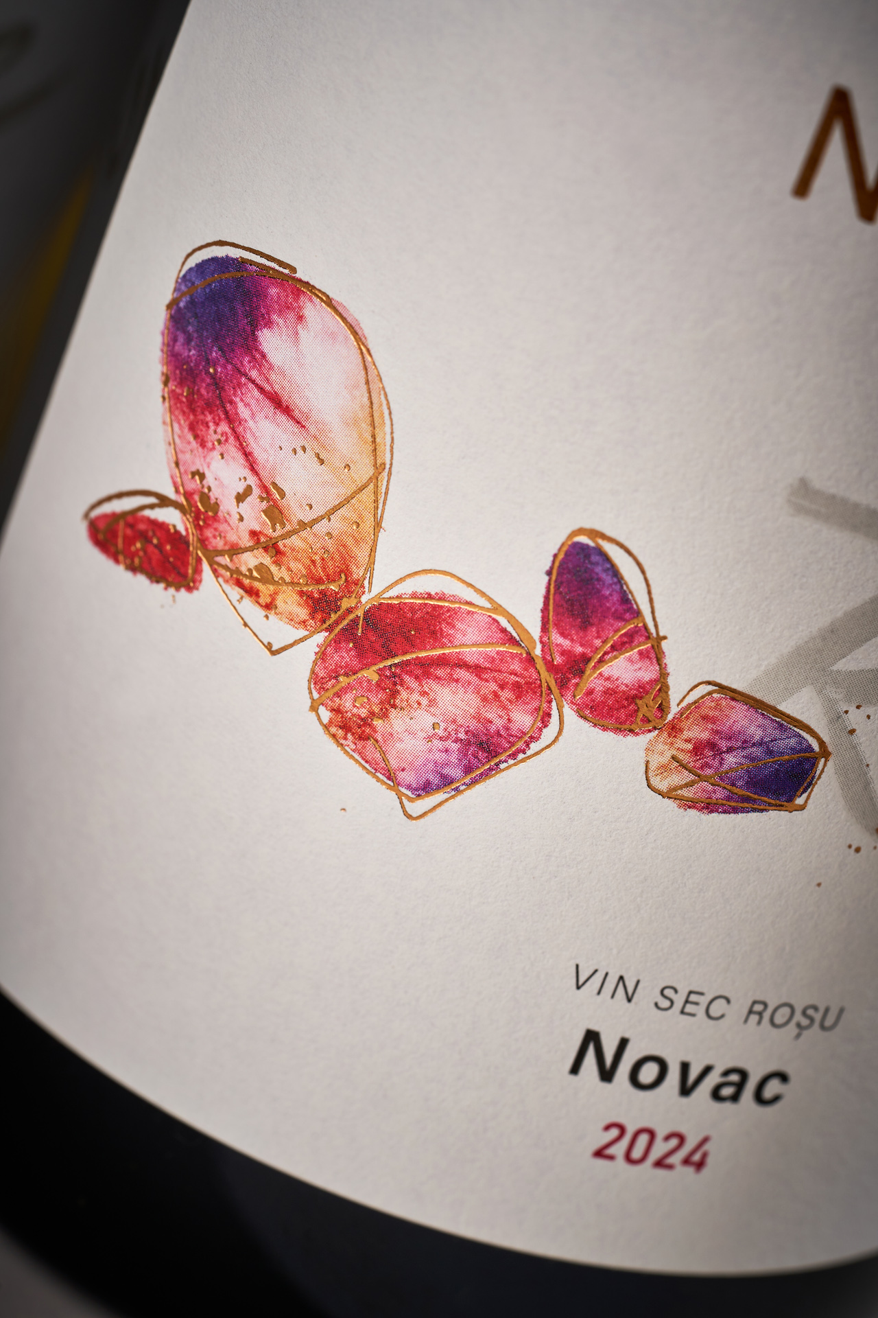
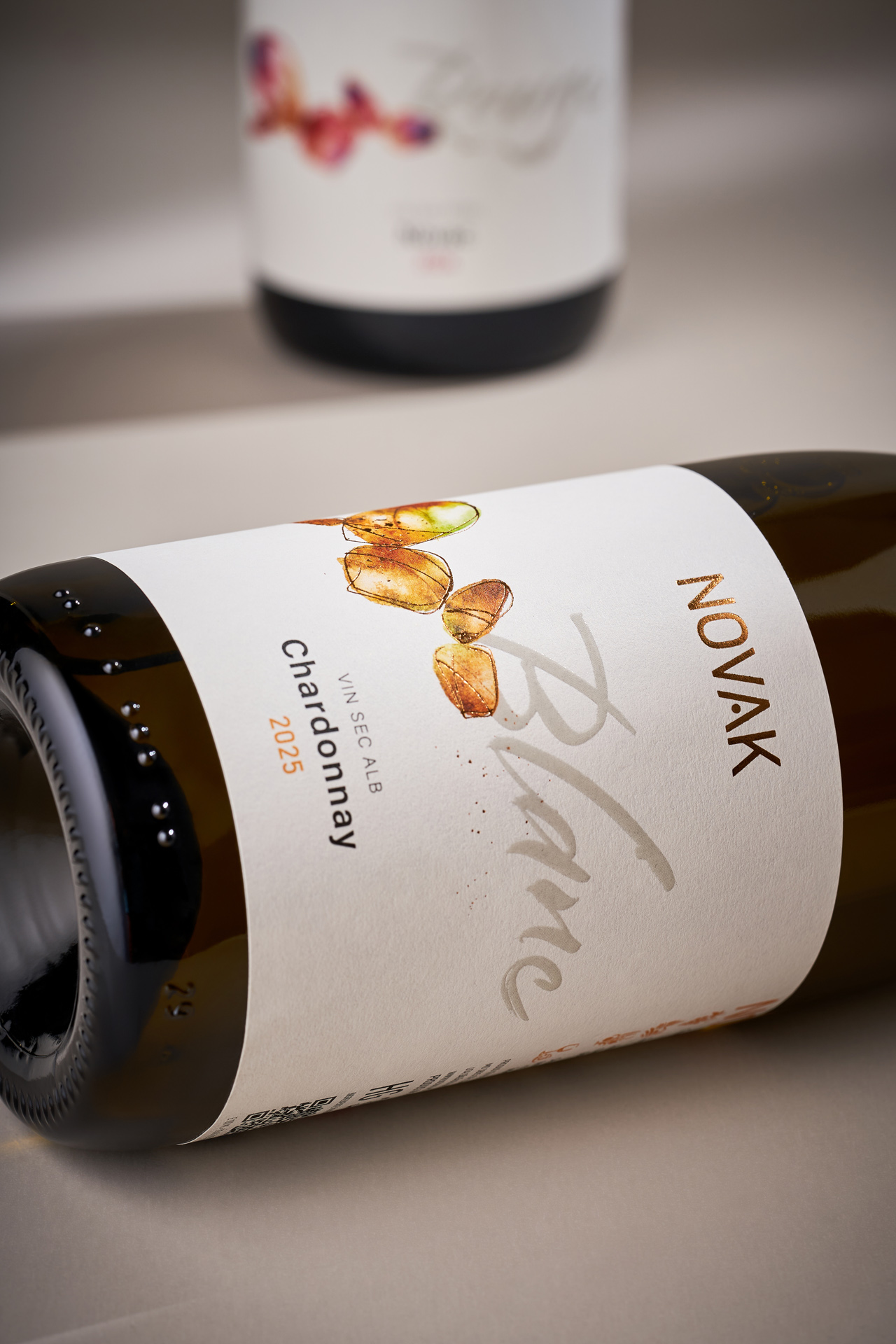
We retained the recognisable foundation and adapted the existing design for a broader range of wines. Stylised stones became the central visual element, carrying the connection to the original concept into the new collection. They are paired with calligraphic lettering identifying the wine category, immediately setting expectations for what is inside the bottle. A visual idea originally created for a single experimental wine has thus evolved into a complete system for a wider collection, giving each variety its own character while keeping the range within a coherent Novak visual language.