- 2021
process
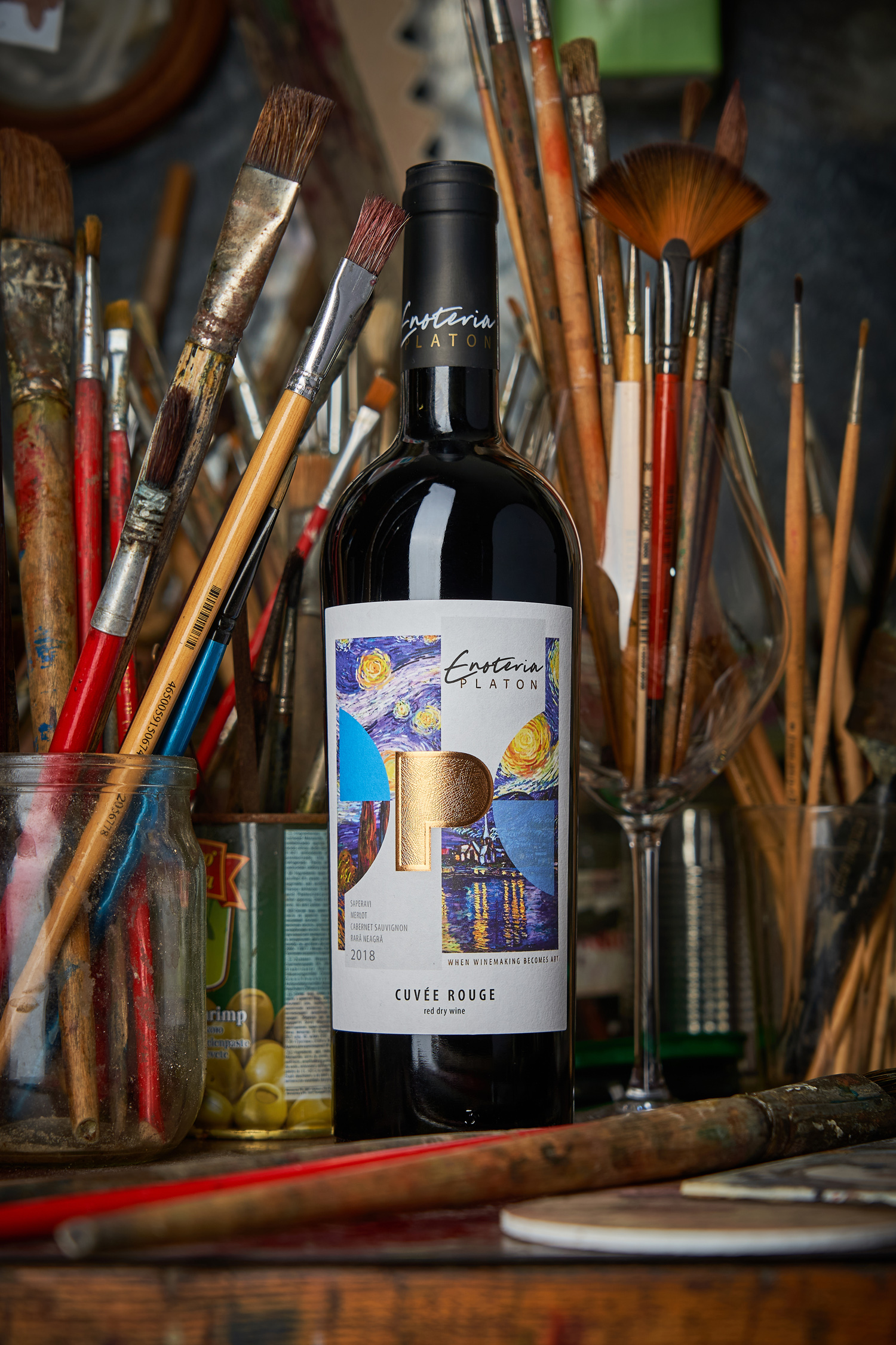
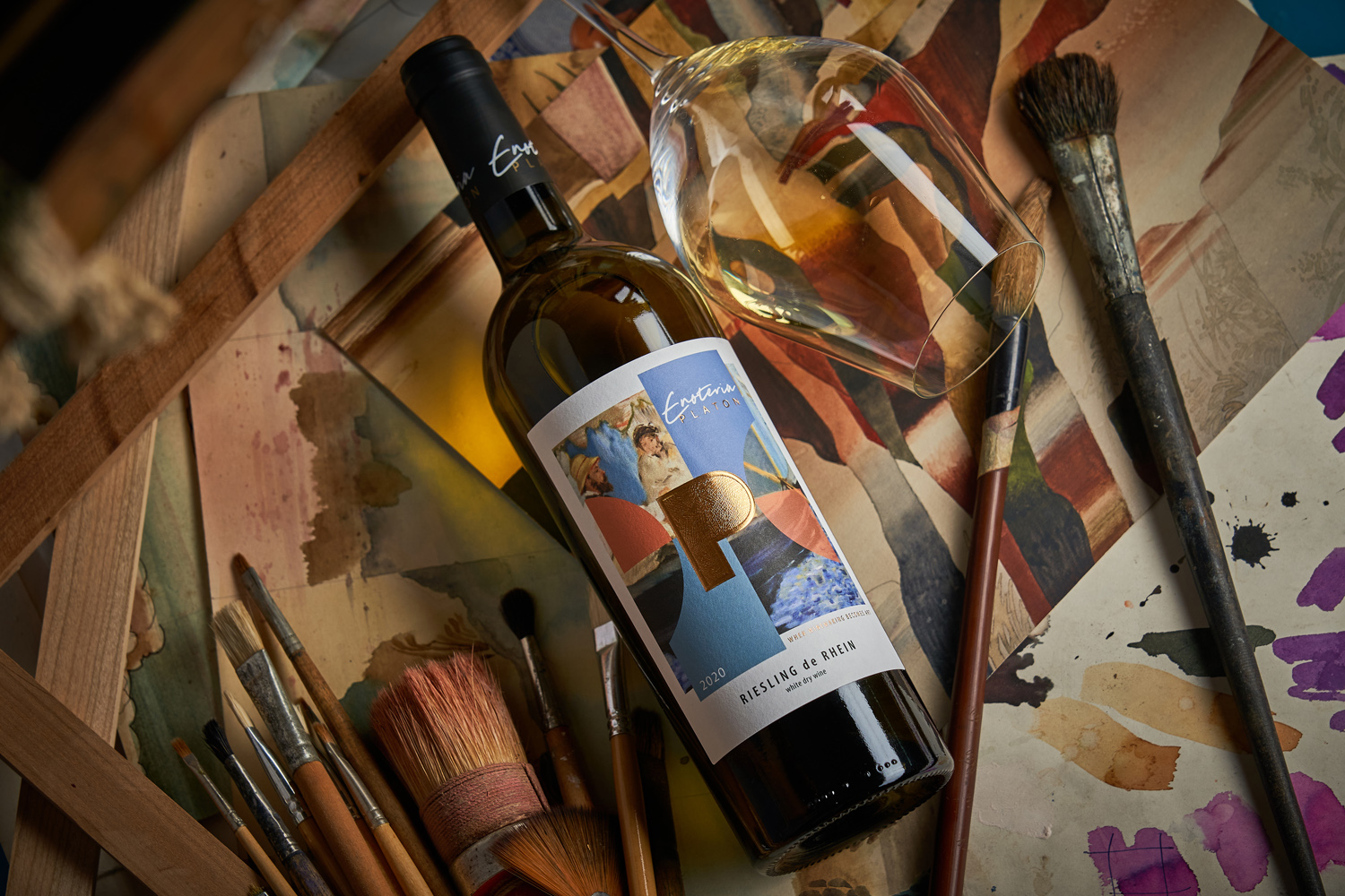
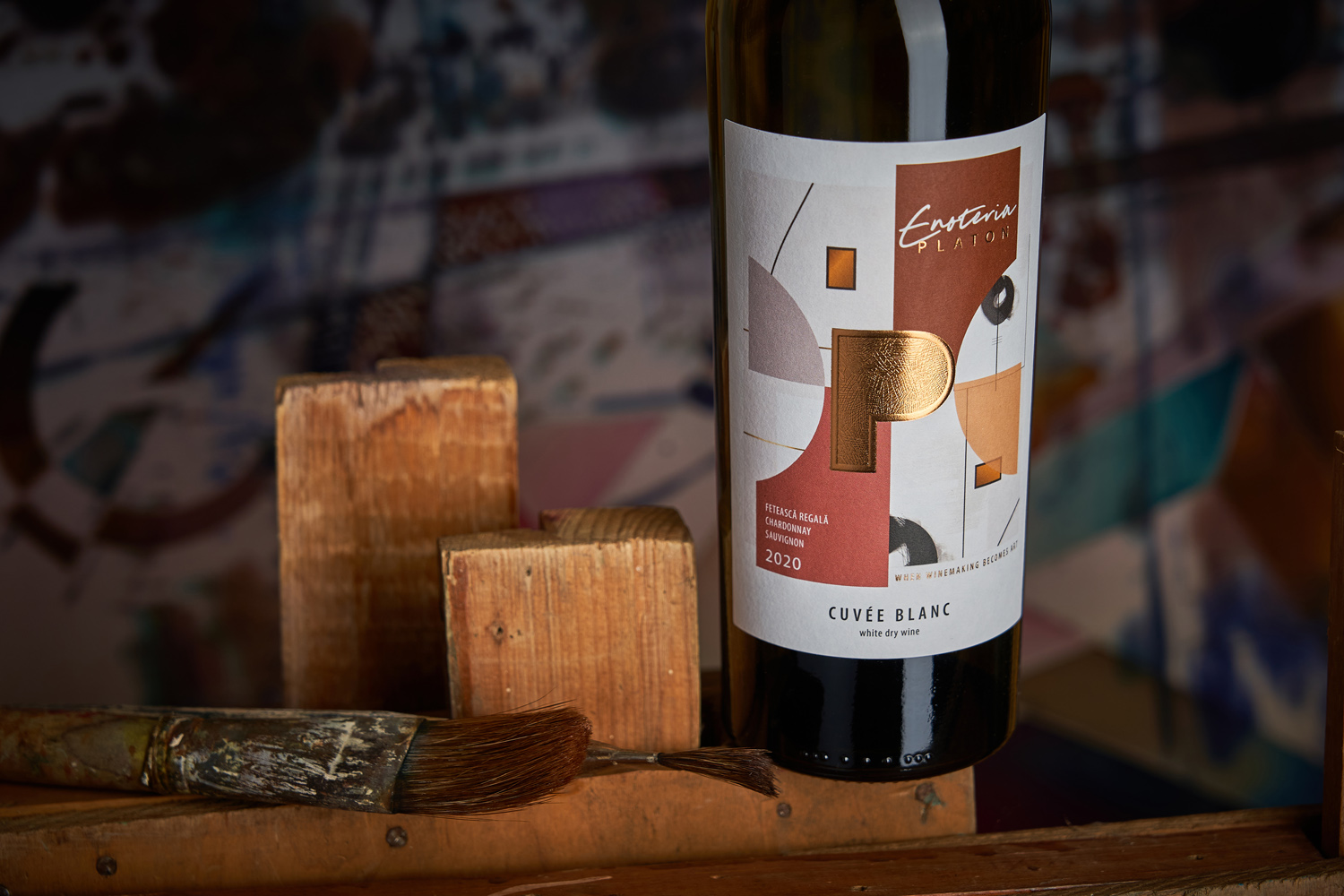
What is wine? For most people it’s just a pleasant drink, a glass of which can help you spend the night, pair with something tasty, and lighten up your time with friends and close ones. However, ask those who make it, and most of them will involuntarily start comparing their creations to works of art. Indeed, it takes so much effort, time, experience, skill, and inspiration to create even the most ordinary bottle of wine that such comparisons do not seem completely unfounded. This is what served as the basis for the Enoteria Platon project, for which our studio has developed naming, positioning, identity and packaging design. Our vision in this case perfectly matched the vision of the winemaker, who wanted to create something fresh, new, different from how other producers see wine and present it to the consumer. So we’ve settled on the concept of total immersion in art, where inspiration blurs the lines between familiar things.
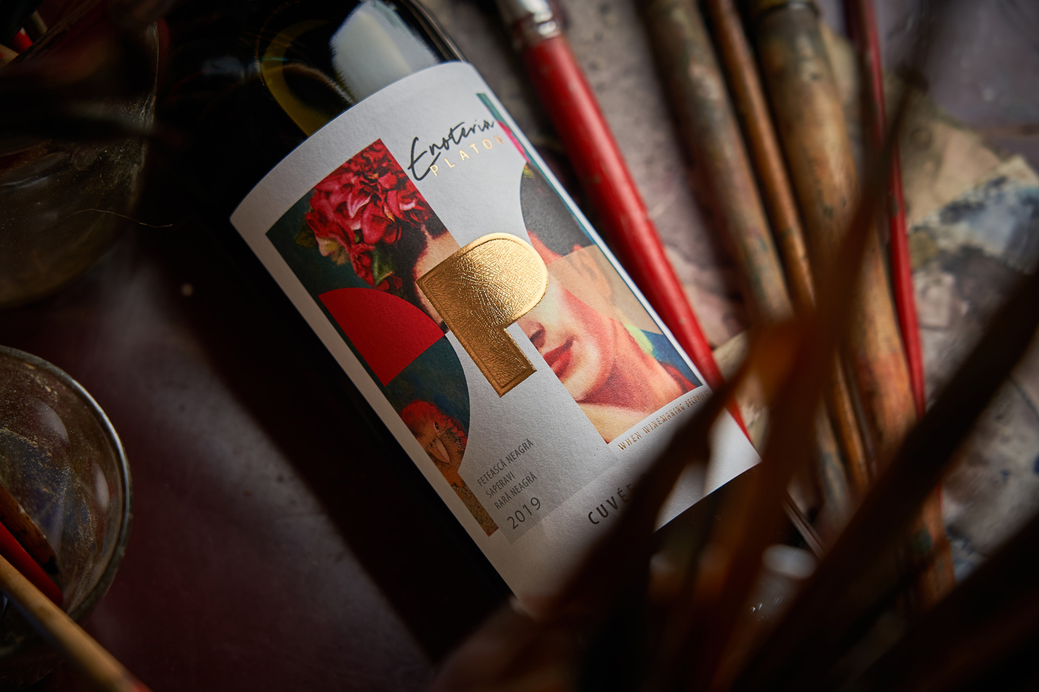
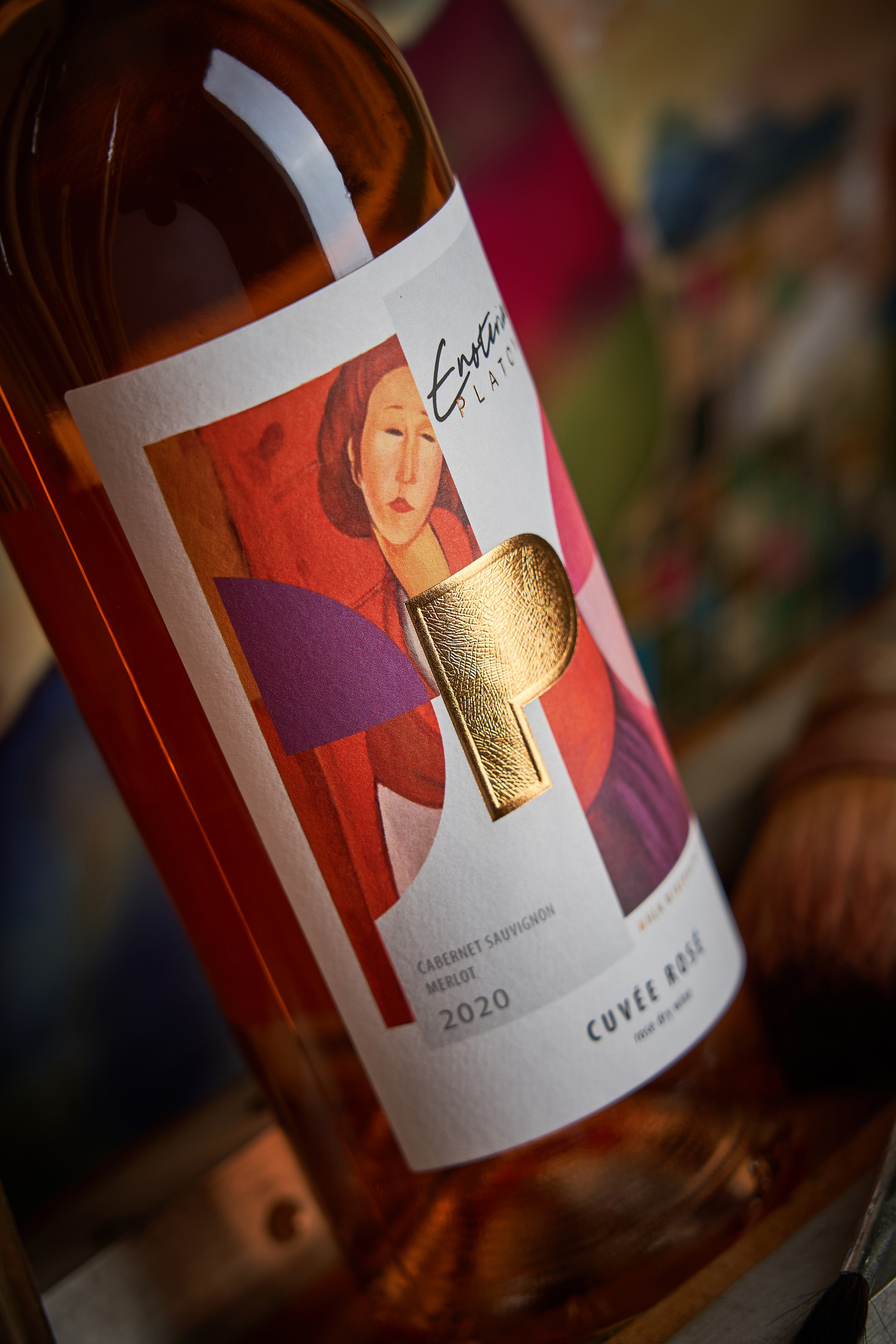
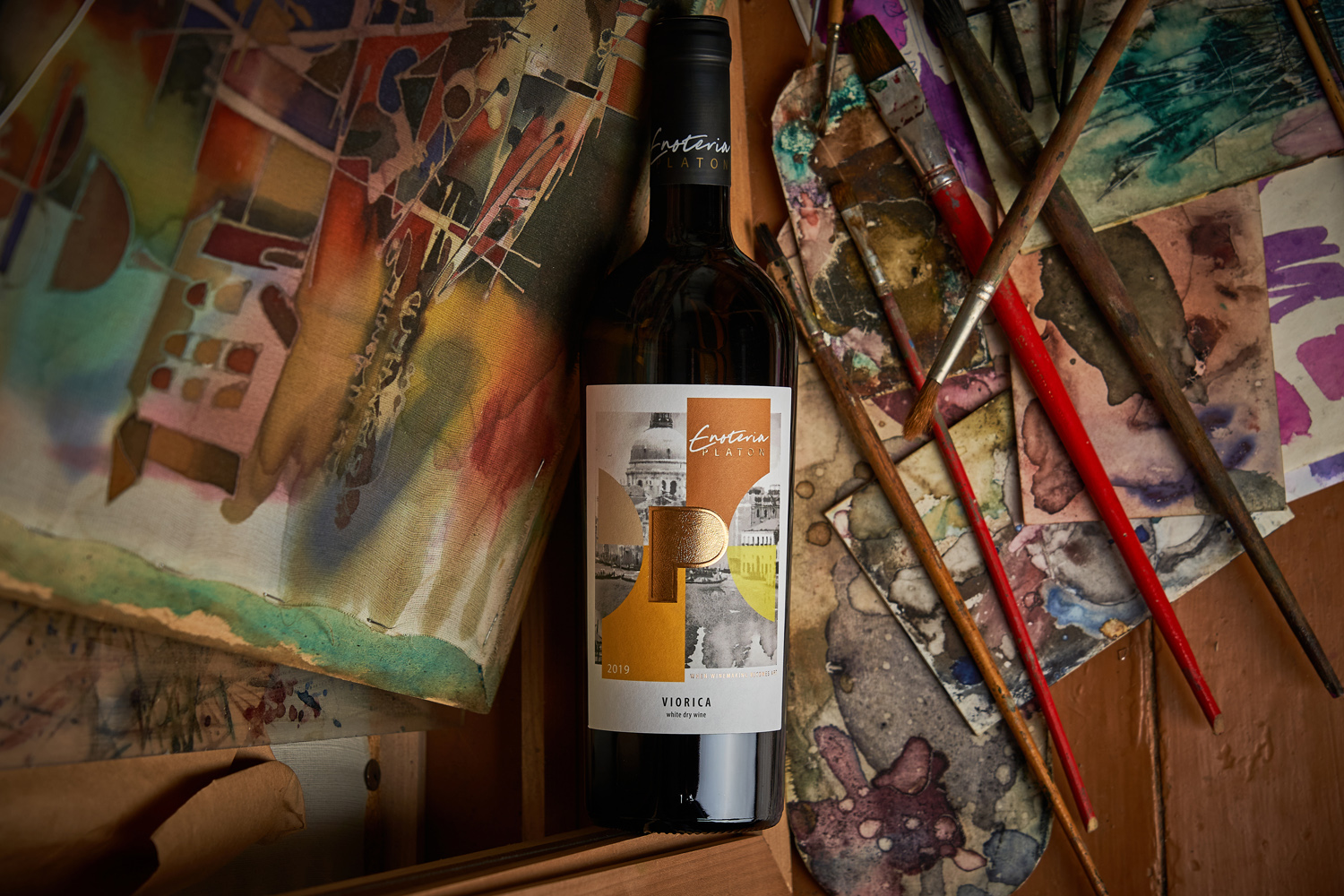
As with any work of art, the work on the visual component for Enoteria Platon took quite some time. The first step was to create a name for the new wine project. Here the word Enoteria, an amalgam of the words “eno” (wine) and “galleria” (gallery), sets the tone for the whole concept, presenting the entire wine lineup as a collection of works of art. The label design embodies this idea on a visual plane, using the styles of paintings from completely different artists and eras as design elements that ultimately make up a unique composition. The central element on all labels is the capital letter P, indicating the name of the winemaker Platon, and executed using the techniques of gold foil stamping and 3D embossing. Taken together, all these elements come together in a single vivid image, different for each individual wine, but invariably bright and recognizable, especially when several creations of the winery are lined up on the shelf at once.