- 2021
process
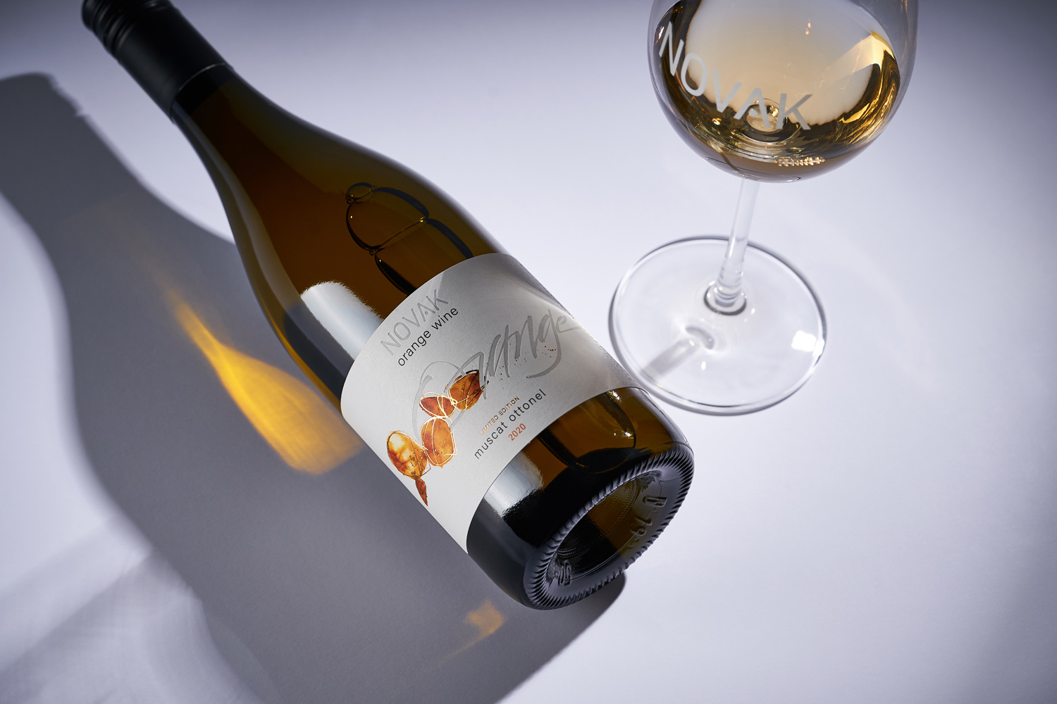
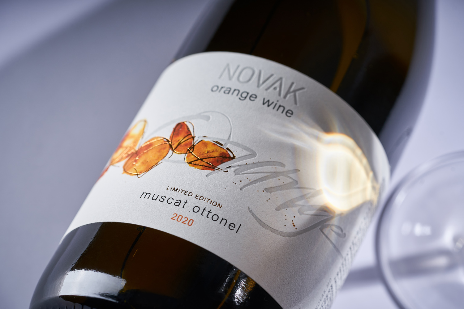
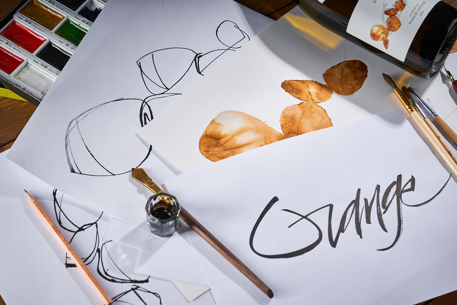
In recent years, Novak Winery has proven themselves as innovators in the Moldovan wine scene, not being afraid to experiment and constantly try something new. This applies not only to winemaking, but to packaging design as well. Adhering to the visual style developed over the years, the manufacturer nevertheless is ready for non-standard solutions in packaging design for its new experimental products. This was the case with one of the latest new positions from Novak Winery, Orange Muscat Ottonel. Given the non-standard and experimental nature of this wine, the label design for this product had to convey its peculiar and uncommon character, while maintaining a connection with the overall aesthetics of the brand.
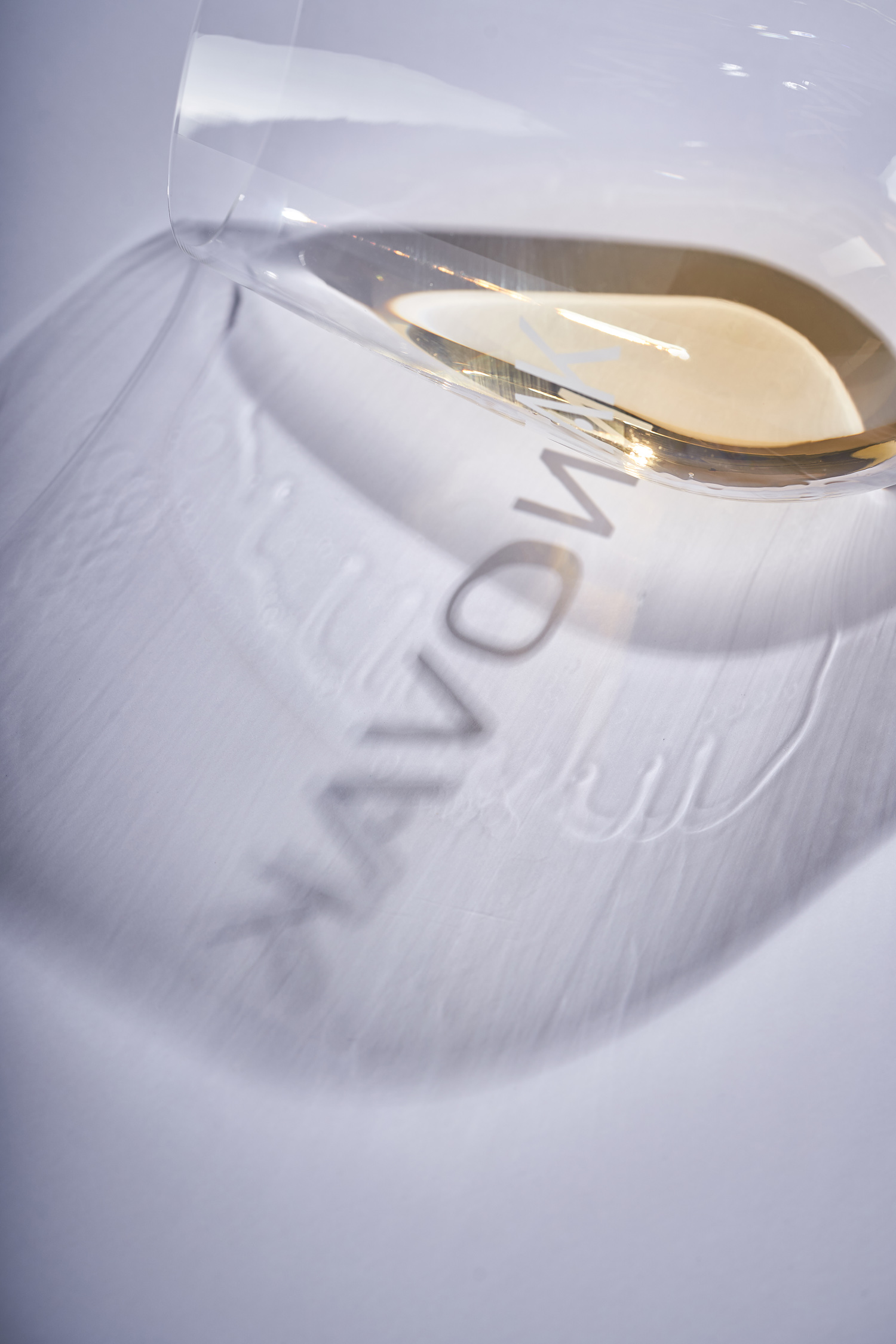
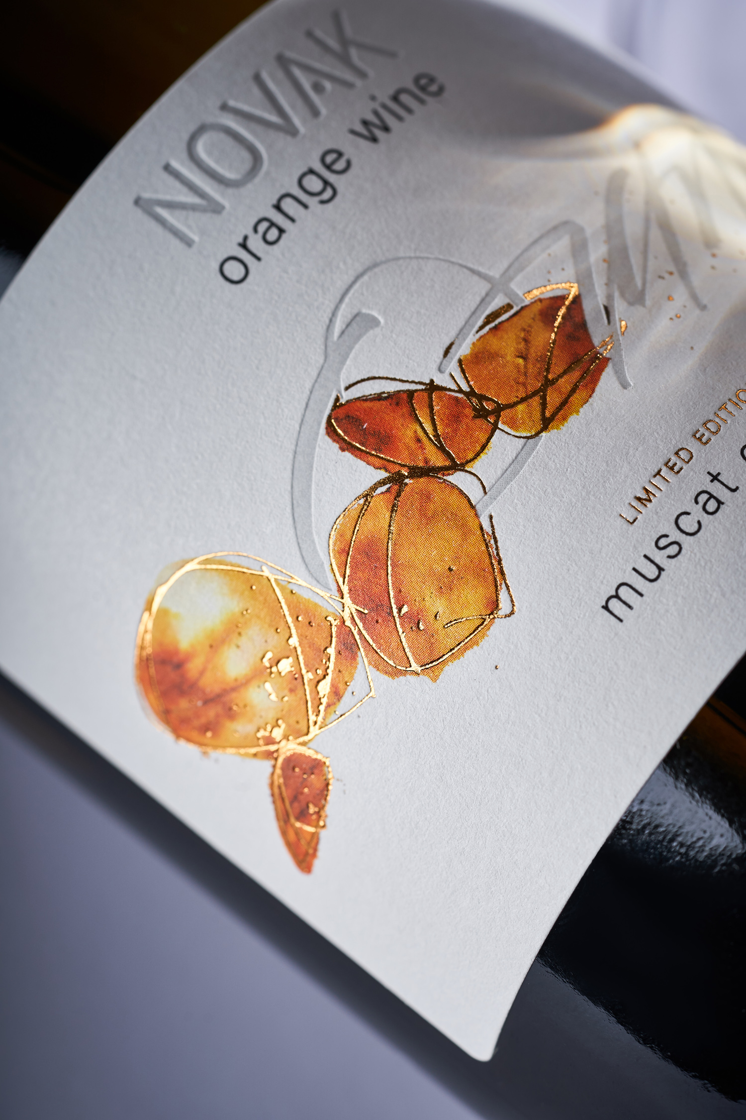
The main source of inspiration for the design of the Novak Orange Muscat Ottonel label is amber. Of course, we are talking about the color spectrum of the stone, which rhymes with the palette of the wine. However, in this case there is also a semantic component to it, because a good orange wine is the result of the work of both nature and an experienced winemaker, just like a skillfully cut amber jewelry. Bright orange stones act as the centerpiece of the composition, and are made through a combination of watercolor painting and calligraphy. Additional accents in gold foil stamping and debossing enhance the volumetric effect of the label, rendering the minimalist composition more versatile and vivid. As a result, the label looks uncommon and bright, avoiding the typical solutions for this category of wines, while maintaining visual continuity with the general portfolio of the manufacturer.