- 2022
process
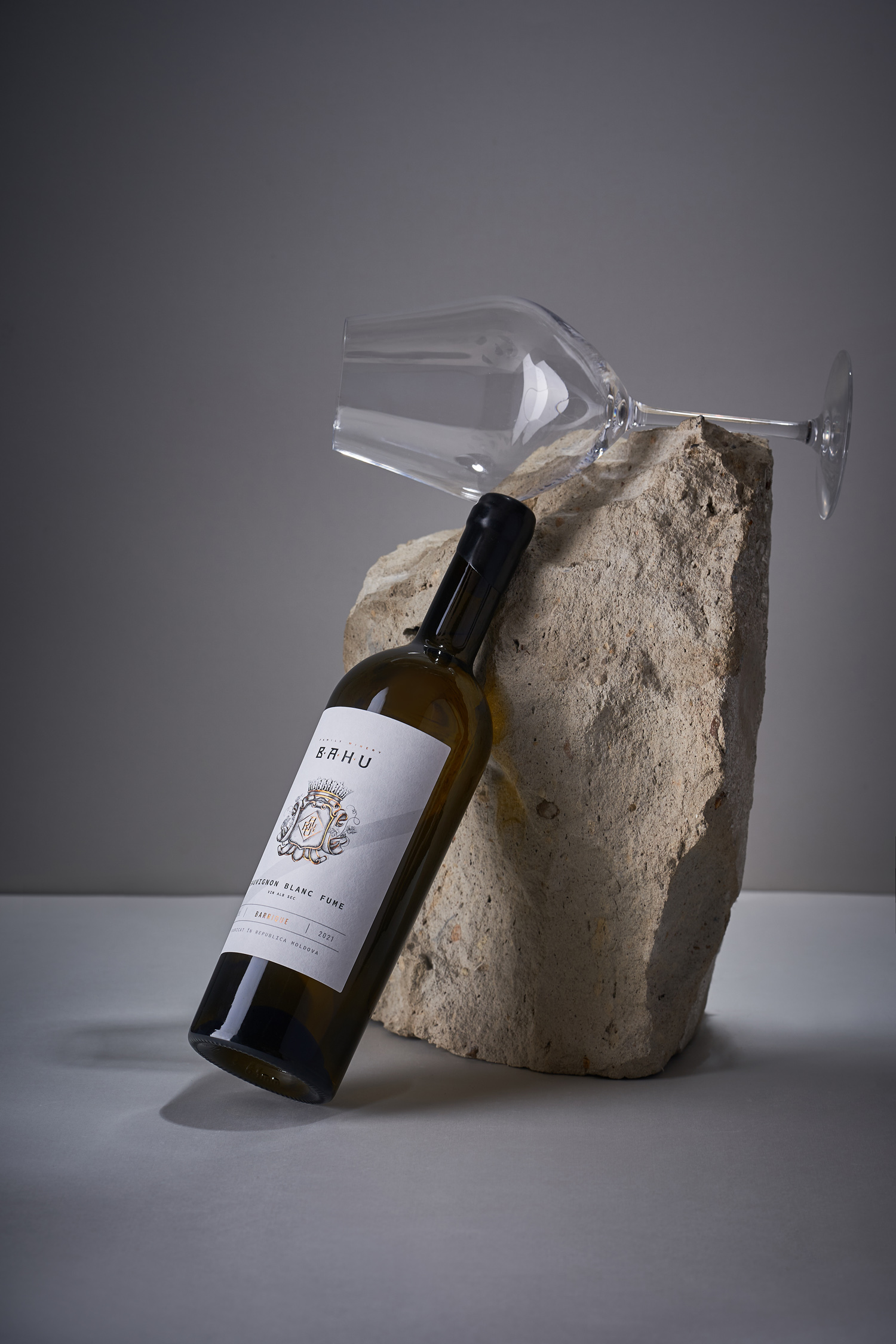
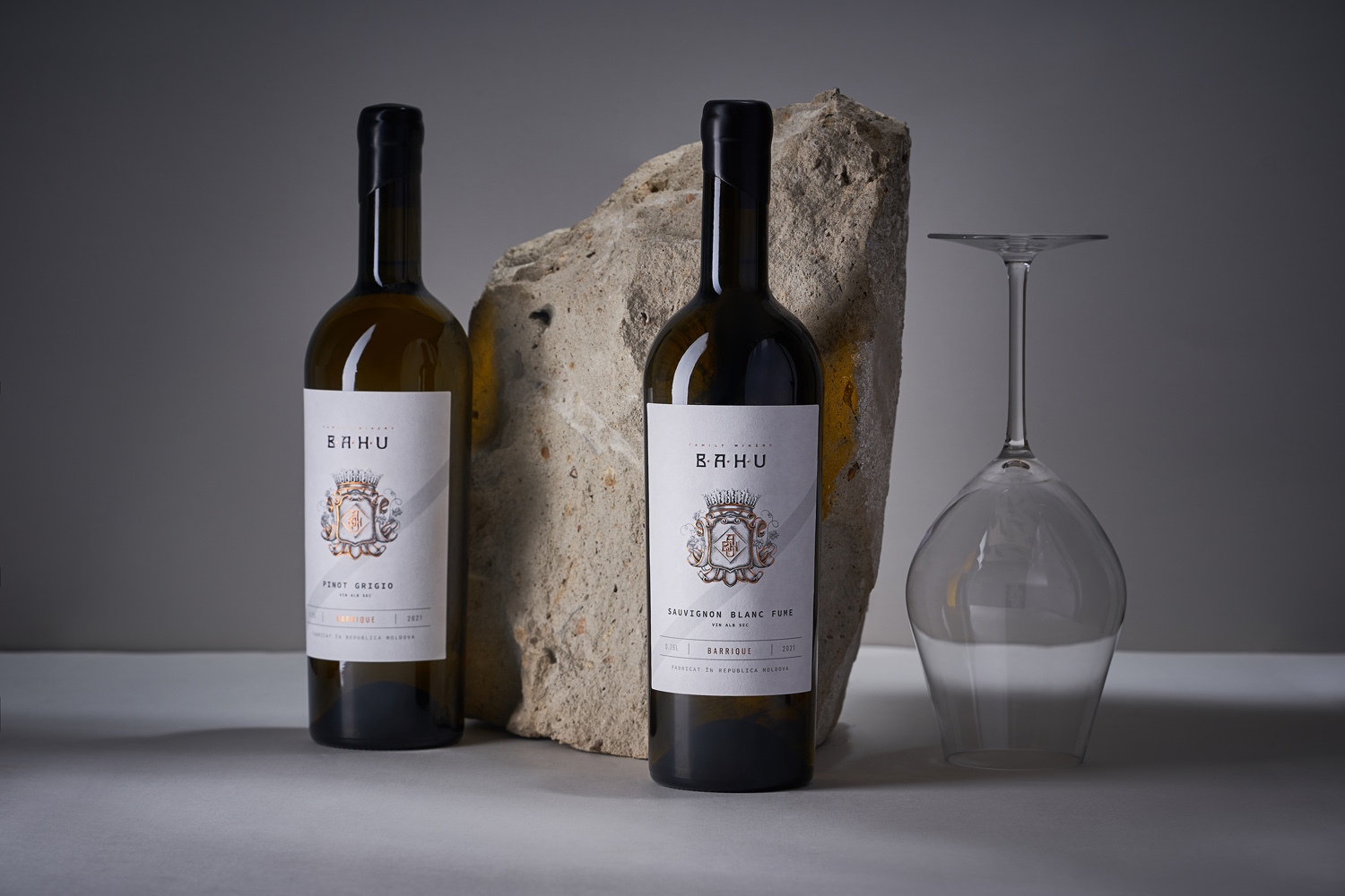
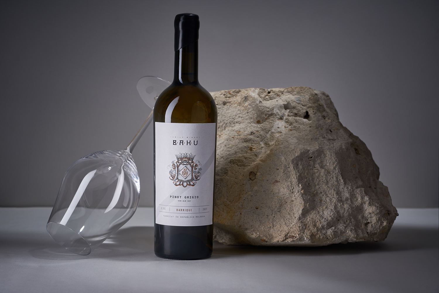
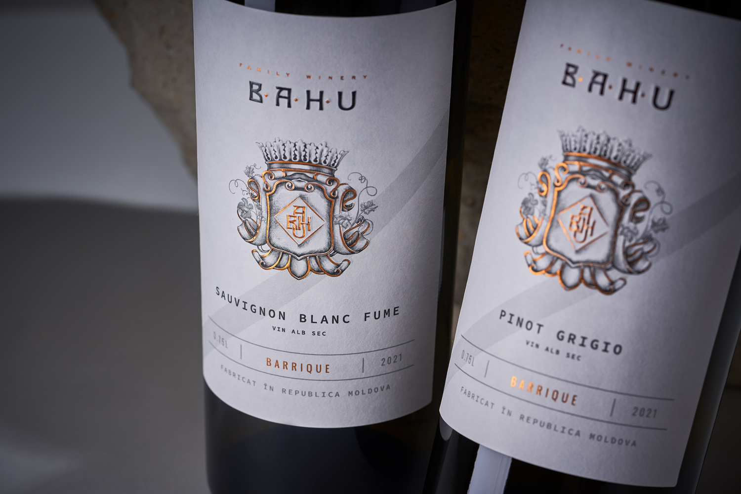
Development and growth is a fundamental concept for any enterprise, especially when it comes to winemaking. No matter how small and modest the undertaking is, over time it grows and transforms into something larger. Naturally, the products are becoming more complex as well, expressing the skills of the winemaker, and aimed at a more sophisticated consumer. Therefore, for the young Bahu Winery, for which we created the design concept just over a year ago, it was a logical step to release a new series of wines after the successful debut of their basic line. We are talking about wines aged in oak barrels, which automatically implies a higher market segment. Our studio was required to emphasize this particular moment in the evolution of the winery, while maintaining the basic style of the manufacturer. This is how the design concept for Bahu Winery Barrique was developed.
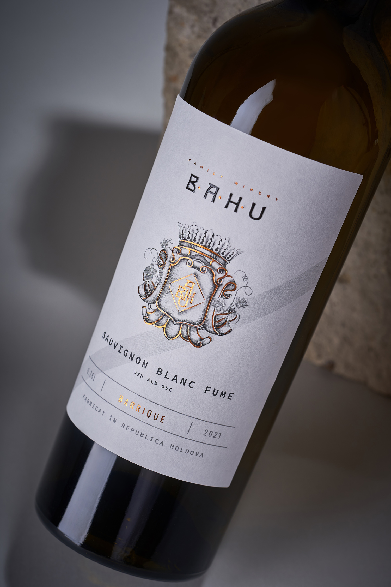
When developing the label design for the Bahu Winery Barrique series, we were guided by the general visual style that we laid down in the basic line of the winery. However, if in the previous series the main emphasis was placed on illustrations in the form of bas-reliefs, in the new line the emphasis is shifted to heraldic elements and a more minimalist composition. Thus, the coat of arms with the monogram, which was inscribed in the illustration, was placed in the center of the label and enlarged, with some of its elements additionally embossed with gold foil. At the same time, the information blocks have retained their basic structure and are distinguished by a minimalistic approach. Thus, the design of the new line focuses on the special character of the wines, while maintaining the unity of the overall visual aesthetics of the manufacturer, and acting as a natural development of their core series.