- 2022
process
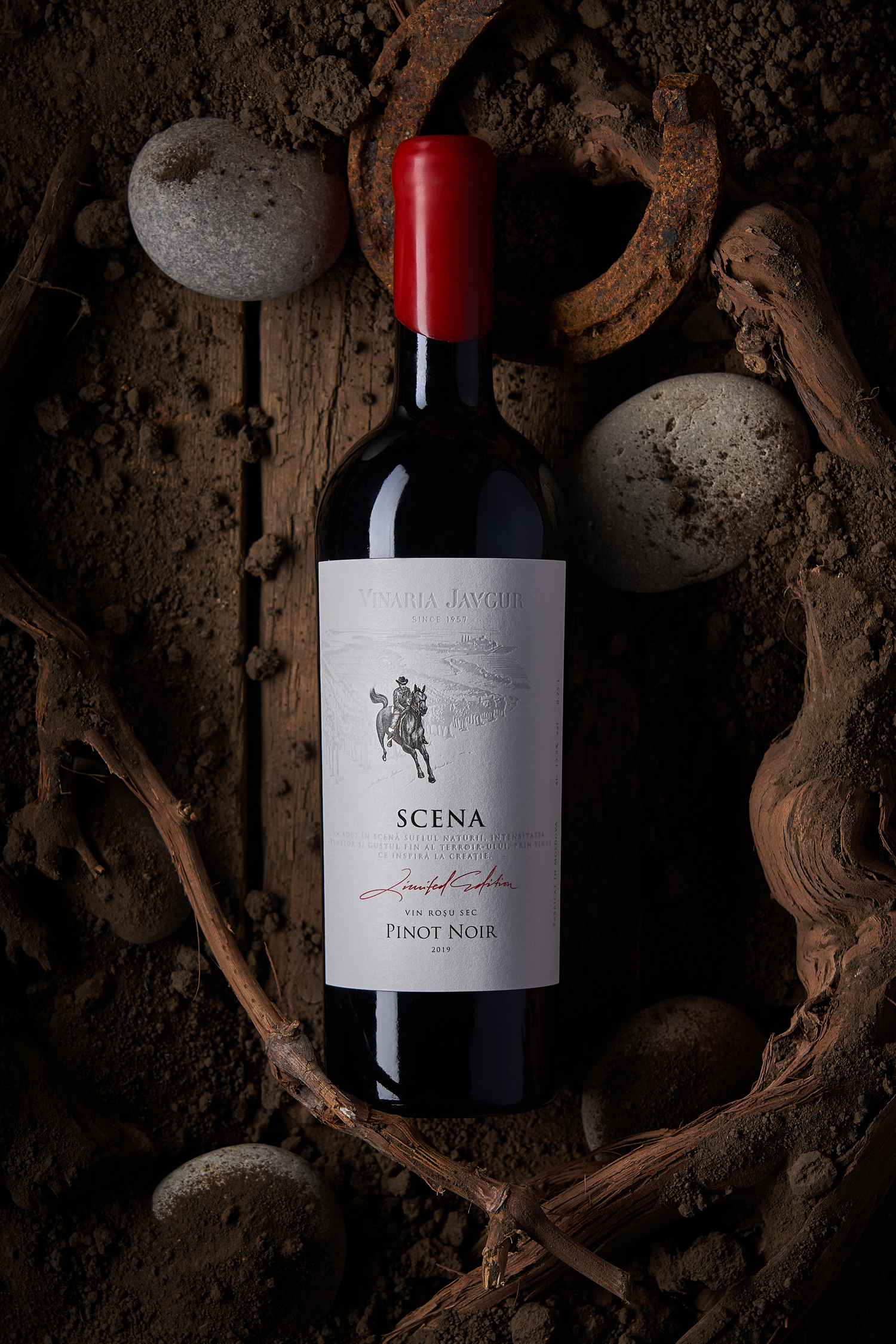
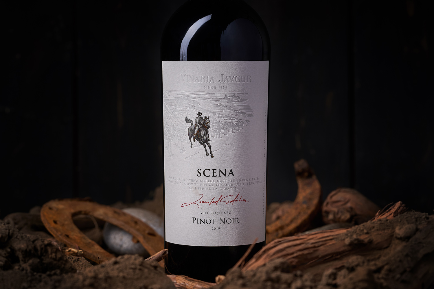
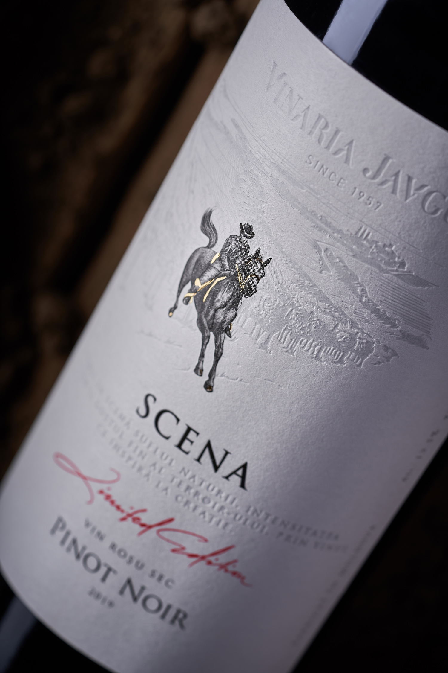
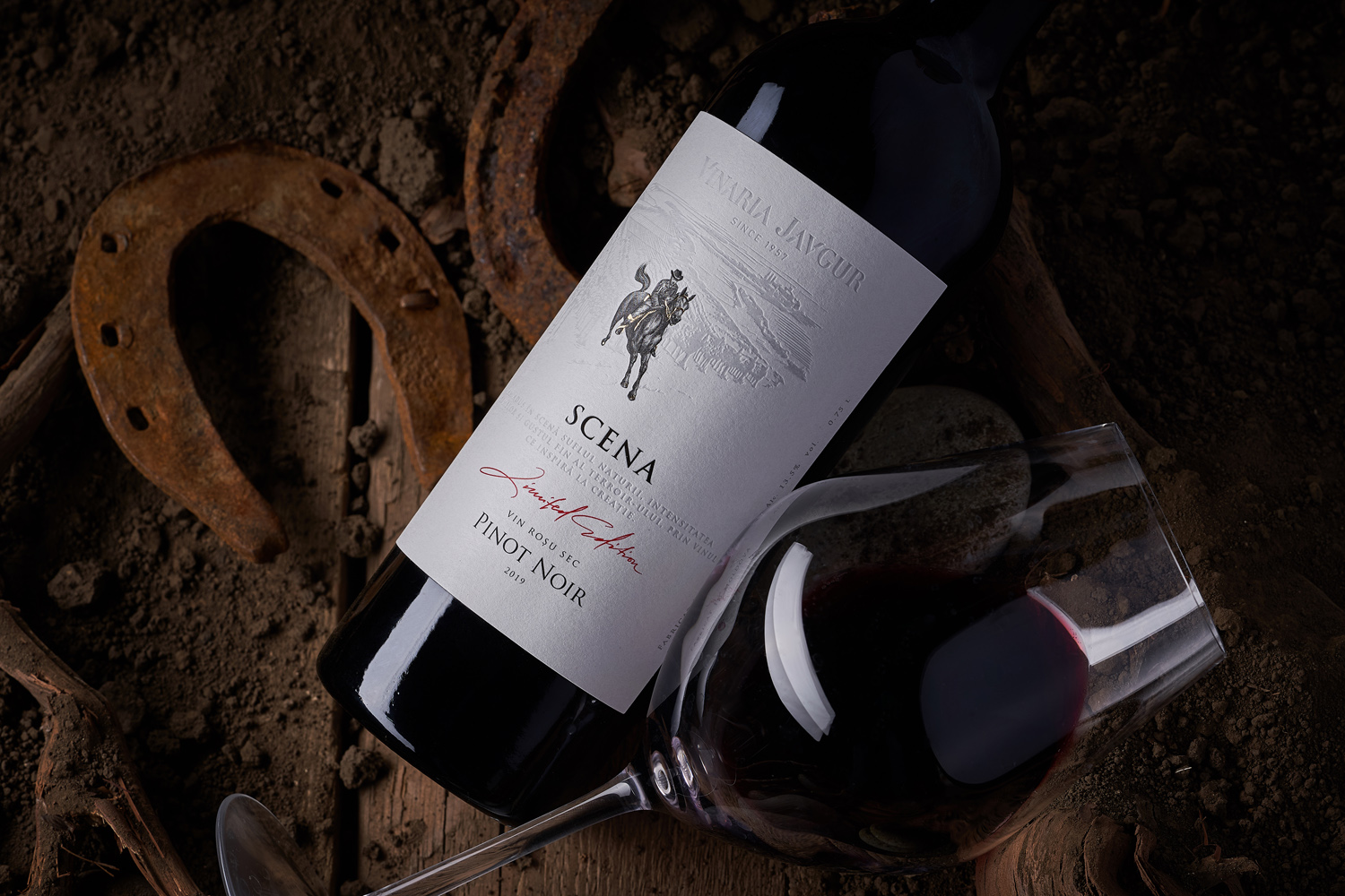
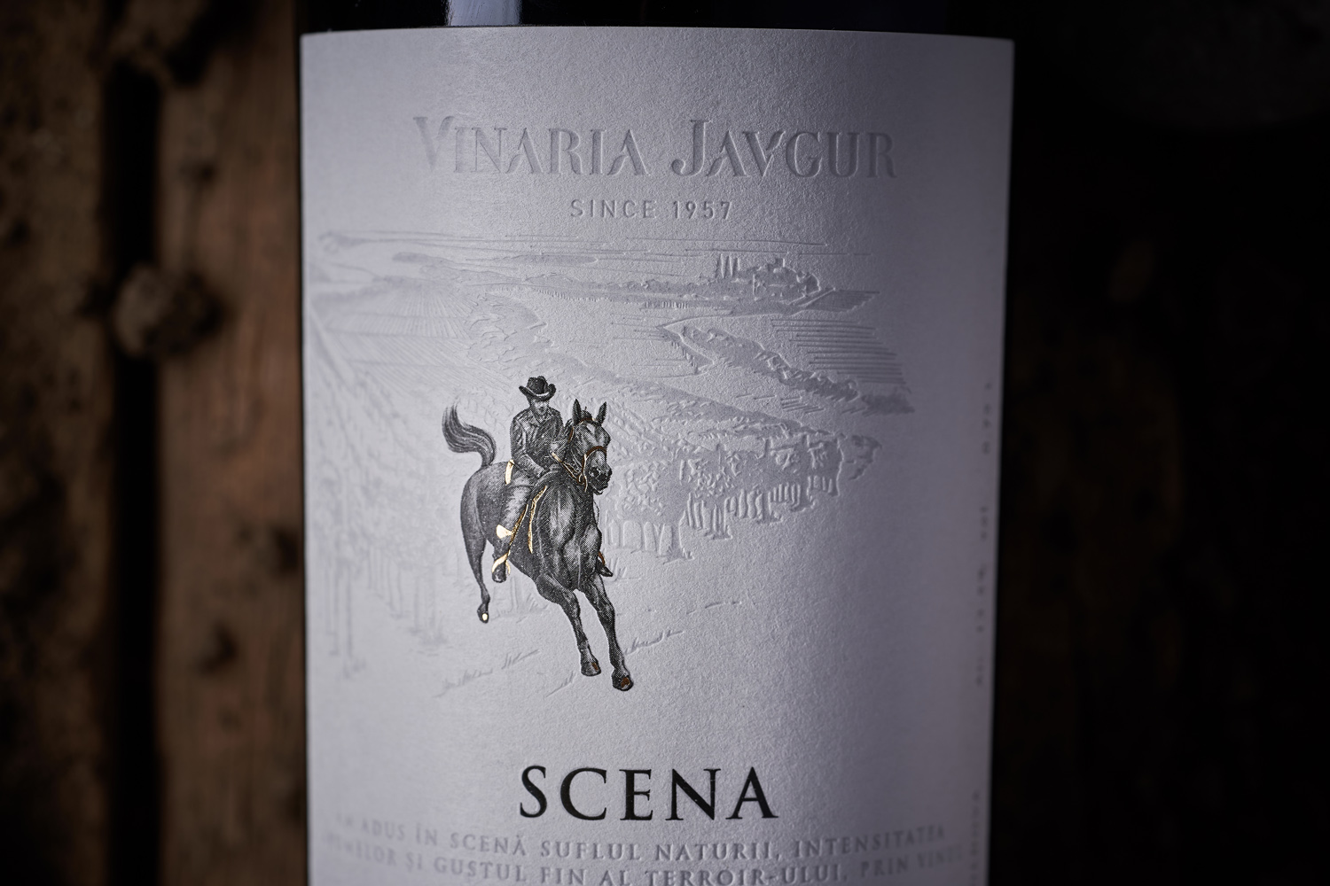
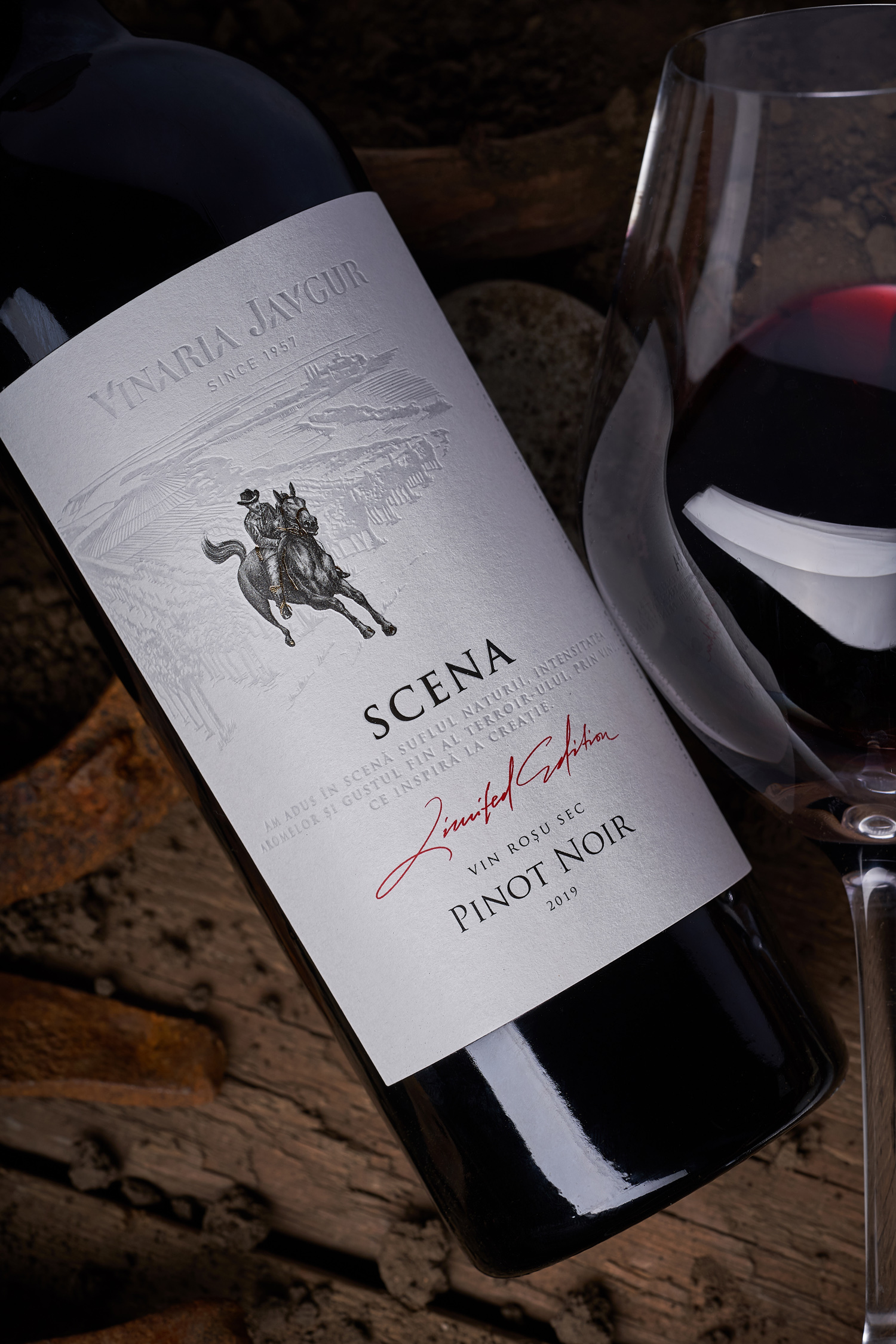
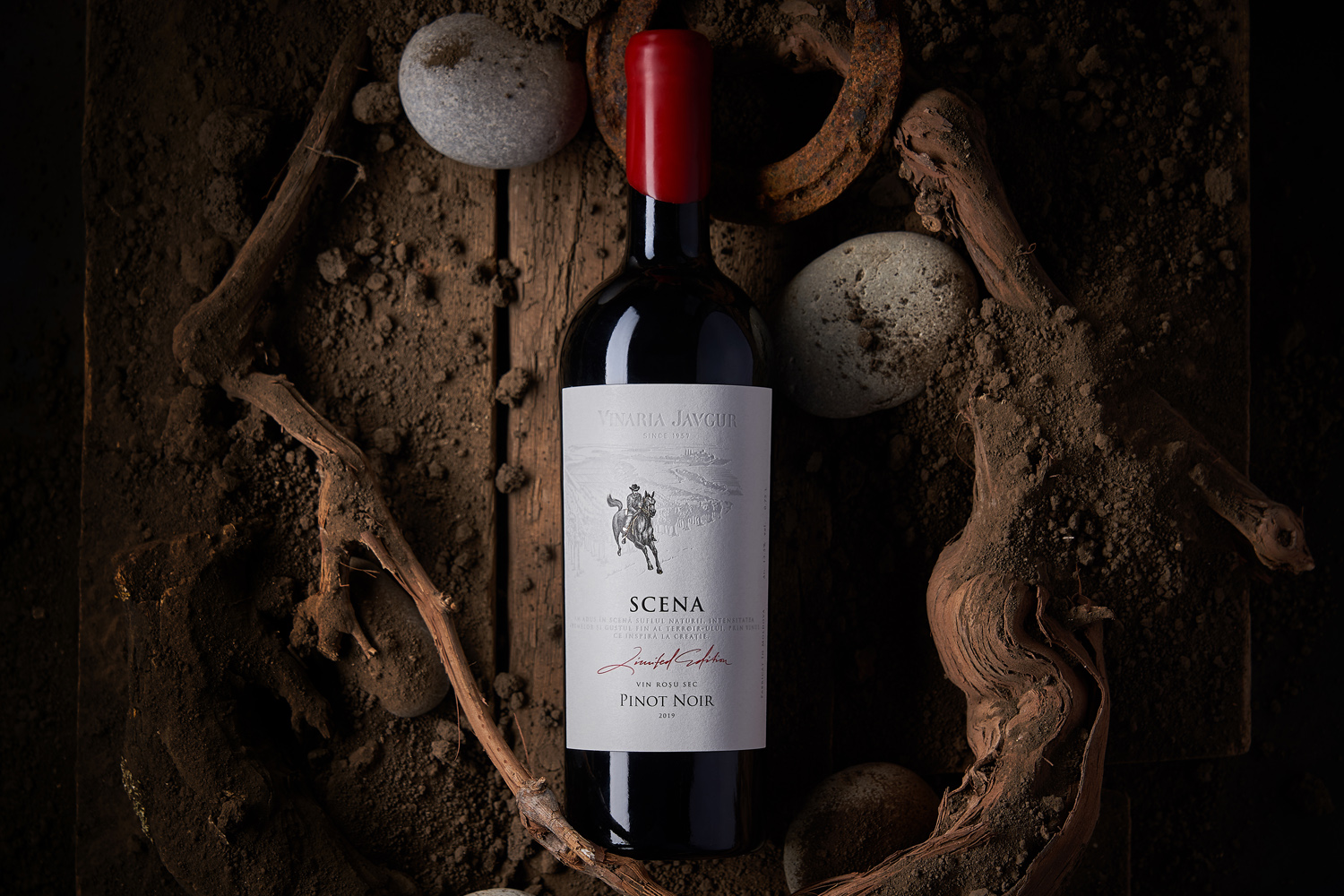
Working with established wineries with decades of history is always interesting for our studio. After all, any project in this context must be included in the existing framework so that it looks organic in the general portfolio of the producer. Therefore, when we were approached by Vinaria Javgur, which has been active in the Moldovan and international market since 1957, with the task of developing a design for its first premium wine, we focused on creating an image that would convey the philosophy, history and values of the winery. This is how the label design for the premium wine Javgur Scena Pinot Noir was created.
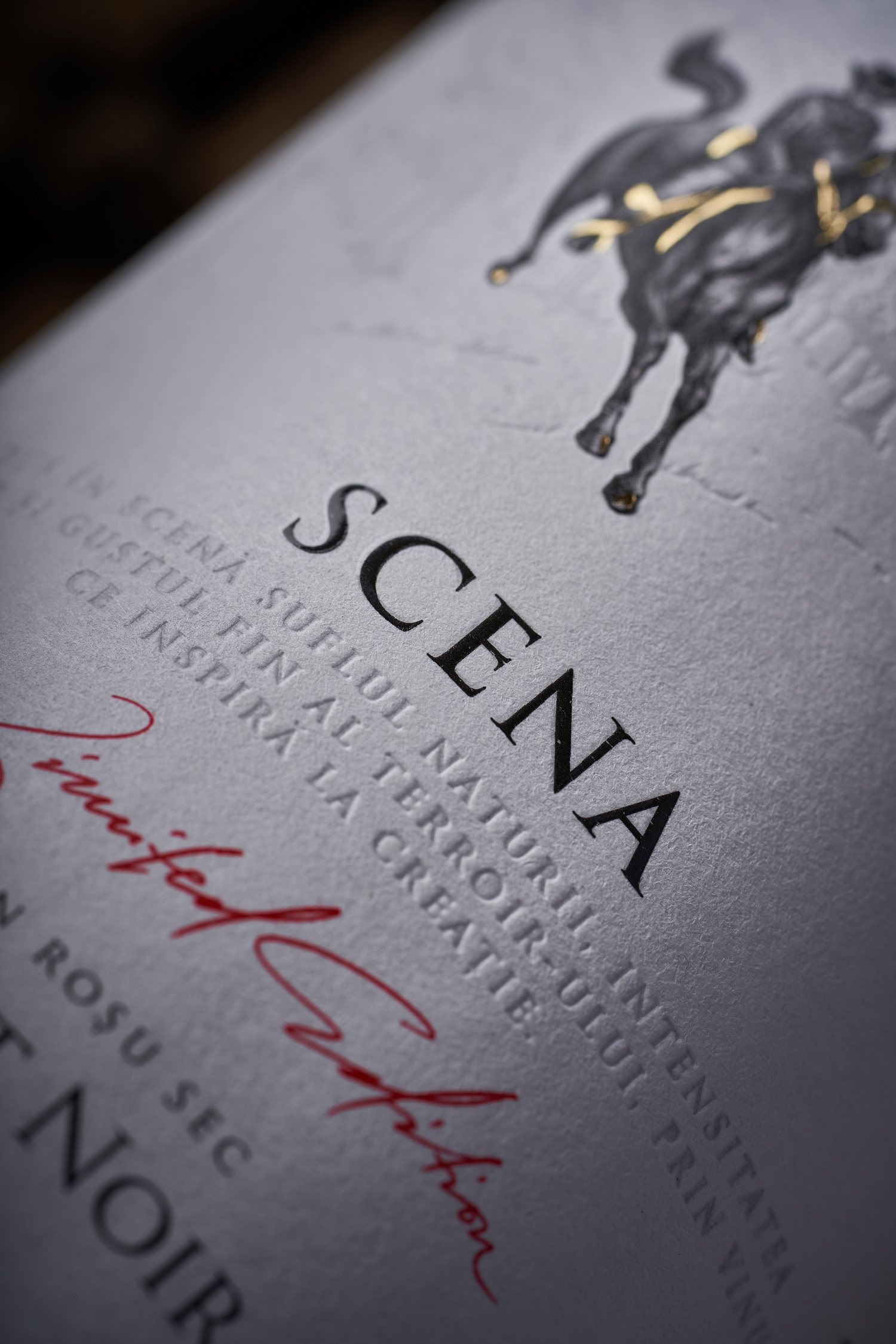
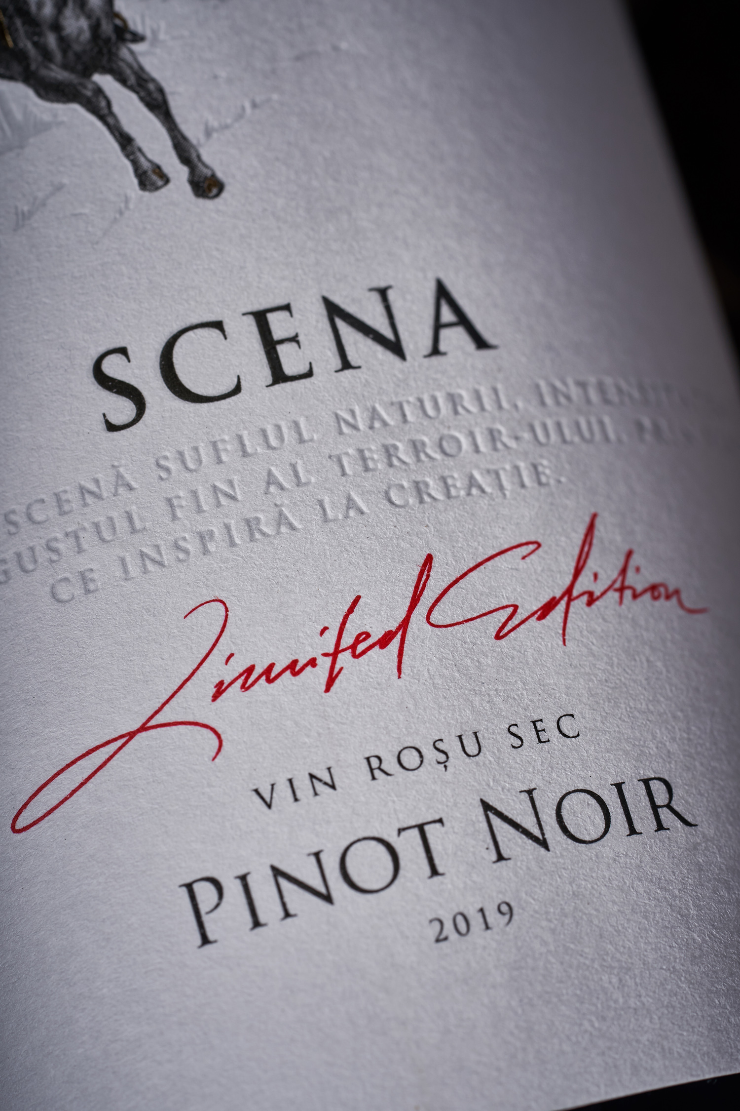
The client’s main request when developing the design for Javgur Scena wine was to display the equestrian theme of the name of the village where the winery is located, and which lends the wine its unique terroir. From Tatar language Iagur is translated as “deep well”, and for a long time this was the place where riders made a stopover to give their horses a drink from local springs. This is exactly what is displayed on the label, with the additional highlight of some elements by post-printing technologies. As a result, the design continues the general visual style of the producer, while indicating the special character of this particular wine in their collection.