
- 2026

process
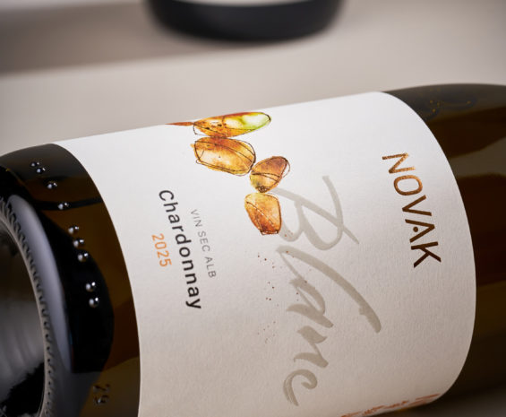
Ten years of collaboration with Novak Winery have become a story of constant evolution. Over that time, we have created numerous labels for different wines and experimental releases, while the visual language of the brand itself continued to develop along the way. A brand is never a static object. It grows, adapts and responds to its product, its audience and the market around it. For a winery as dynamic and experimental as Novak, this ability to evolve is an essential part of its character. The latest chapter in this ongoing collaboration was the transformation of the winery's core collection of indigenous grape varieties.
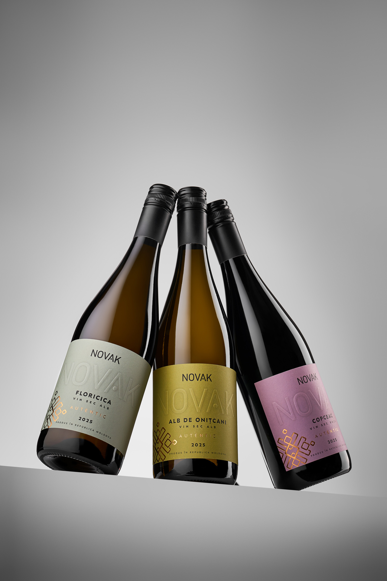
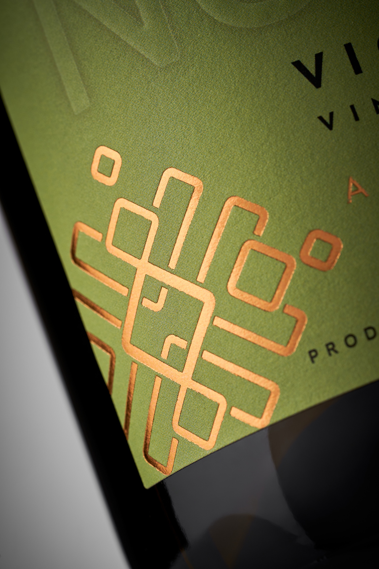
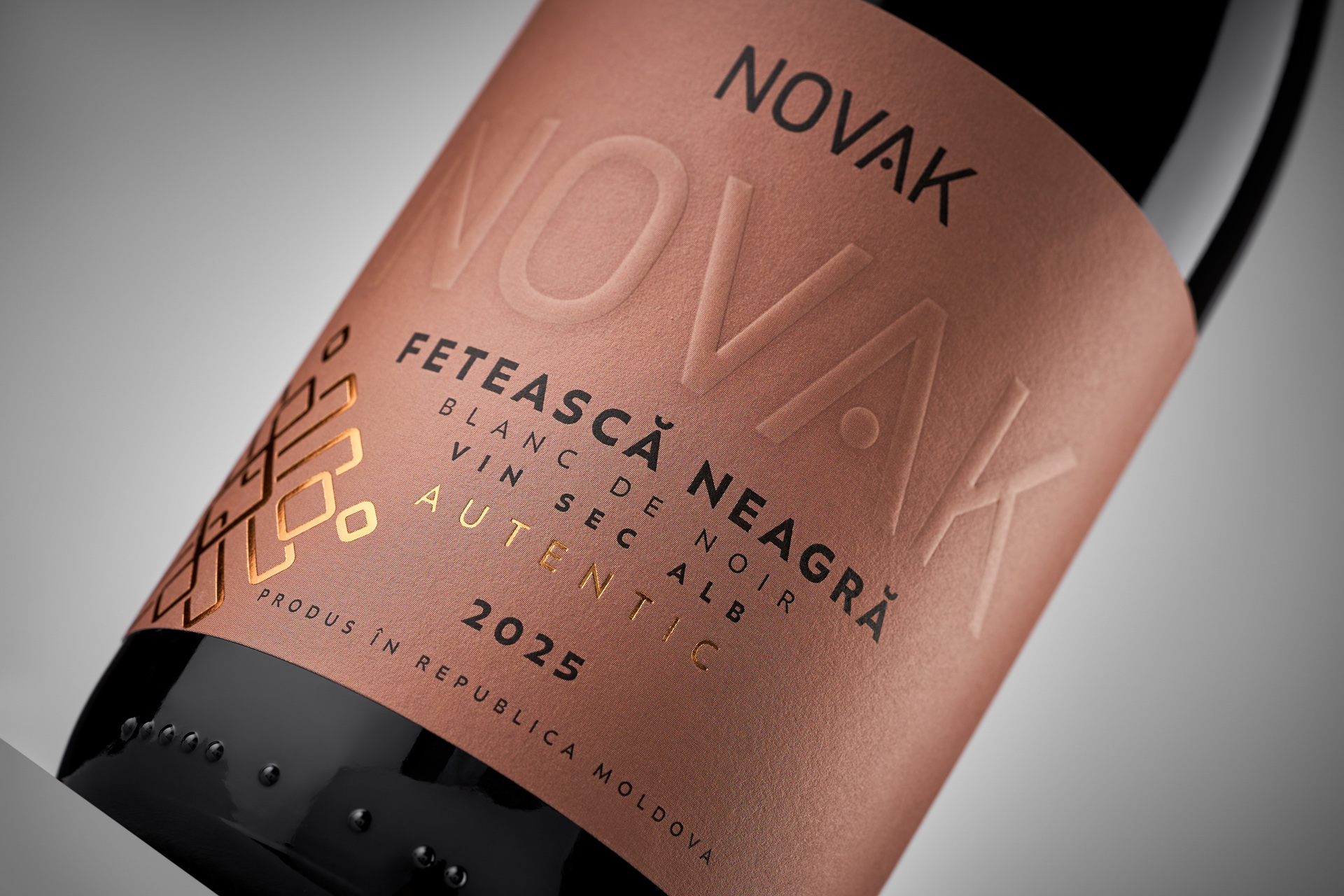
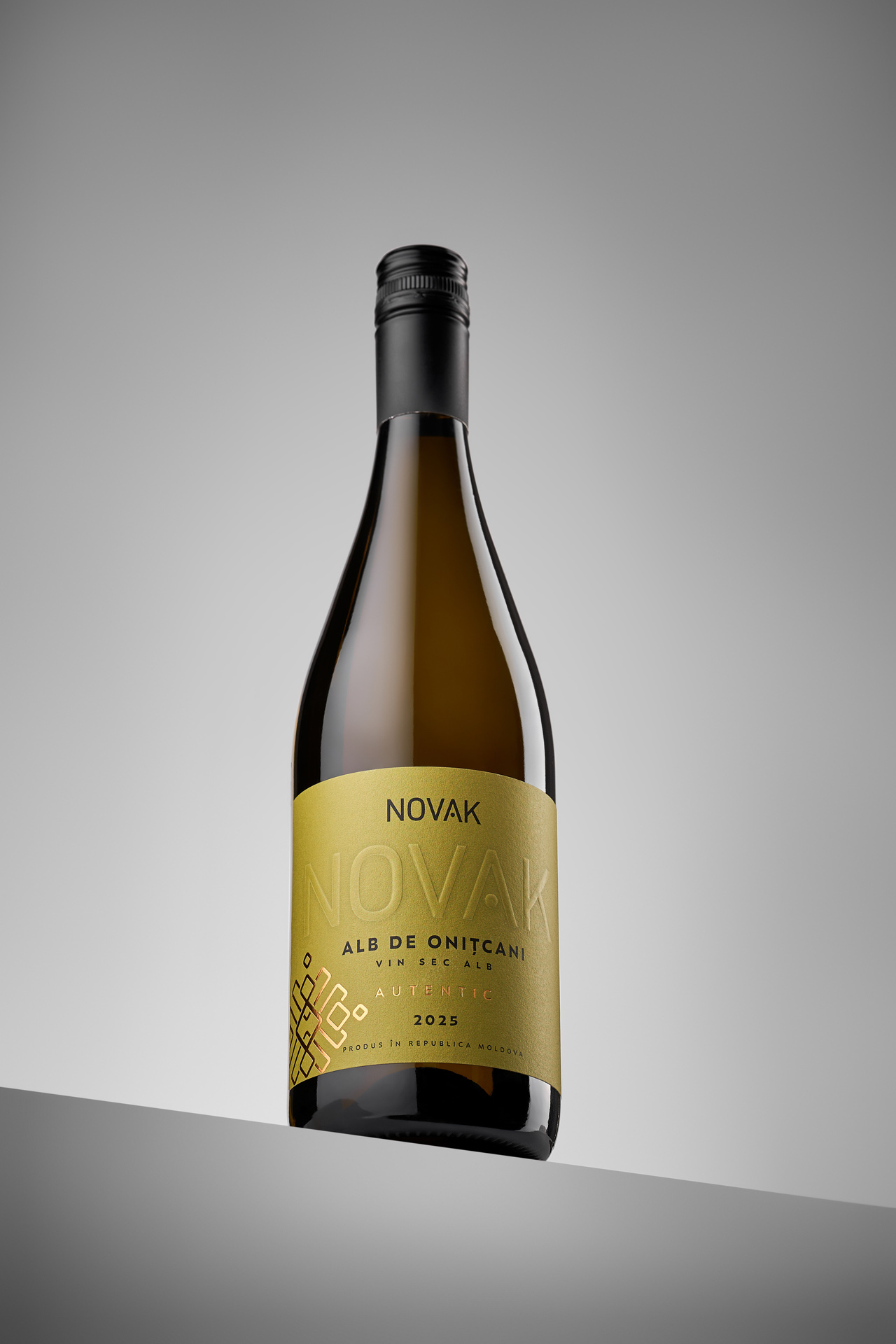
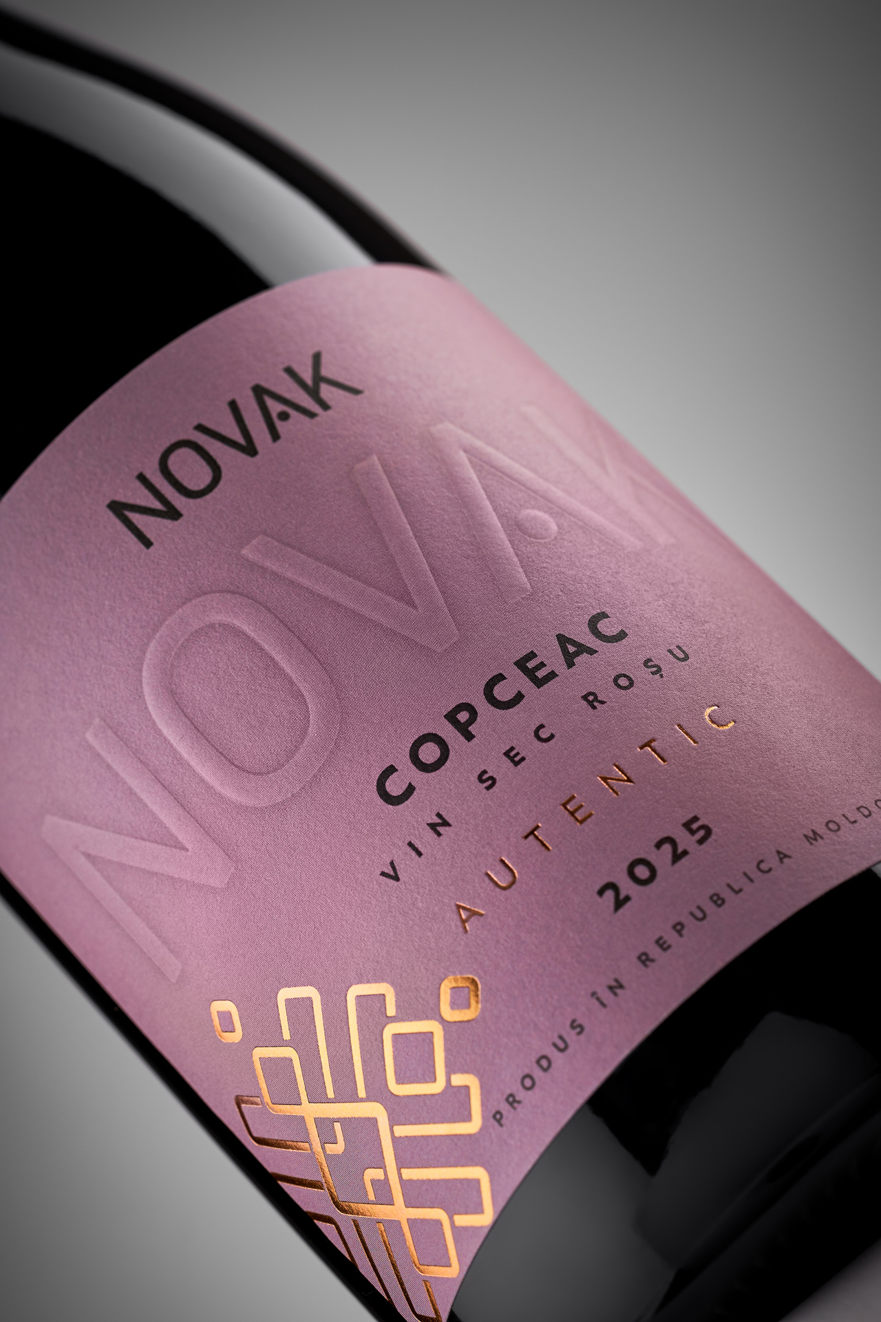
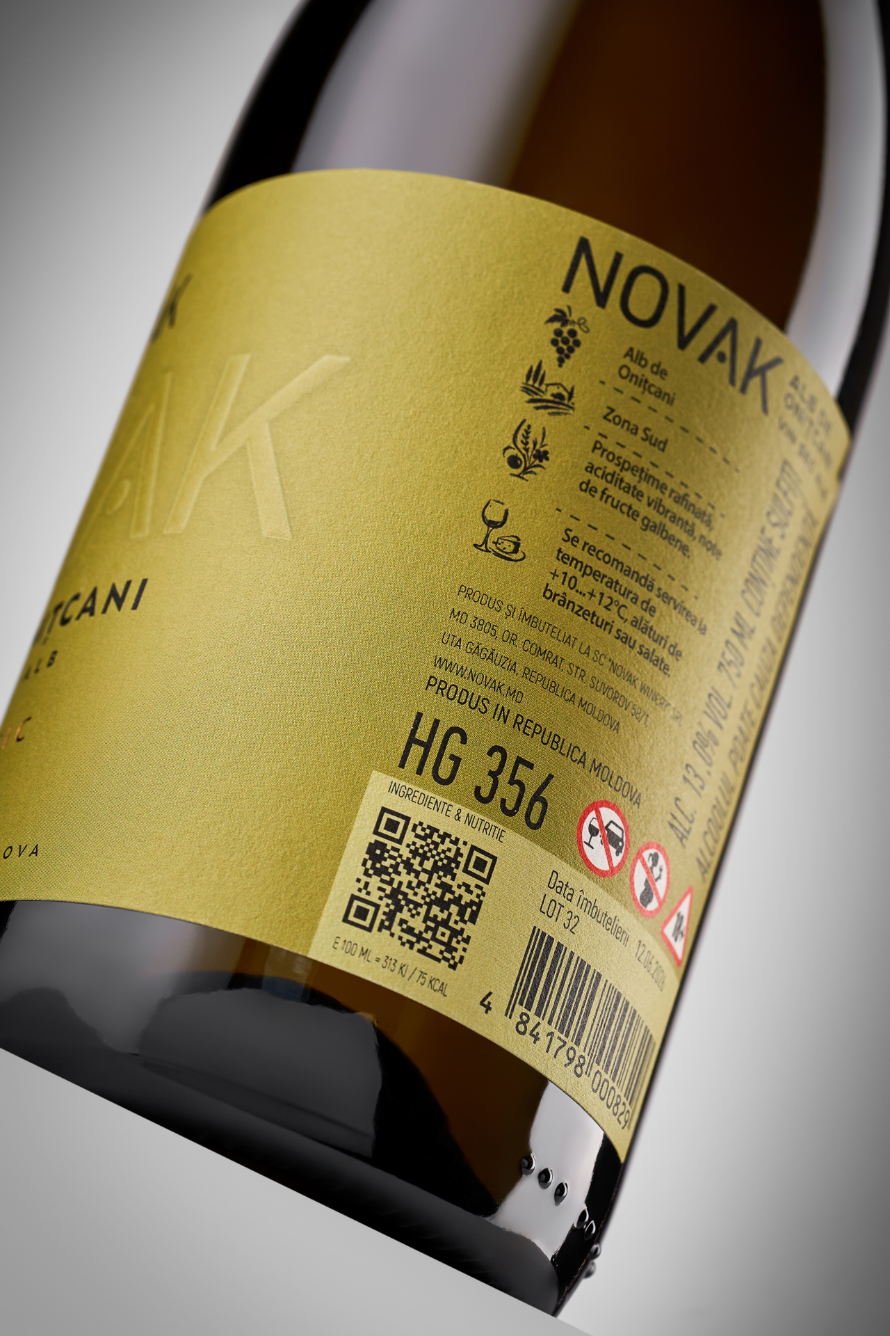
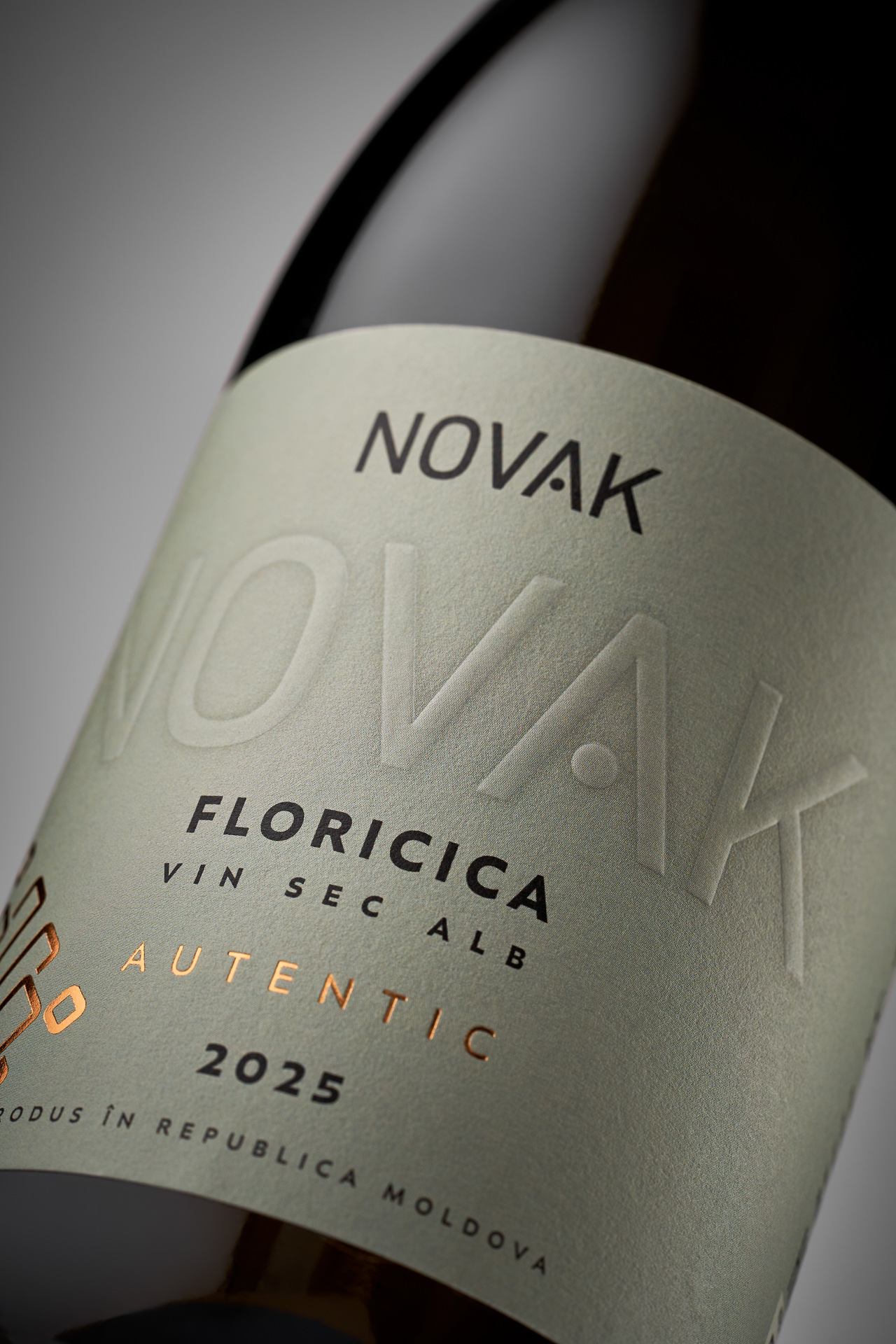
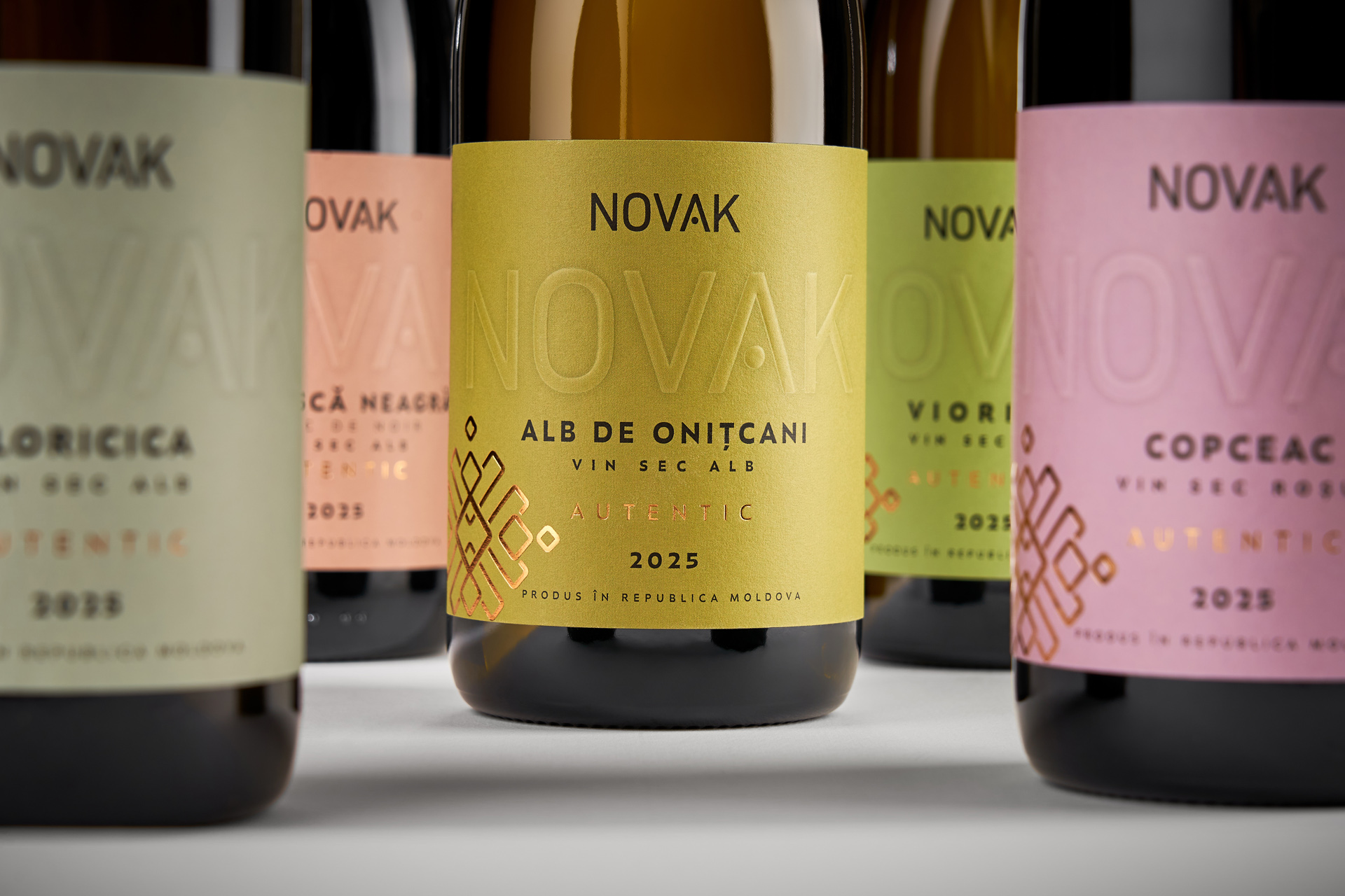
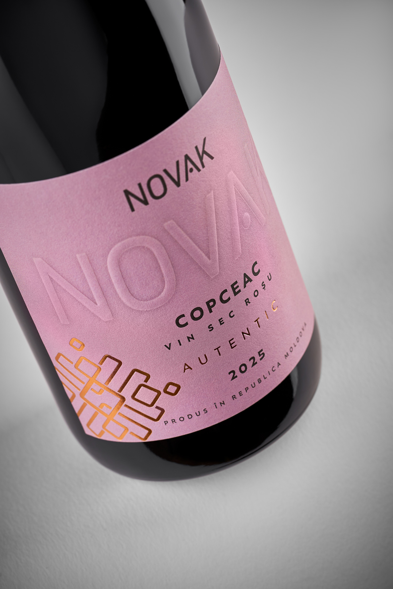
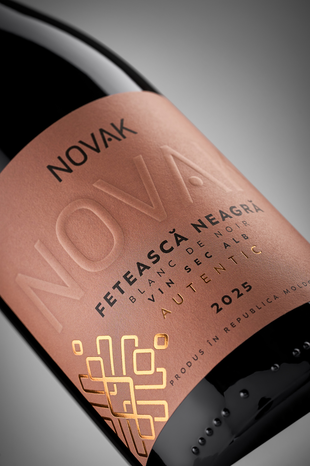
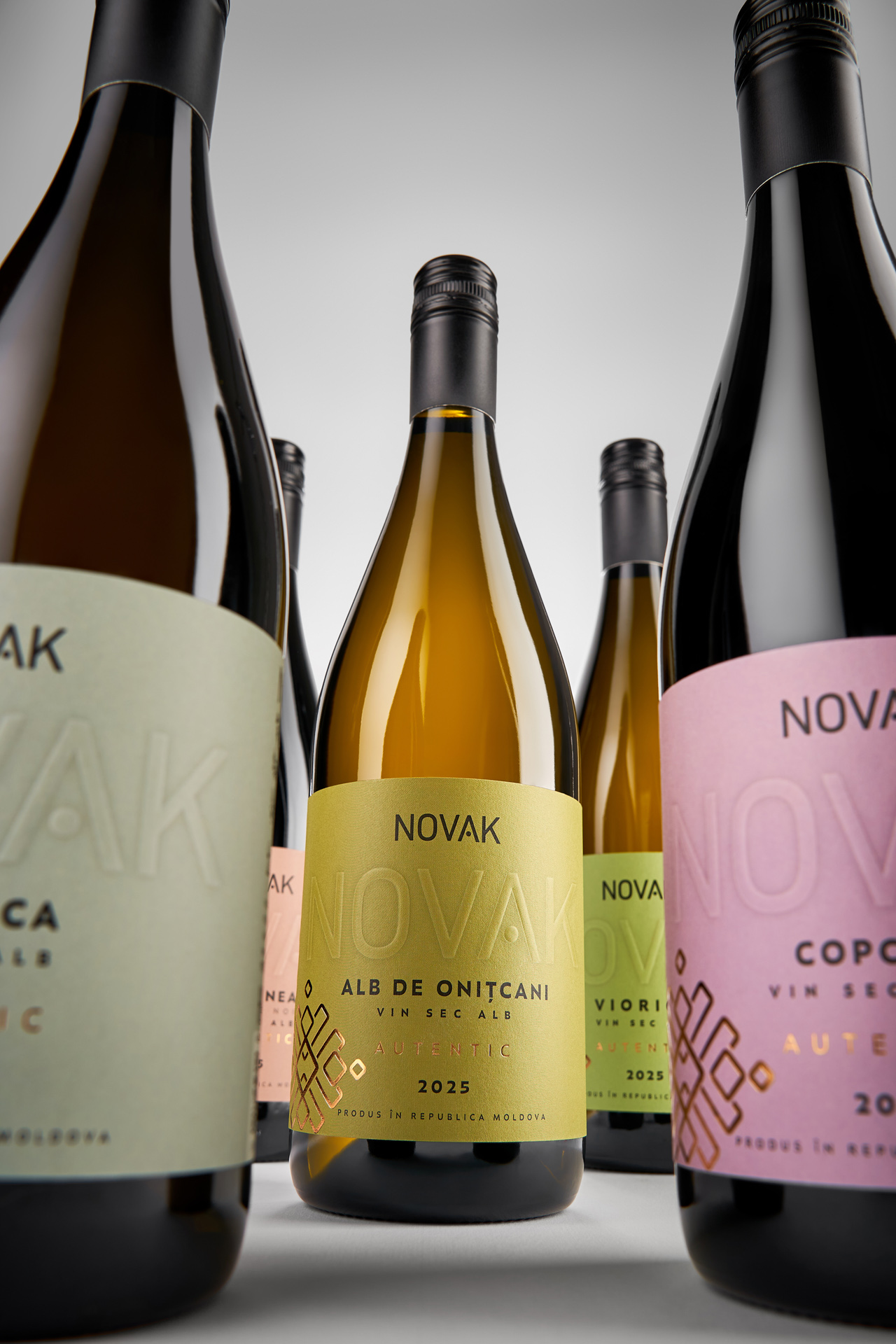
The challenge was to rethink the design while preserving the recognizable graphic elements that have become part of Novak Winery's visual identity. A renewed colour system gives each wine a stronger individual presence while highlighting the diversity of the collection and its connection to nature. Colour also becomes a practical navigation tool, making it easier for consumers to recognize and choose their favourite wine. The result is a familiar collection seen from a new perspective, one that retains the character of the brand while allowing it to keep moving forward.