- 2022
process
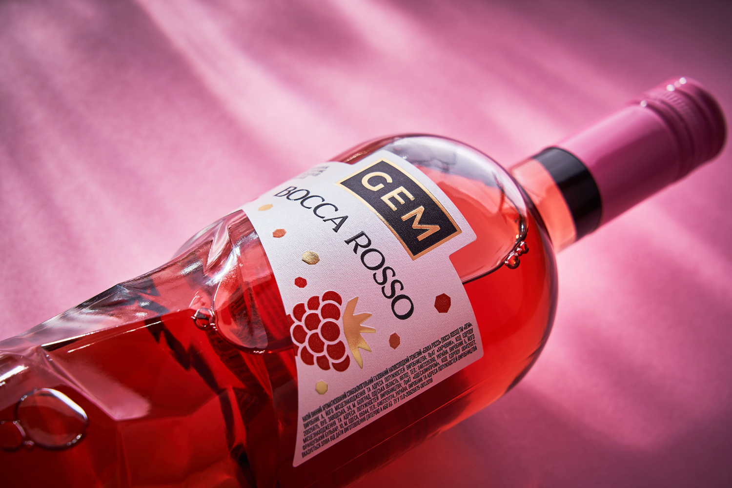
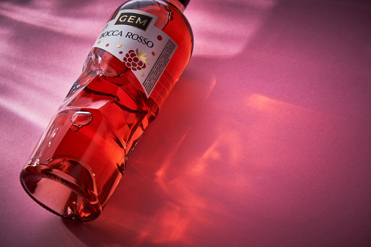
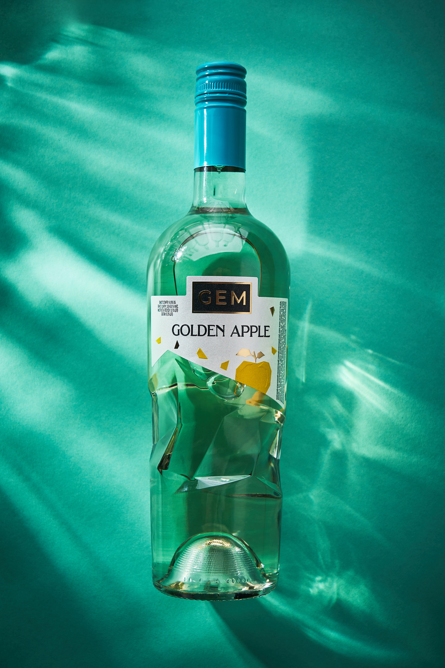
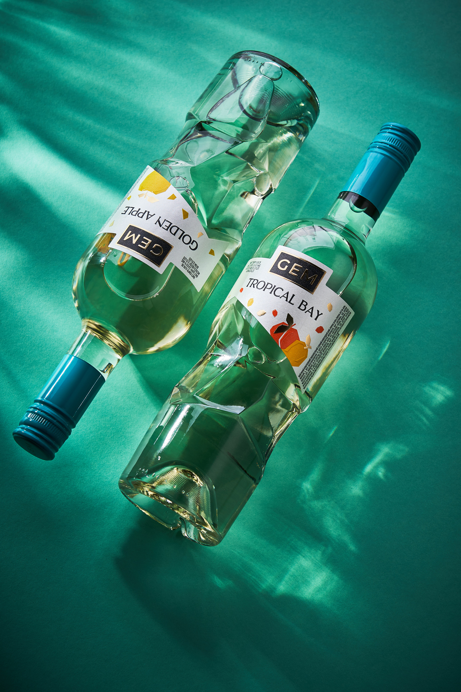
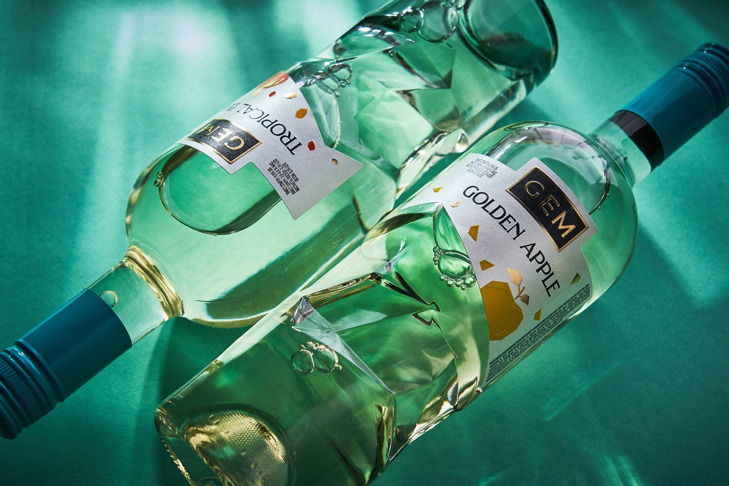
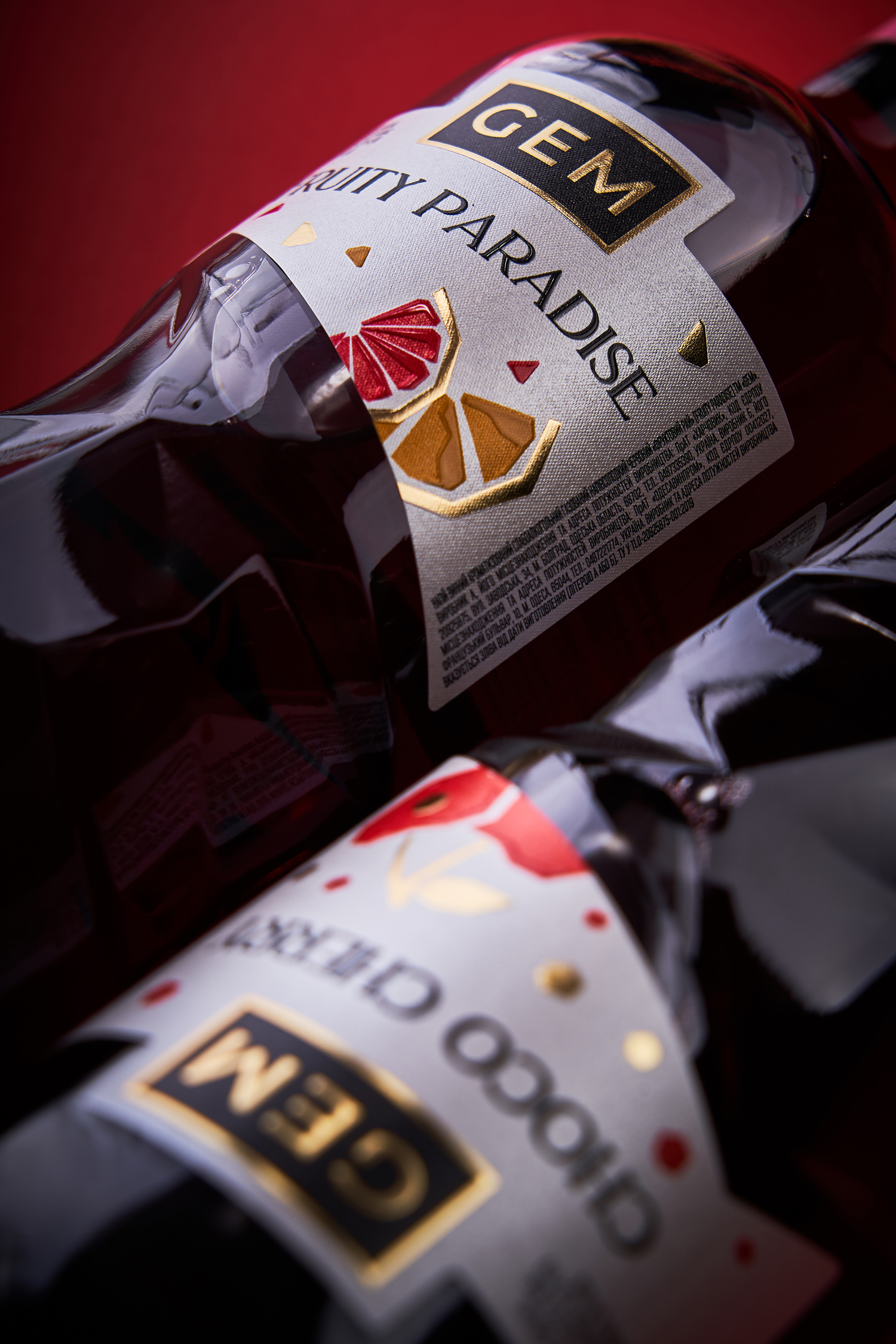
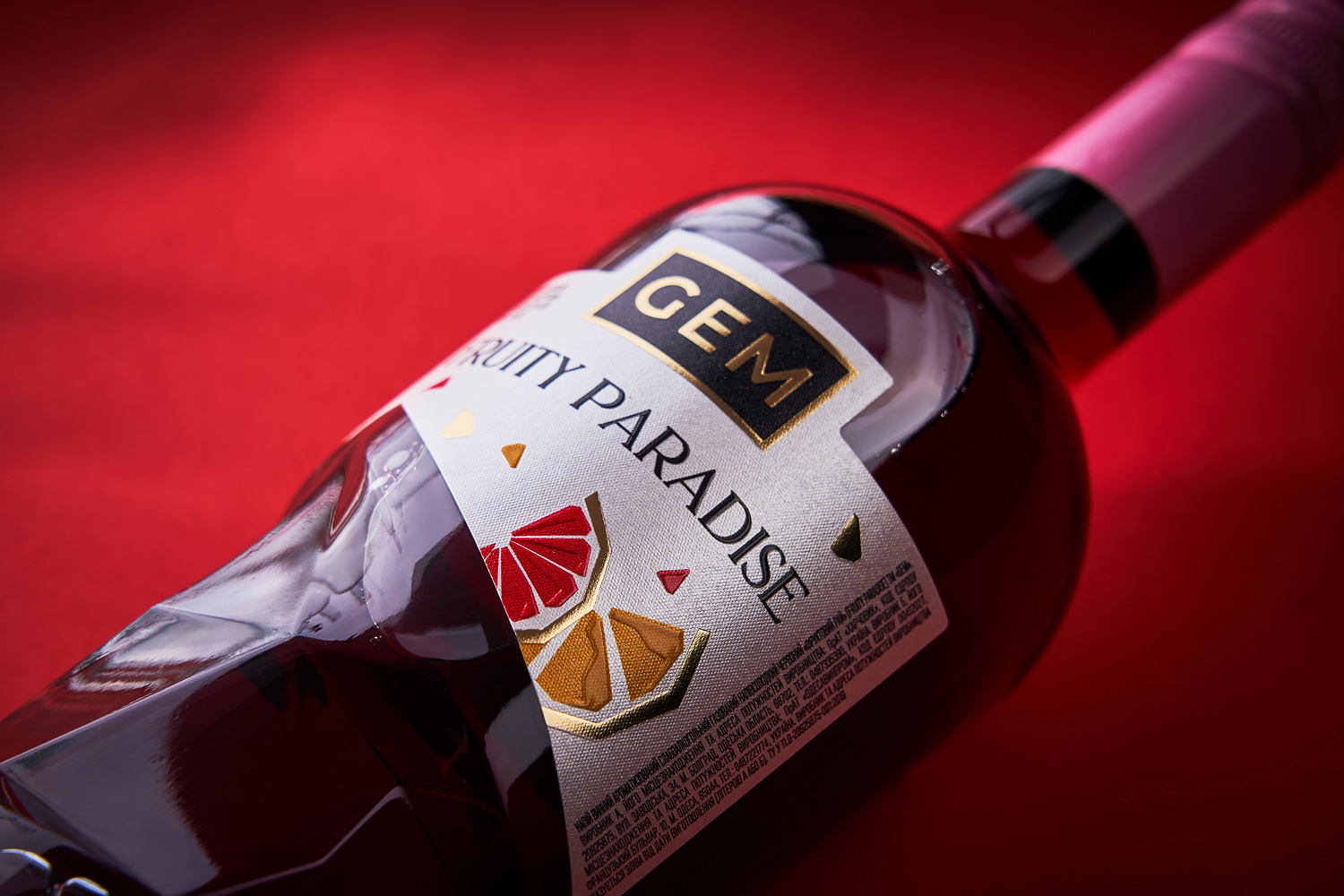
Fruit wines are a special category of drinks that are quite different from classic wines, including graphic design. Despite the apparent initial similarity, the packaging design for fruit wines is intended, first of all, to point out the fruit component of the drink, to make it clear to the consumer how it differs from traditional wine. And given the fact that the main audience of this category of products are young people who are ready for experiments, the packaging should look vivid and bright. This was the basis for the development of bottle and label design for Gem fruit wines.
The primary task in developing the packaging design for Gem fruit wines was to create a bottle of a unique shape that would reflect the main feature of the product and its name. That is why the middle segment of the bottle has a complex multifaceted shape, which resembles the faceting of a precious stone. The label complements the irregular shape of the bottle and presents essential information about the product through stylized images of fruits, which are further highlighted through post-printing processes. Thus, thanks to the original bottle shape and bright label design, the drink instantly stands out on the shelf and attracts the attention of the consumer.