- 2021
process
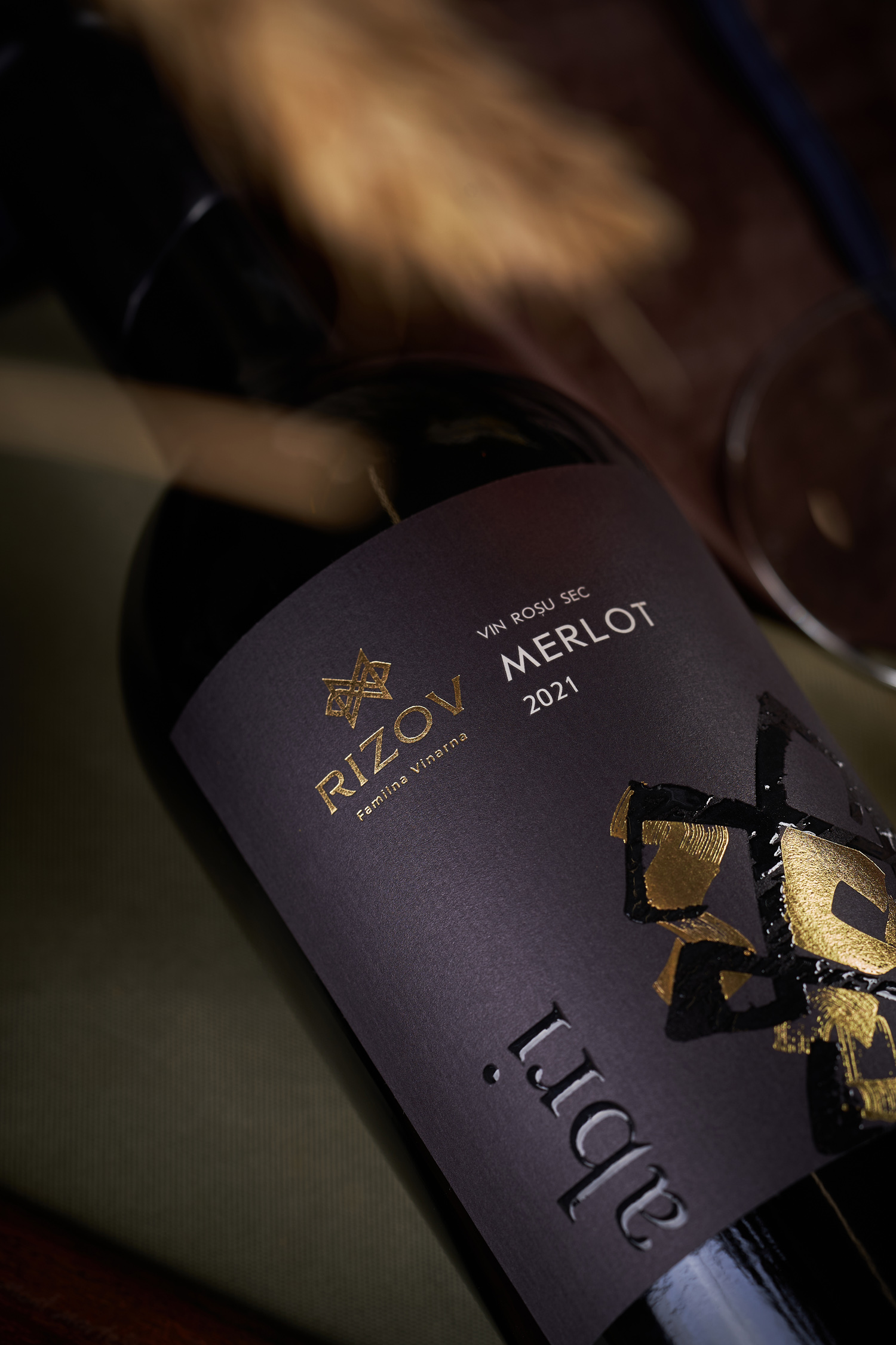
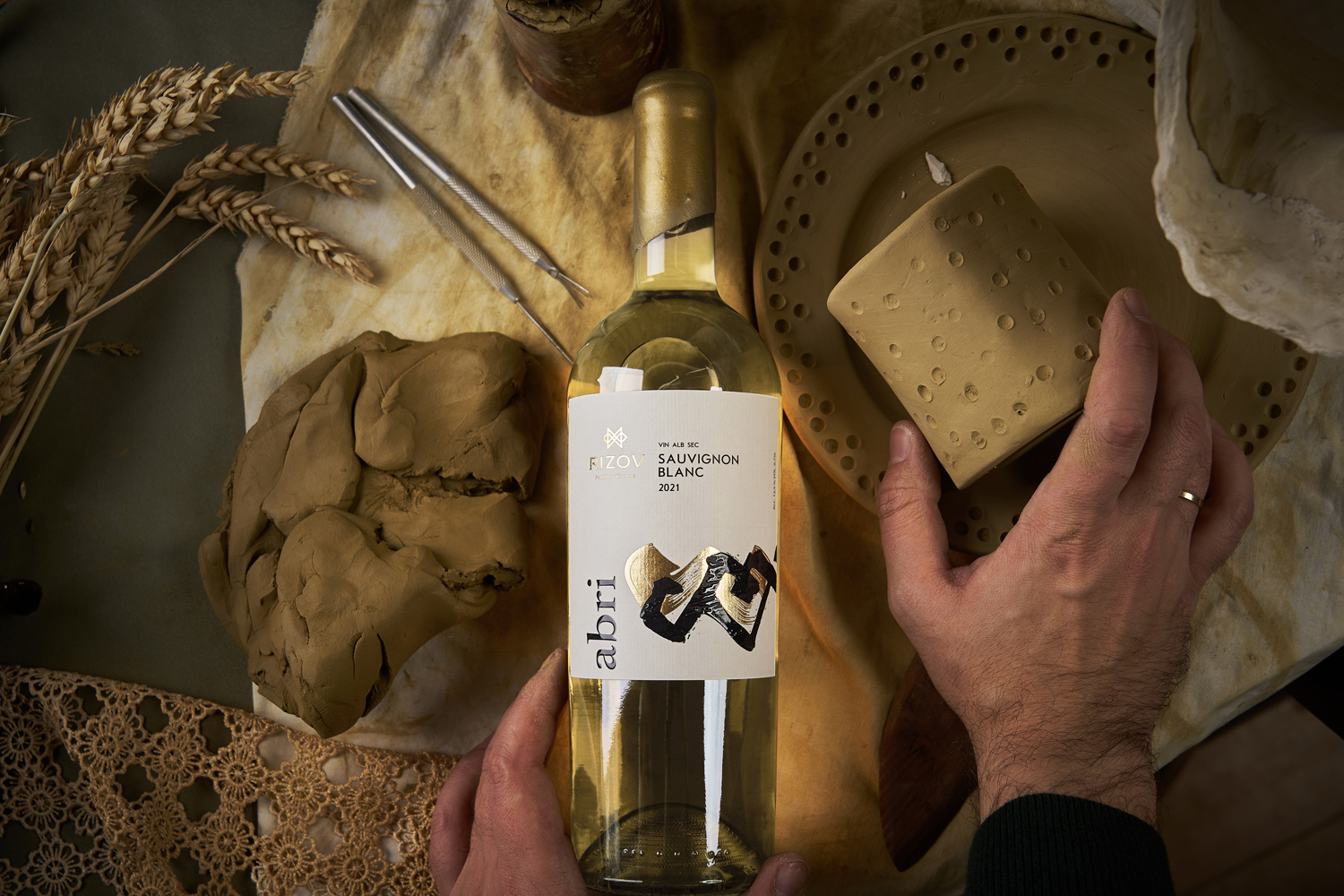
Each winery has its own story. Some are decades old, some even centuries old, some are striking in scale, some are known for unique wines. And there are also wineries whose history is inseparable from the history of a single family, and they are no less interesting and entertaining than the giants of the industry. The Rizov family winery, founded in the Bulgarian community in the south of Moldova, is an excellent example of such an enterprise. Having matured to enter the professional market, the small manufacturer was clearly aware of the main values that they would like to convey to the consumer - Bulgarian roots, family unity, and commitment to high quality. These aspects became the basis for the development of the logo and label design for Rizov Familna Vinarnia.
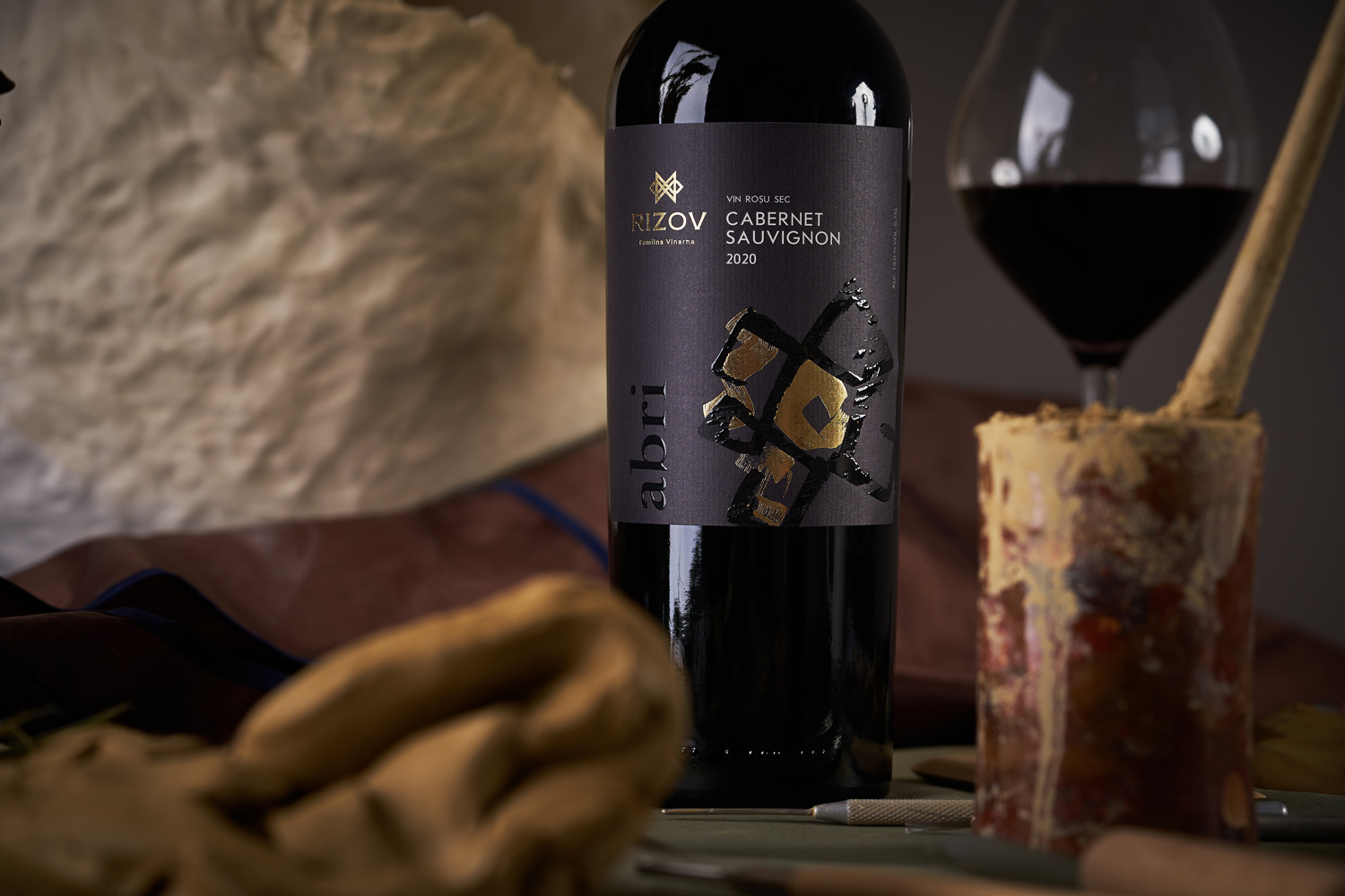
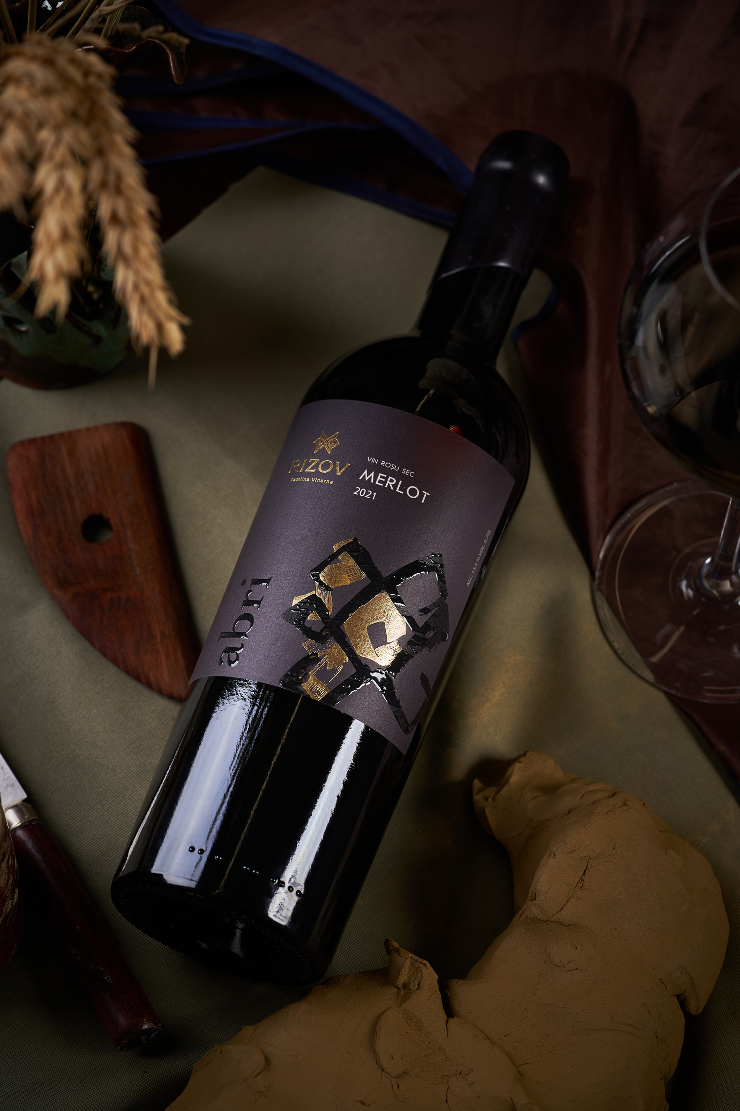
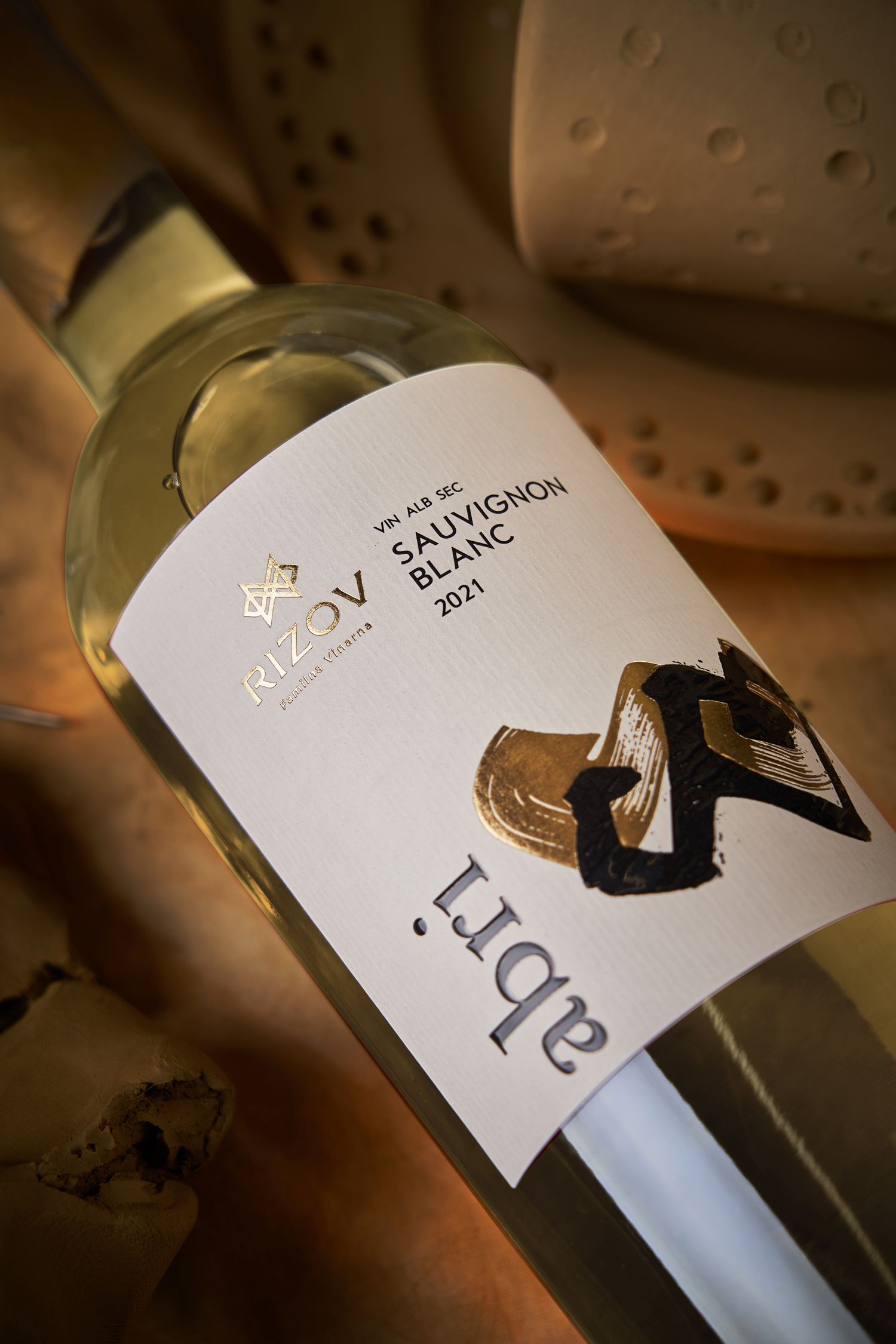
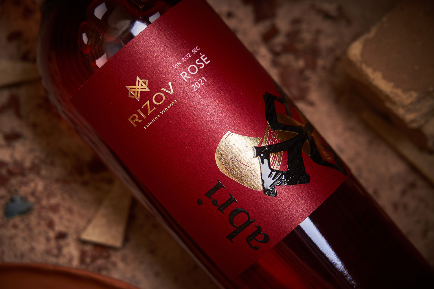
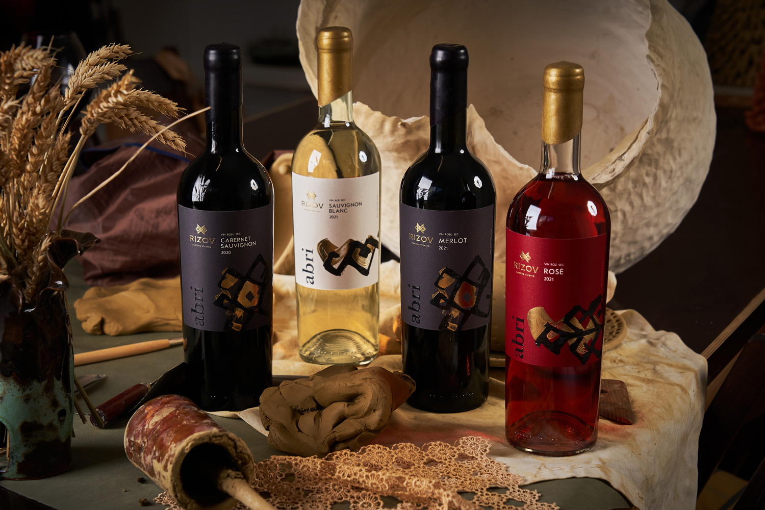
The portfolio of the small family winery Rizov includes several product lines, and we began our work on creating packaging design with the Abri series, consisting of light, young, drinkable wines. The winery's logo is based on an ethnic element called “Kanatitsa”, which is used by Bulgarian artisans in completely different products. One of the many meanings inherent to this element is “family, unity”. A similar element is repeated as the centerpiece in the label design, unique and hand drawn with a brush for each wine. In combination with a rather restrained informational part, a minimalistic palette, and selective use of post-print technologies, we managed to create a modern-looking design, which nevertheless is not shy to speak loudly and proudly about its ethnic roots.