- 2022
process
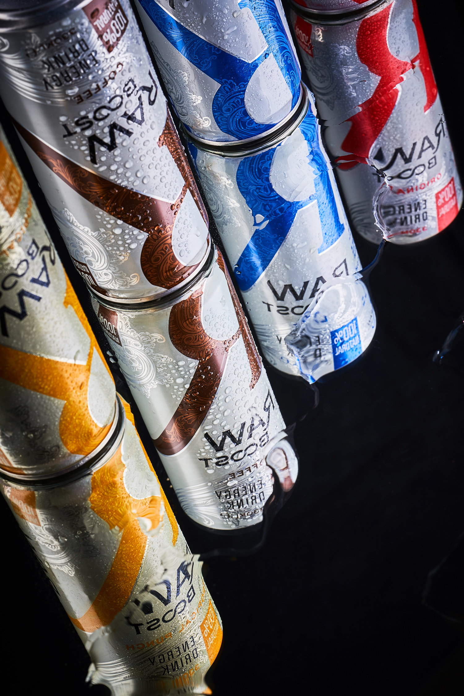
Raw Boost is a line of energy drinks created exclusively from natural ingredients. And though our studio specializes in creating packaging design exclusively for alcoholic beverages, in this particular case, we wanted to try something new and develop a brand from a related field from scratch. There were many nuances that made the task very intriguing. First, the packaging format and the way the design was applied to it imposed their own limitations during the development process. Second, we had to consider the competitive environment and the target audience for these products, which are fundamentally different from the industries we are used to. The result of a long development process is a dynamic and modern design that captures the very essence of Raw Boost drinks.
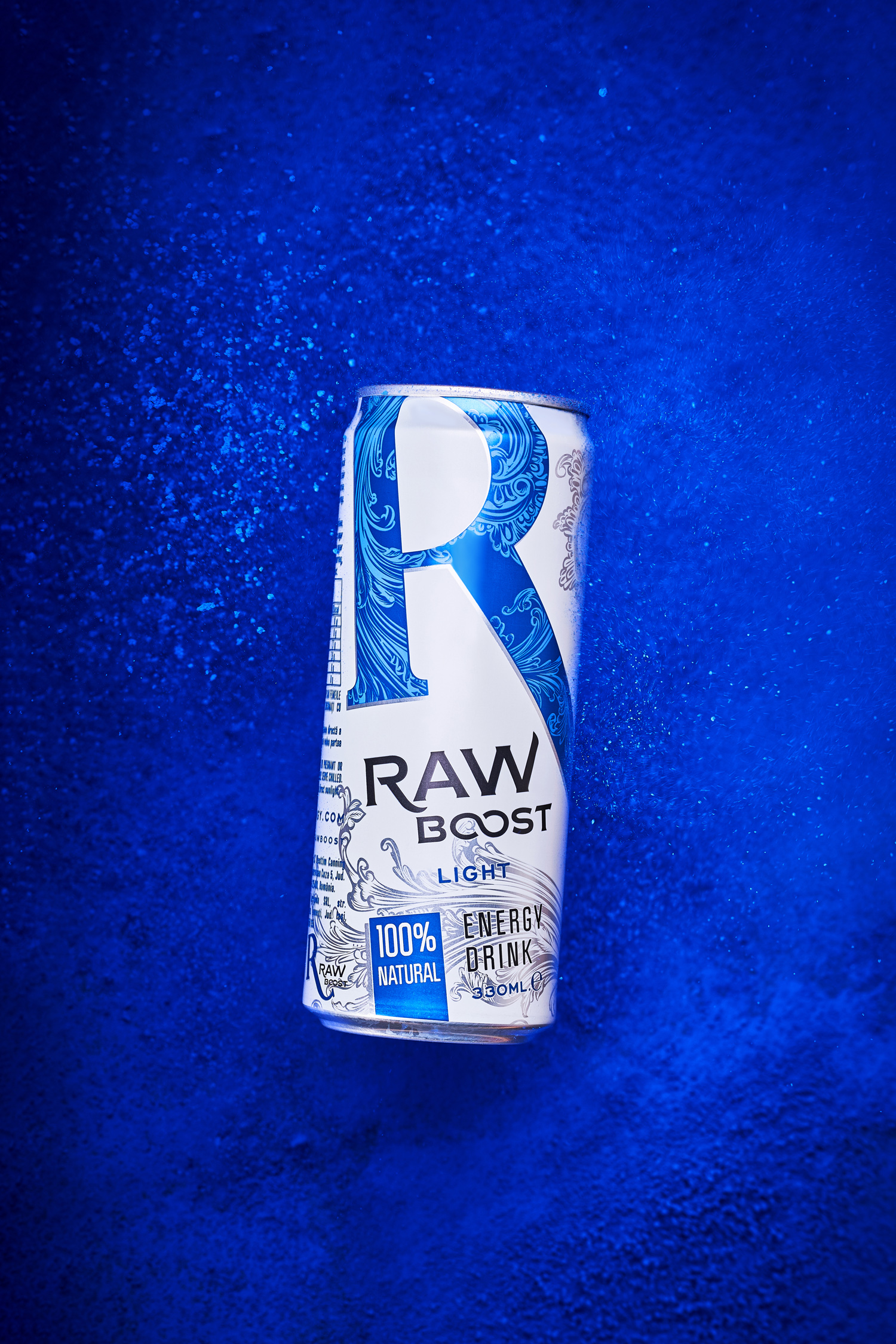
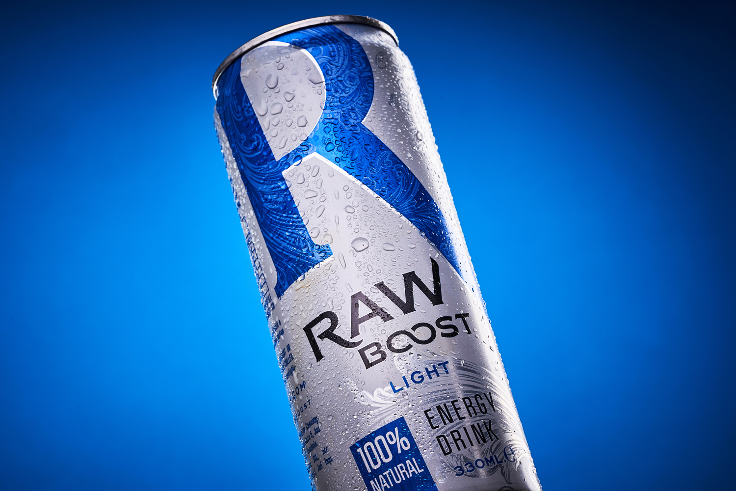
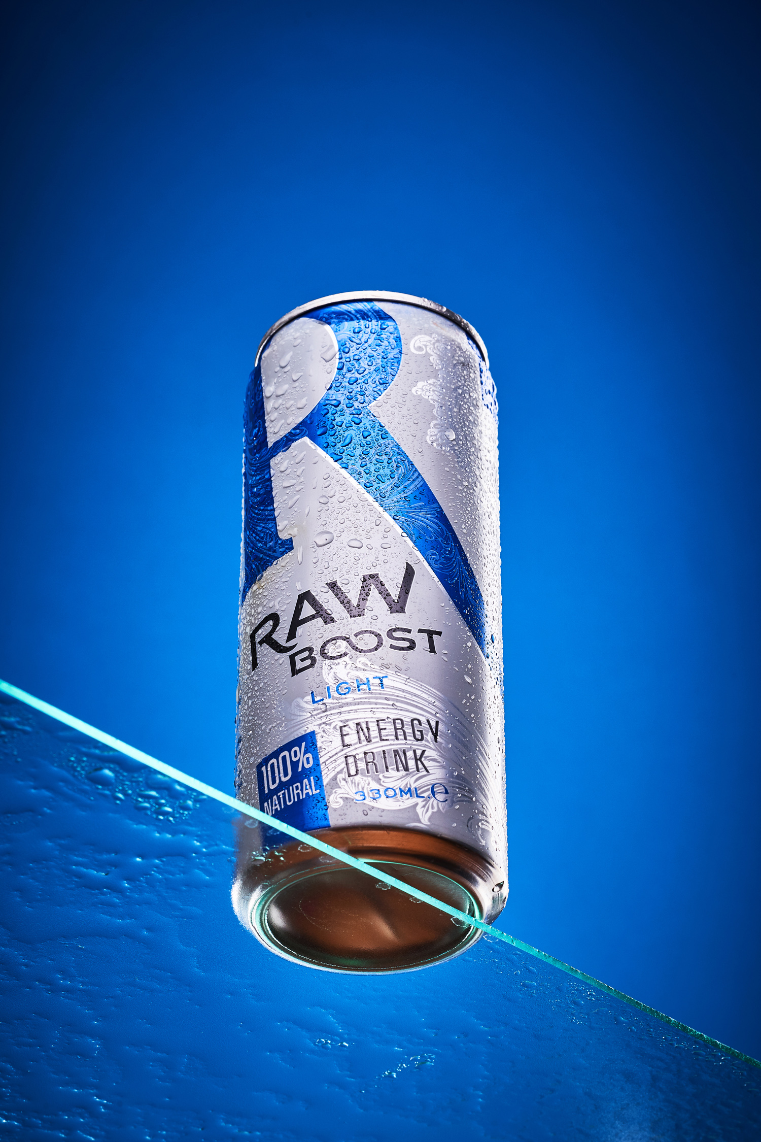
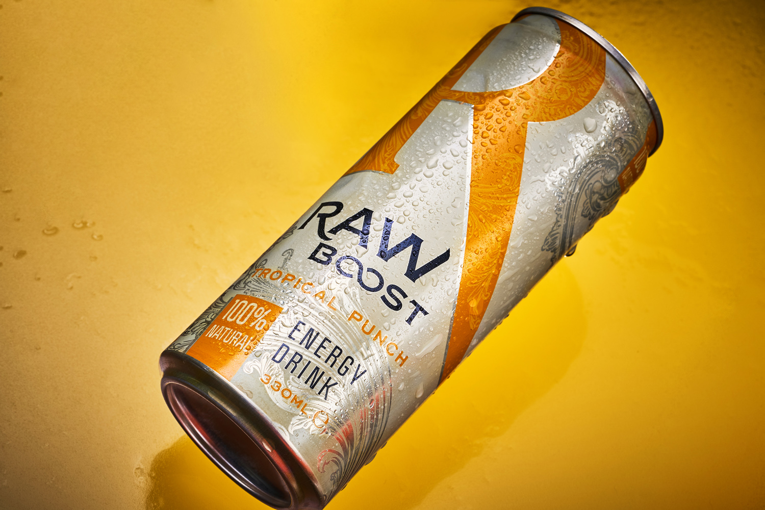
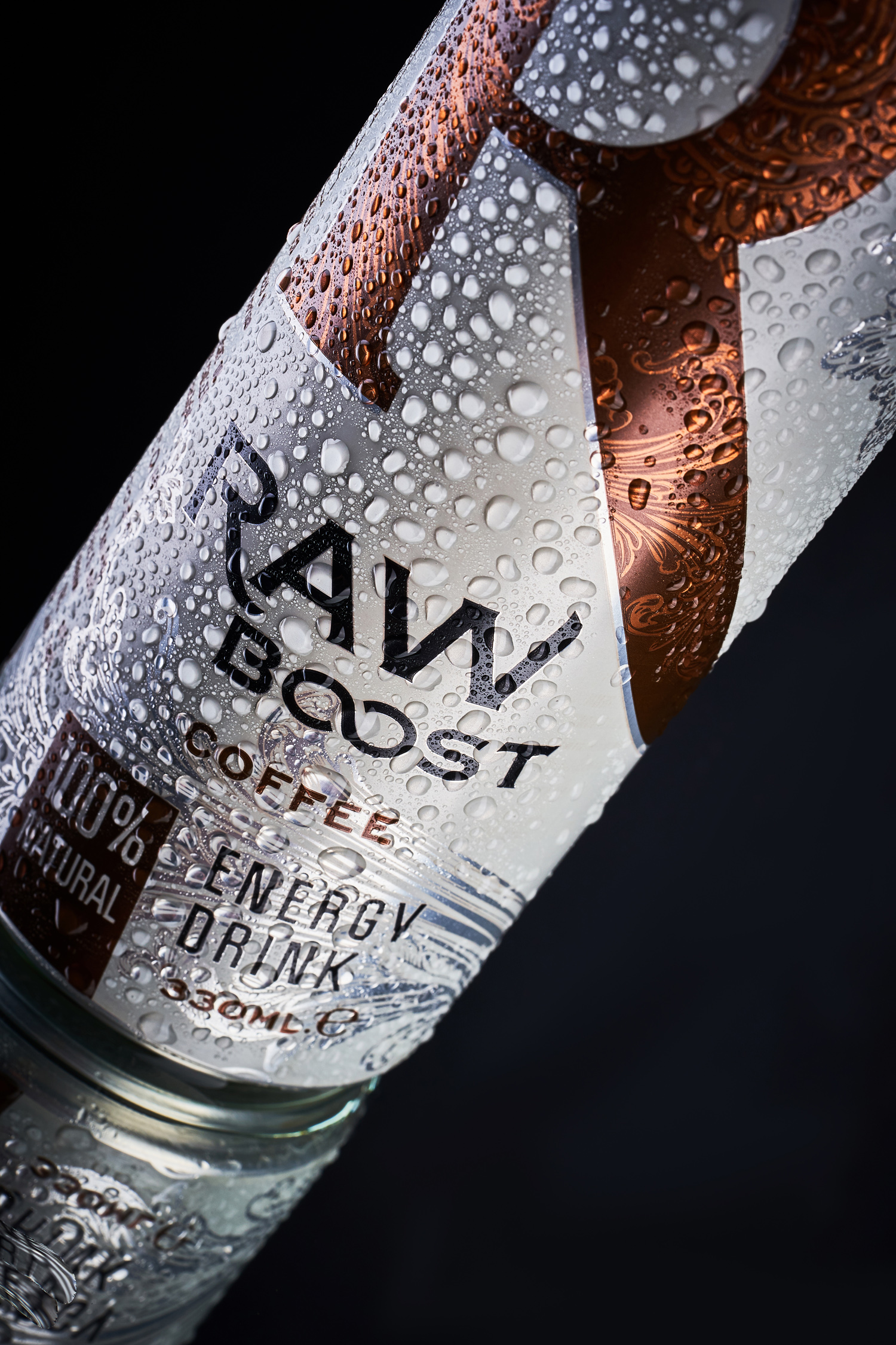
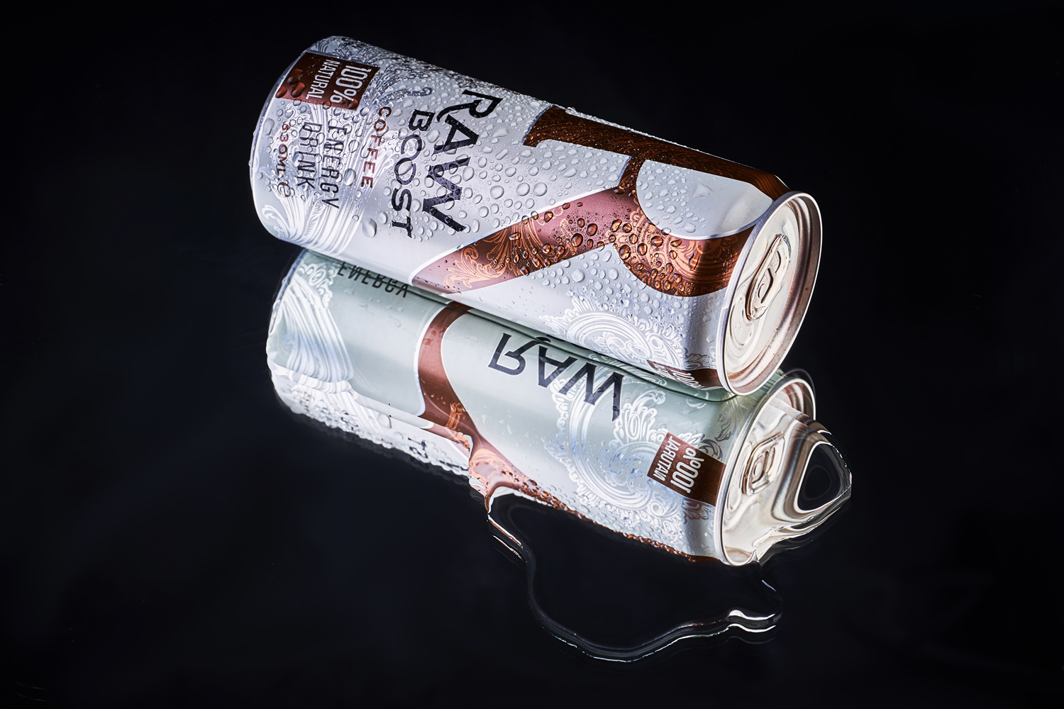
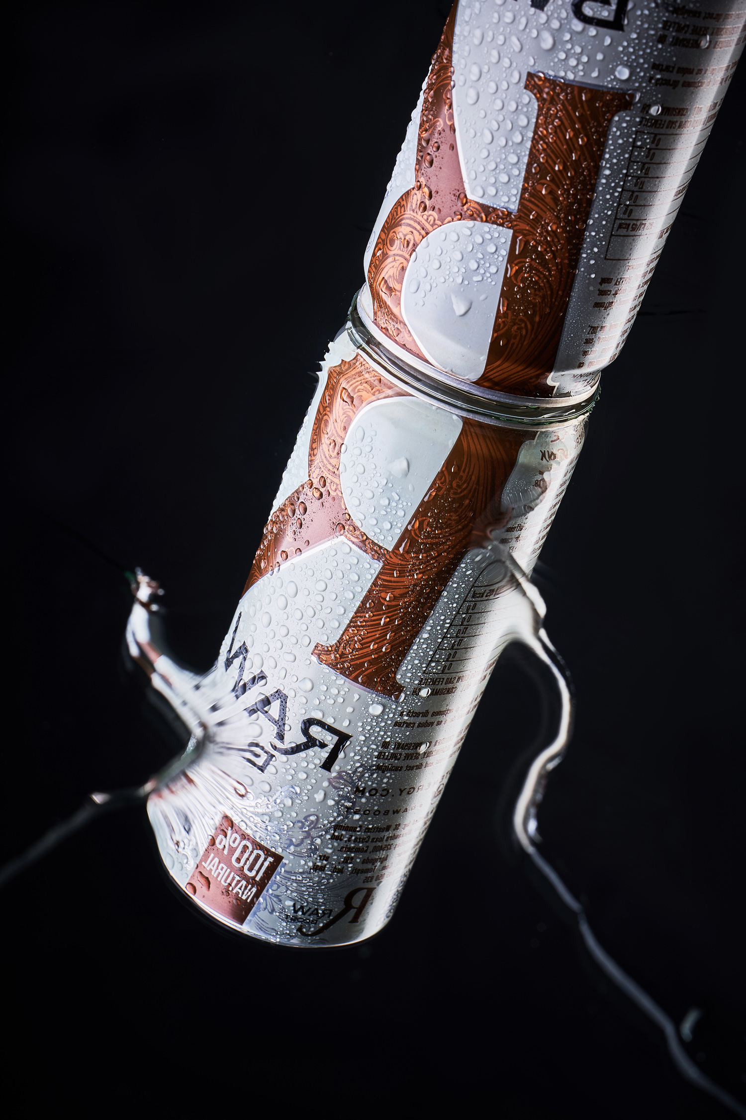
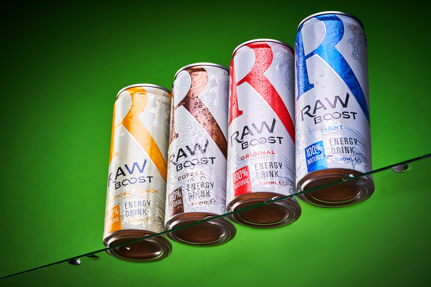
The primary task in developing the visual design for Raw Boost energy drinks was the creation of the so-called eye-stopper - a bright element that would act as the main product identifier on the shelf. We’ve chosen the capital letter R for this role, which immediately attracts the attention of the consumer with its shape, and allows you to distinguish the drink from competitors. The division of products in the line is made through the use of a variable color scheme. And additional graphic elements are employed to emphasize the lightness and dynamism of the drink in the can. At the same time, the maximum visual effect is achieved when the products are placed side by side on the shelf, which makes the brand more memorable and attractive.