- 2018
process
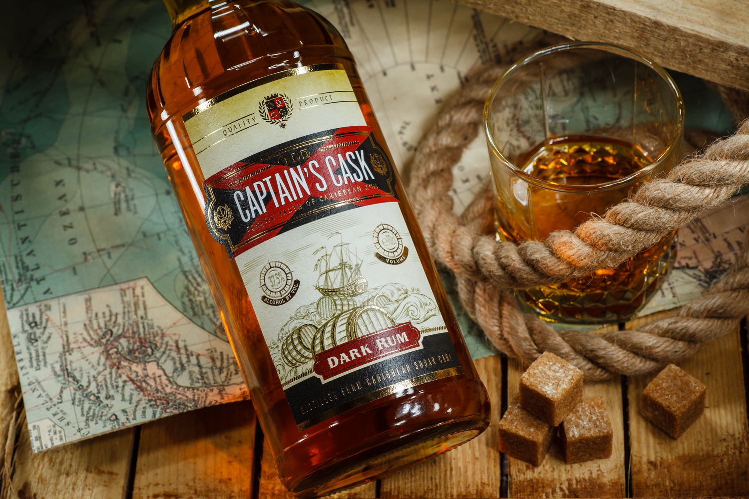
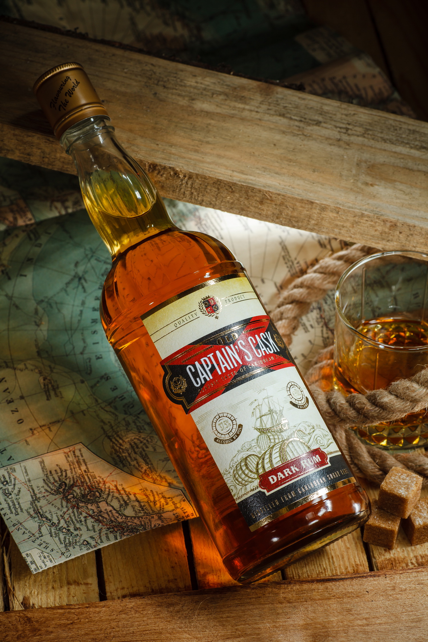
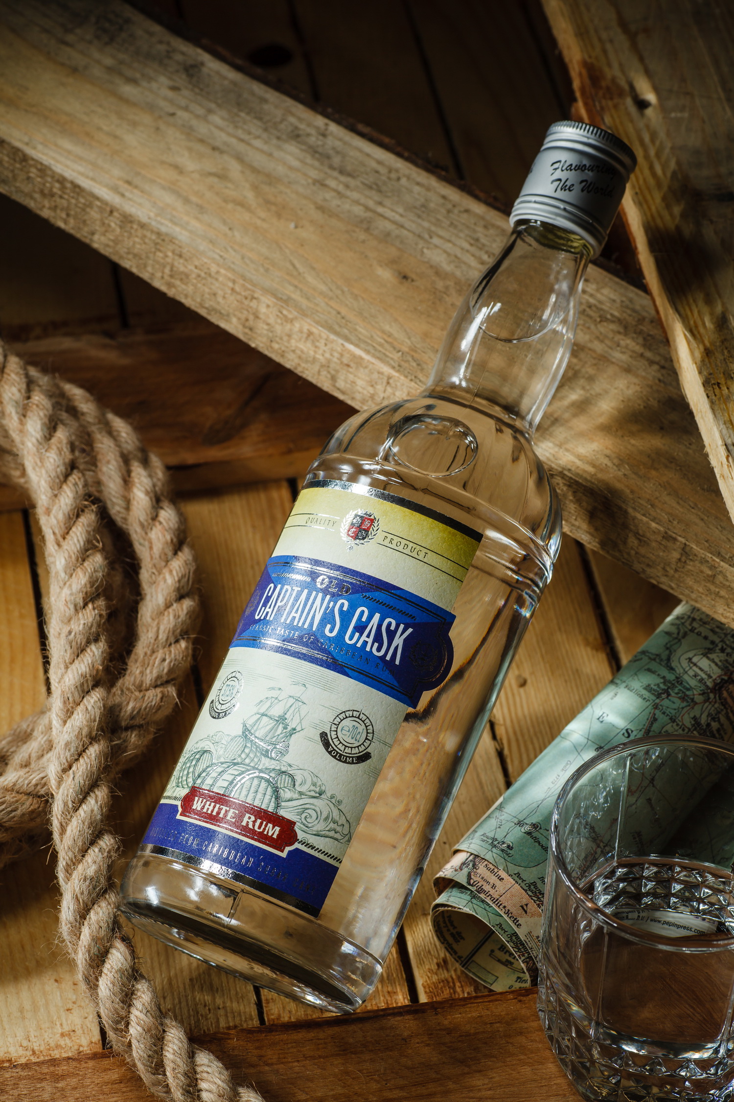
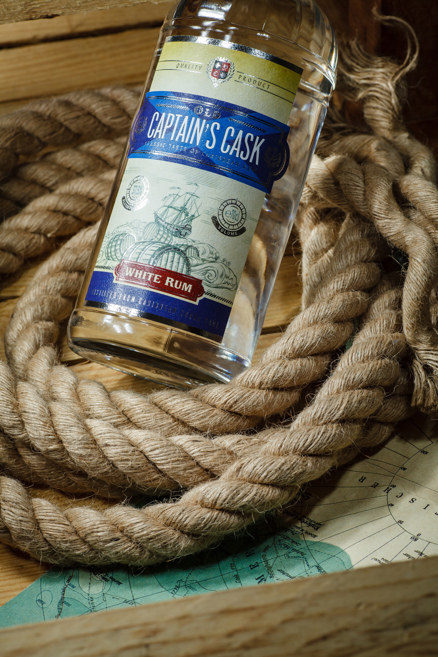
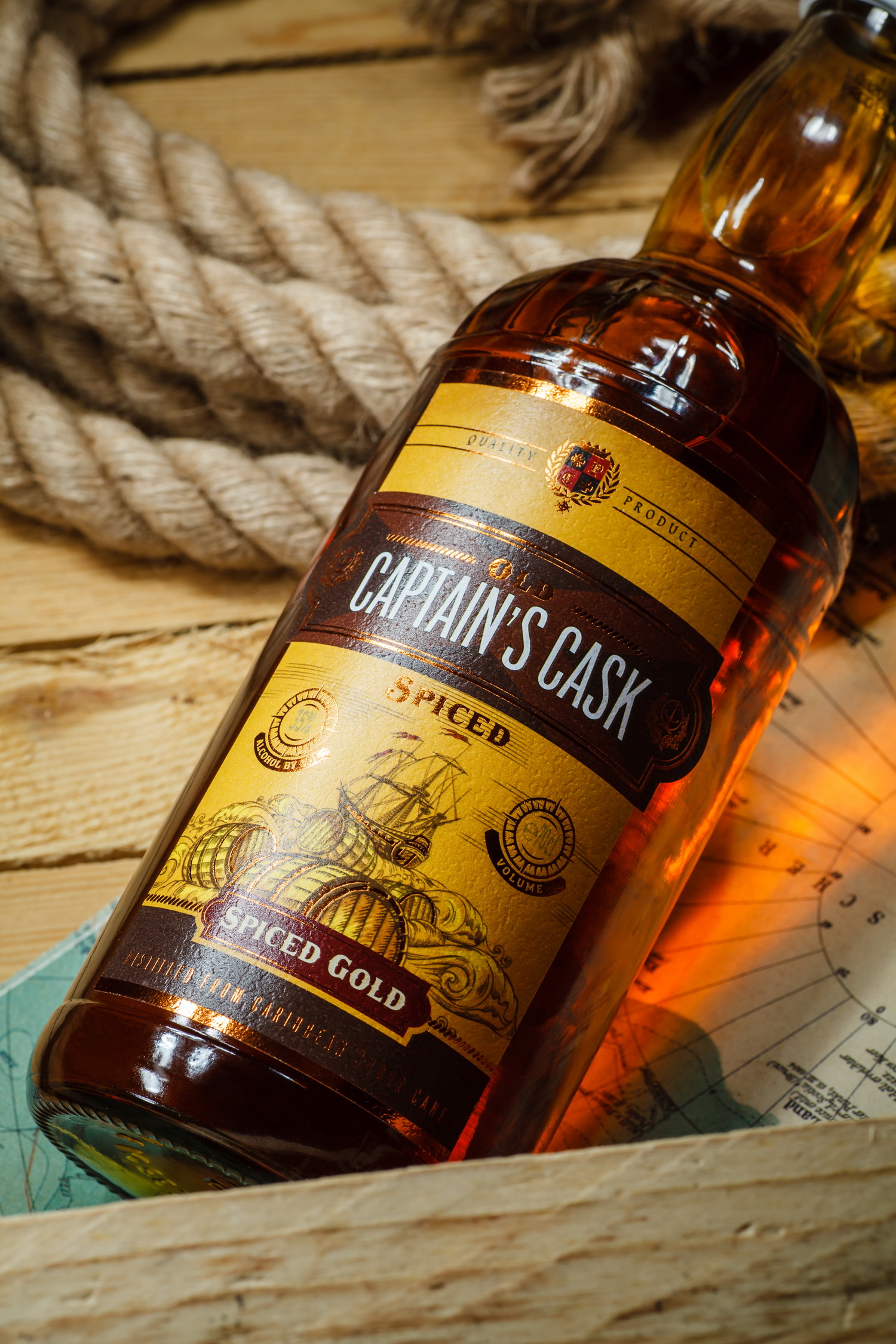
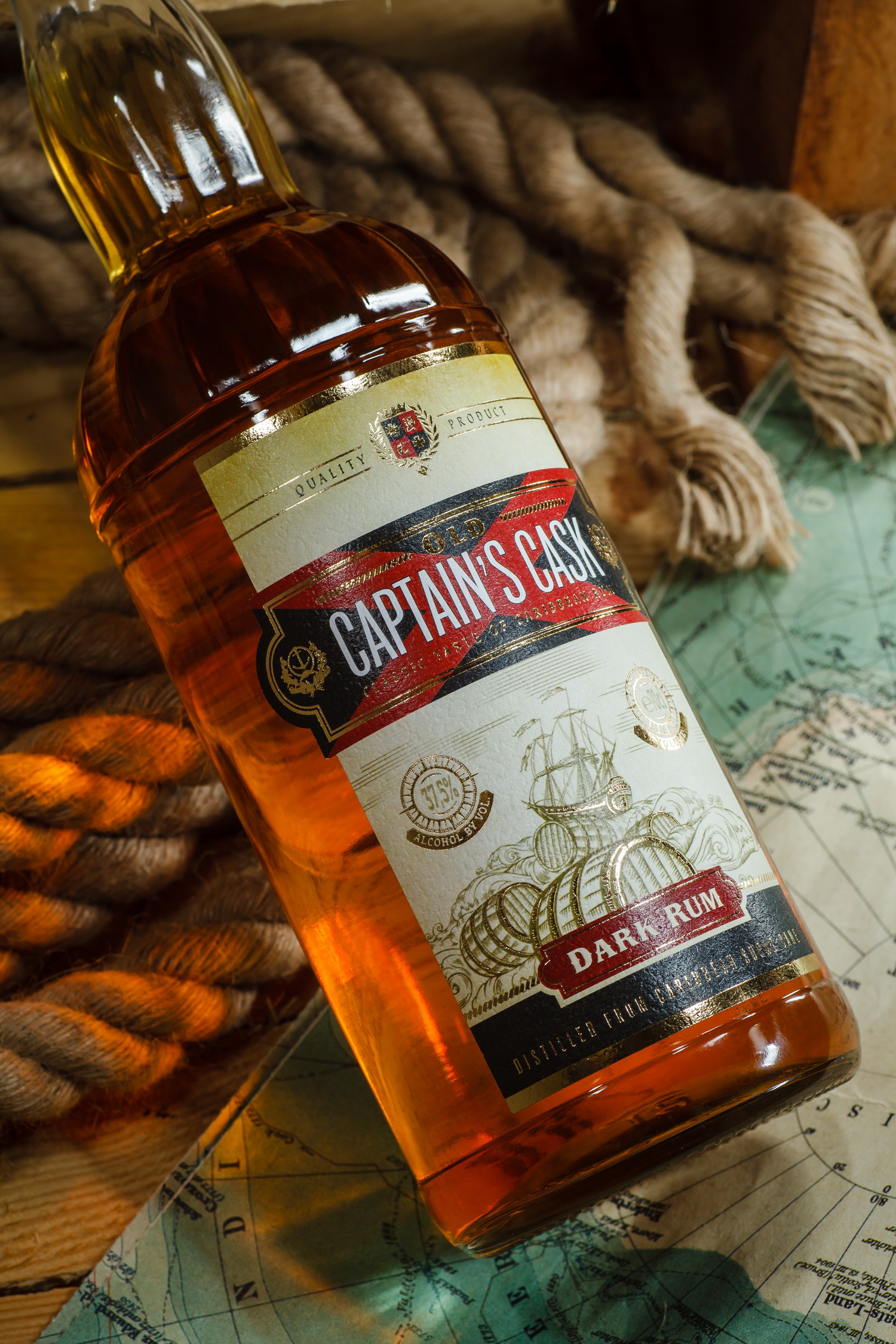
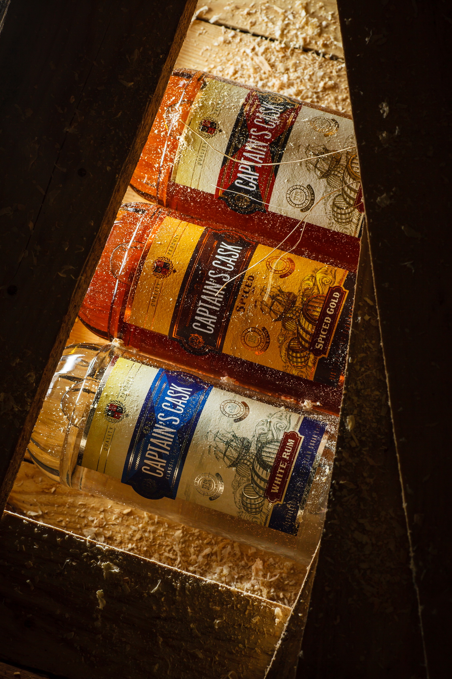
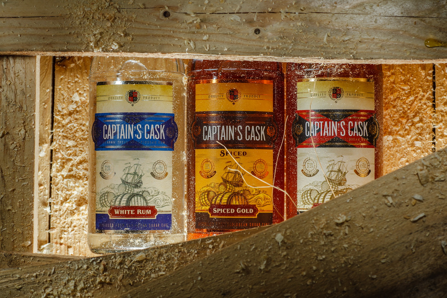
The redesign project for Captain's Cask rum produced by the Belgian company Sodiko made part of a larger effort for renewing the visual aspect of this client’s products. This project required us to refresh the label design for the mid range rums, making it more relevant to the modern market. As a result, we’ve developed the label design virtually from scratch, keeping only the general idea of the old packaging.
The basis for the new composition is the already existing concept of Captain's Cask rums - the image of rum barrels and a ship out in the sea - which helps to identify the nature of the drink. Meanwhile, all the illustrations have been redrawn, the main graphic and information elements designed from scratch, and the overall style of the label executed in the spirit of modern vintage, common to drinks of this category. Some of the label’s elements were also processed with foil stamping, which made it more vivid and attractive.