process
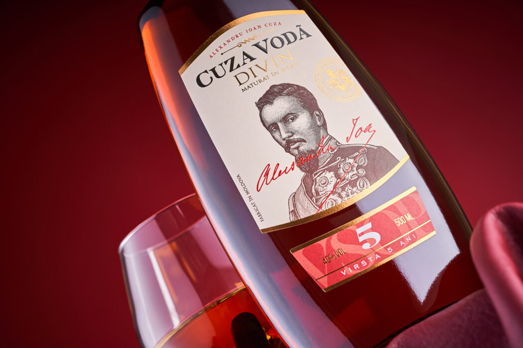
The label redesign project for the Moldovan brandy Cuza Voda is an excellent example of a situation where a product already established on the market requires a visual update with the scope to increase its relevance on the shelf. The main goal in this case was the creation of a brighter and more noticeable package, while maintaining the overall aesthetics of Moldovan divin distillates. In order to accomplish this, we’ve decided to completely change the approach to packaging, placing an emphasis on the famous historical figure who served as the inspiration for the brand.
The large-scale packaging redesign for Cuza Voda divin included a parallel work on several product lines simultaneously. For regular brandies, we’ve created an image, the central element of which is an engraved portrait of Alexander Ioan Cuza. During the detailed study of his heraldry and its rethinking, several graphic elements were added into the composition for greater historical authenticity. Thanks to the use of color differentiation, the products in the line are easily identifiable on the shelf, while the addition of gold foil stamping adds a premium and solemn feel to the packaging.


