- 2018
process
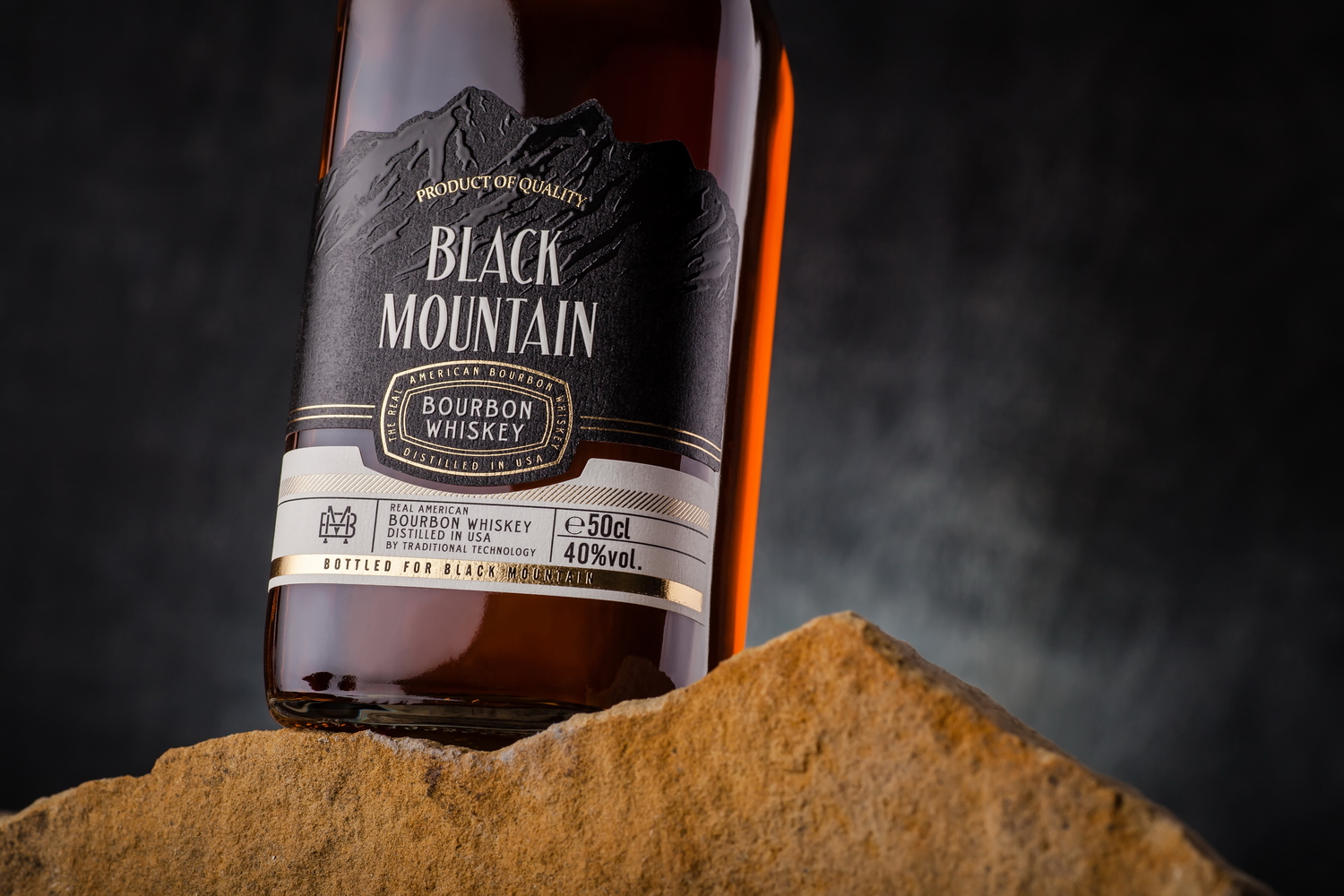
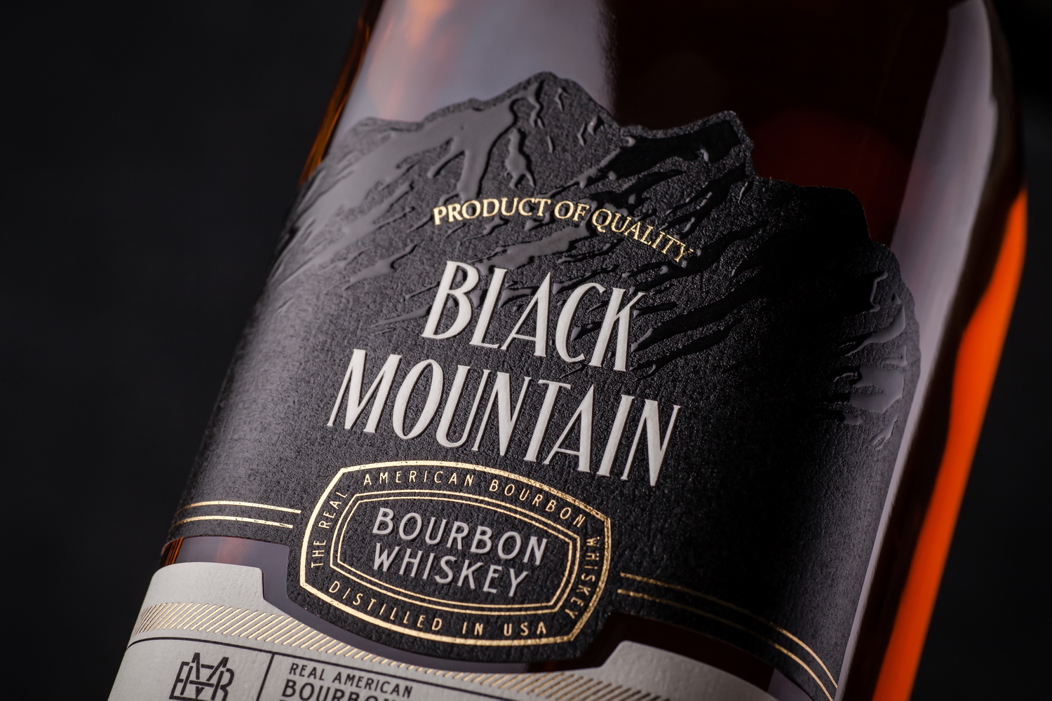
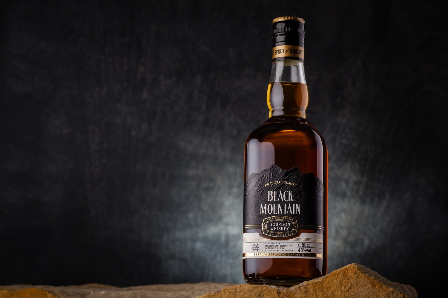
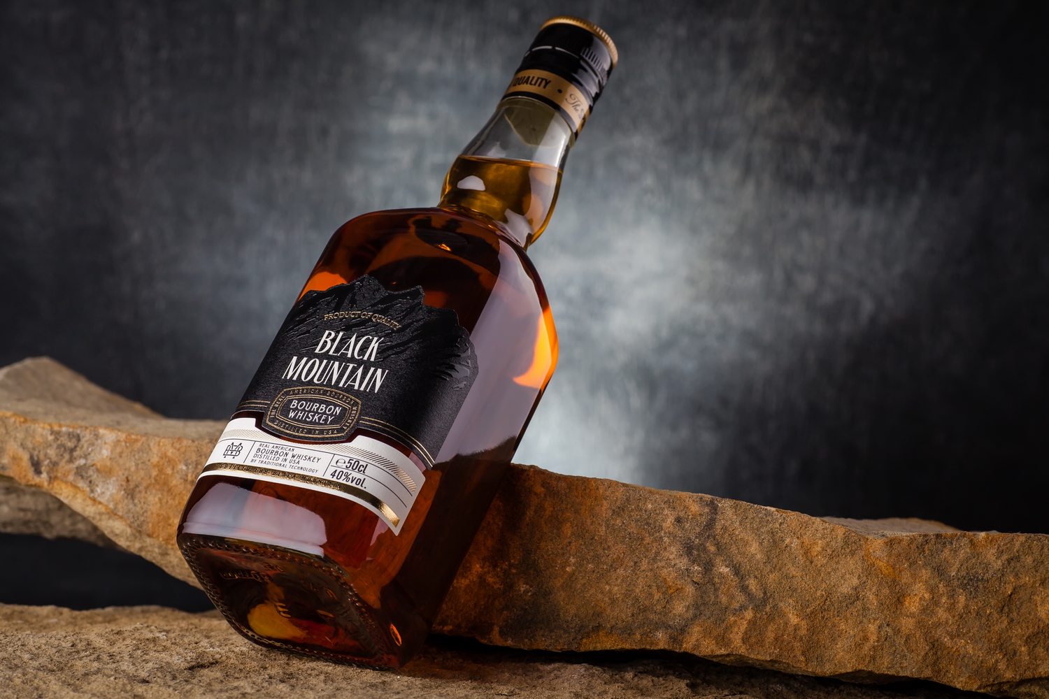
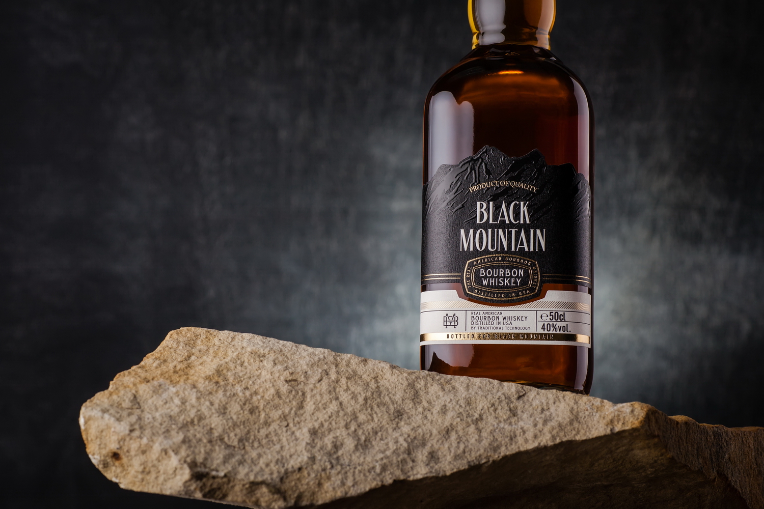
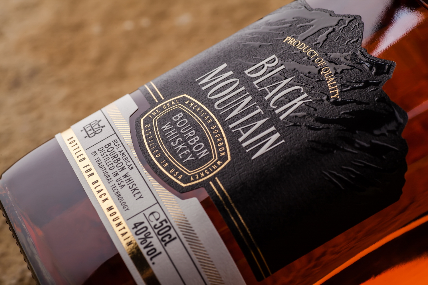
Black Mountain is bourbon destined for the mass segment, produced by the Belgian company Sodiko, which has contracted us on numerous occasions in the past. The main goal of this project was creating a classic bourbon label, which would identify the drink at first sight, while also making it more memorable and interesting. That’s why we’ve decided to put the main emphasis on the name of the brand itself, reflecting it from a visual perspective.
At a glance, the label for Black Mountain respects all the packaging design traditions used for bourbon labels, with the trademark typography and set of visual elements employed. However, the main feature of this design is the contoured illustration of a black mountain, which takes up the entire upper part of the label, and attracts the consumer’s attention thanks to the use of a specially shaped knife and the application of tactile varnish. As a result, the name of the trademark serves as the product’s main identifier, and makes it more memorable on the product shelf.