- 2025
process
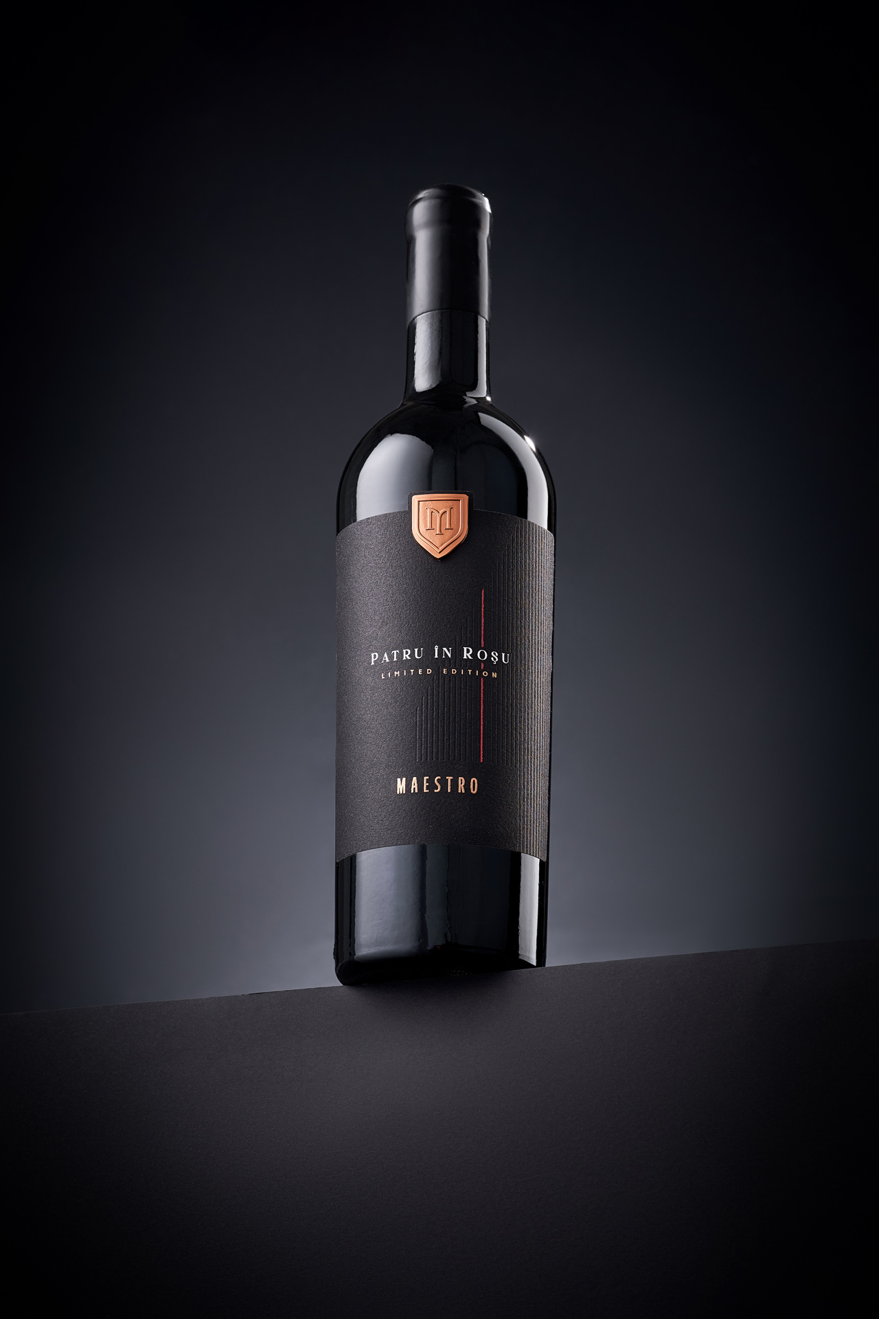
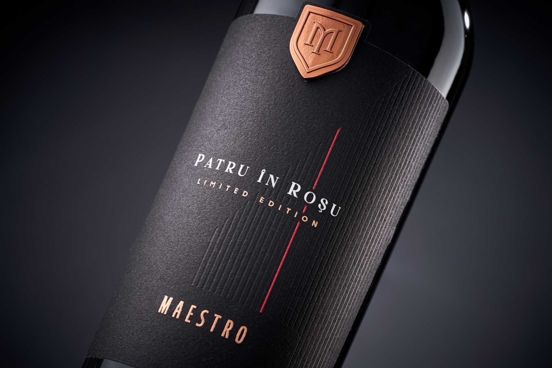
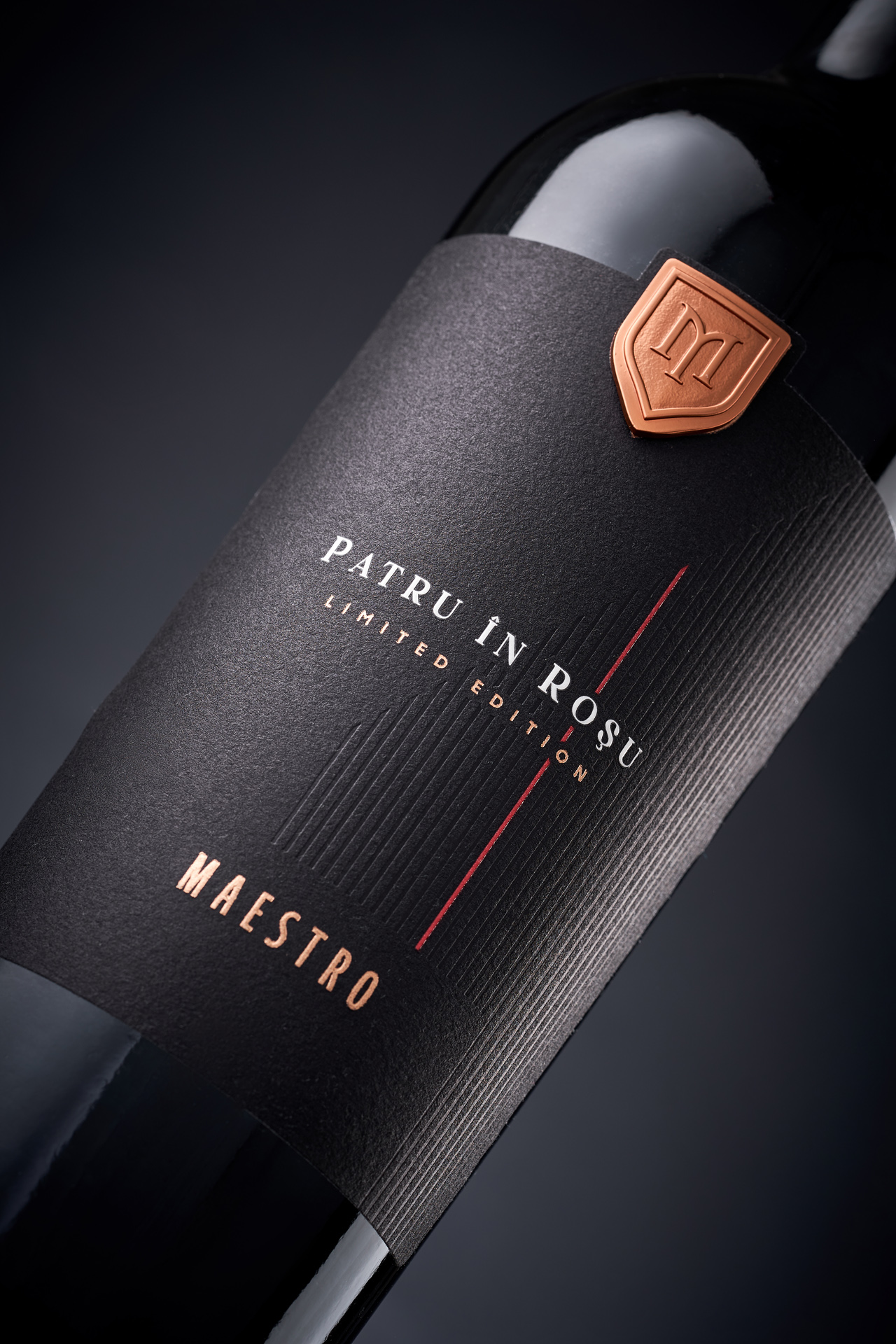
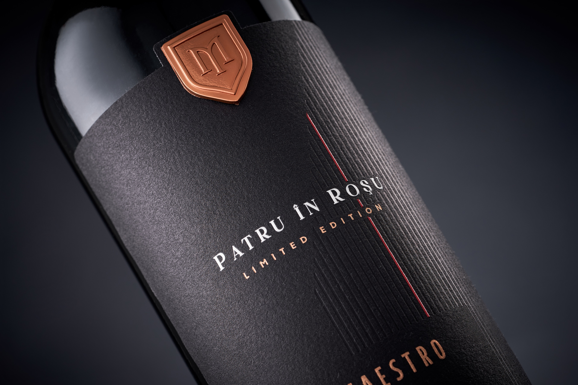
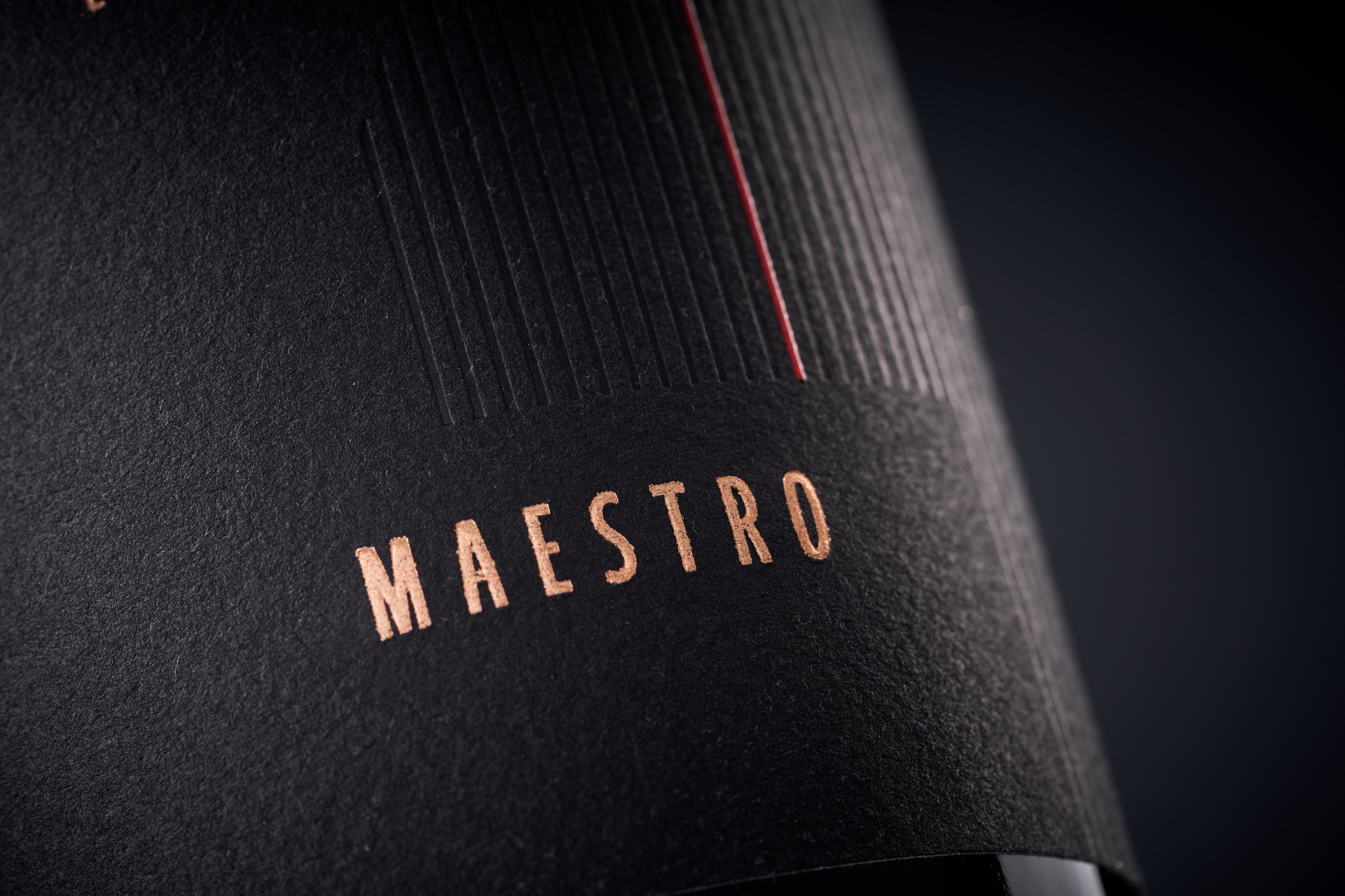
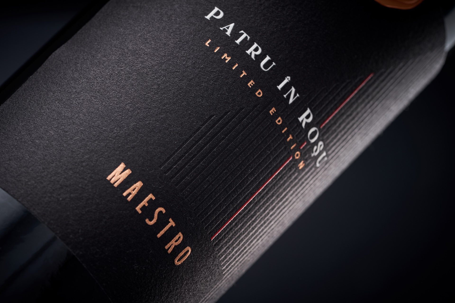
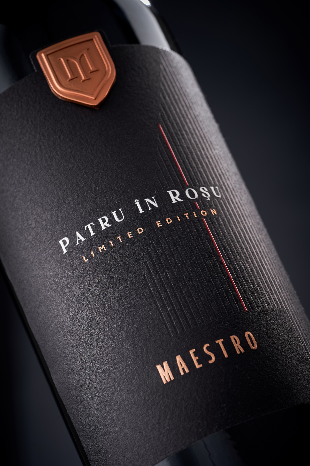
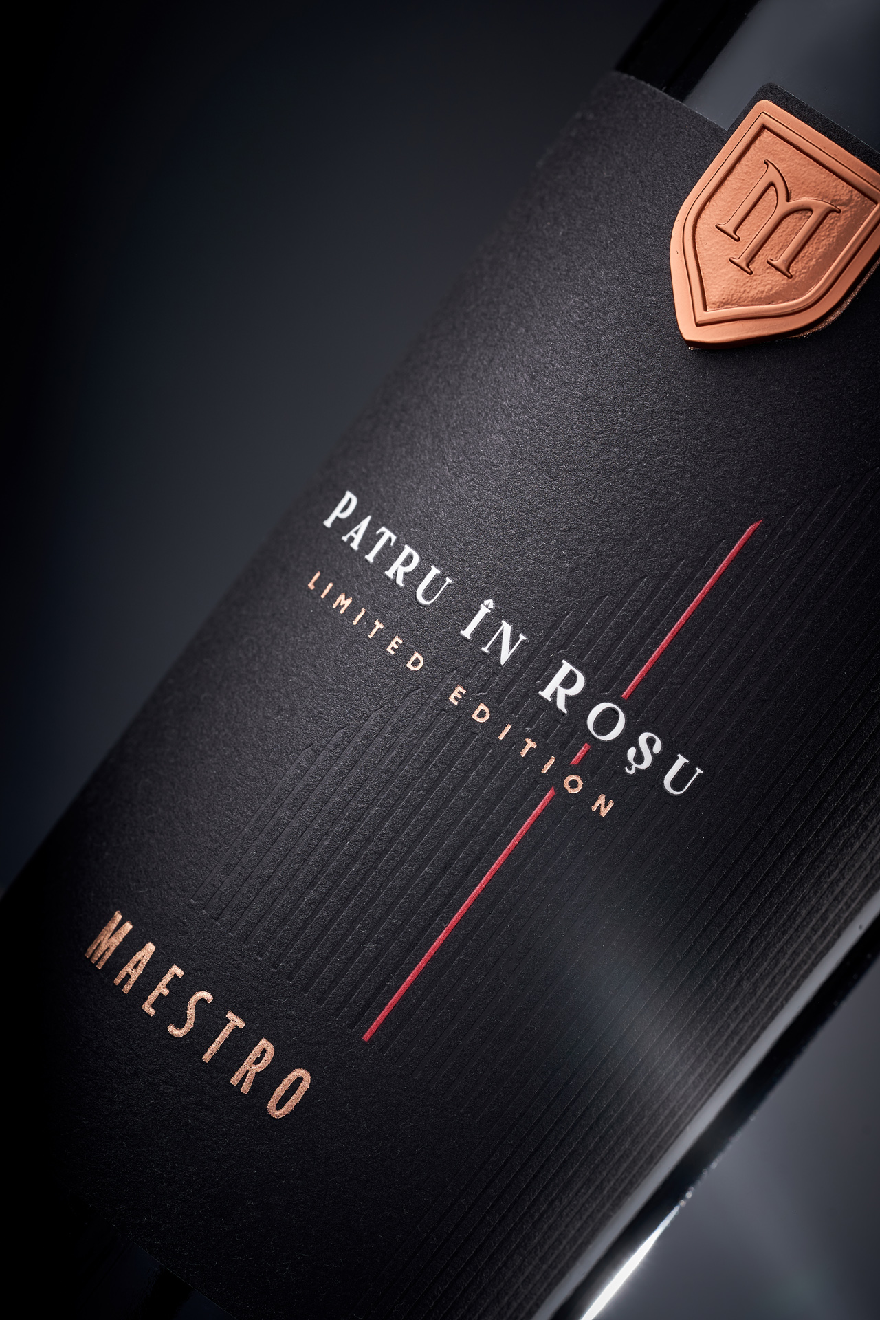
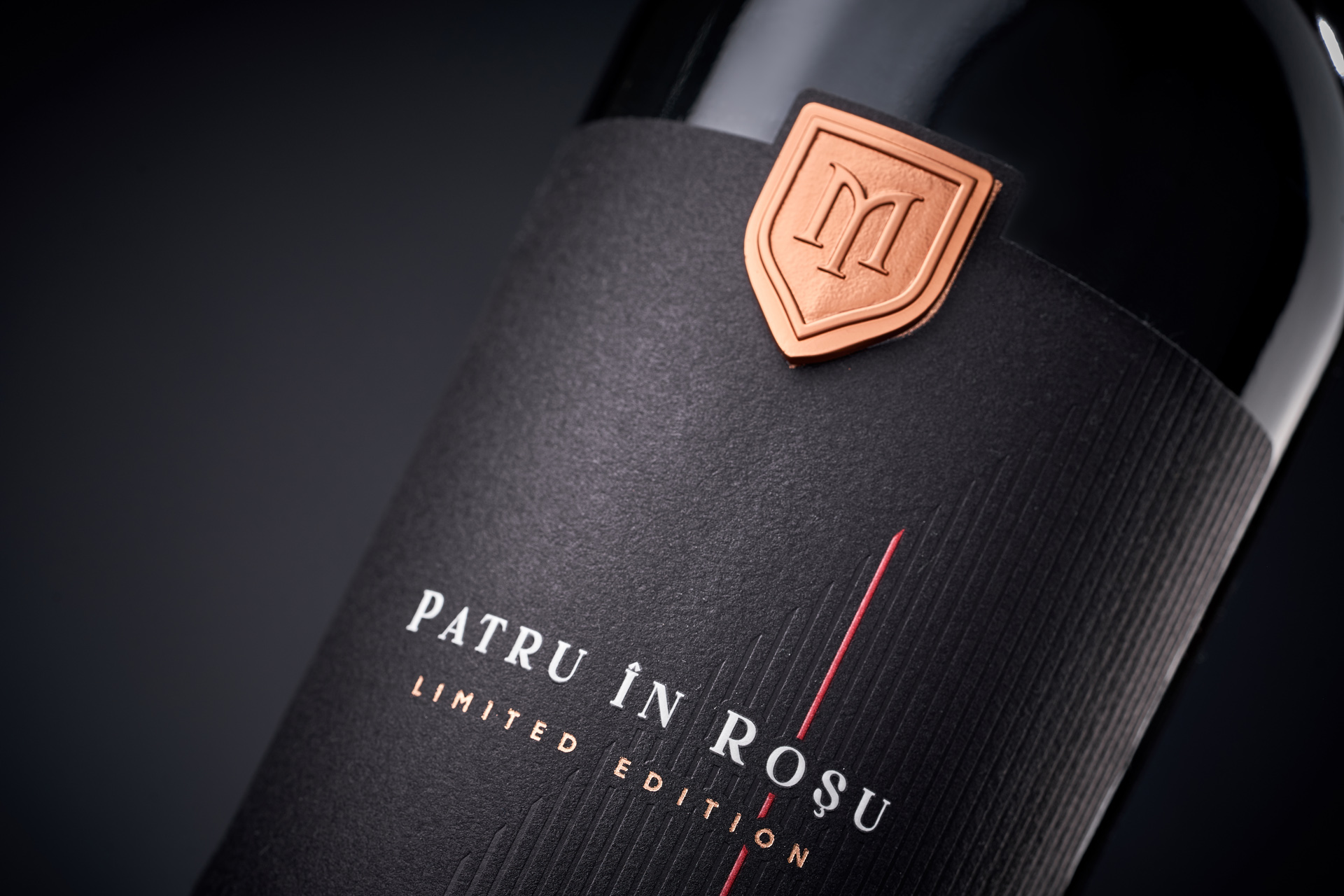
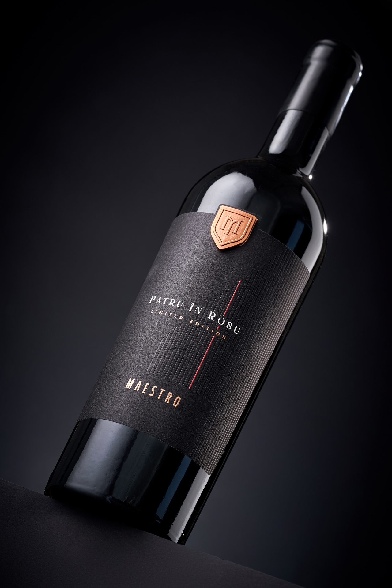
Patru în Roșu is a limited-edition red cuvée crafted by Maestro from four distinct grape varieties. The studio’s task was to create a label that would express the wine’s complexity while preserving the refined, understated character that defines the brand. The solution was a minimalist visual system built entirely on texture, rhythm, and precise detail rather than decorative elements.
The label features a deep matte surface enhanced by subtle vertical embossing - a quiet metaphor for structure, depth, and the multi-layered nature of the blend. A single red line introduces tension and movement, acting as the axis around which the composition is organized. The warm metallic emblem reinforces the feeling of craftsmanship and highlights the limited nature of the edition.
The result is a design that speaks softly yet confidently: a thoughtful balance of restraint, sophistication, and intention. It reflects Maestro’s philosophy - achieving maximum expression through minimal, carefully measured means.