- 2025
process
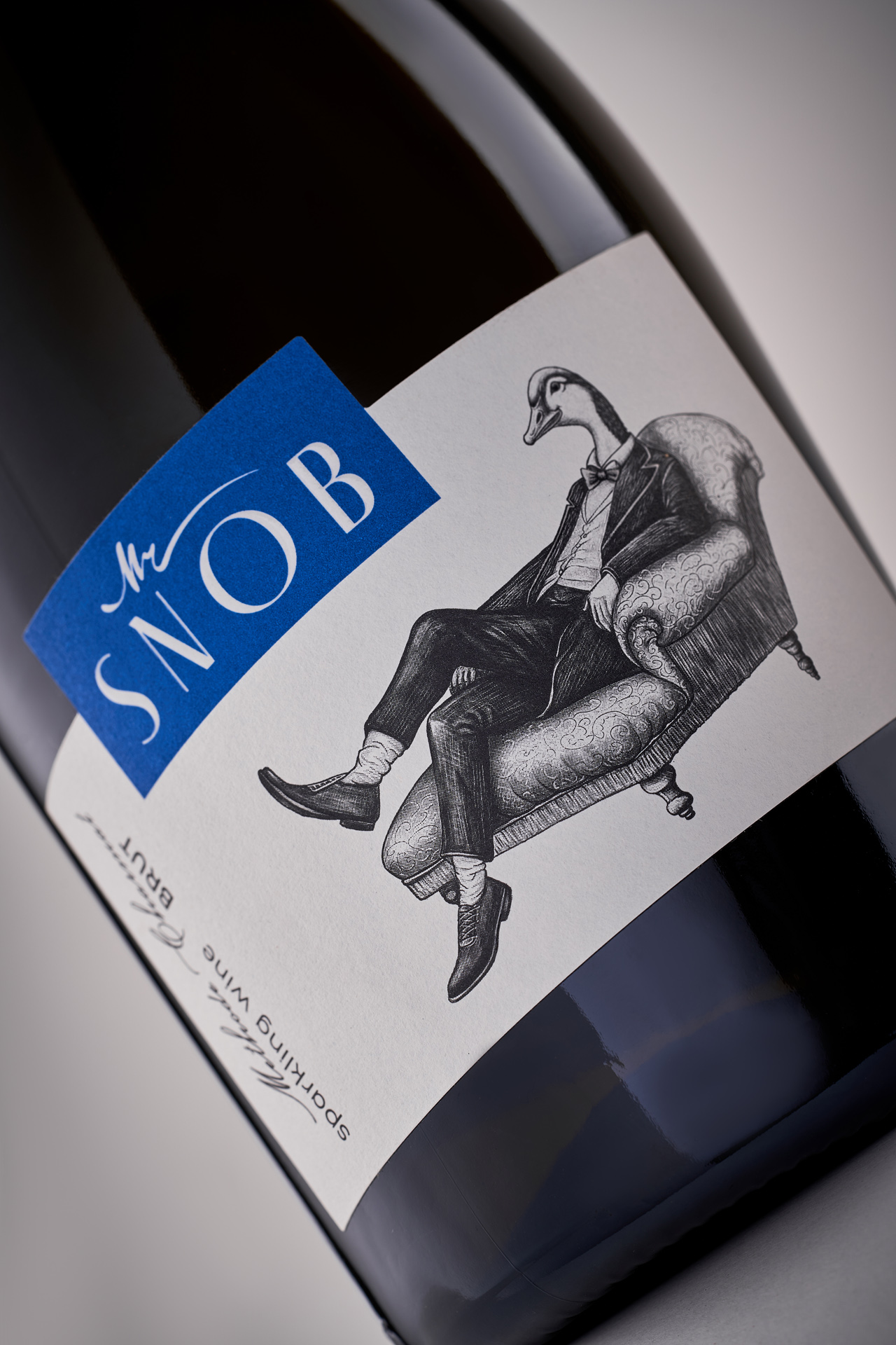
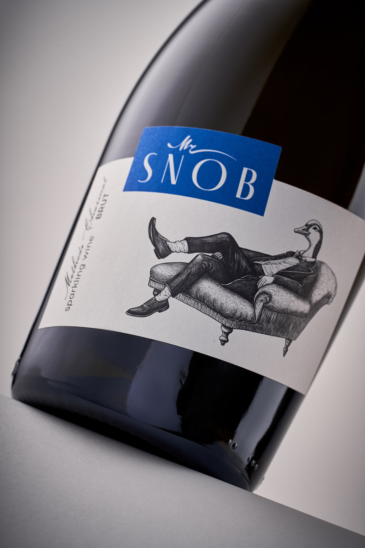
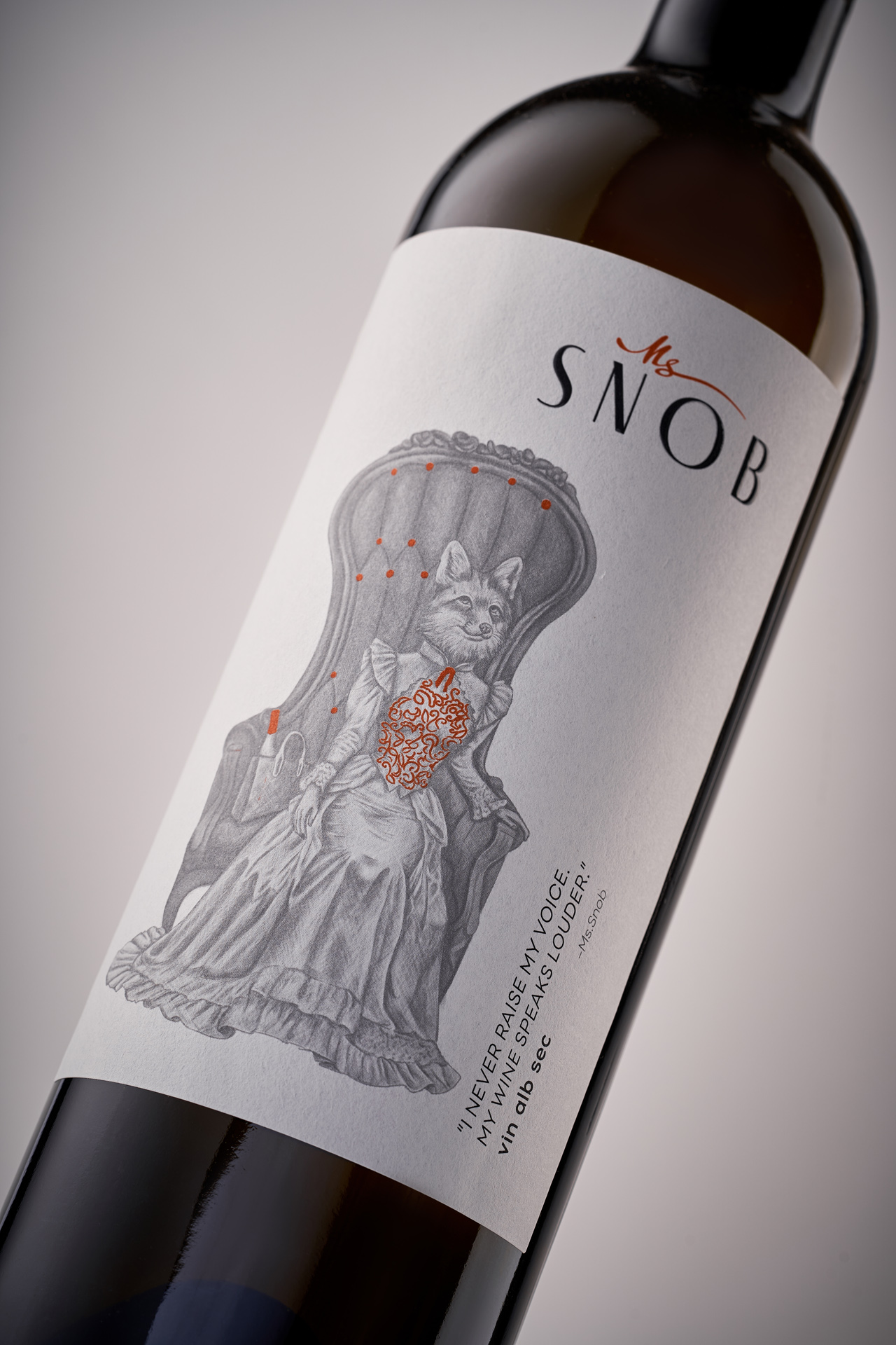
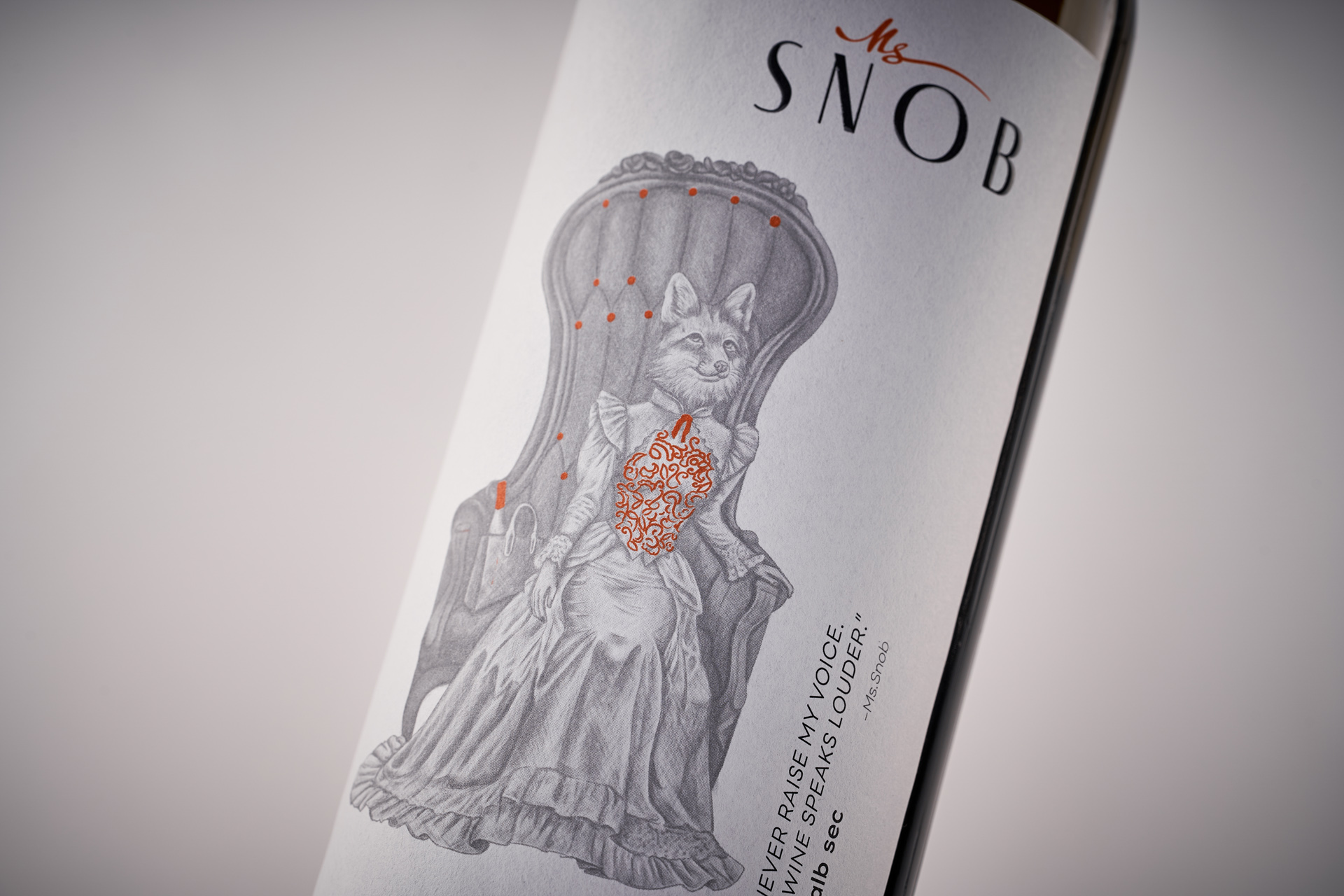
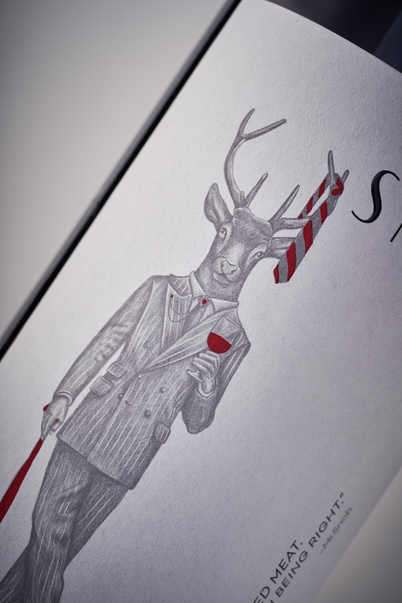
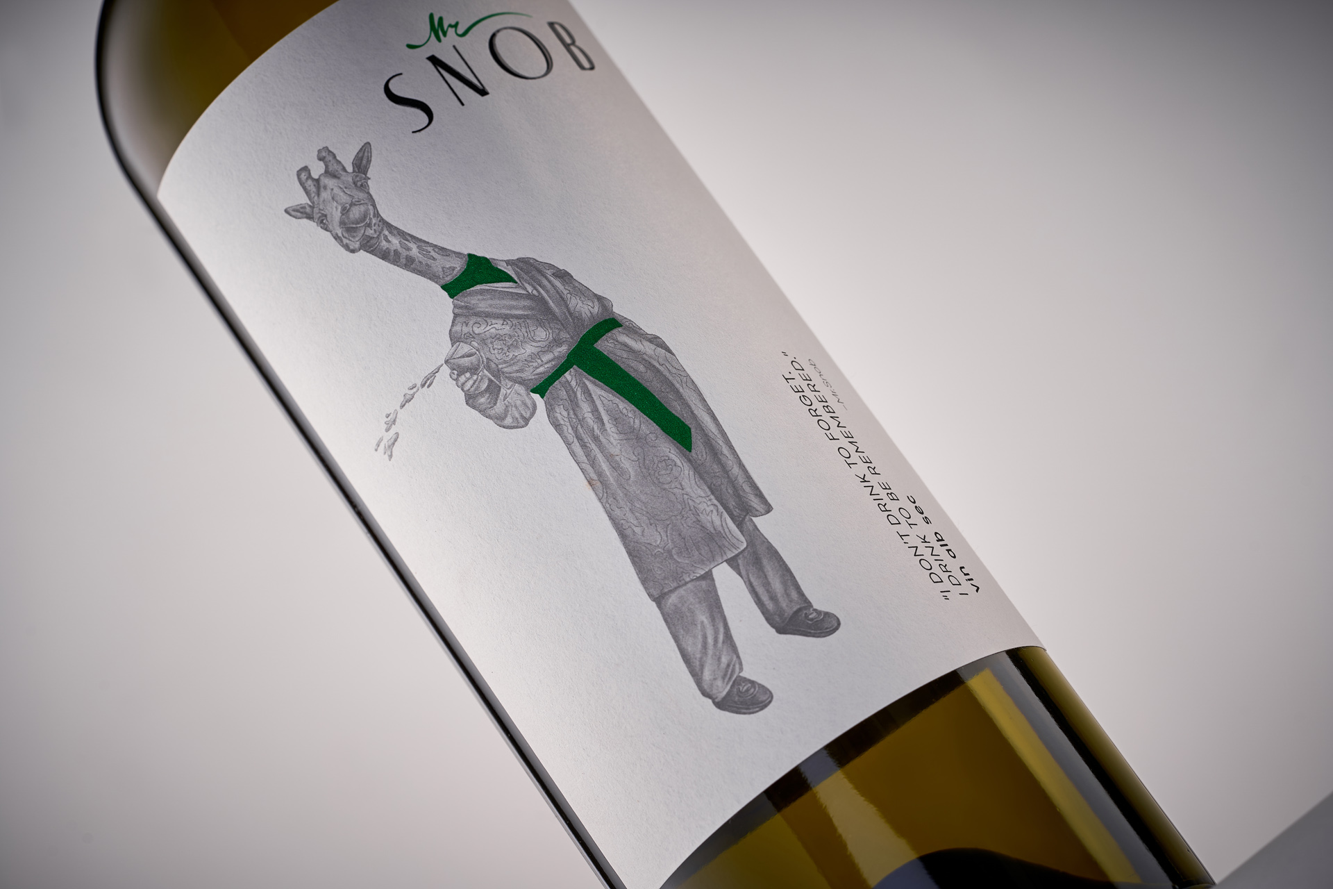
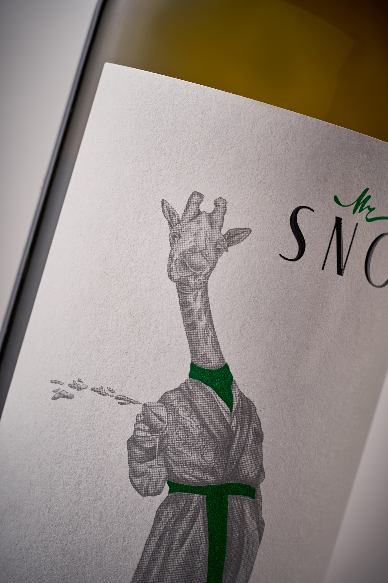
Snob by Vinum is a wine series built on irony, ease and a conscious rejection of unnecessary seriousness. It is a project that questions the idea of wine as something that must always be complex, ceremonial or intellectually demanding.
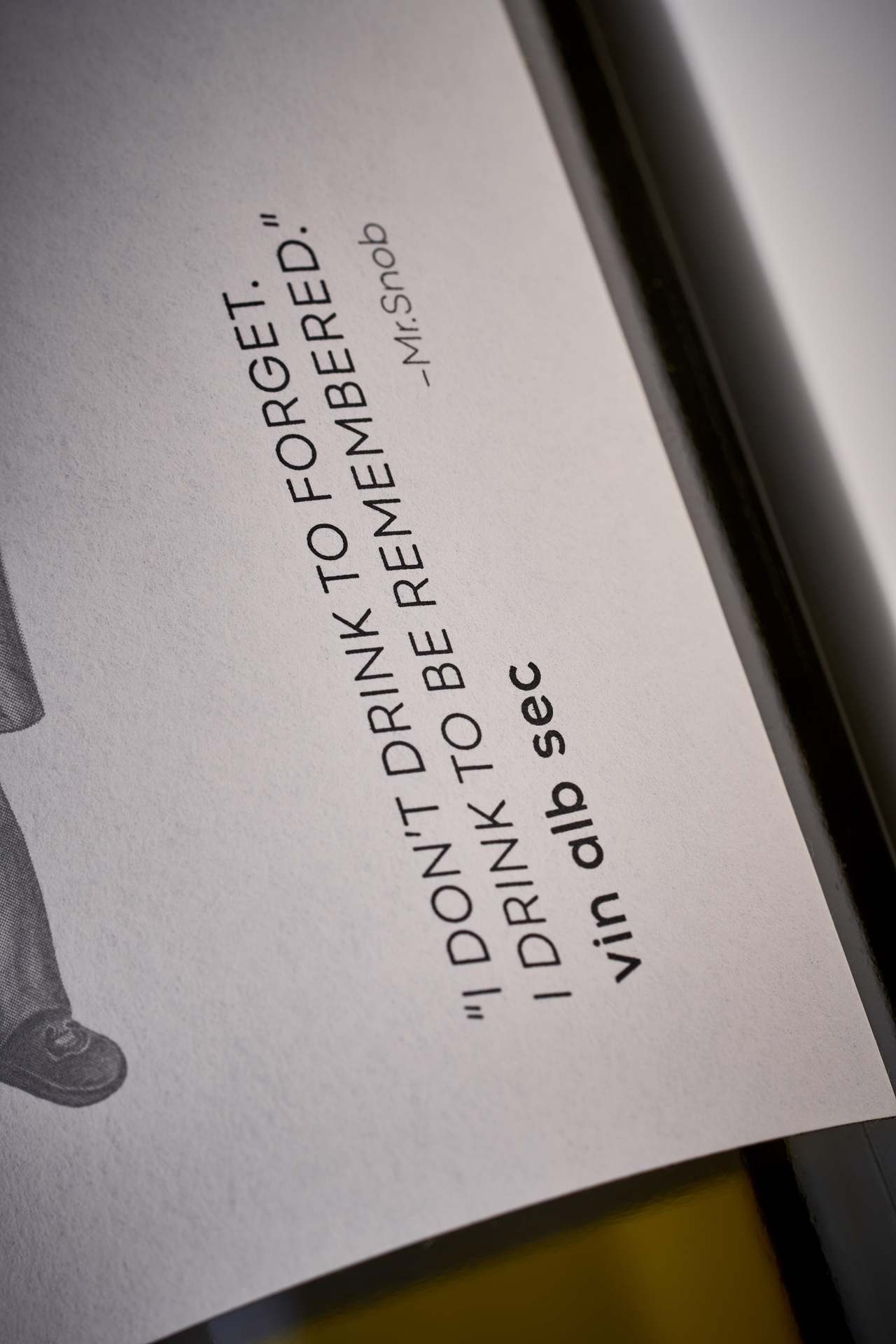
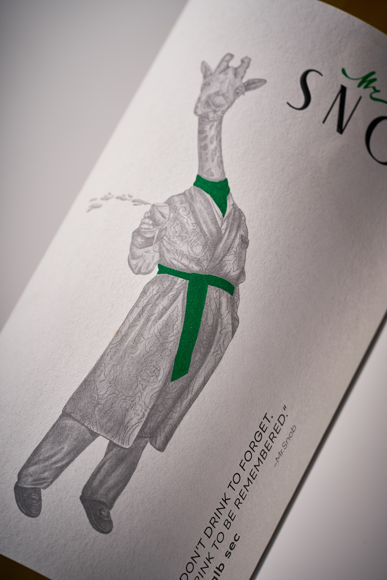
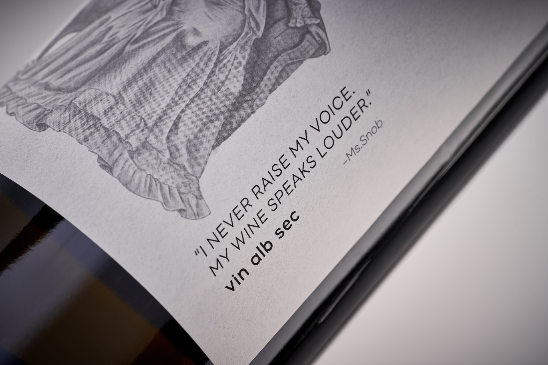
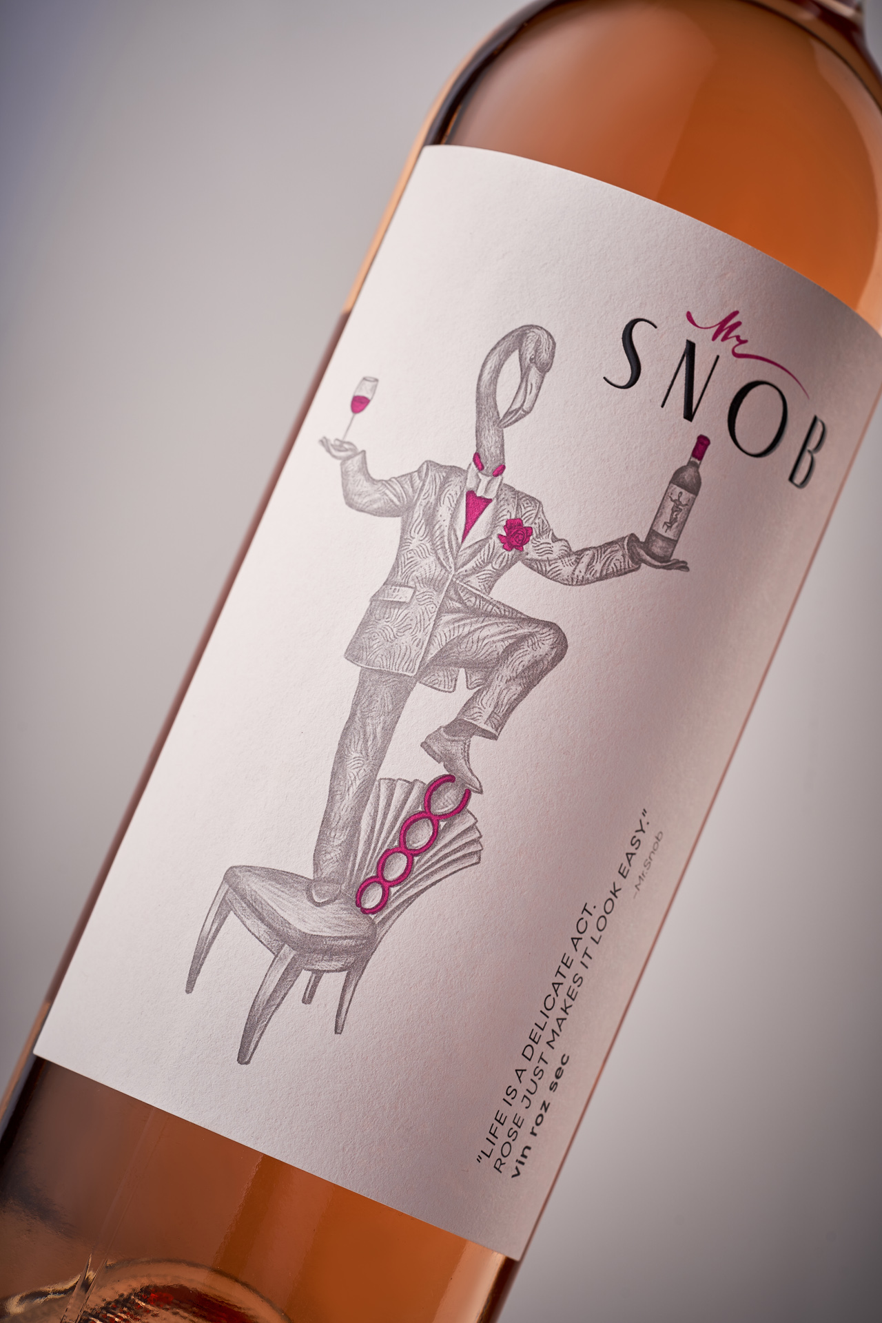
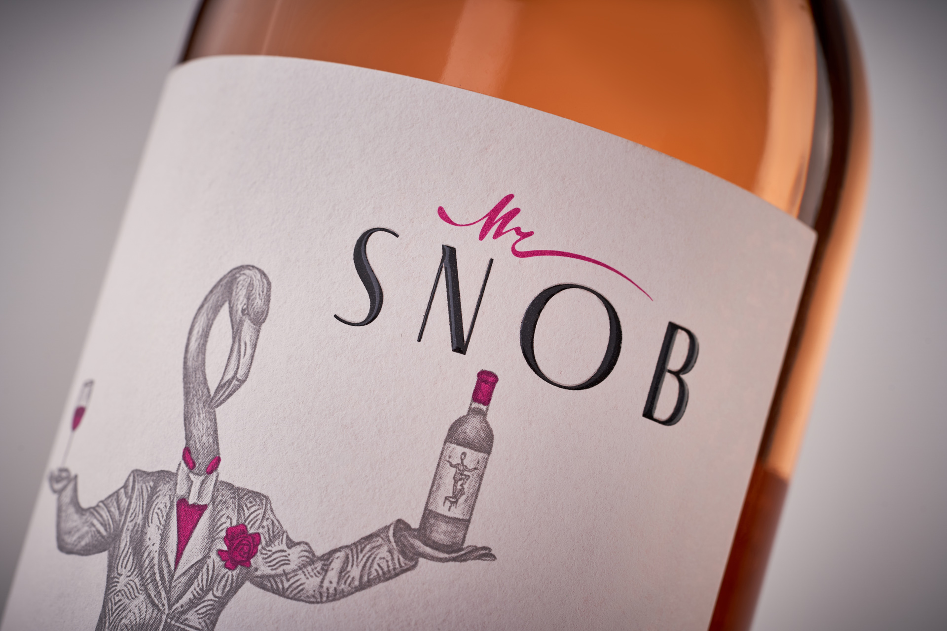
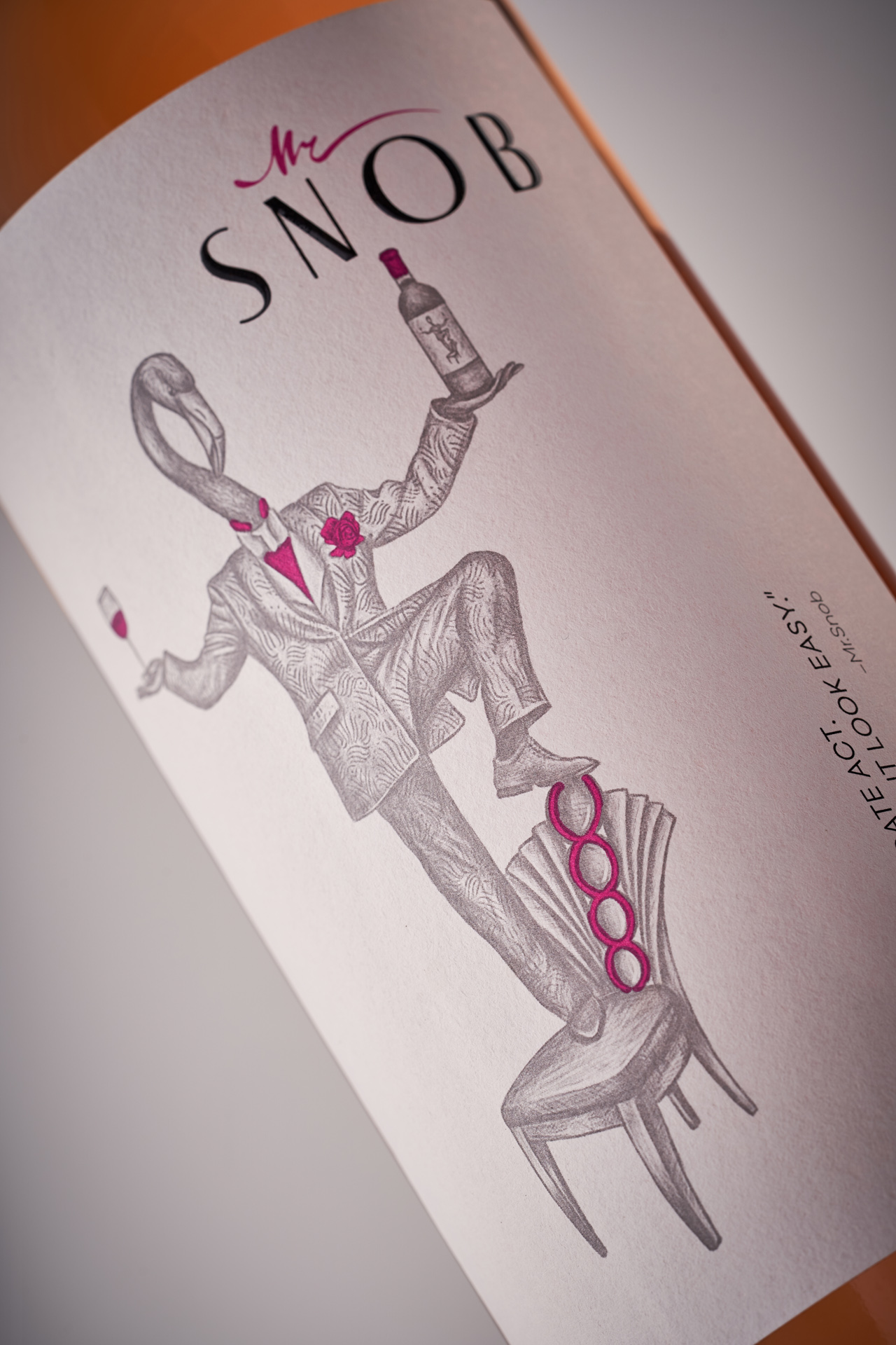
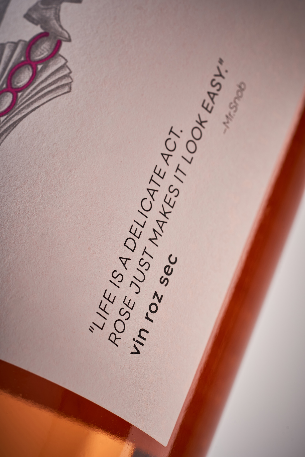
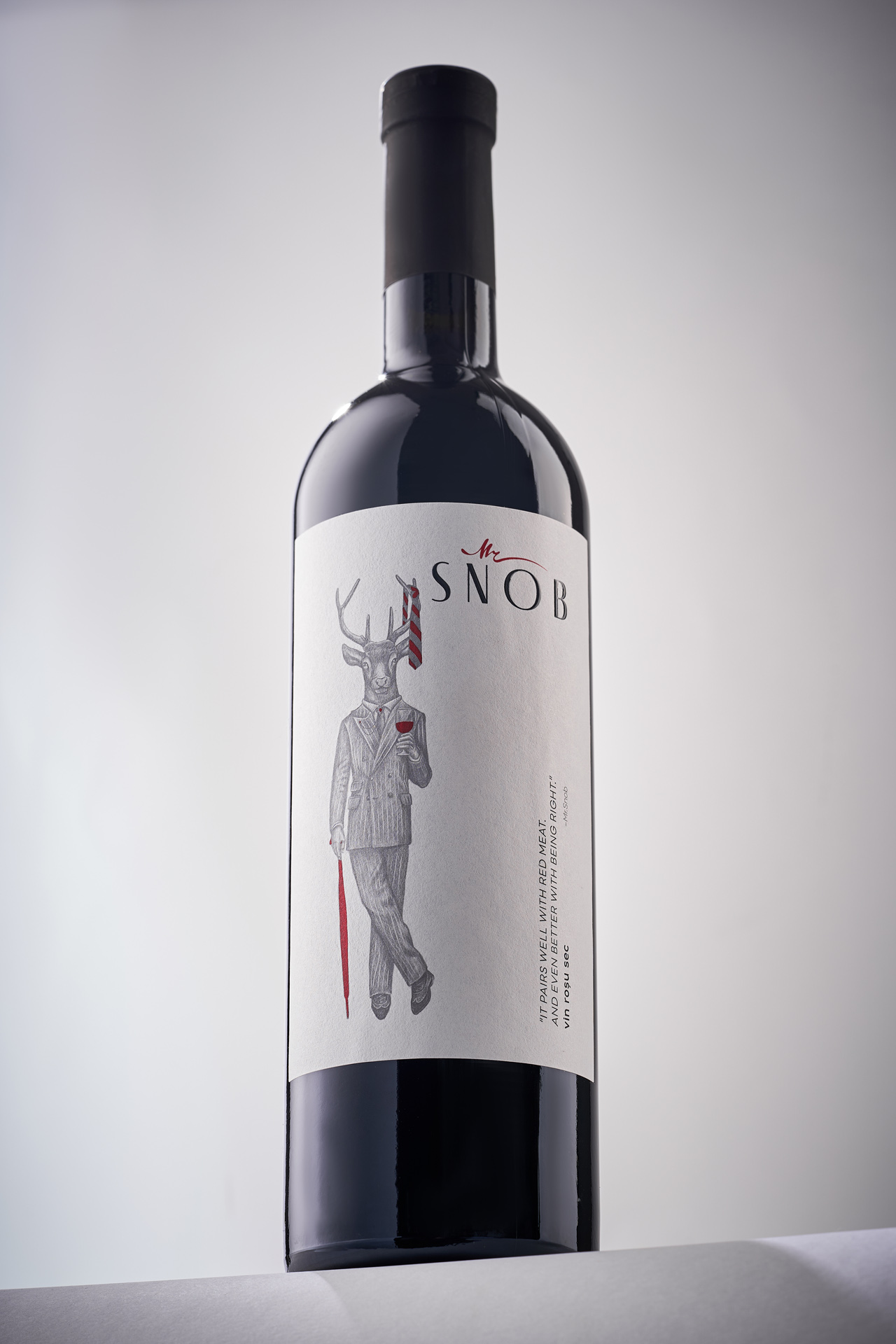
The name Snob is deliberately provocative. It plays with the stereotype of wine elitism, dense terminology and the constant pursuit of hidden meanings. Instead of reinforcing these ideas, the series does the opposite. It invites the drinker to relax, to enjoy the moment and to engage with wine in a more intuitive and emotional way.
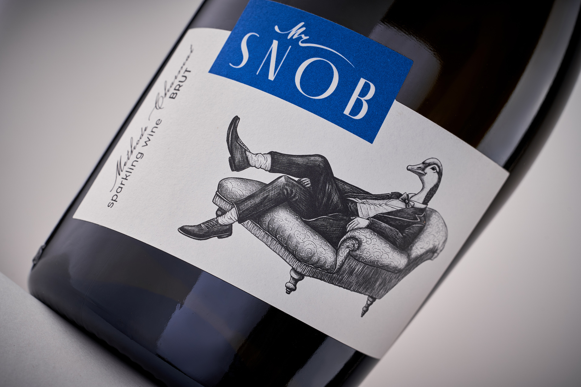
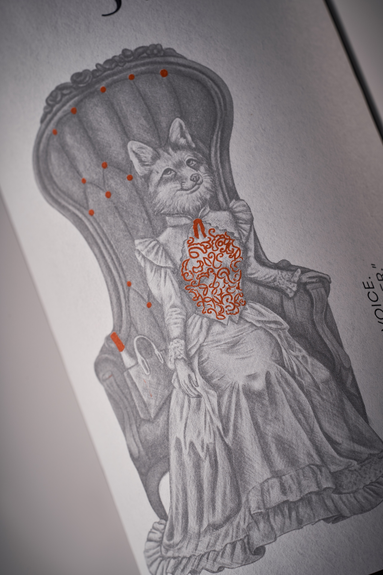
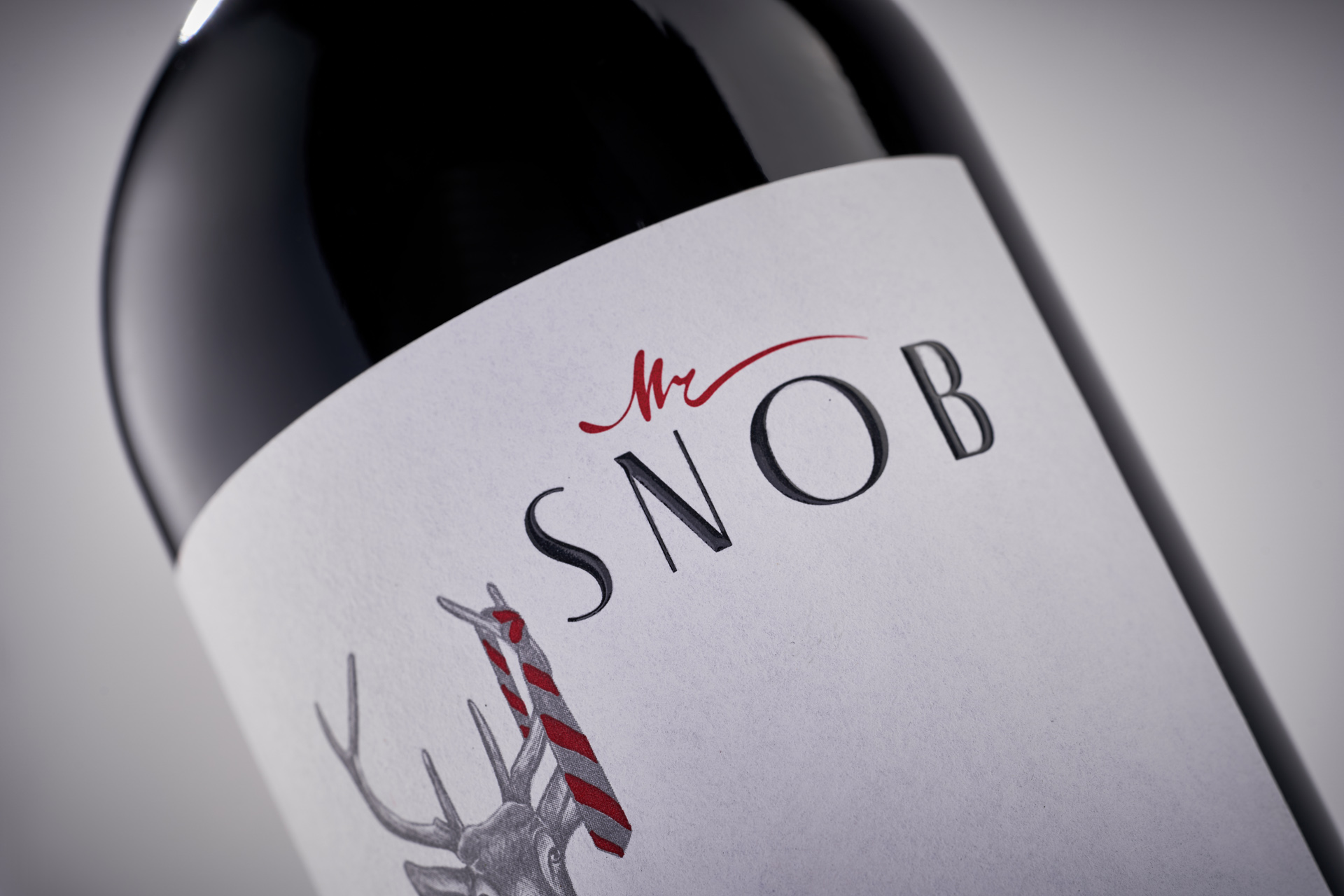
The visual concept follows the same philosophy. Anthropomorphic animal illustrations become the central element of the labels, bringing humor, personality and a touch of playfulness into the design. These characters create an immediate emotional connection and remove the distance often associated with wine packaging.
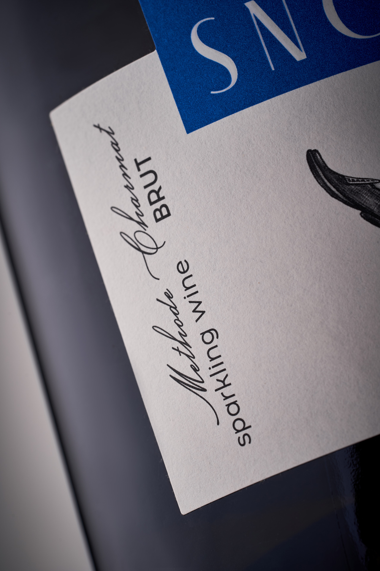
The composition remains minimal and clean, allowing the illustrations to speak clearly. Color accents help differentiate the wines within the range while maintaining visual coherence across the series.
Snob is not about proving knowledge or status. It is about everyday pleasure, spontaneous moments and wines that feel approachable, honest and alive.