- 2025
process
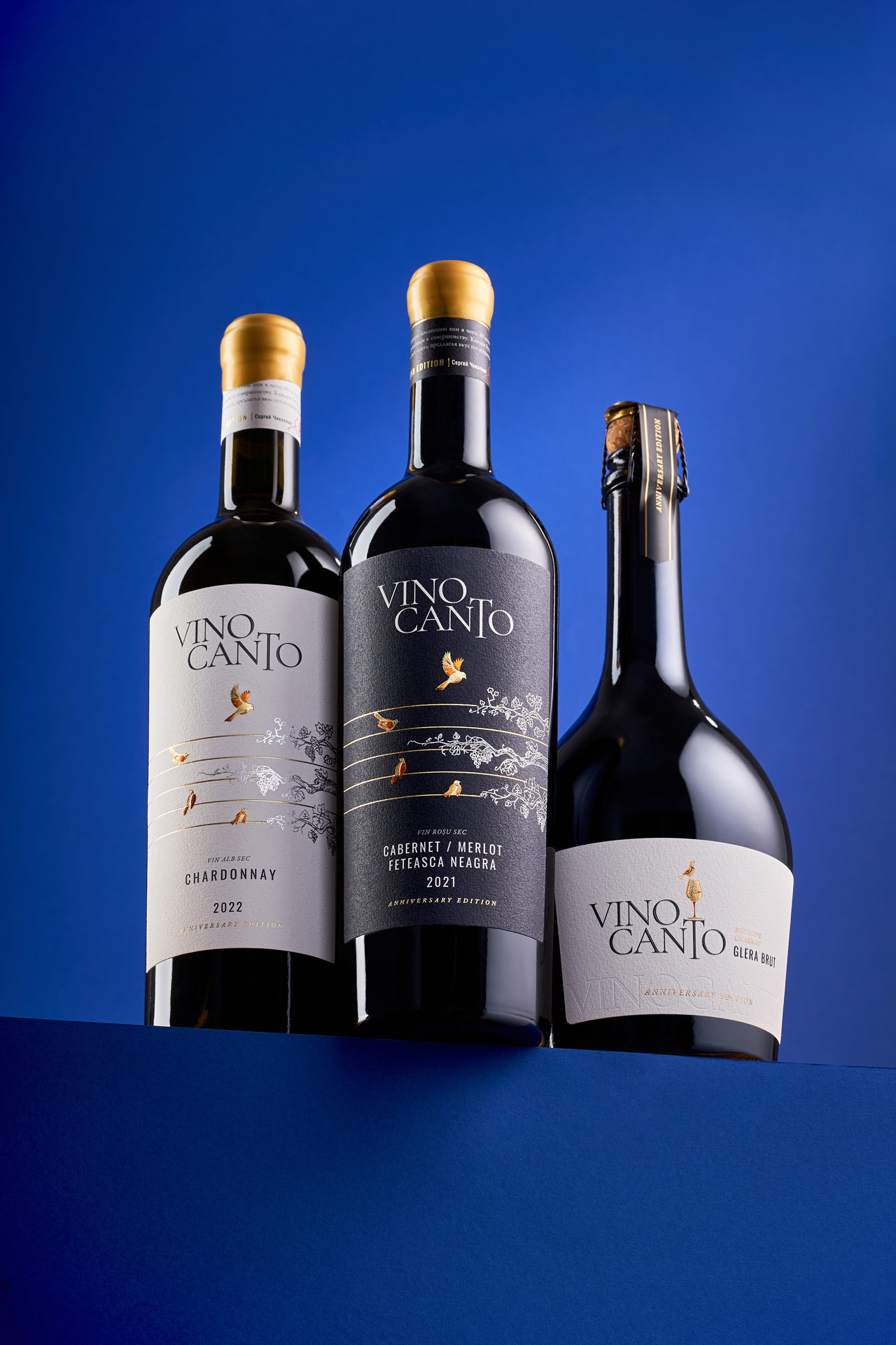
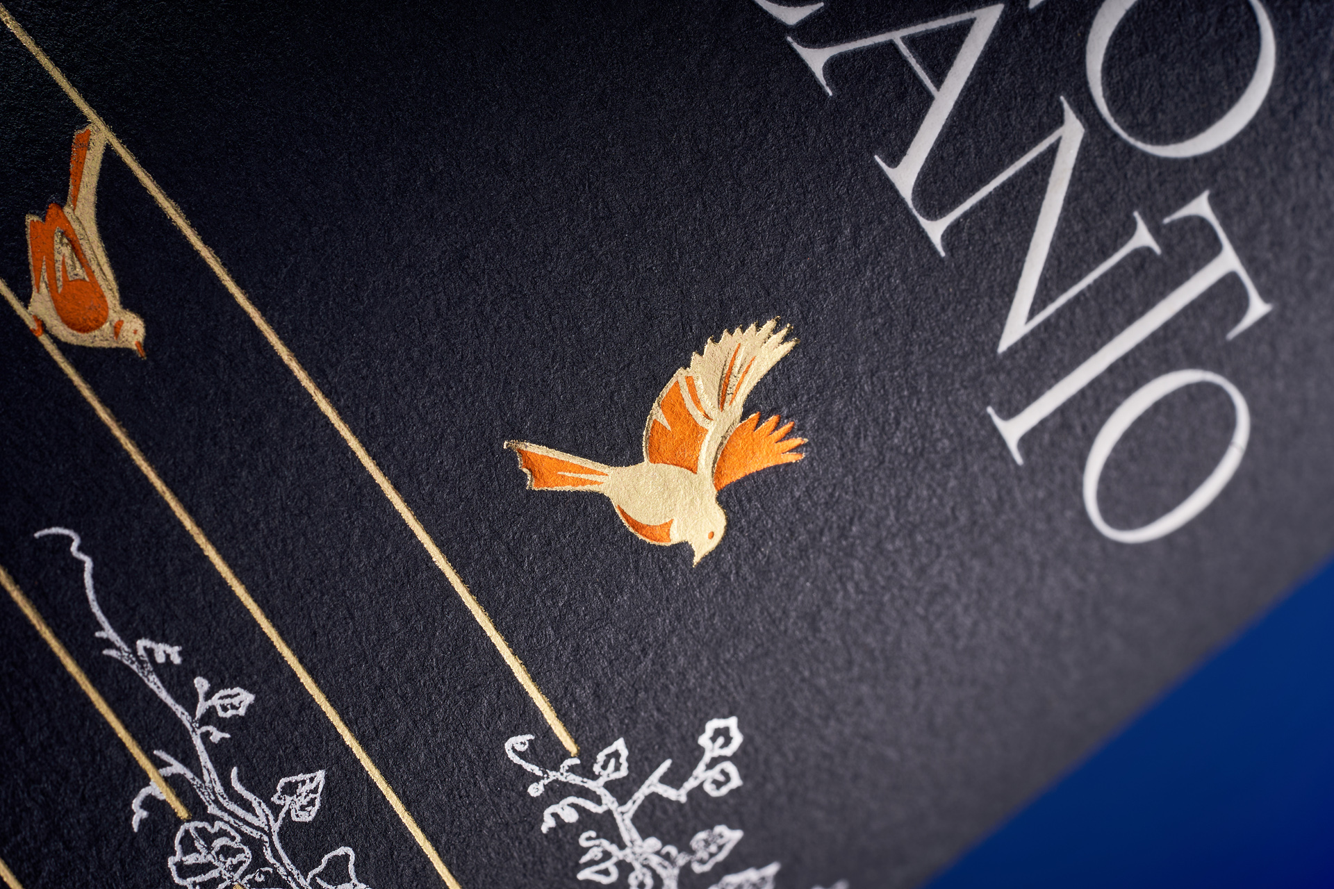
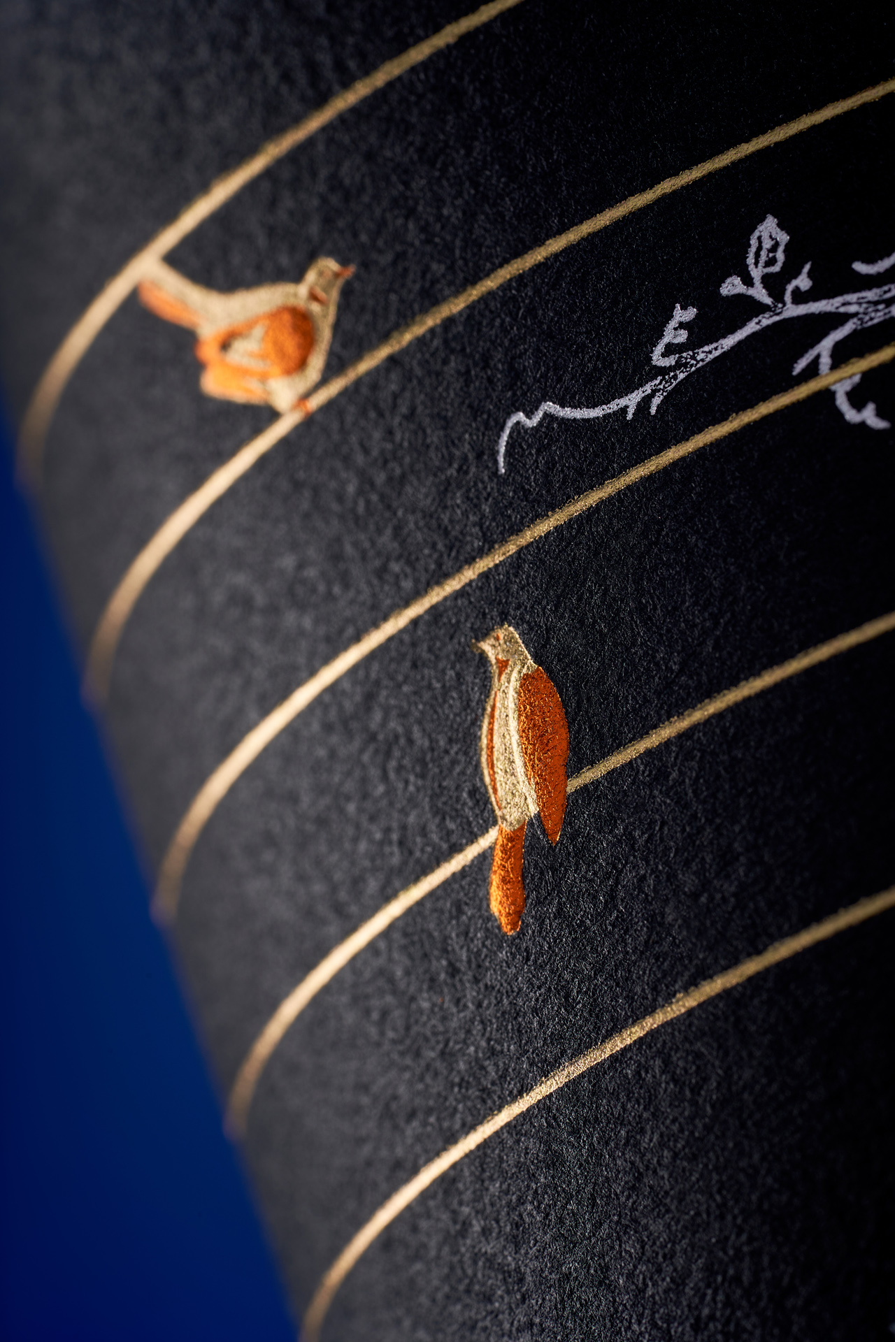
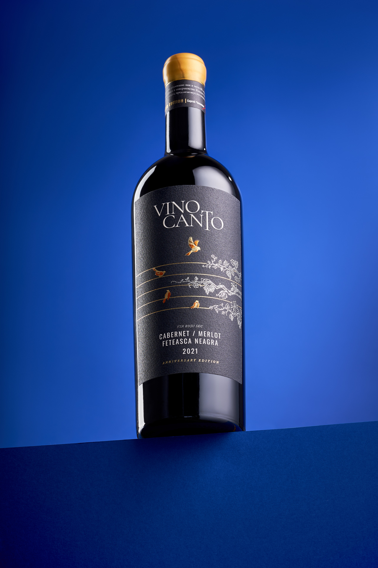
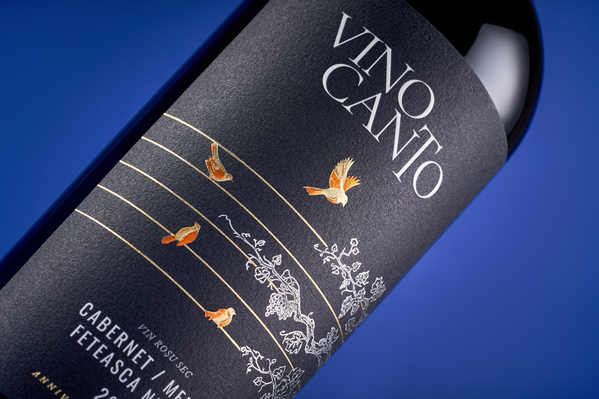
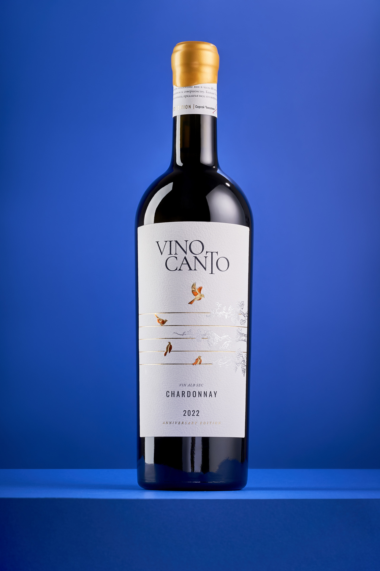
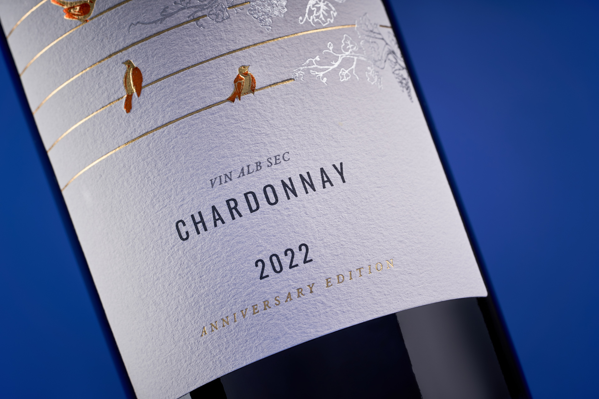
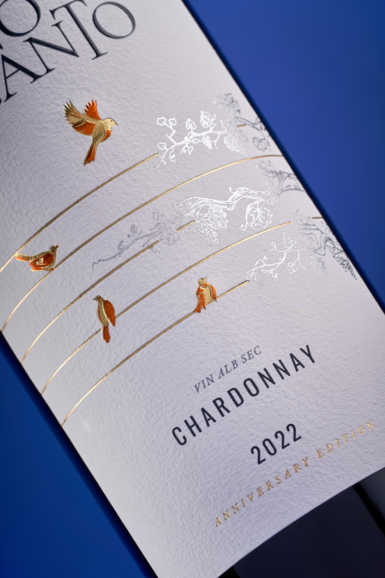
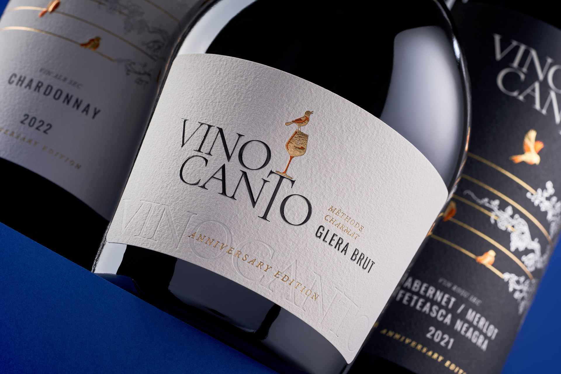
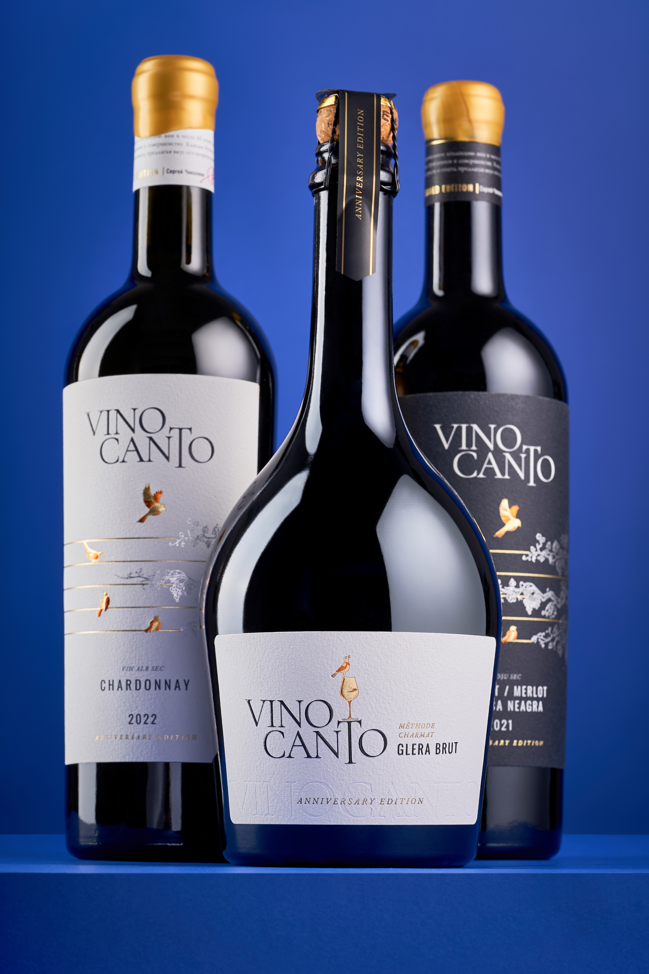
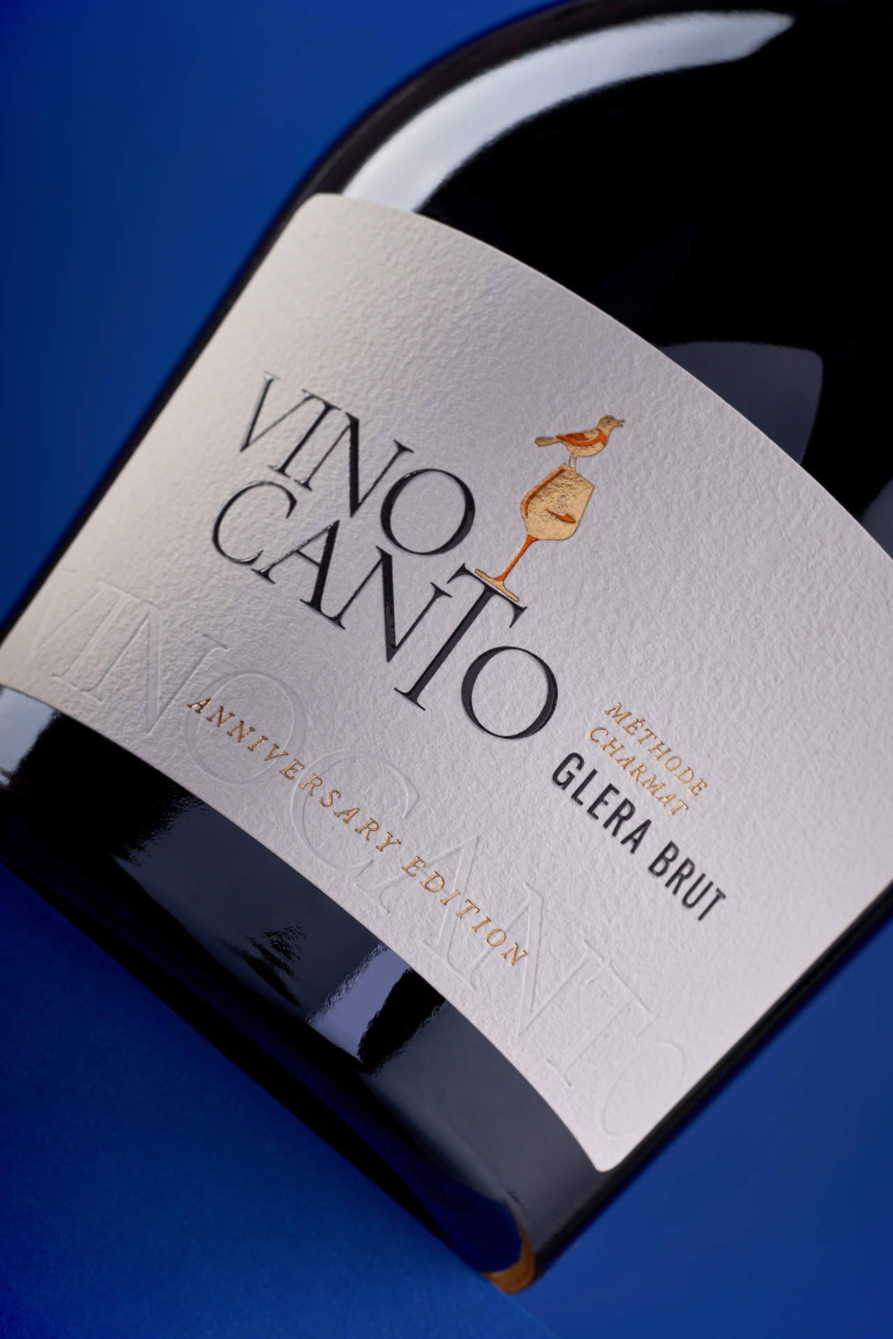
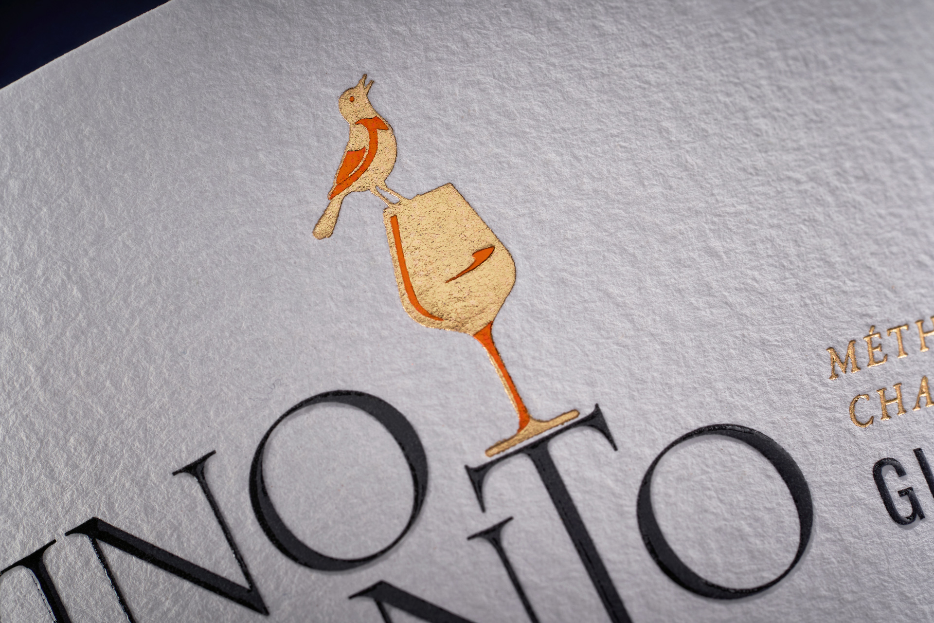
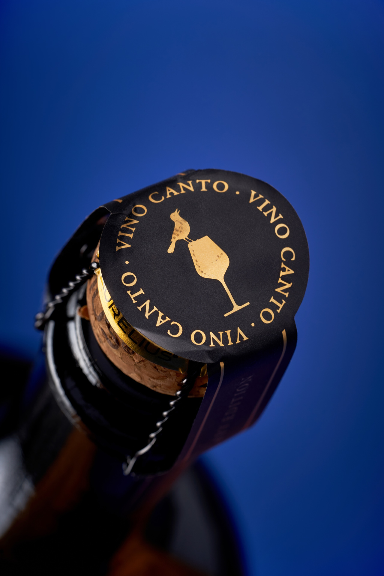
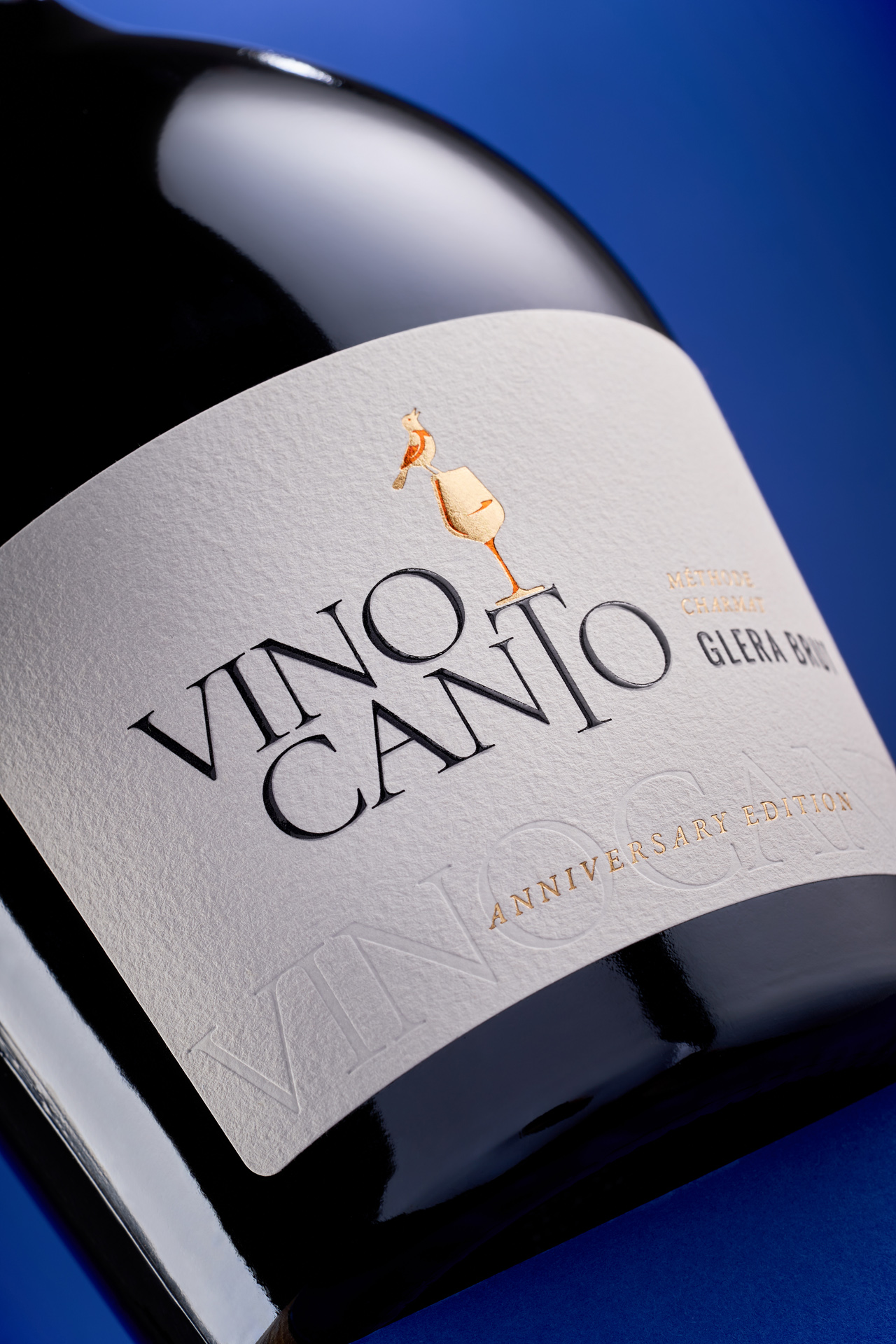
Vino Canto is a private label project created in collaboration with the local printing house Financial Papers, built around a simple but poetic idea: wine as a song. The name itself suggests rhythm, voice and emotion, yet instead of illustrating musical instruments or literal motifs, the studio chose a more subtle metaphor. The central symbol became a singing bird - a light, expressive figure that captures the idea of sound turning into movement and mood.
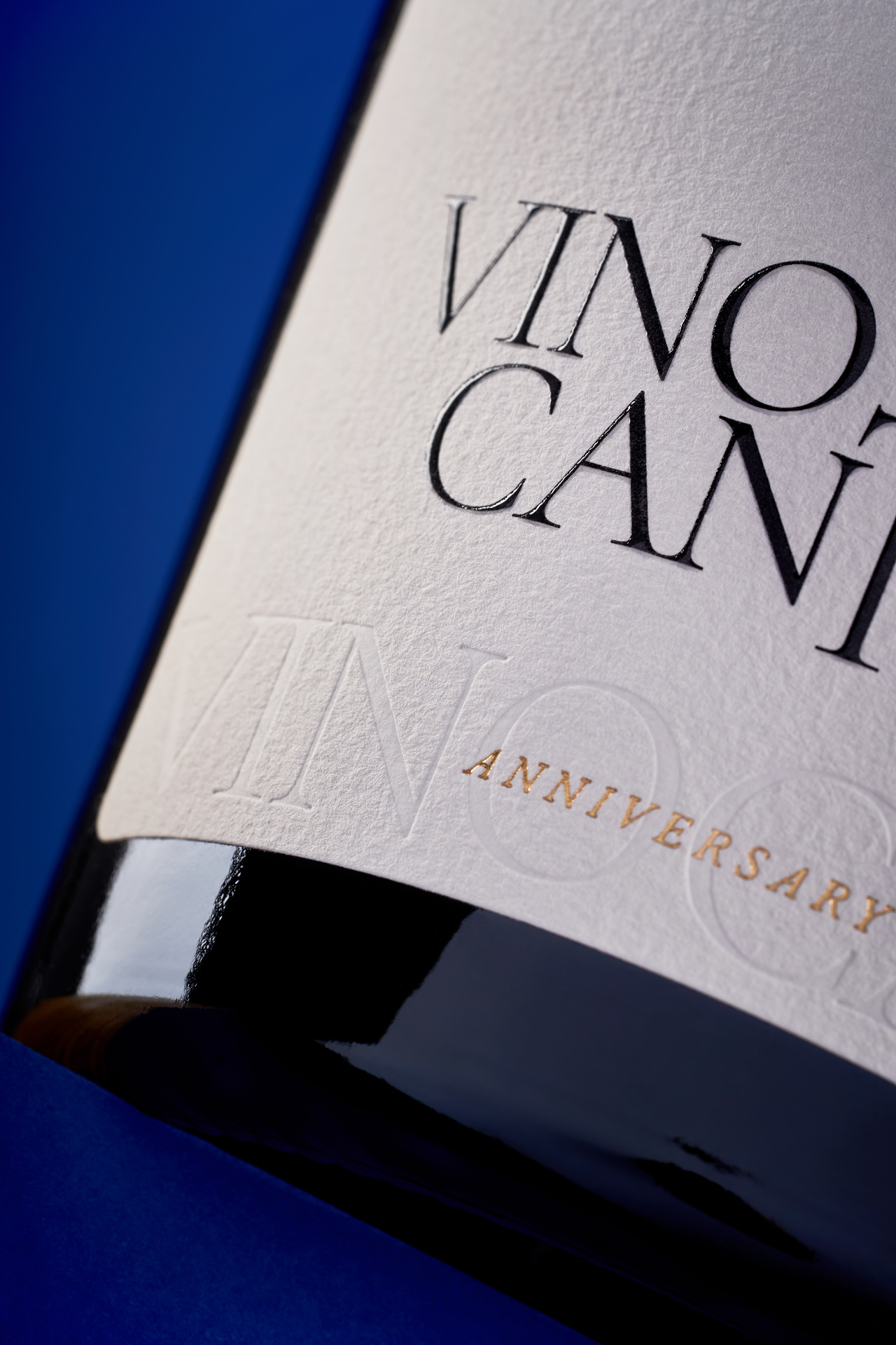
The visual solution is intentionally minimal, allowing the concept to speak through form rather than complexity. The bird illustration becomes the anchor of the design, while the clean layout and restrained accents create a sense of quiet elegance. The collection includes two still wines and one sparkling, and the label system ensures they feel connected yet distinct. Vino Canto is a gentle, lyrical interpretation of its name - a design where simplicity becomes expression, and every bottle carries its own soft melody.