- 2025
process
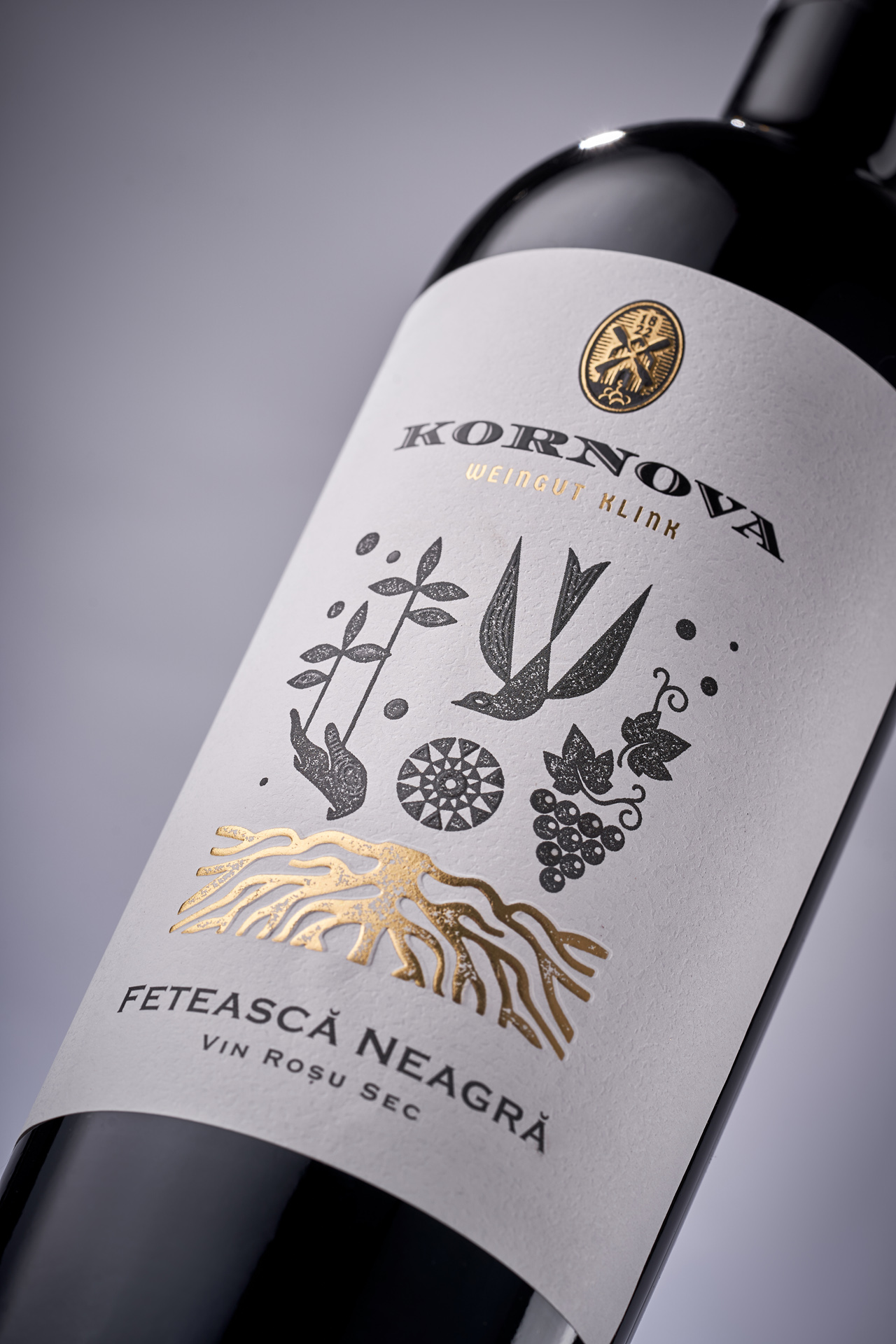
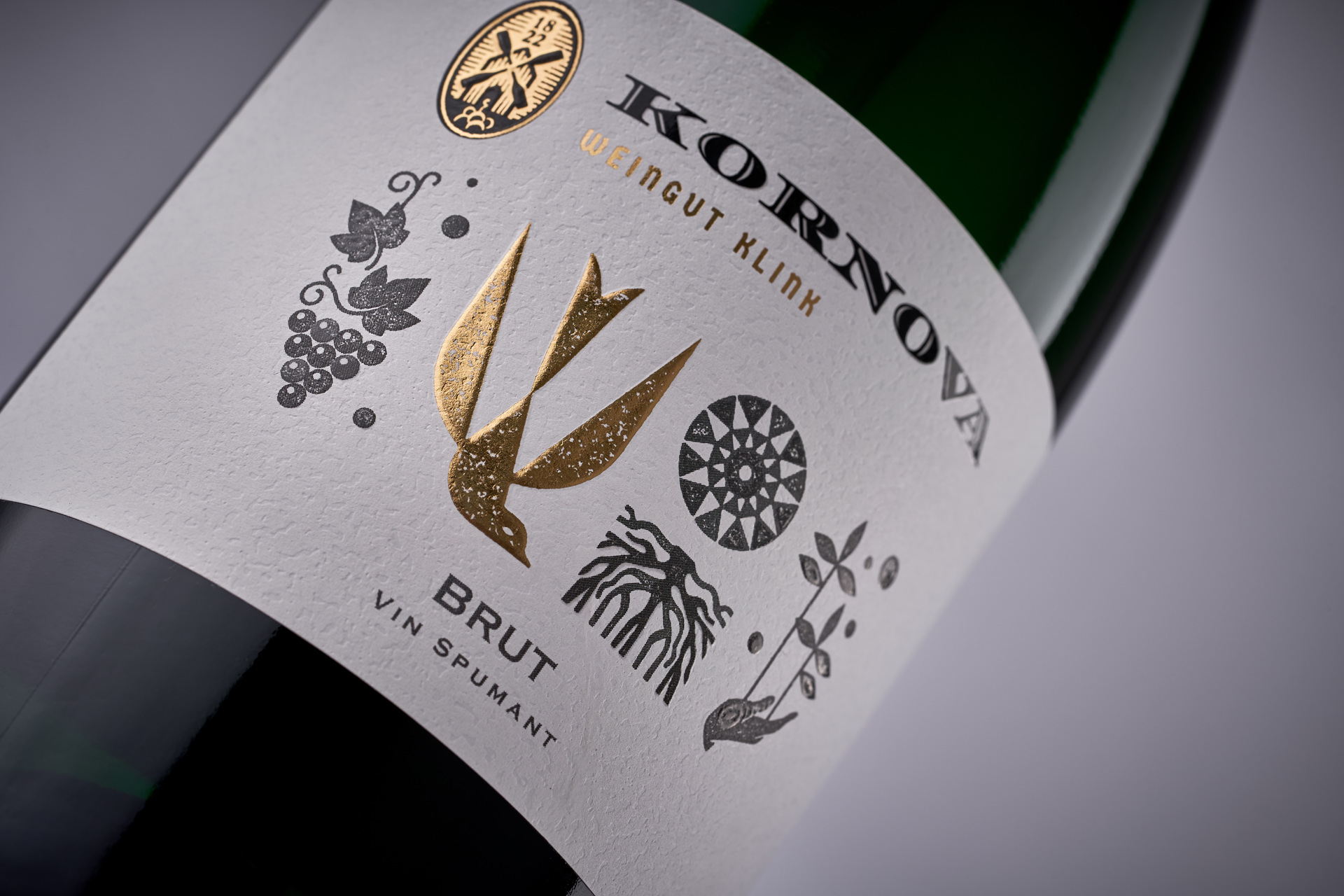
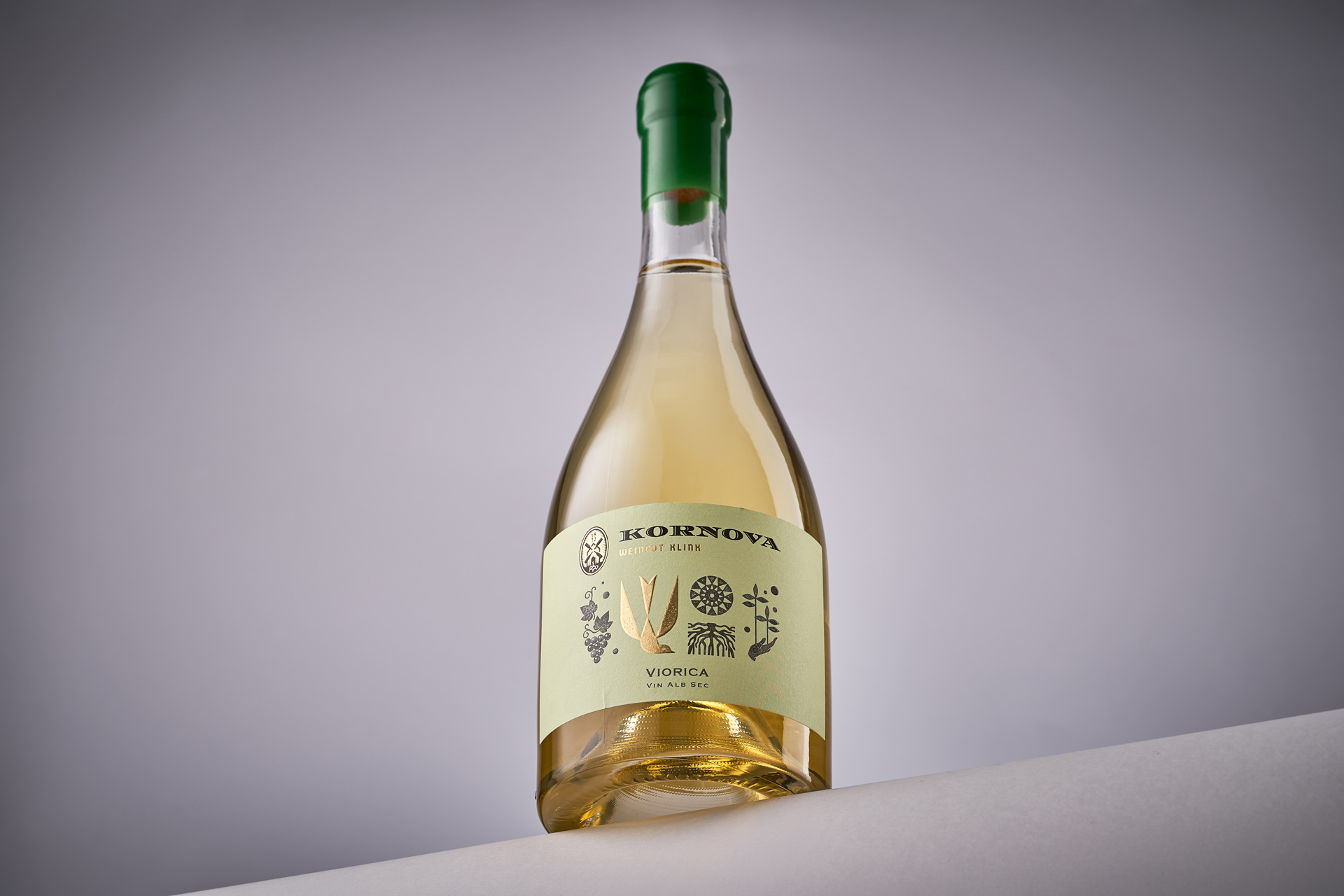
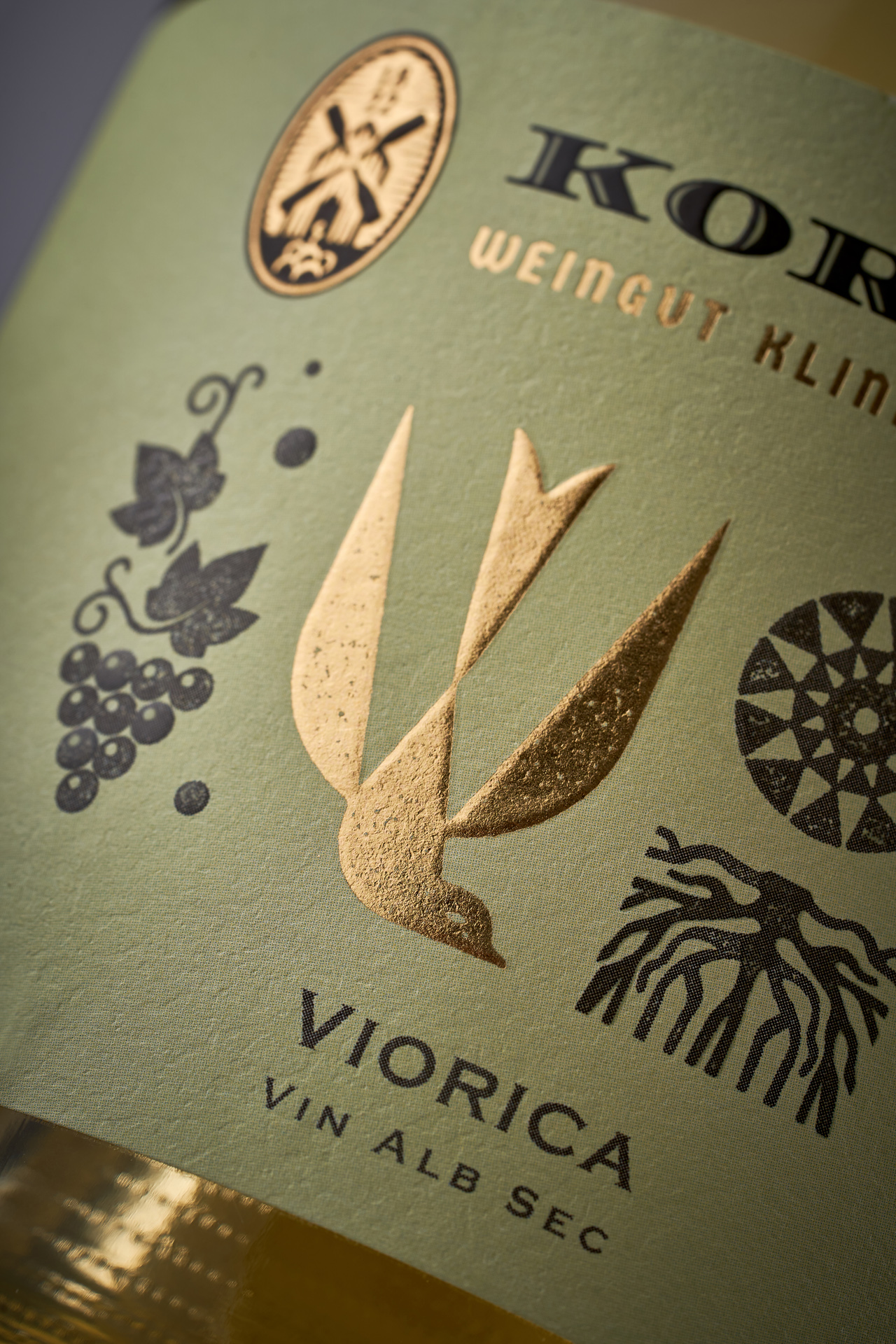
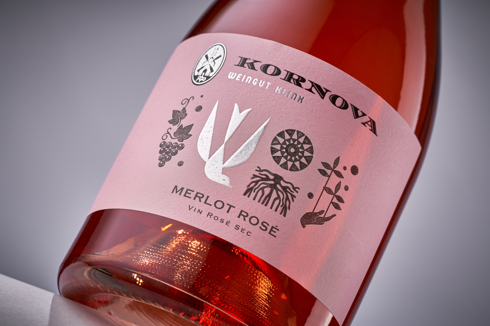
Kornova Weingut is a new Moldovan winery born in the village of Cornova — a place where, long ago, German settlers found a second home. These people brought their winemaking tradition and over generations, their culture merged with the spirit of Moldova, forming a unique local identity. The challenge was to craft a visual language that honors this cultural synthesis — not through decorative ethnography, but through refined symbolism and clean modern aesthetics.
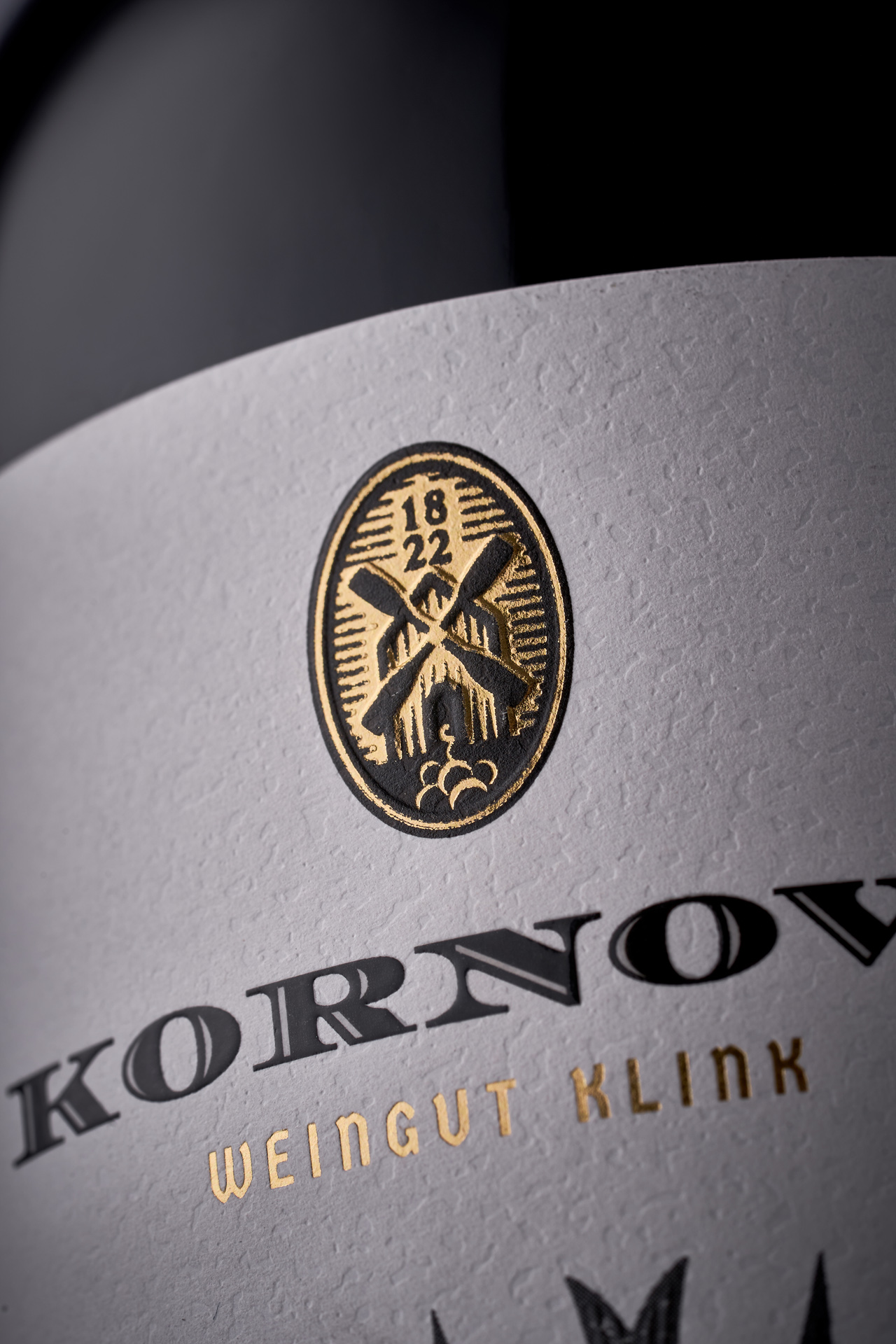
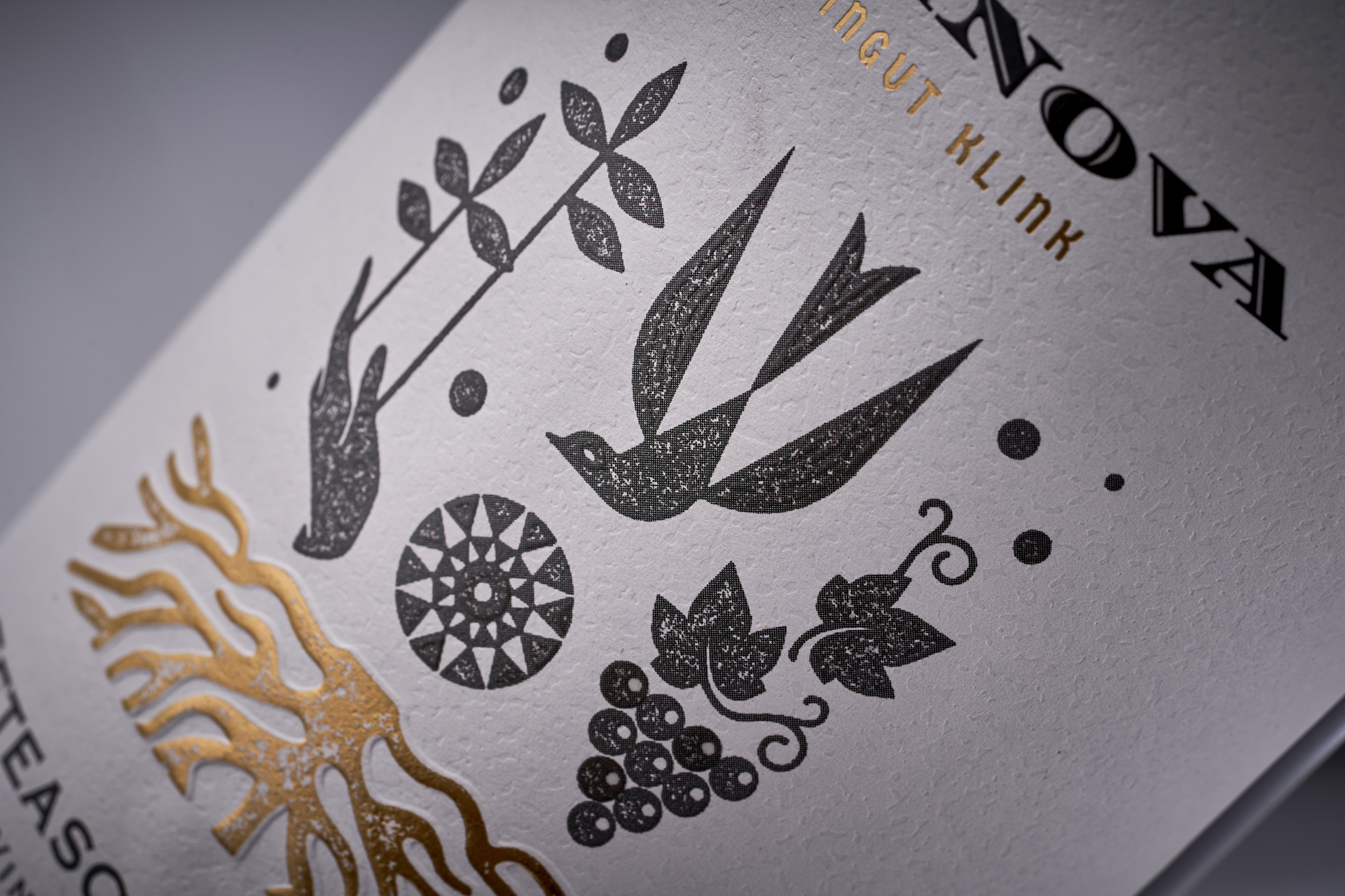
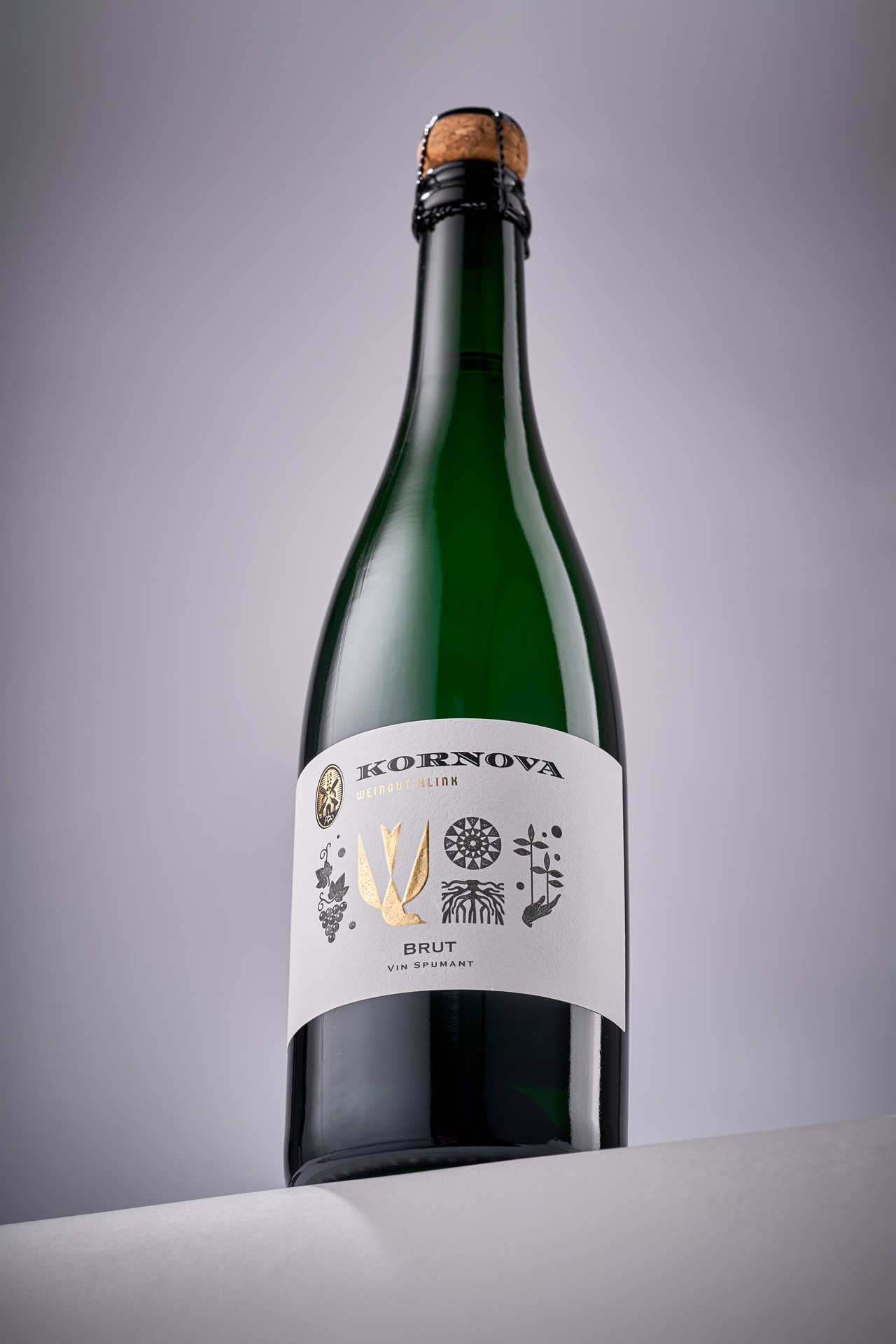
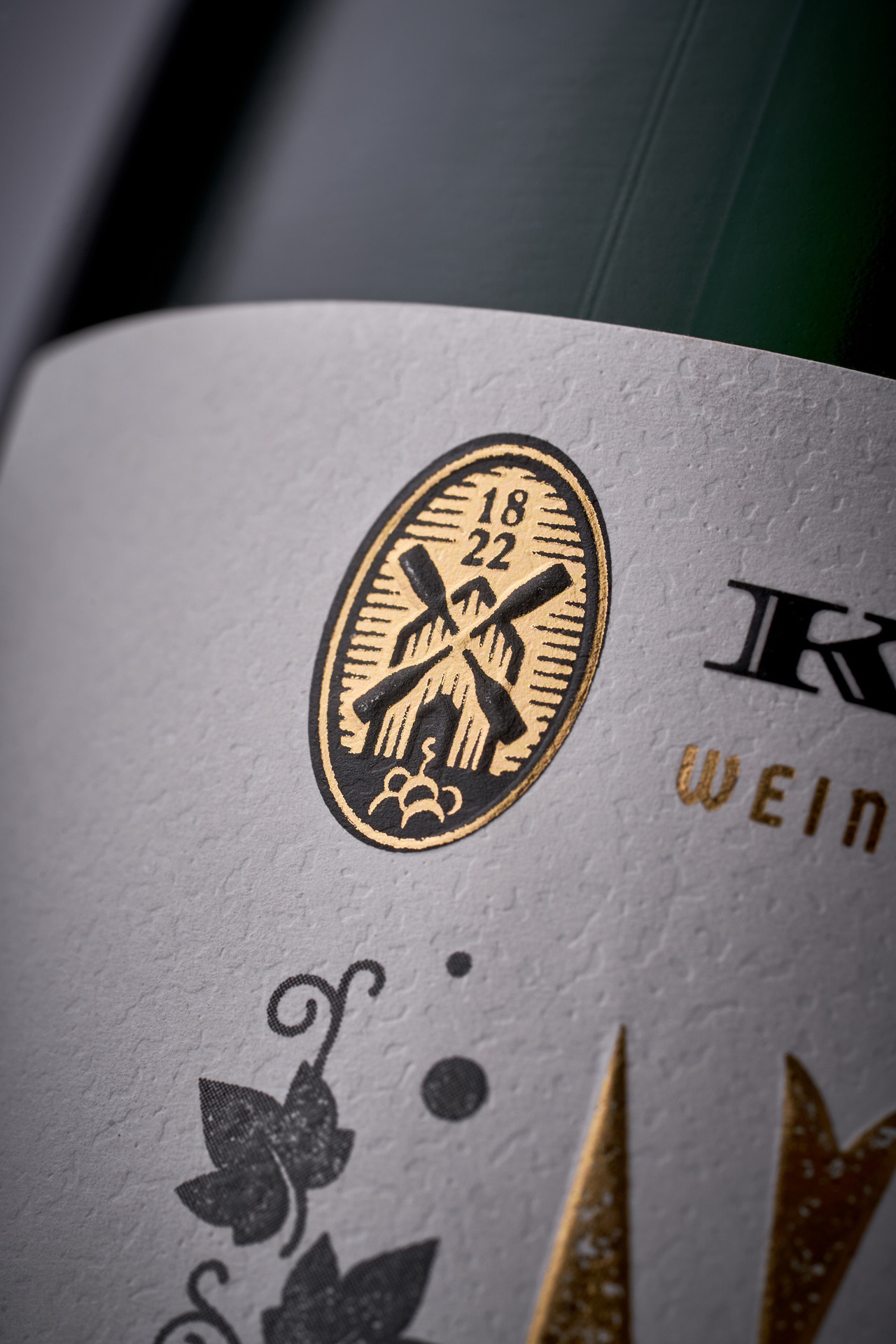
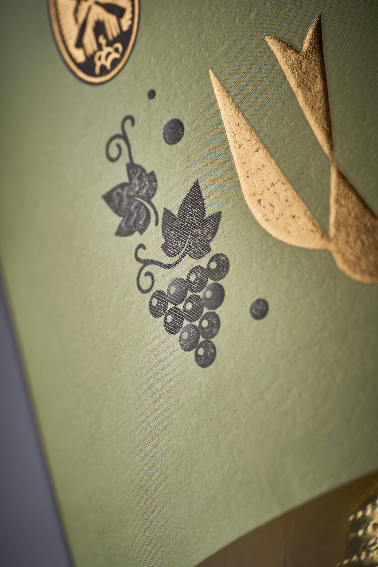
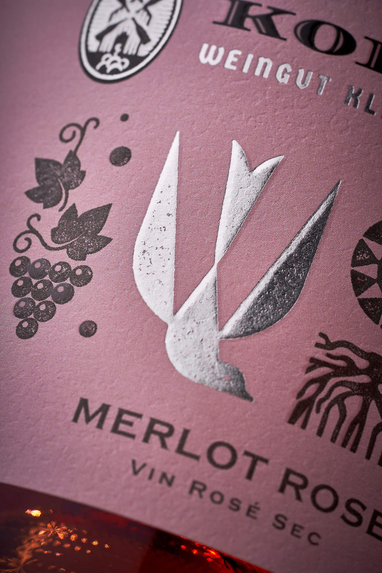
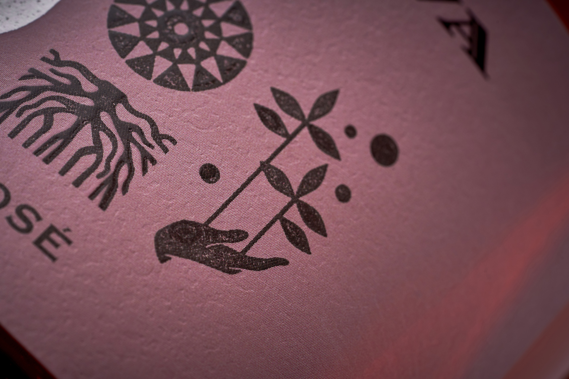
Our studio created a label system inspired by traditional woodcarving from the region. Rather than using literal motifs, we abstracted them into a modern symbolic alphabet — a set of minimalist icons that includes grapevines, regional flora, and ornamental geometry. At the heart of the composition is a bee-eater bird, native to Moldova and treated with gold foil to emphasize its role as a cultural totem. The result is a restrained yet meaningful design that speaks softly but clearly — about heritage, place, and continuity. The system is adaptable across a diverse product line, offering the winery a timeless and consistent brand presence.