- 2025
process
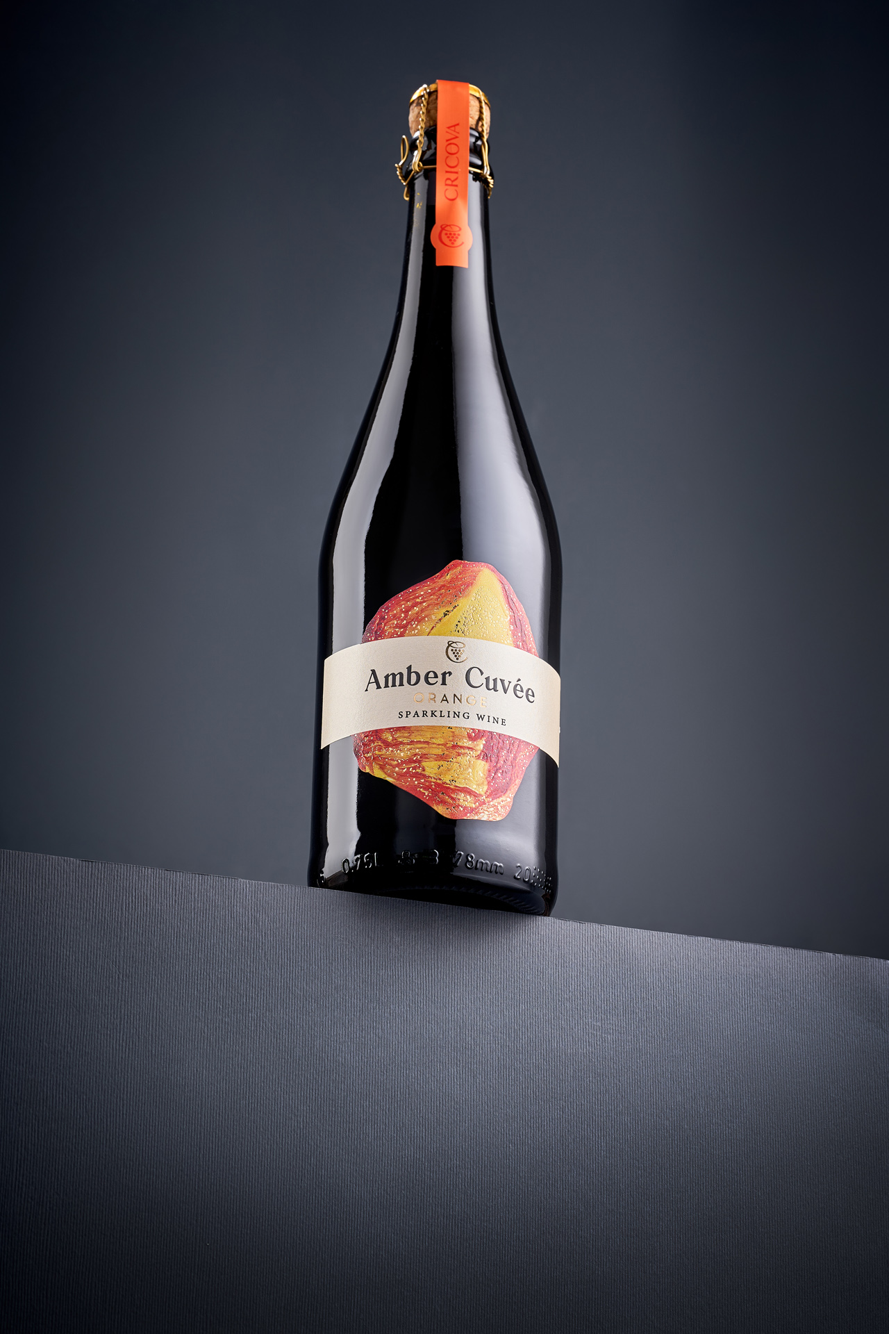
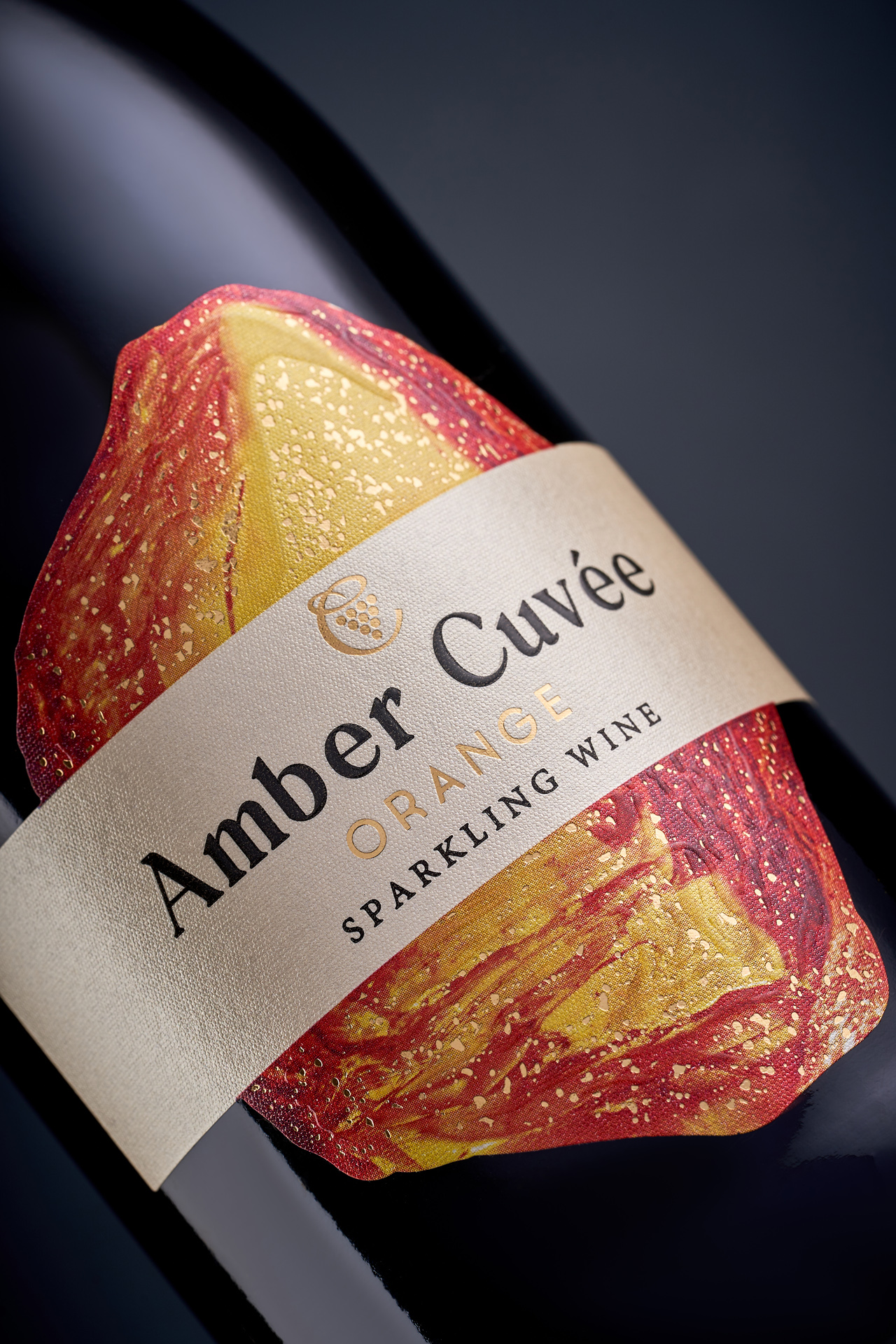
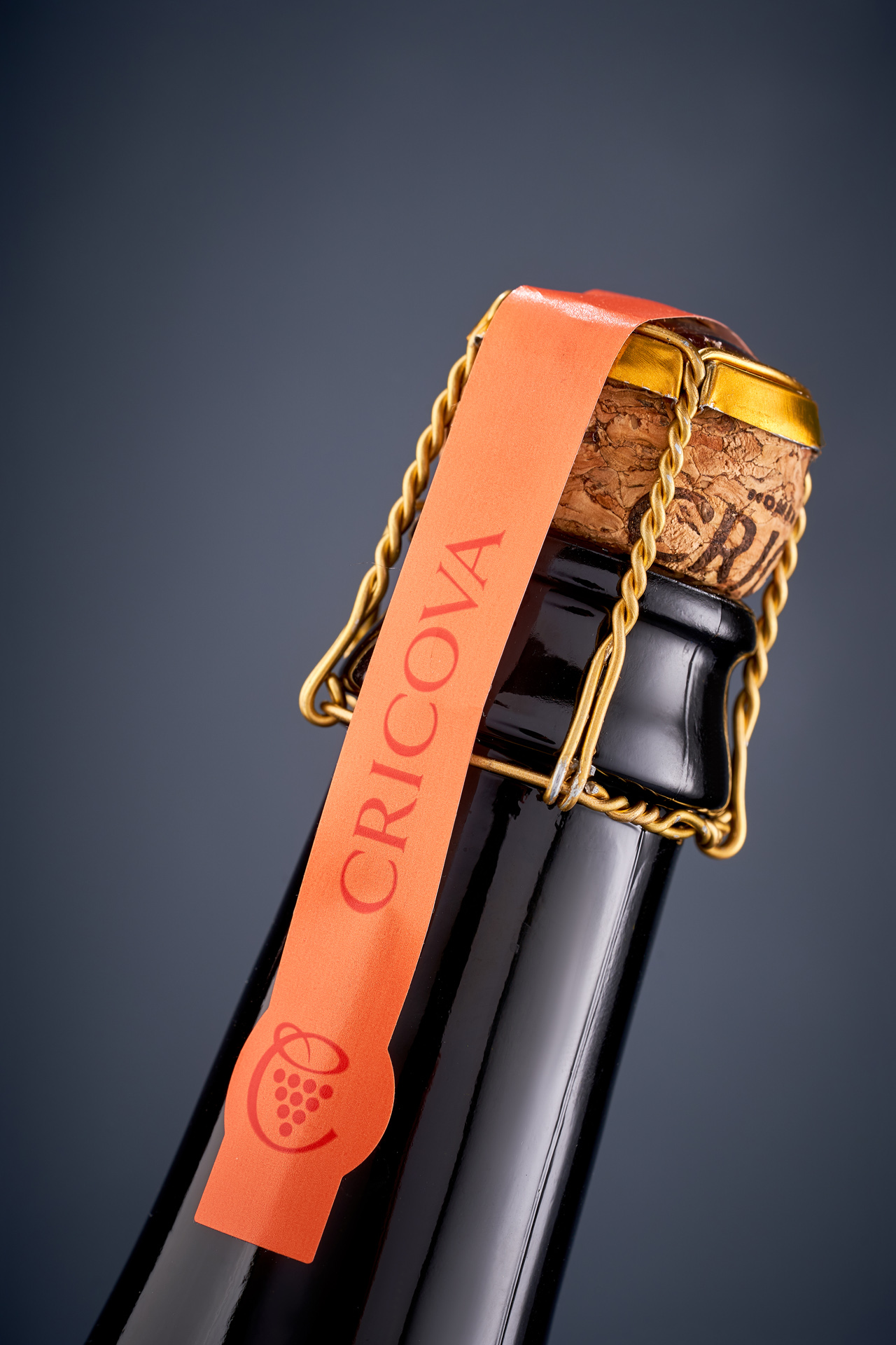
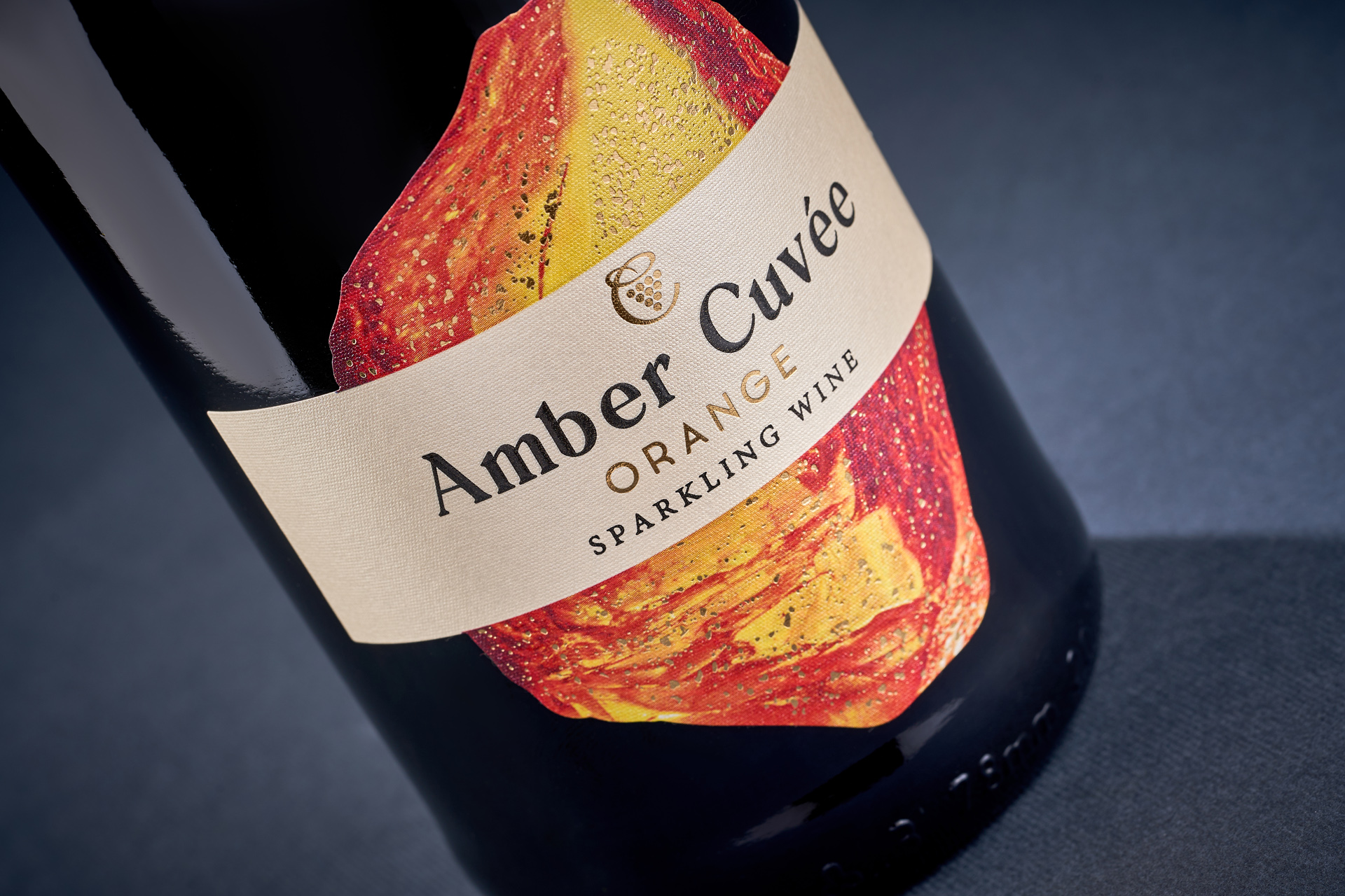
Cricova is one of Moldova’s most iconic wineries, deeply rooted in tradition and widely known for its classic sparkling wines. Introducing an orange sparkling wine — the first of its kind in the winery’s history — marks a bold departure from its usual path. This experimental cuvée, made from skin-contact white grapes, demanded a design language capable of expressing both innovation and authenticity. The task was to find a visual metaphor that could bridge Cricova’s heritage with this forward-thinking release.
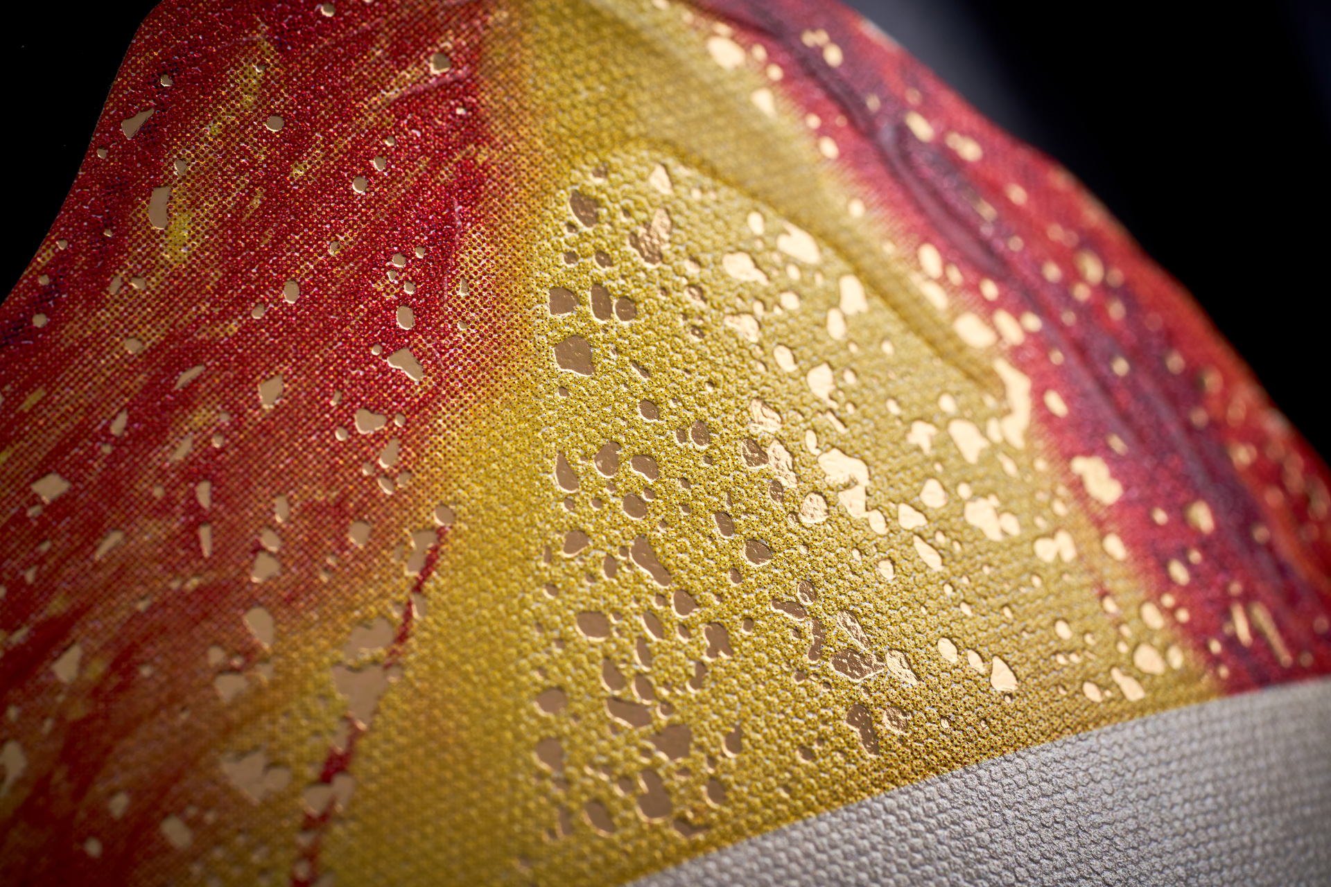
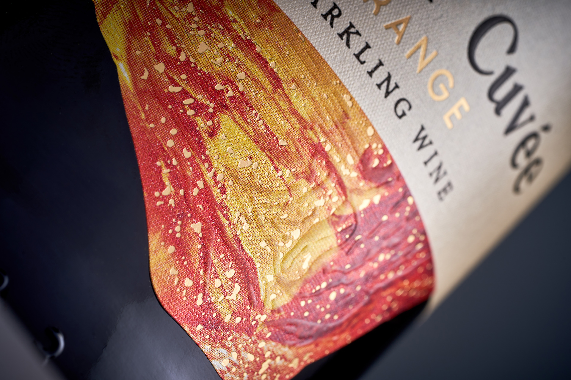
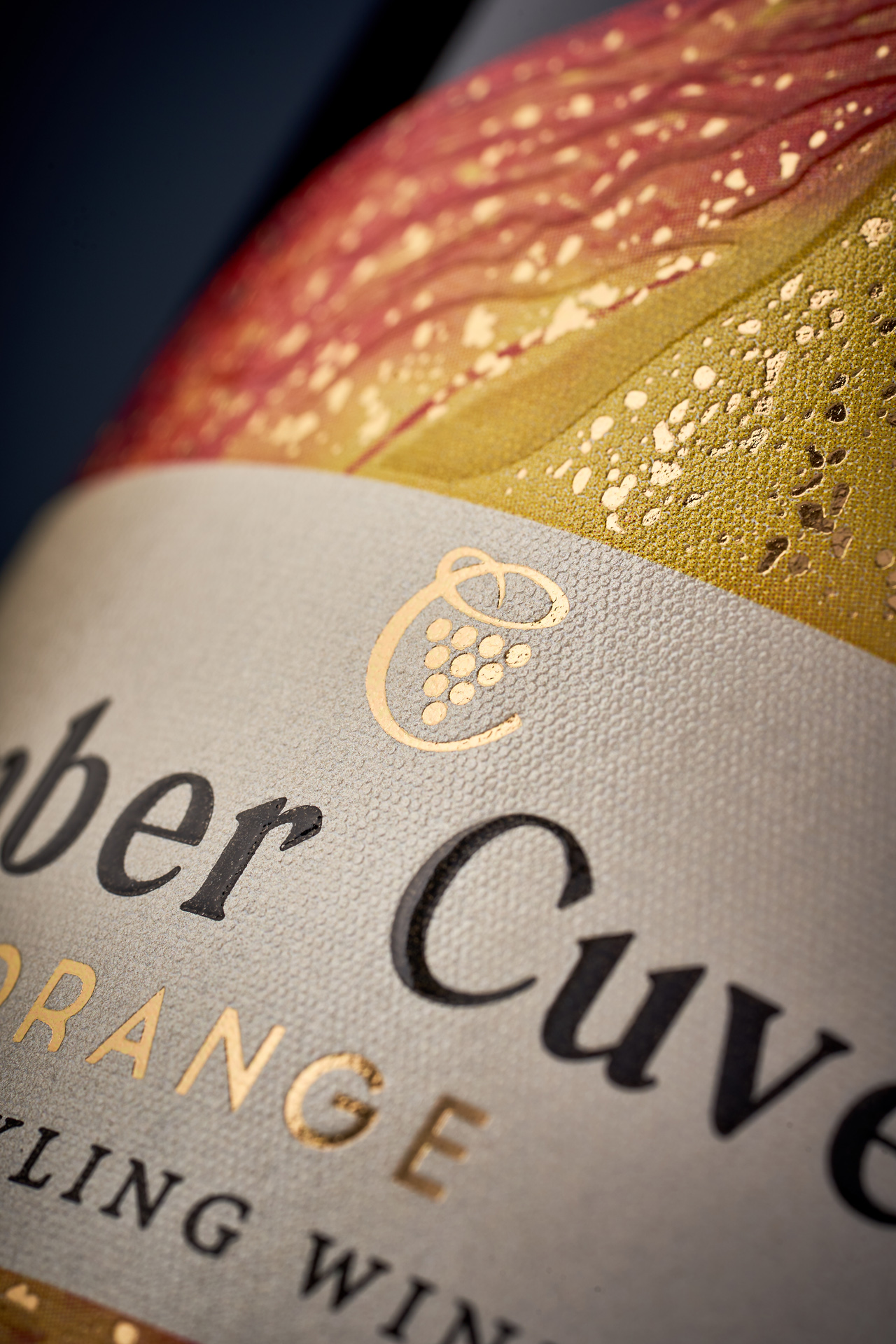
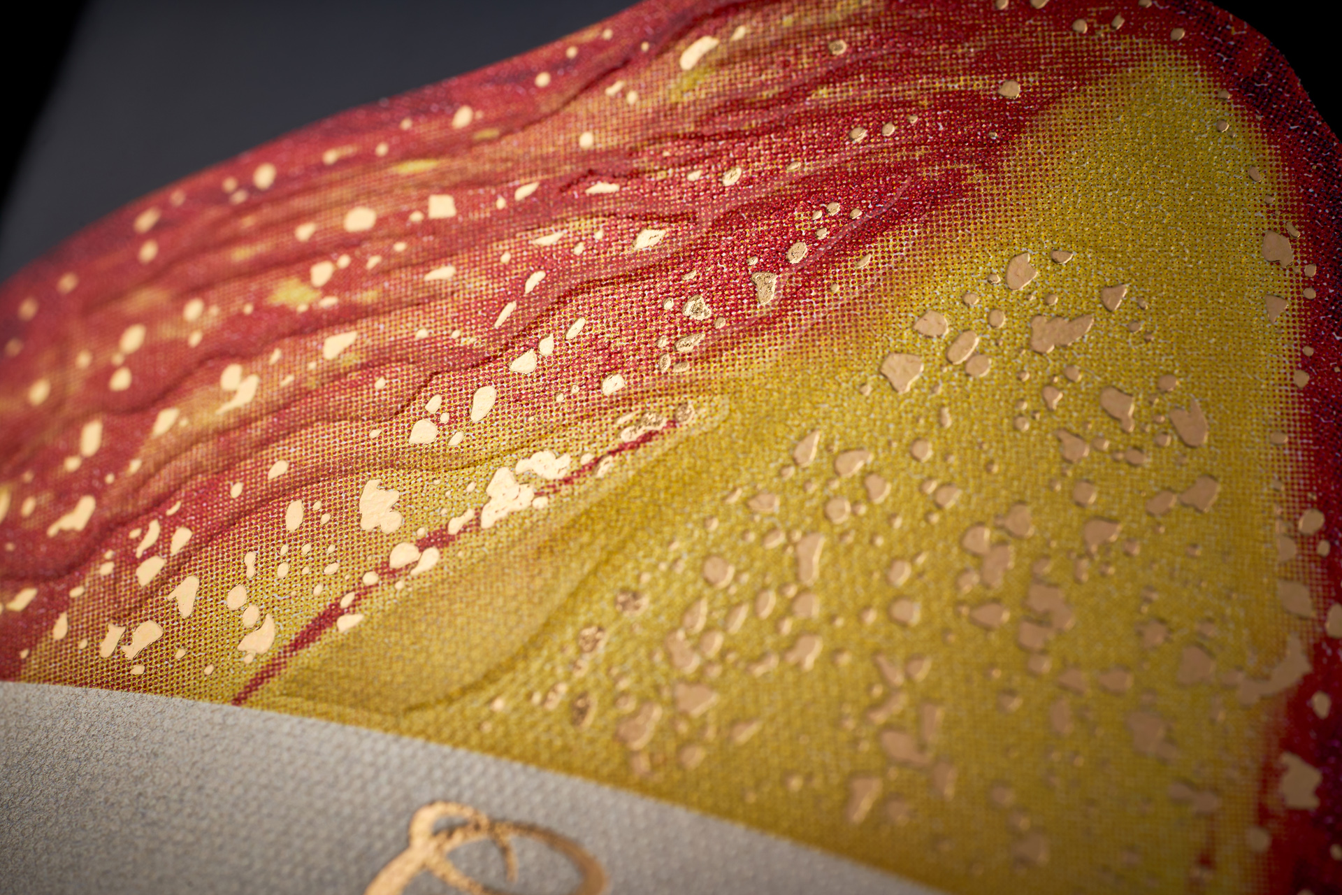
We turned to amber — a natural stone formed over millennia and prized for its rich color and glow. Much like this wine, amber captures warmth, depth, and a sense of suspended time. The label shape is cut asymmetrically to resemble a polished gemstone, creating a tactile, sculptural element that feels distinct on the bottle. Layers of hot-foil stamping add iridescent gold fragments, echoing the light-reflecting qualities of real amber. The overall look remains elegant and premium, yet breaks away from Cricova’s classical codes, introducing a new visual chapter for a brand willing to evolve while honoring its roots.