- 2025
process
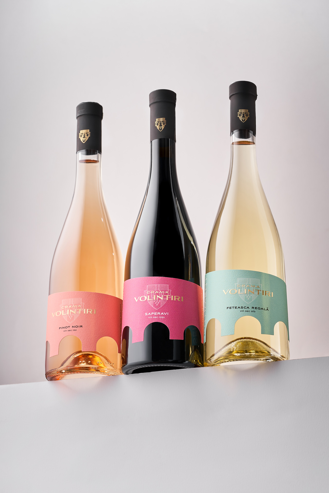
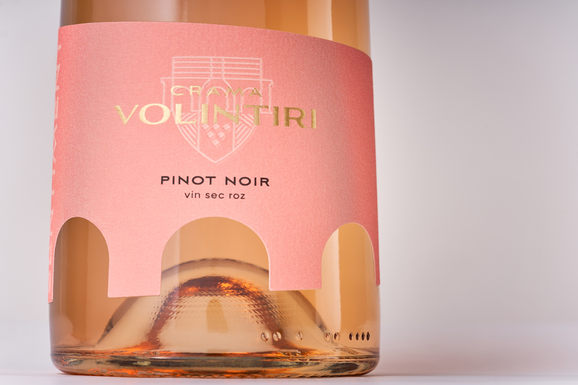
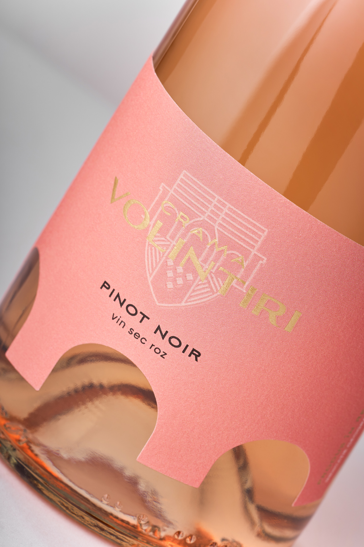
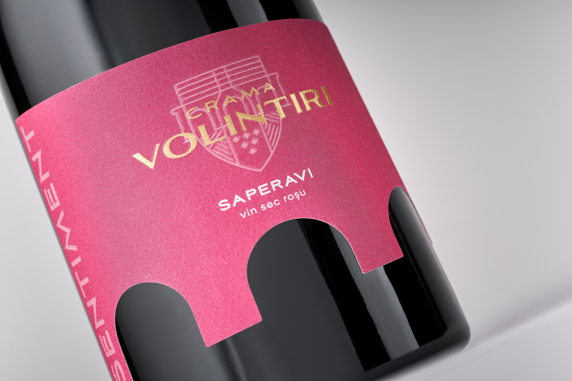
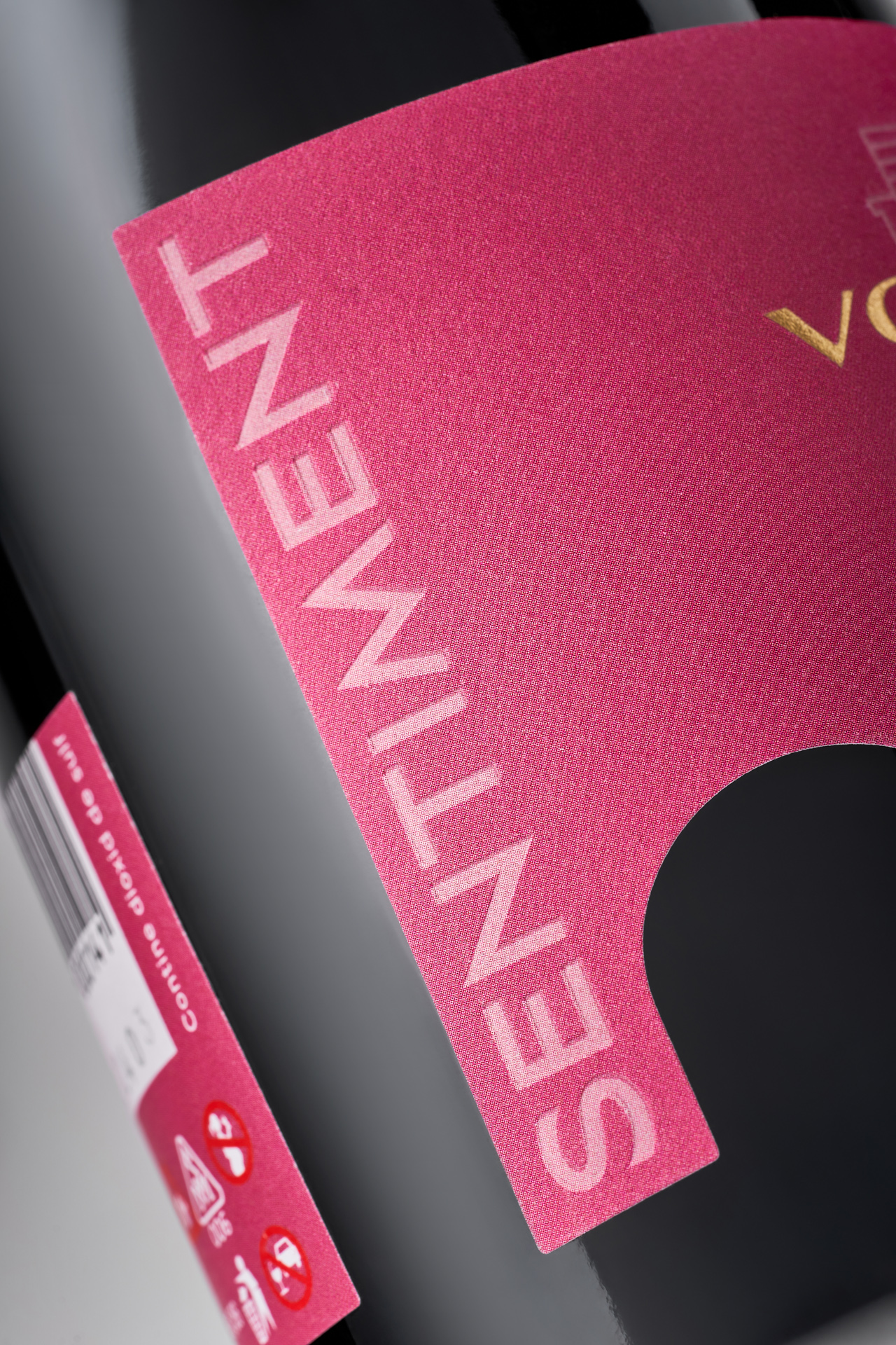
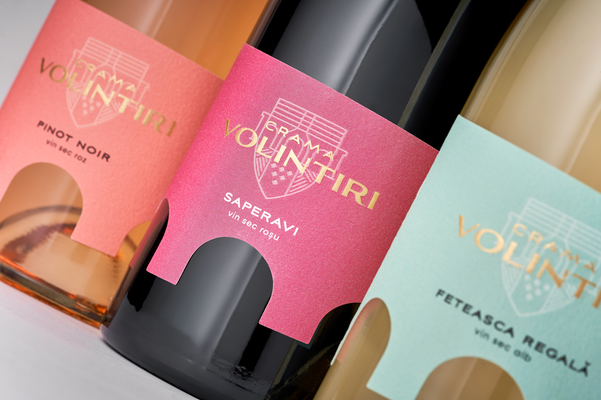
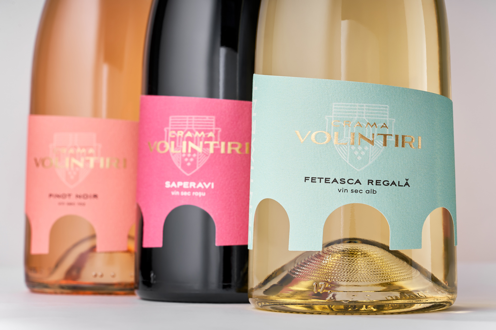
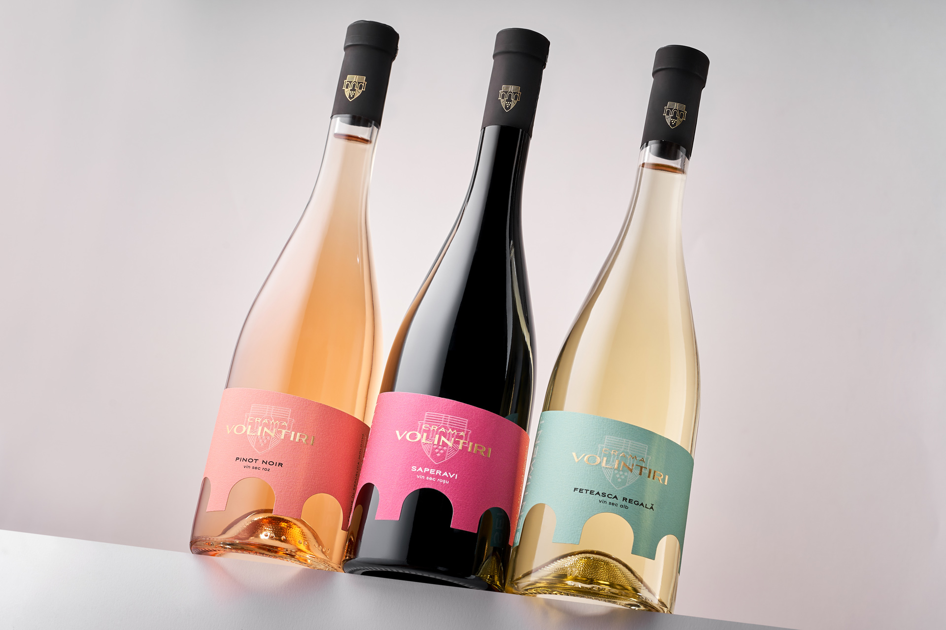
Crama Volintiri approached our studio with the need to refresh their visual identity: a new logo and label redesign for their wines. The change was prompted by the switch to a new bottle shape, which also created an opportunity to rethink the brand’s style and bring more expressiveness to its presentation. The challenge was to maintain brand continuity while at the same time offering a solution that would distinguish Crama Volintiri on the shelf. It was important to find a visual symbol deeply rooted in the winery’s region and heritage, one that could emphasize authenticity and local origin.
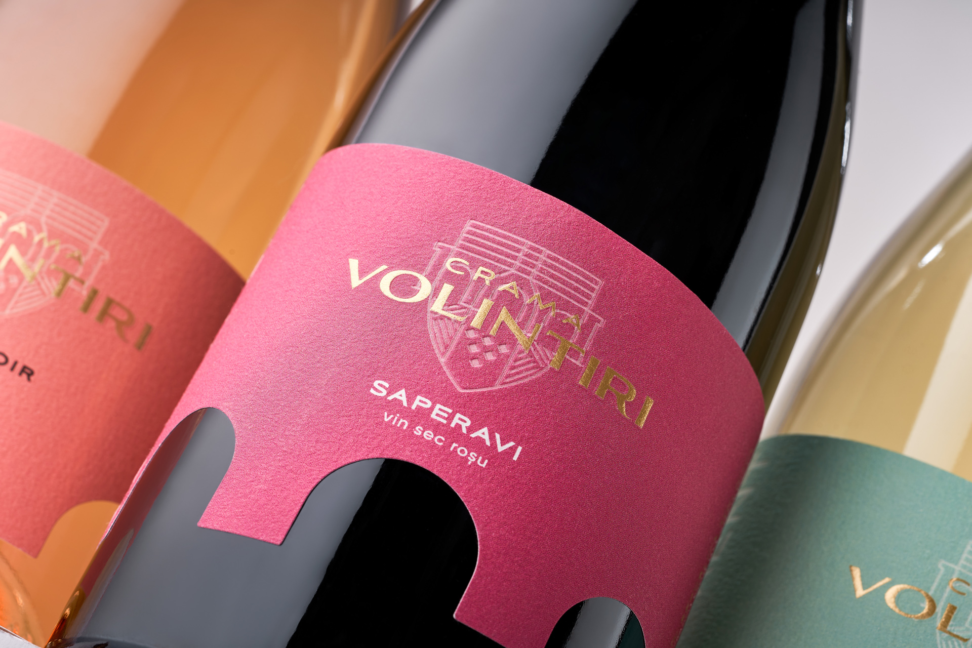
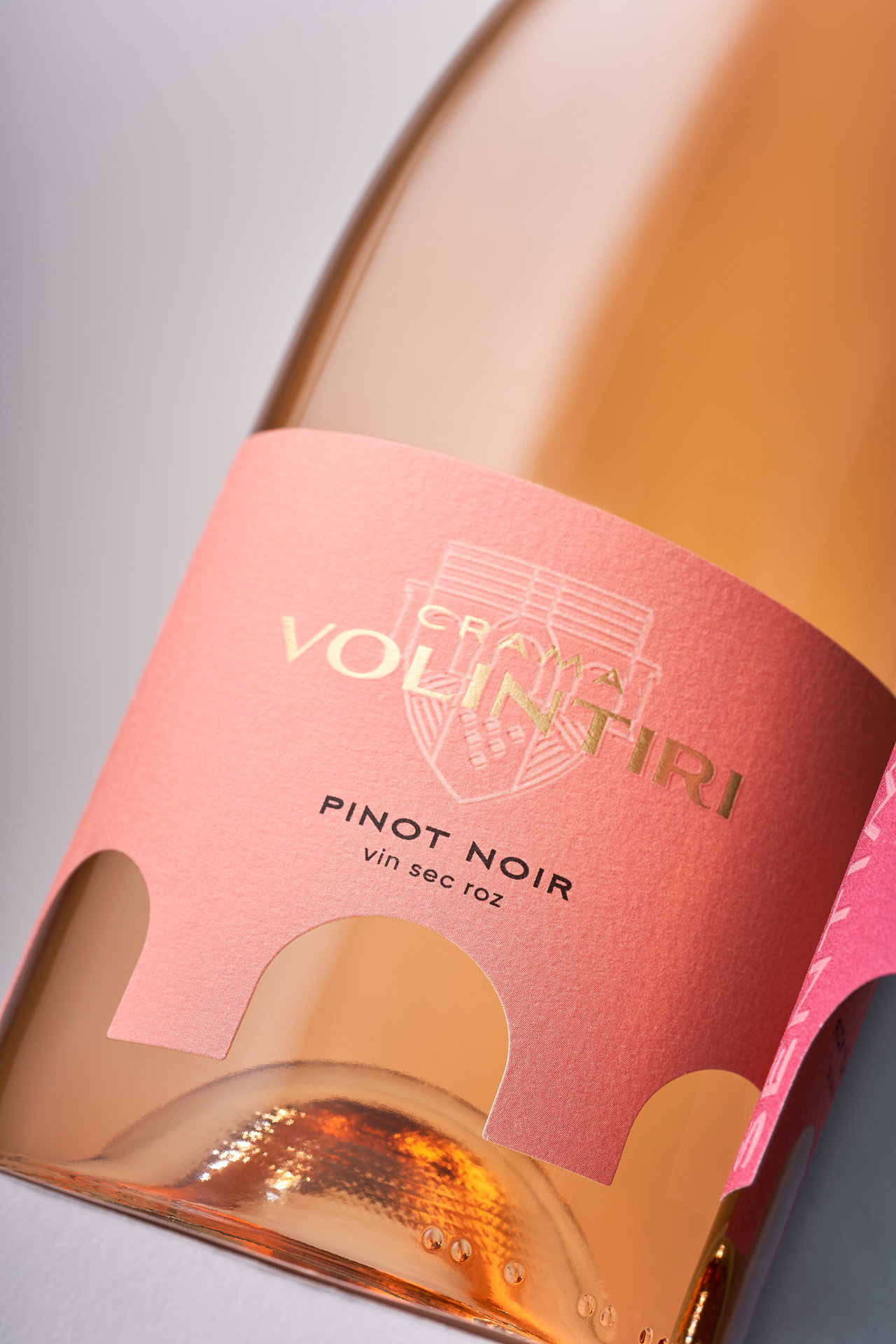
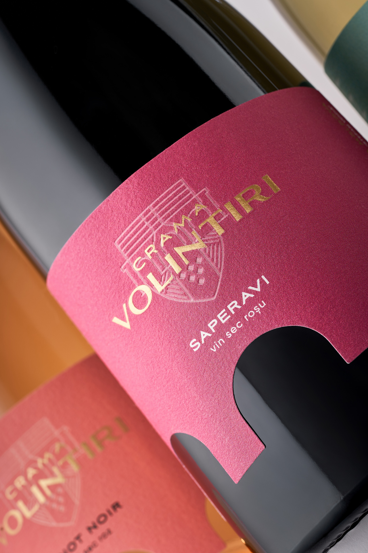
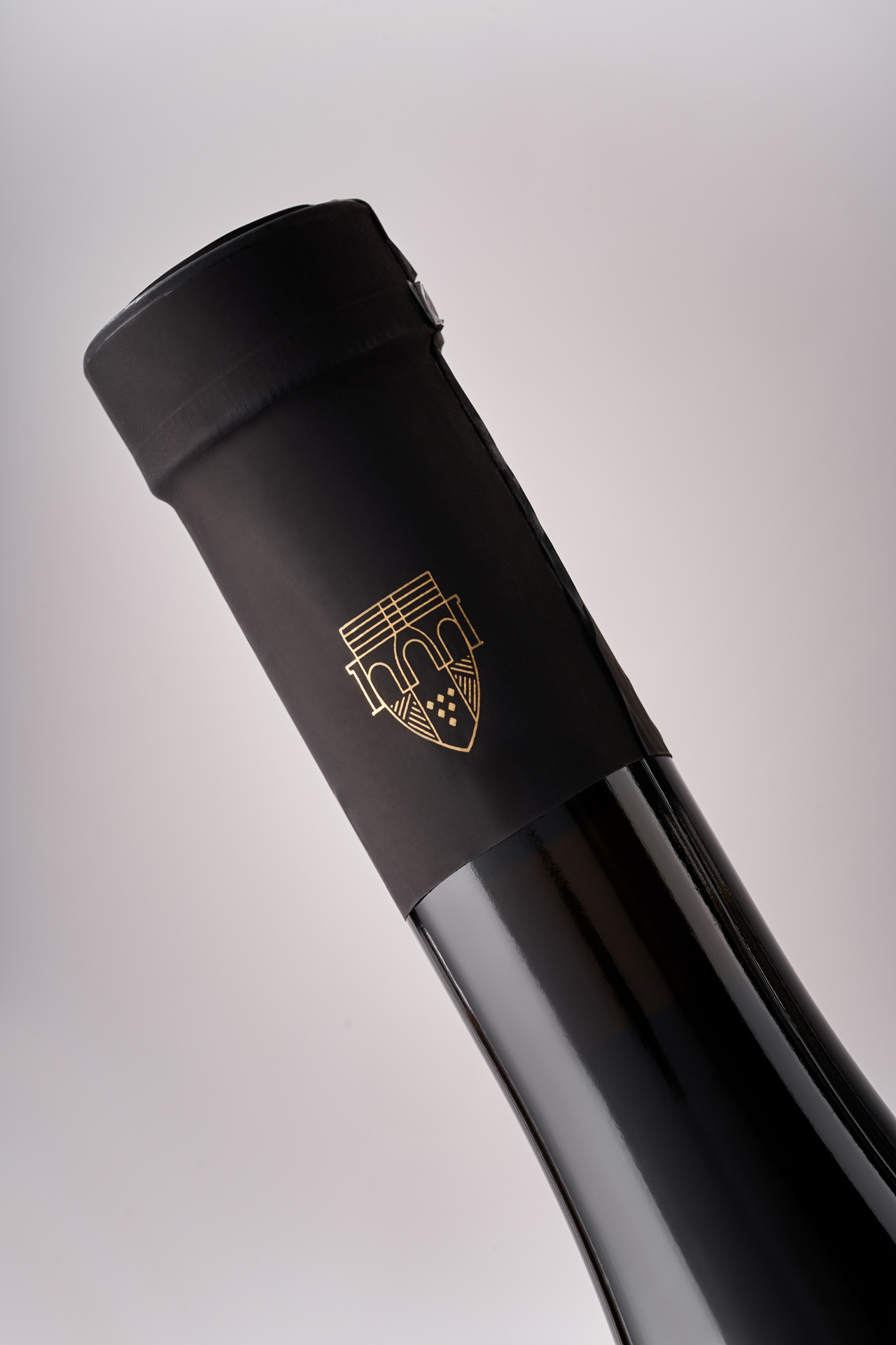
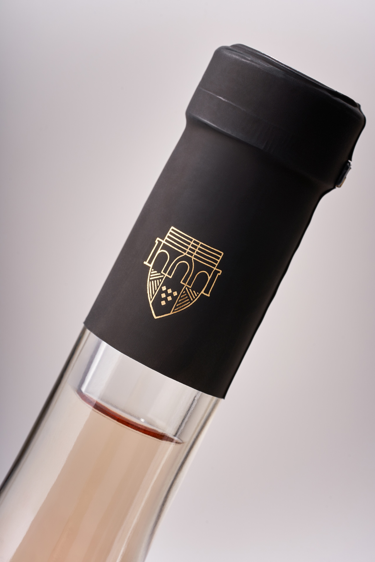
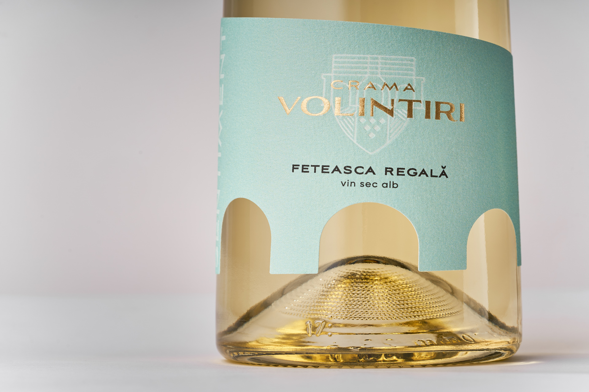
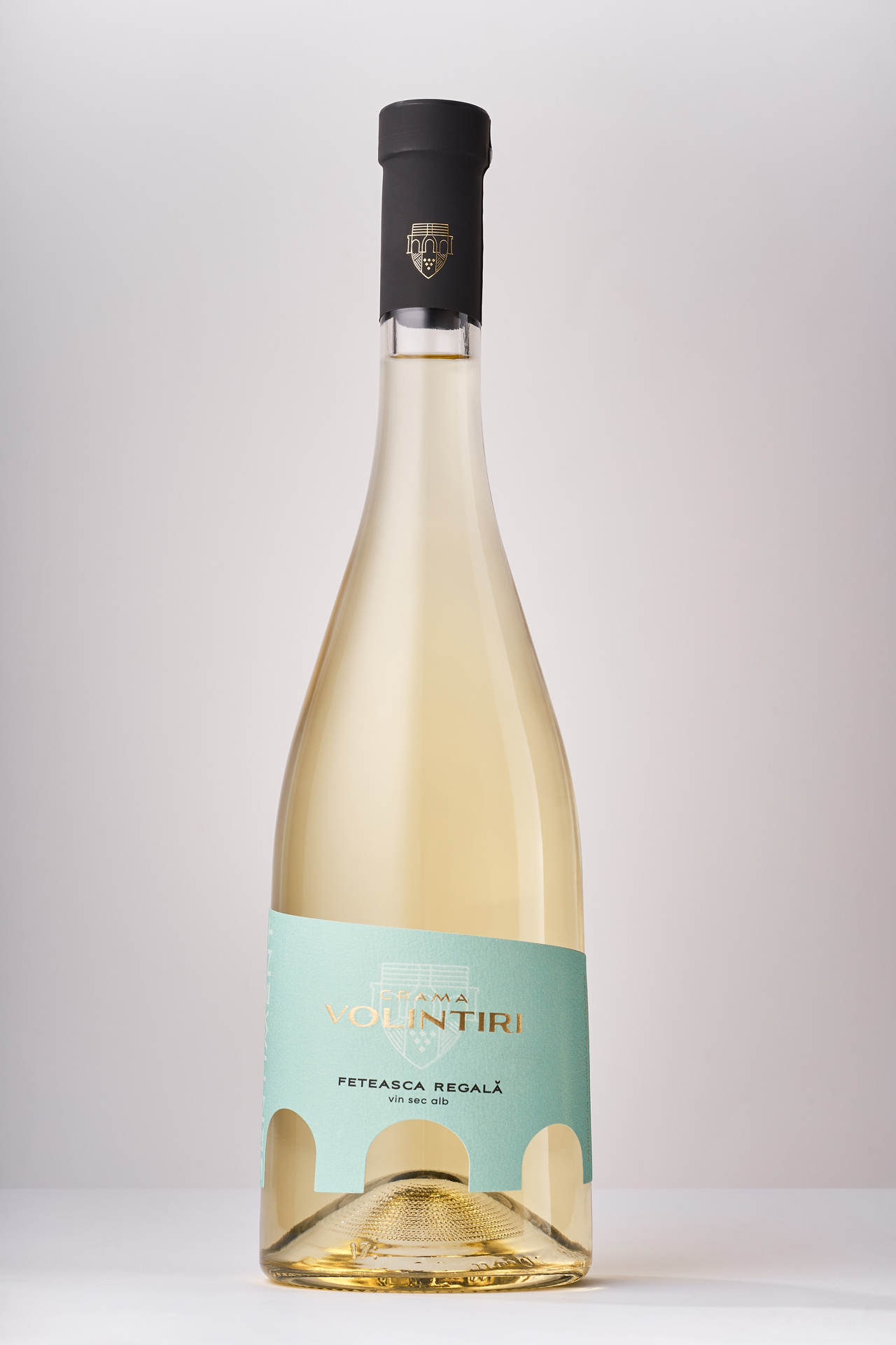
We developed a concept inspired by a bridge - a key symbol connected with the village of Volintiri. The old bridge near the village became the central motif of the design, representing a strong link between tradition and modernity. This idea was brought to life through a distinctive label cutout shaped like a bridge arch, instantly recognizable and unique. To differentiate wine varieties and types, a clear system of color coding was introduced: soft pastel shades for whites and rosés, and deeper, richer tones for reds. The new logo was seamlessly integrated into the composition, preserving brand recognition. As a result, the refreshed identity of Crama Volintiri unites local roots, modern minimalism, and user-friendly navigation across the portfolio.