- 2025
process
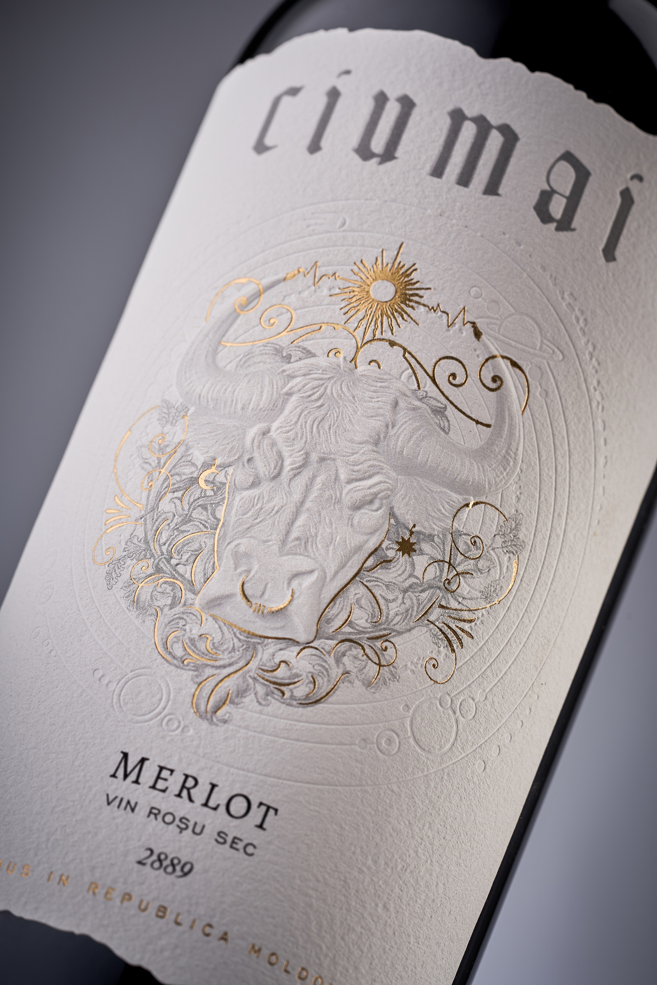
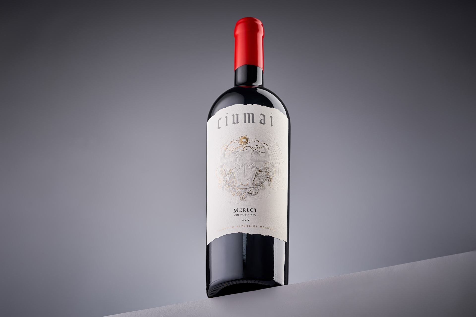
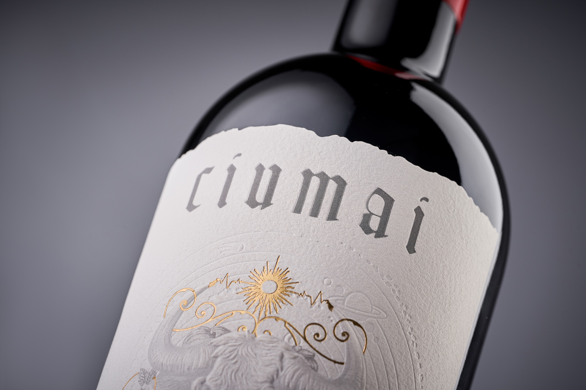
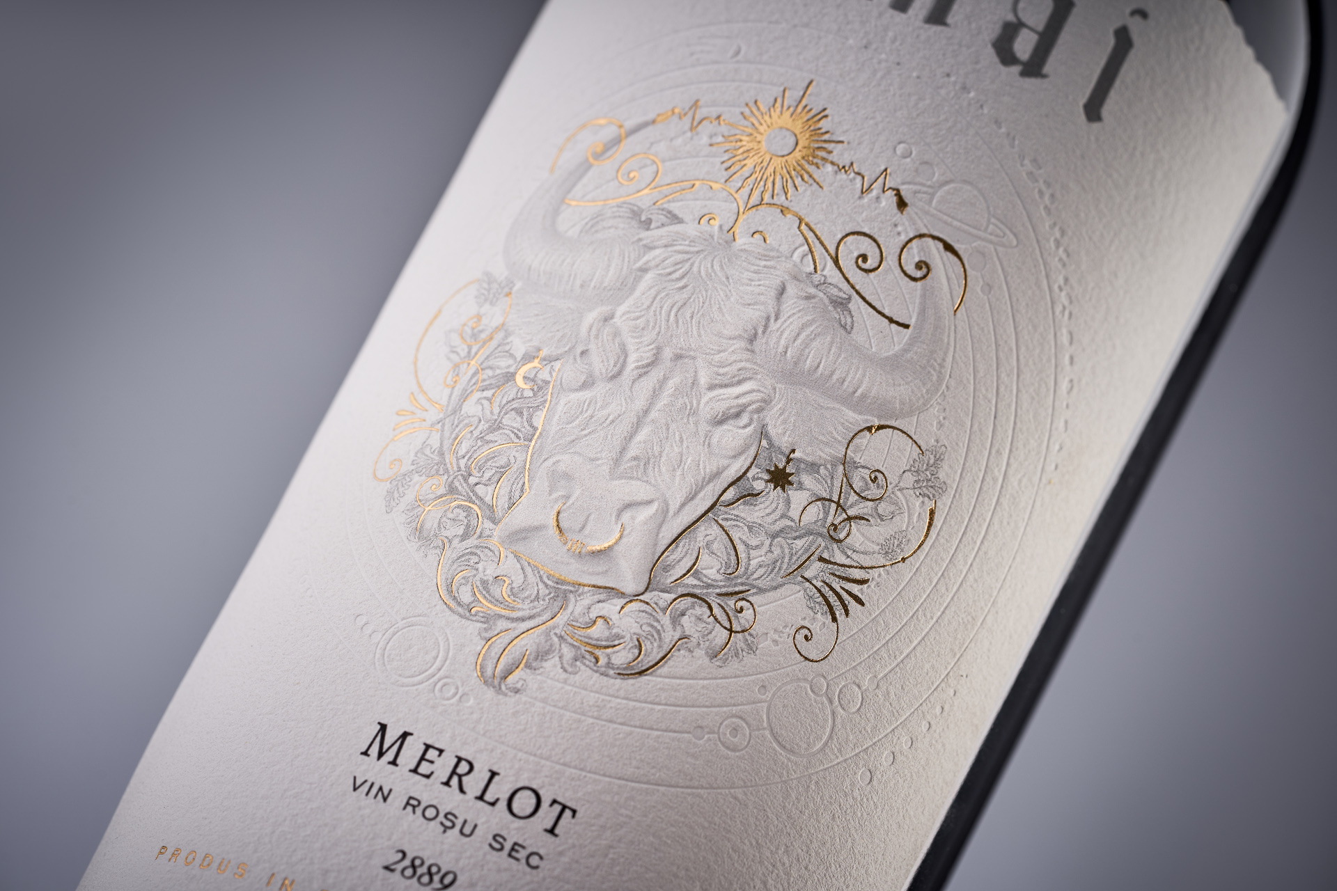
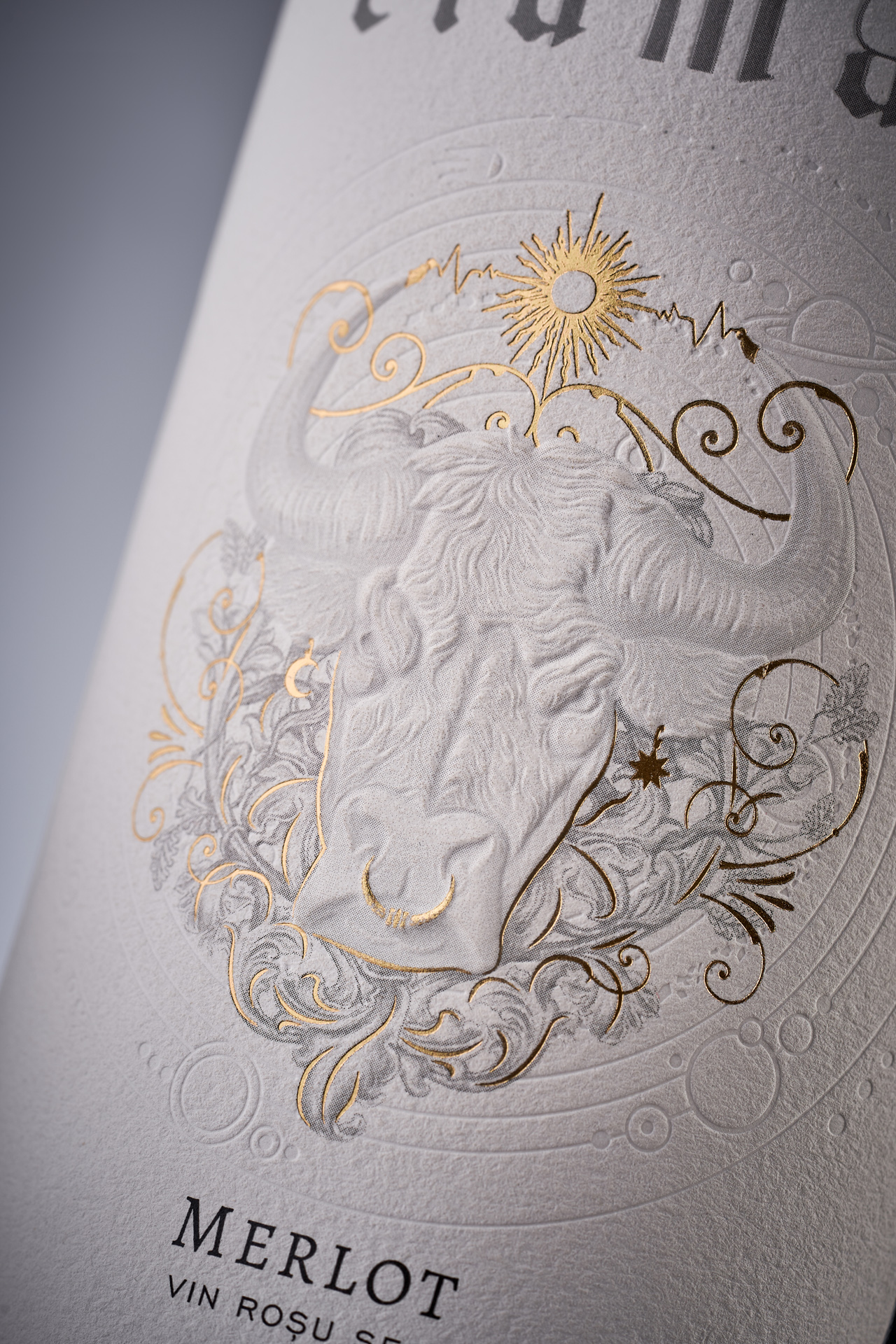
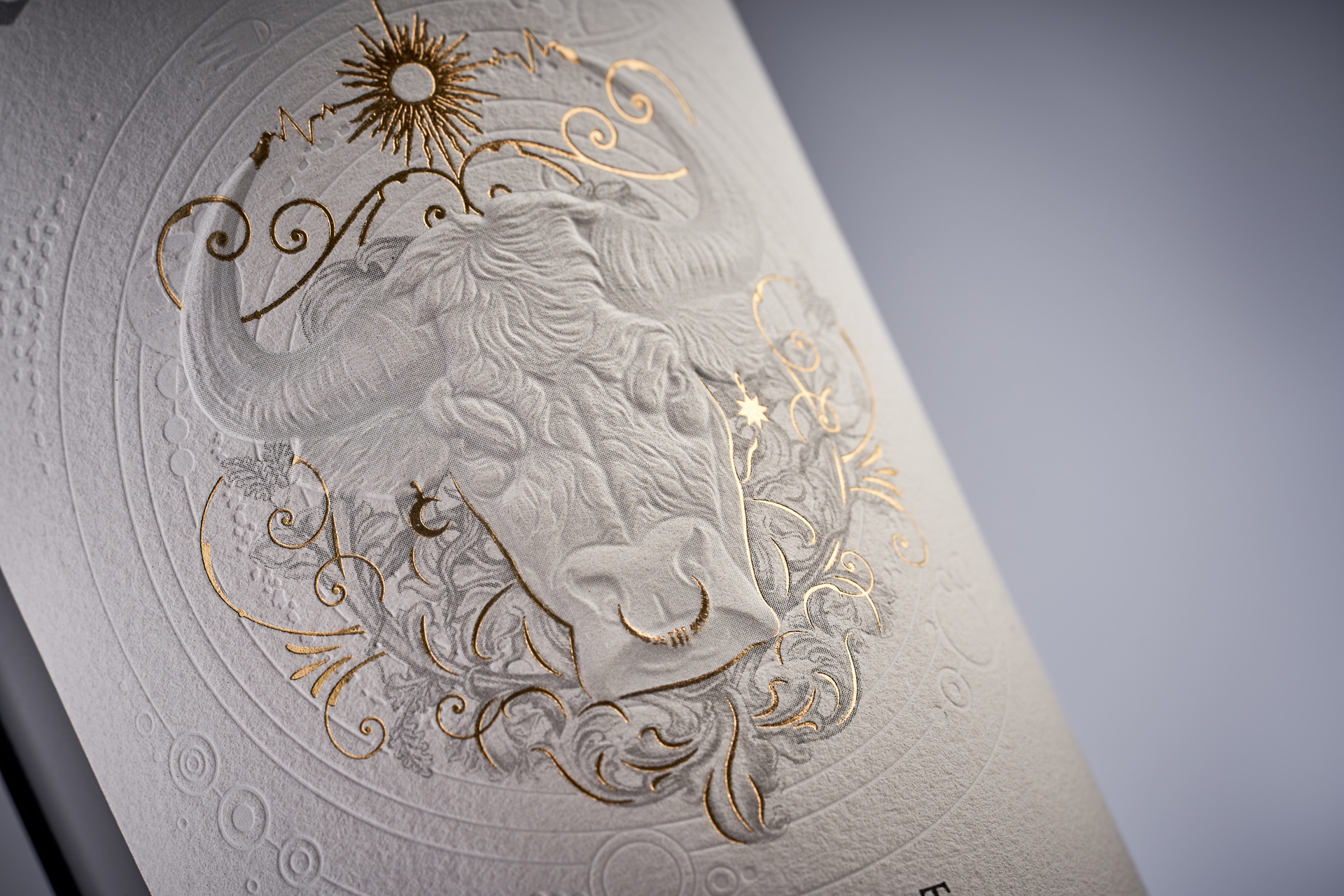
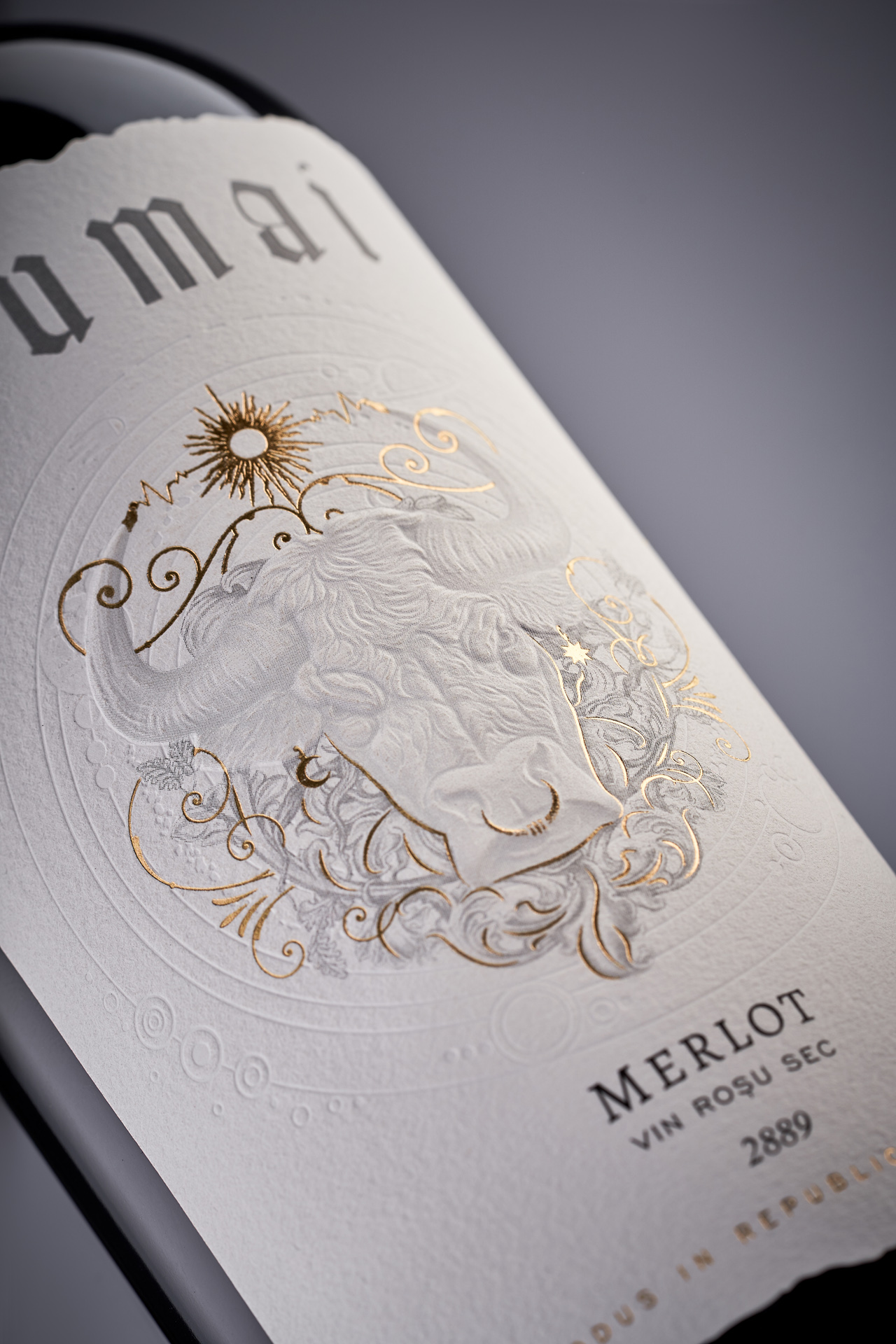
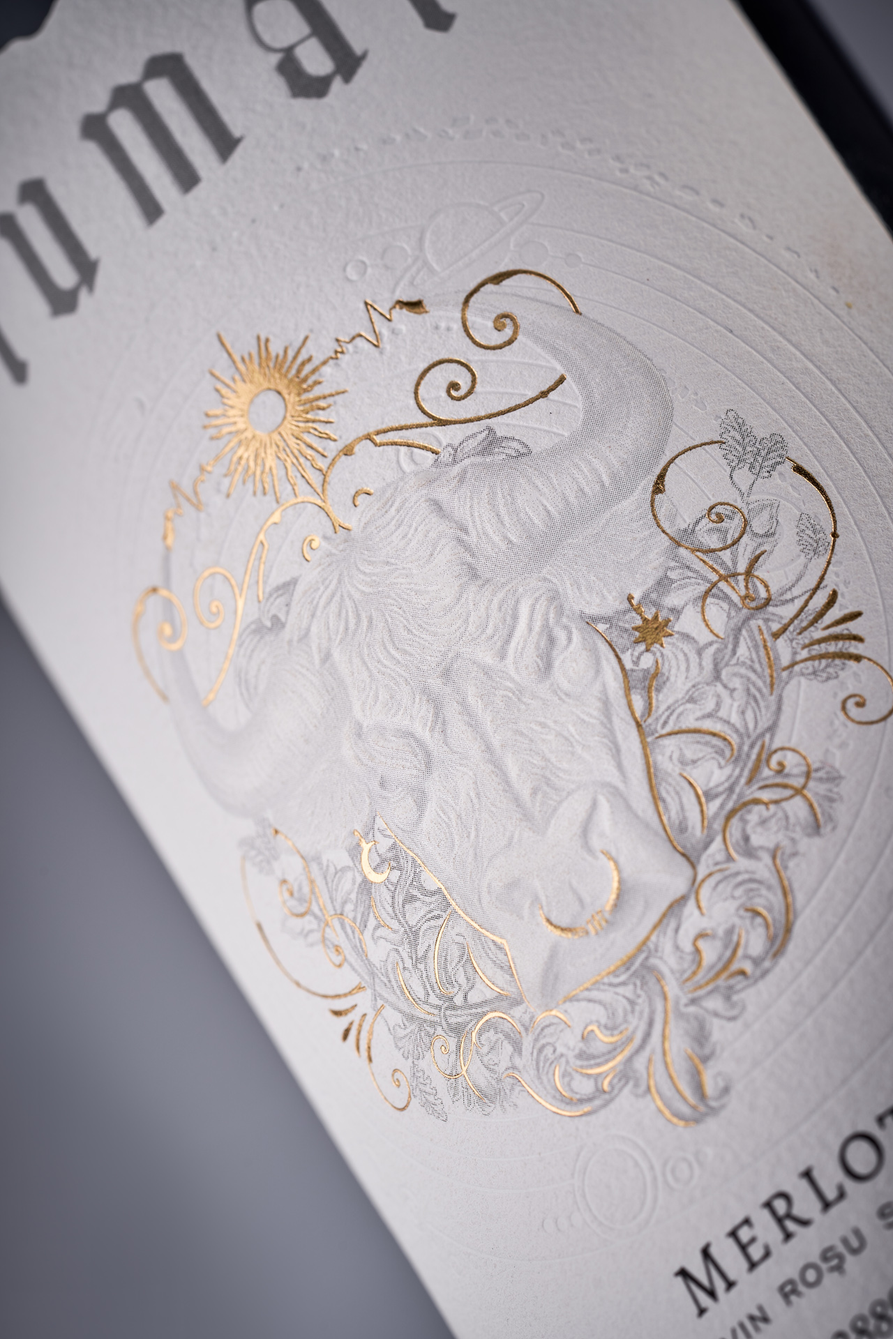
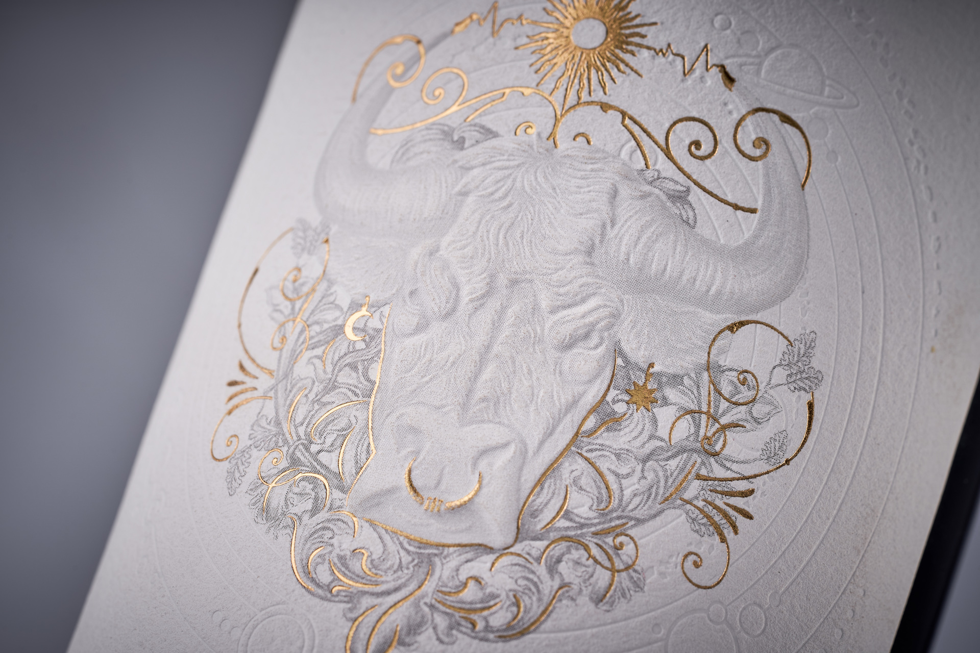
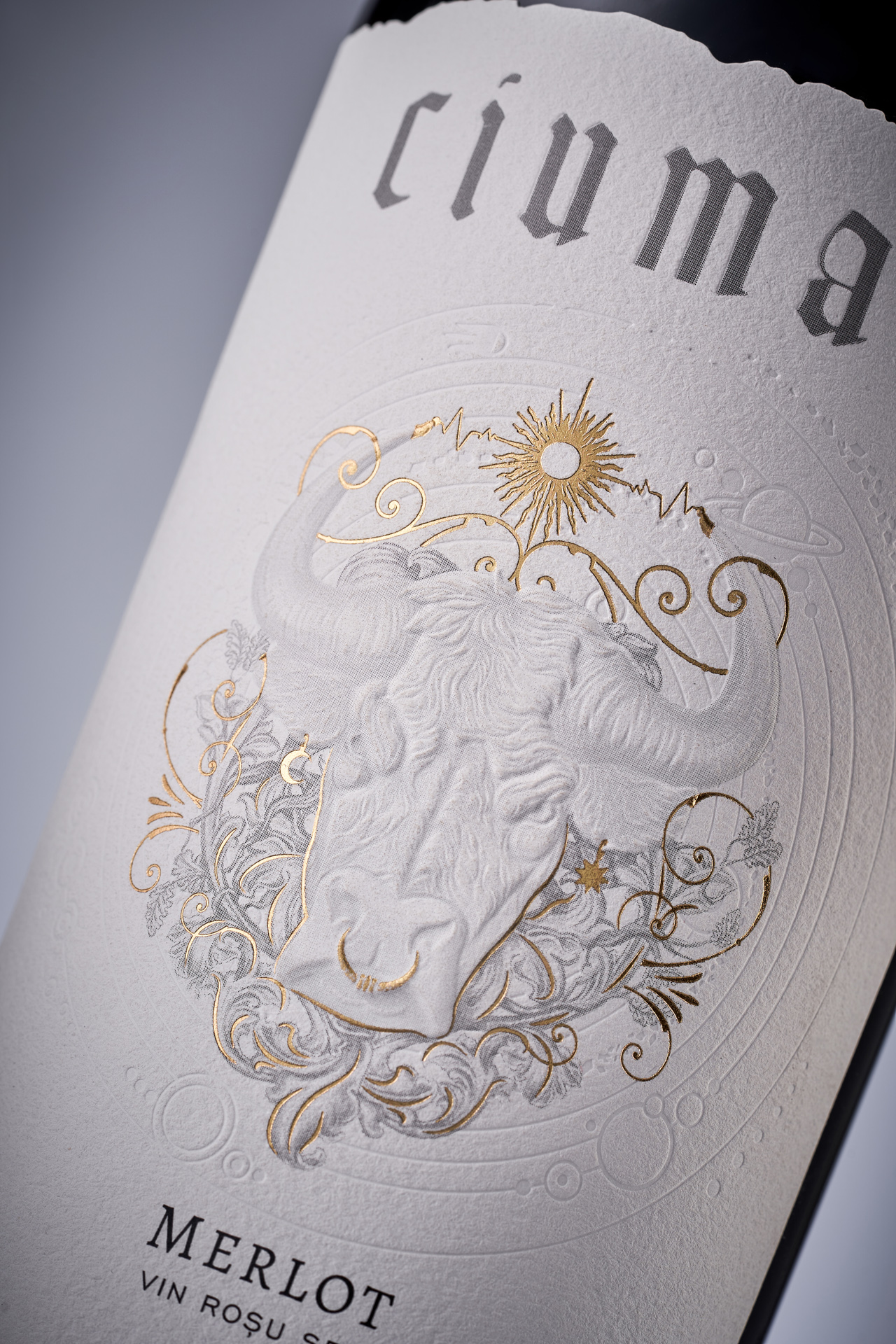
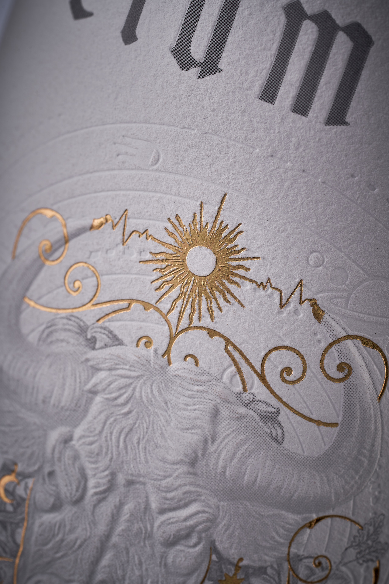
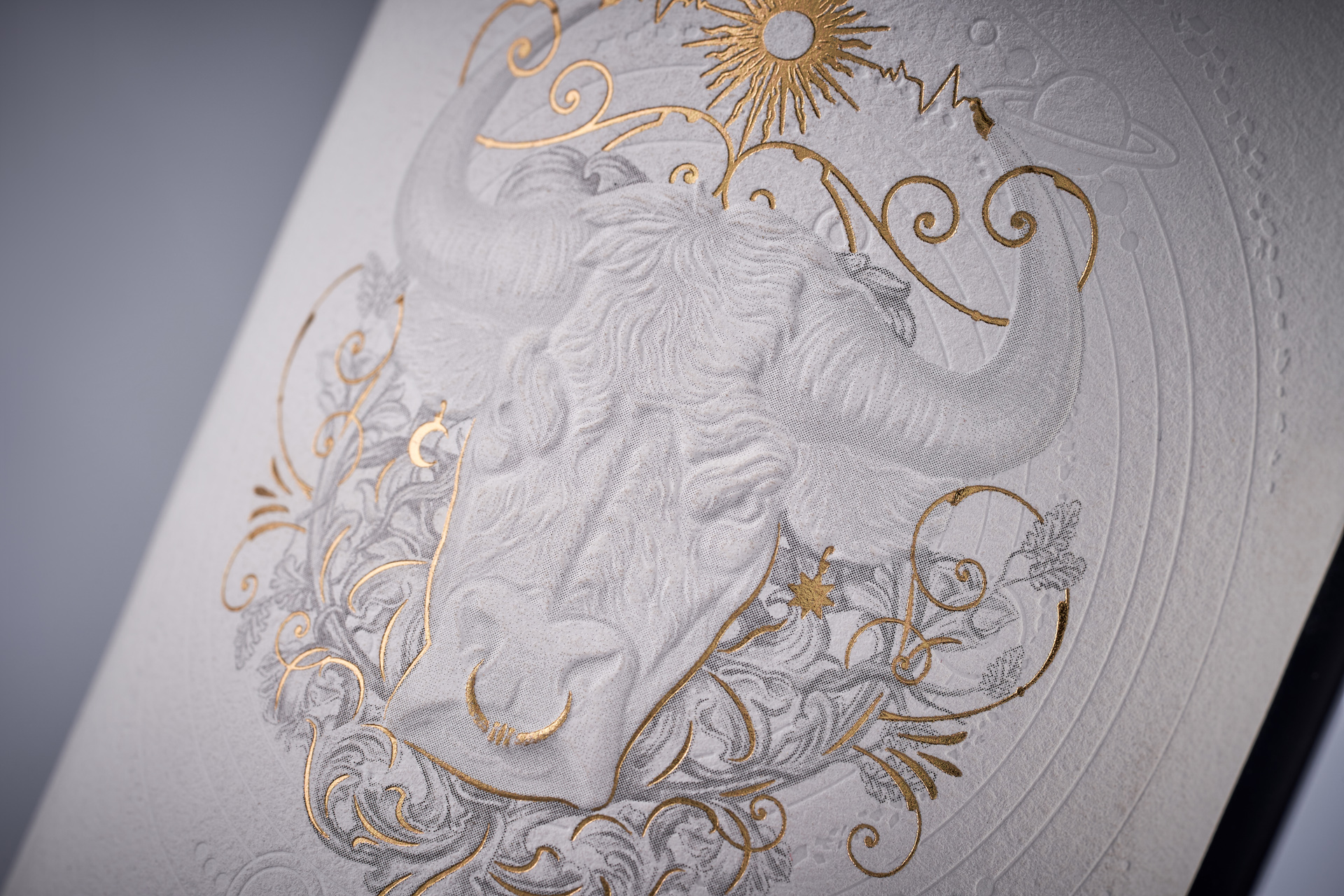
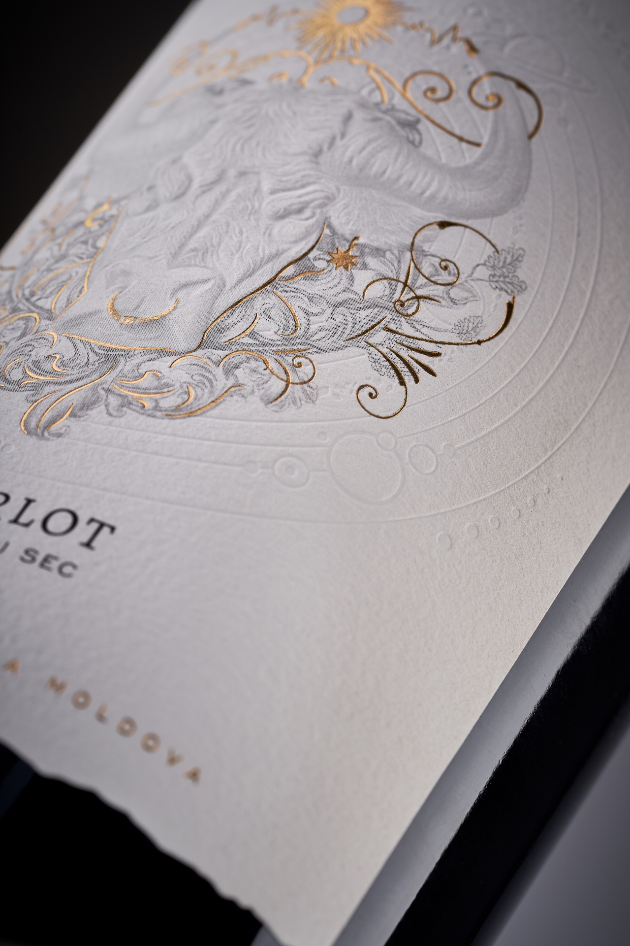
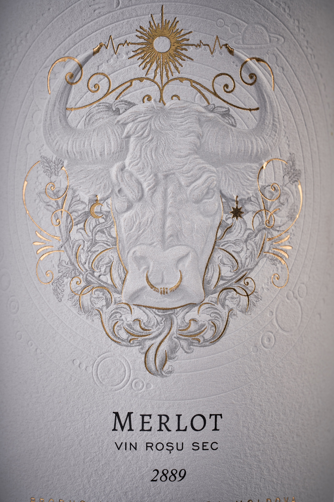
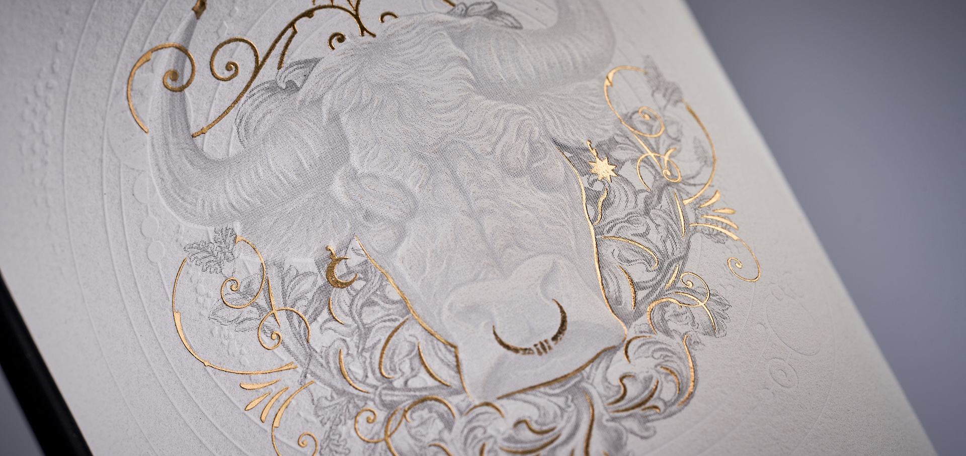
Ciumai is a winery with roots reaching back to the mid-20th century. Despite its longstanding presence and recognizability, the brand had never released a truly premium wine — until now. This new product was set to become the first in an exclusive line, and it required a visual identity to match: luxurious, expressive, and rich in meaning. The label needed not only to stand out, but to reflect the winery’s philosophy — its connection to the land and its deep, almost mystical approach to winemaking.
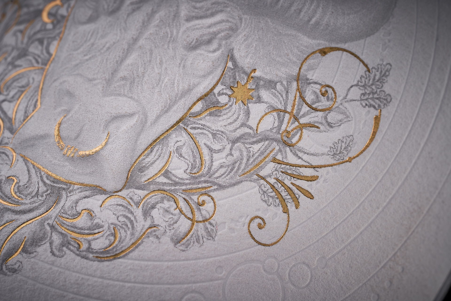
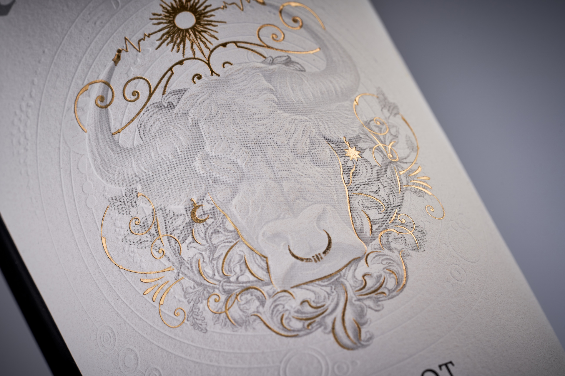
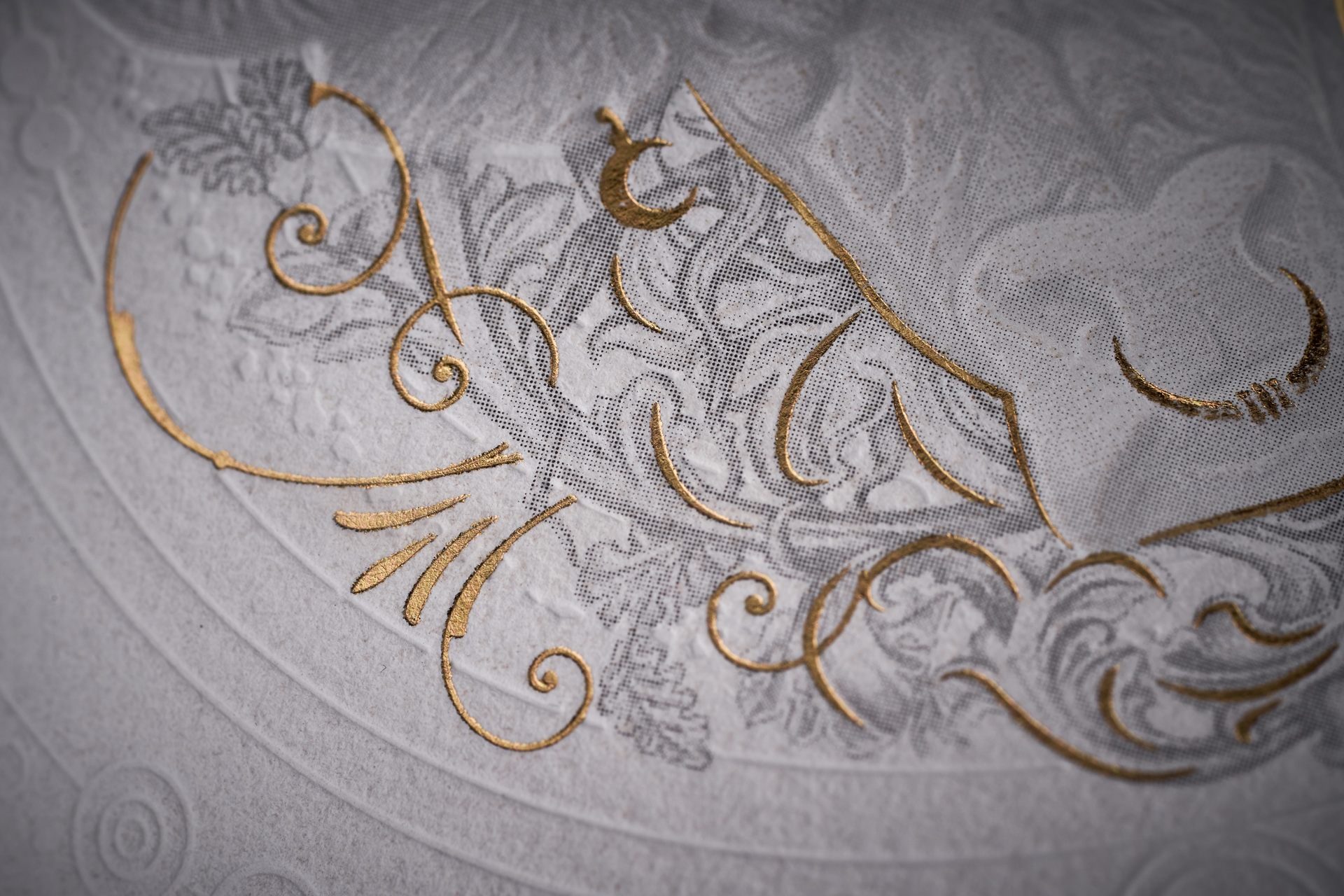
The visual concept developed by 43oz Studio centers around a stylized bull’s head — a reference to Moldova’s national emblem and a symbol of the wine’s strong ties to its origin. Surrounding it is a composition of esoteric symbols, evoking the sacred nature of the craft and the uniqueness of each vintage. The label delivers a rich tactile experience through the use of multiple production techniques, including 3D embossing, delicate debossing, and gold foil stamping. As a result, the label doesn’t just tell a visual story — it feels like a true luxury object, perfectly aligned with its category.