- 2026
process
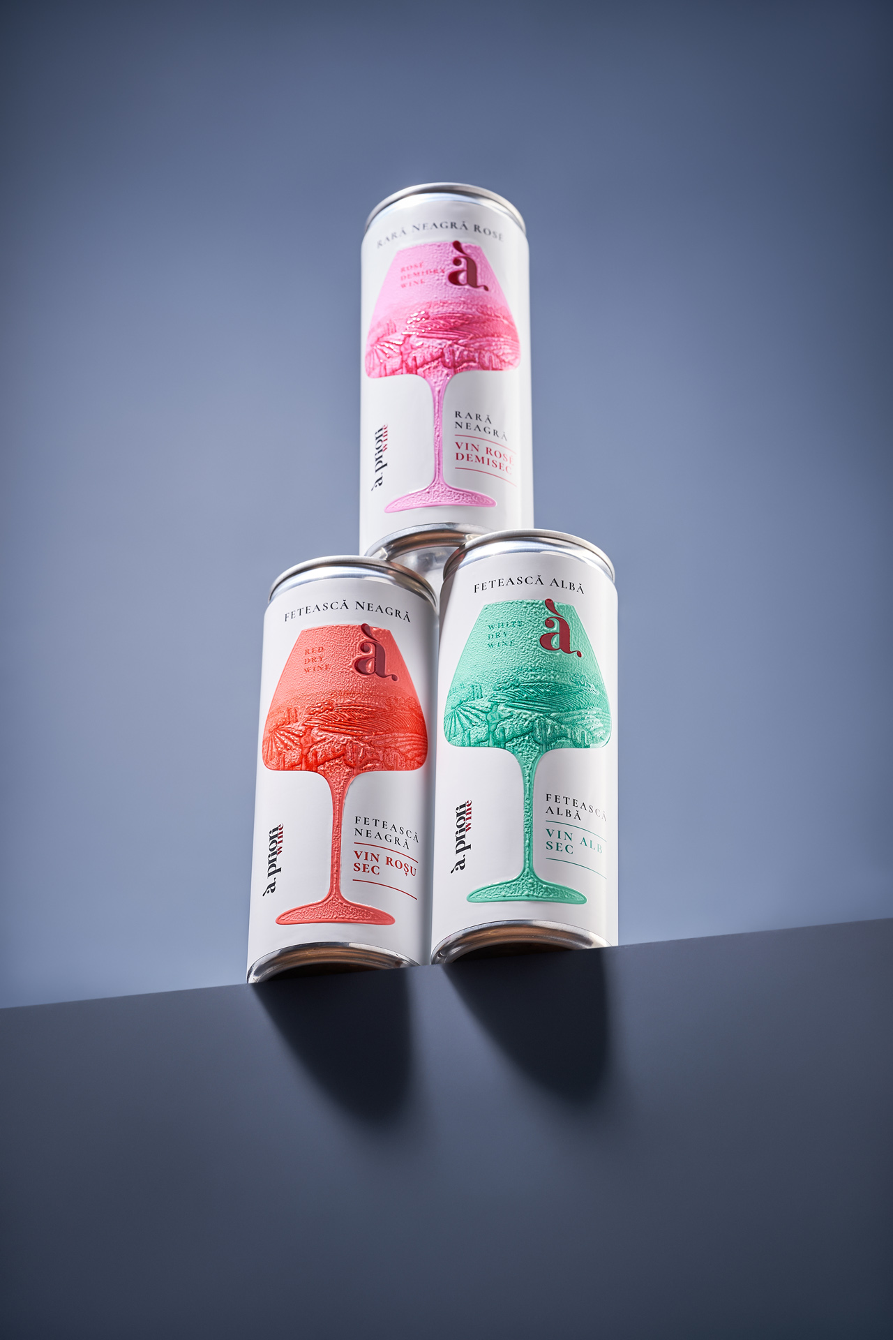
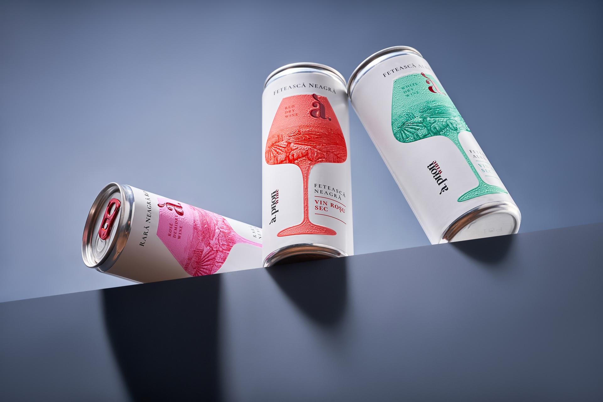
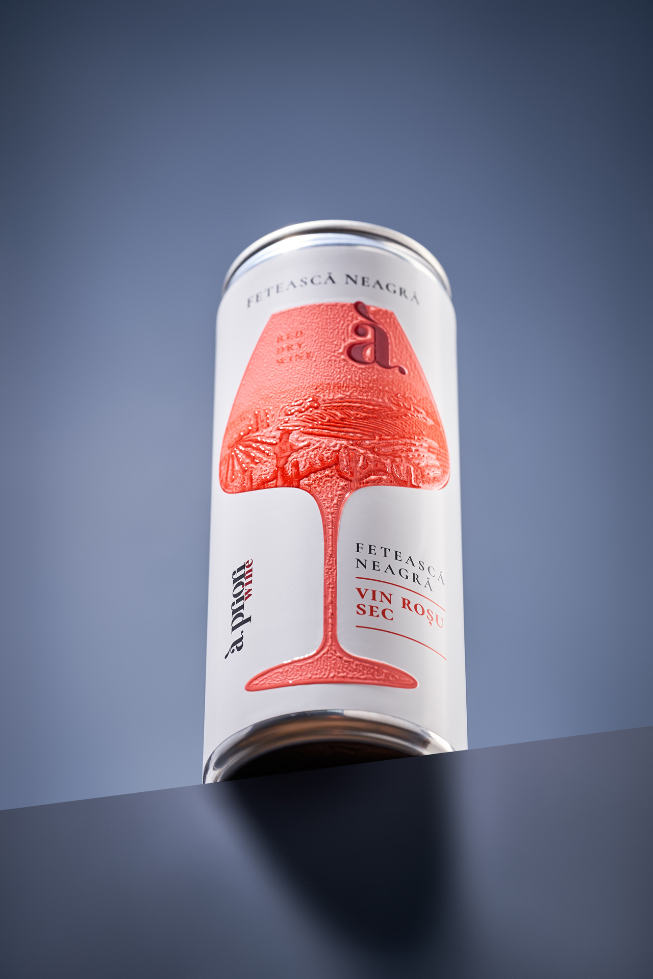
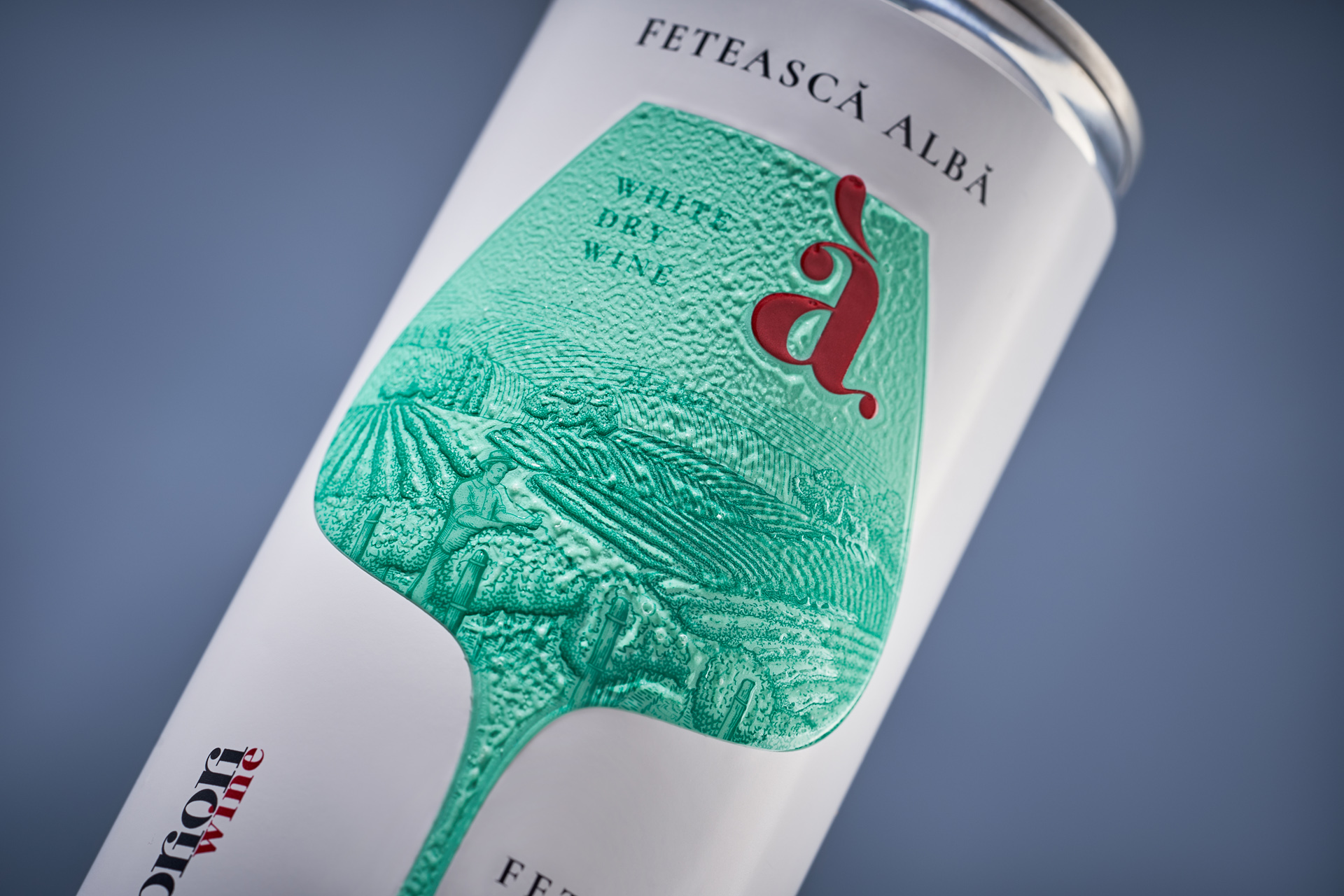
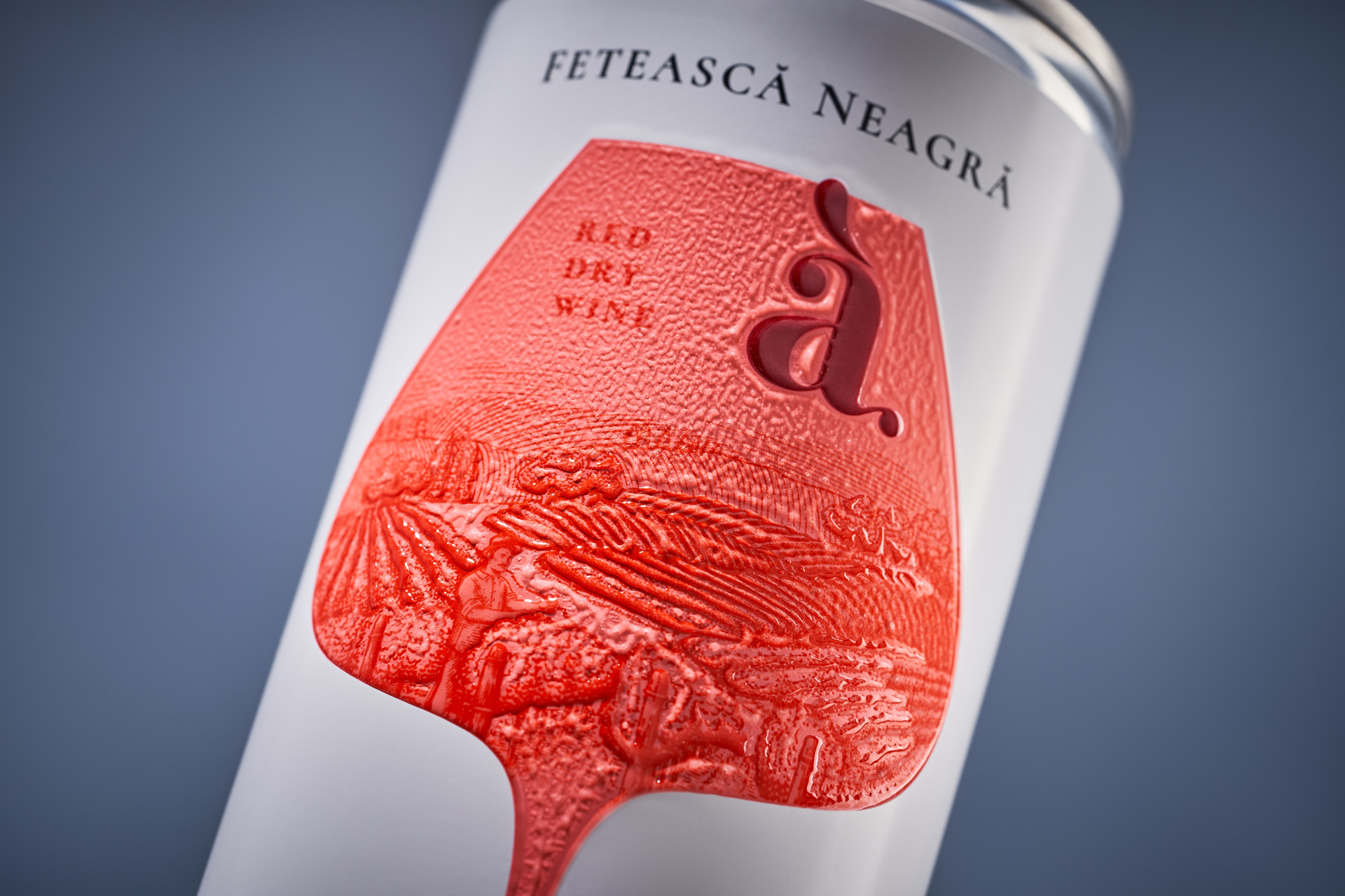
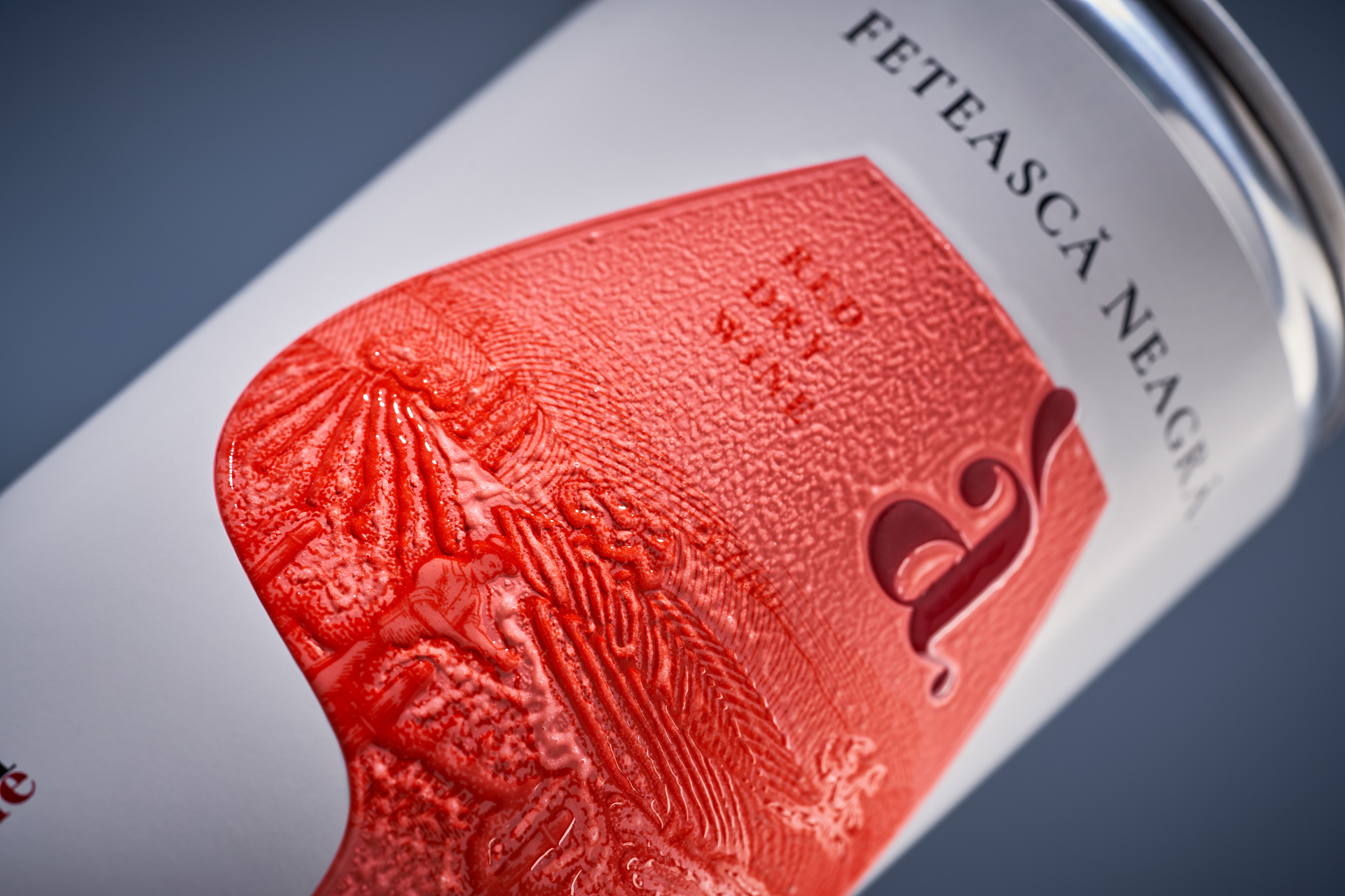
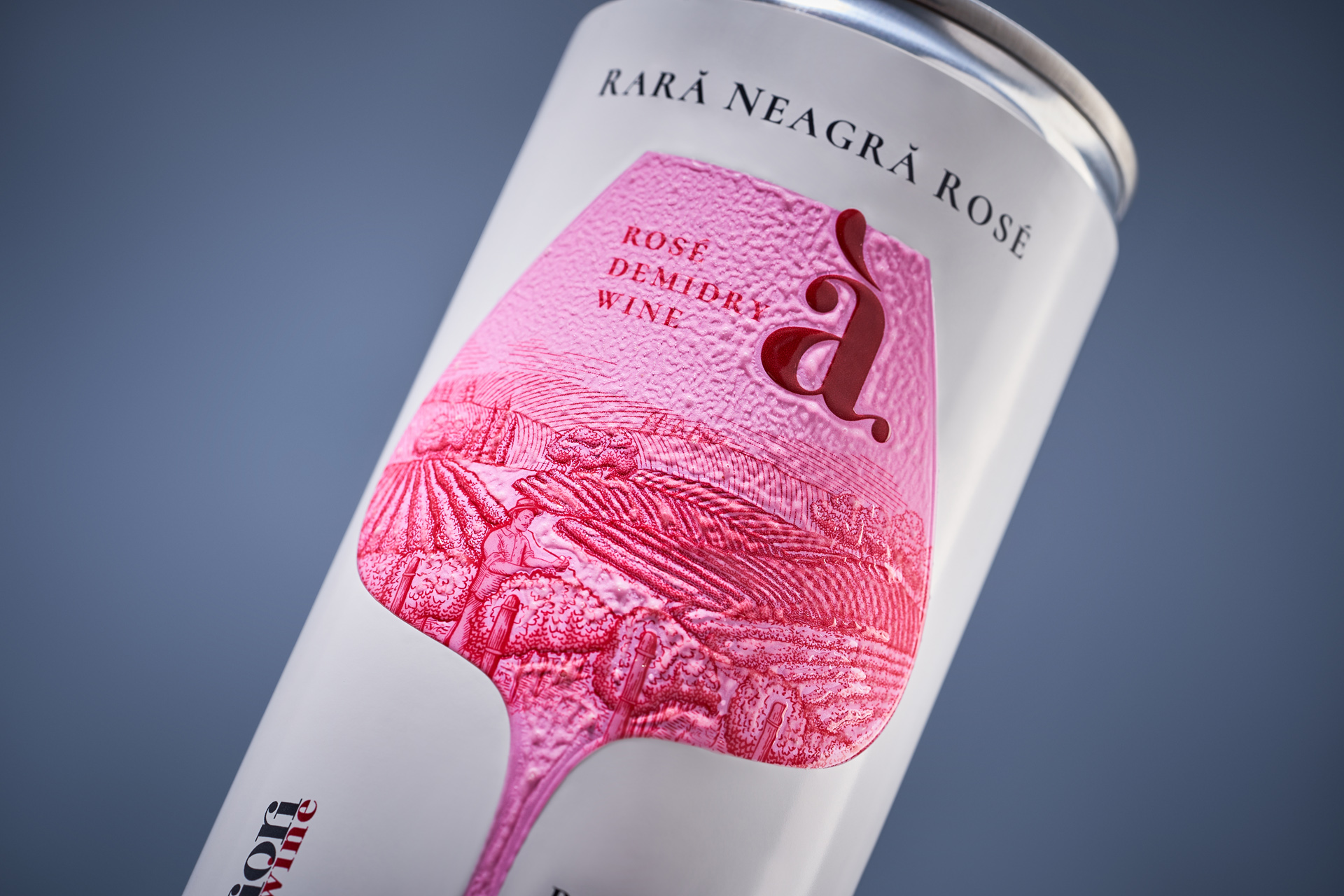
The can format has long been associated with cocktails, sparkling wines, energy drinks, or more accessible wine-based beverages. For Apriori Wine, the challenge was to move beyond this perception and clearly communicate that the product inside is a classic wine - identical to what you would expect from a traditional bottle. The goal was to preserve the sense of wine culture, quality, and familiarity, while working within a format that is still unconventional for this category.
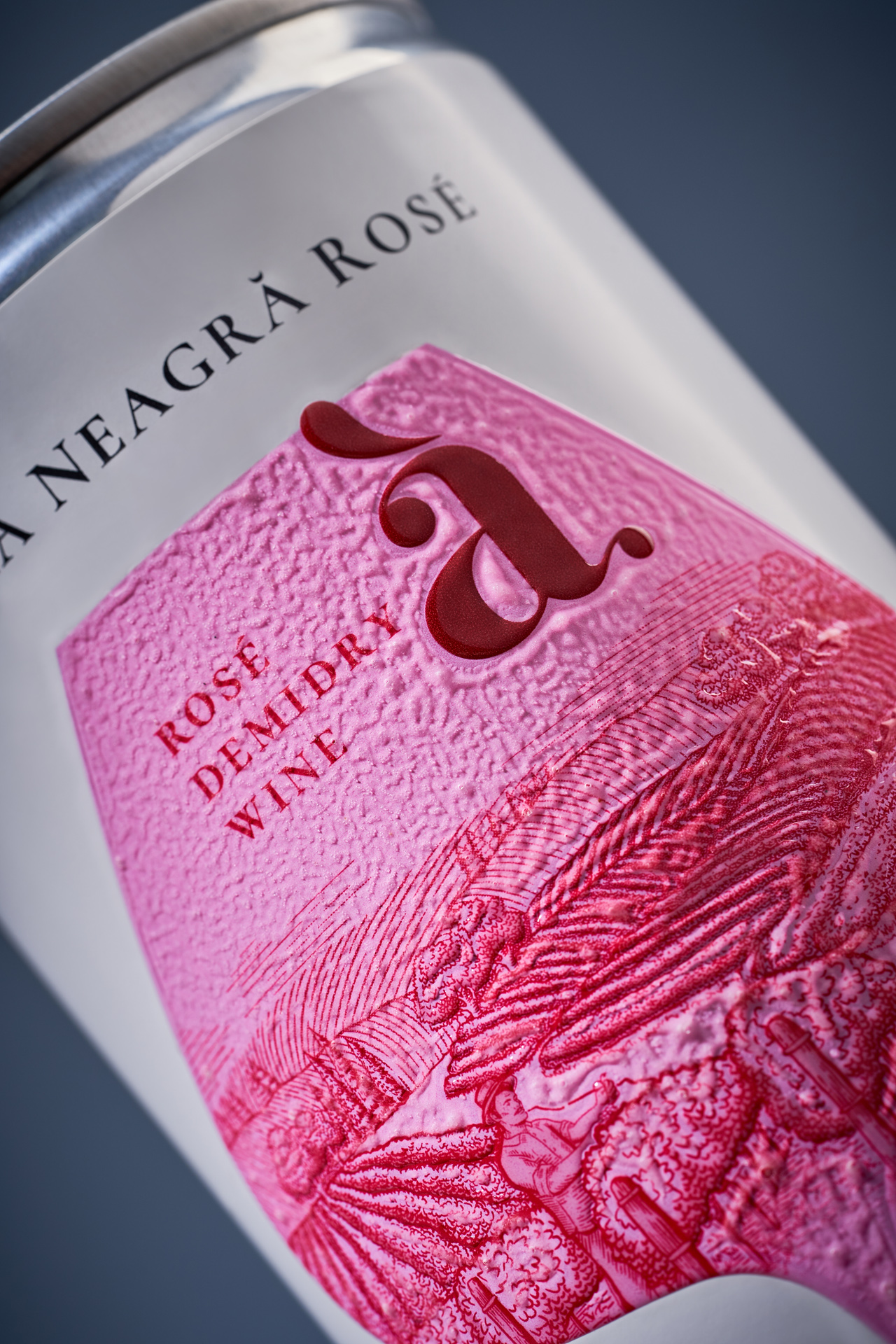
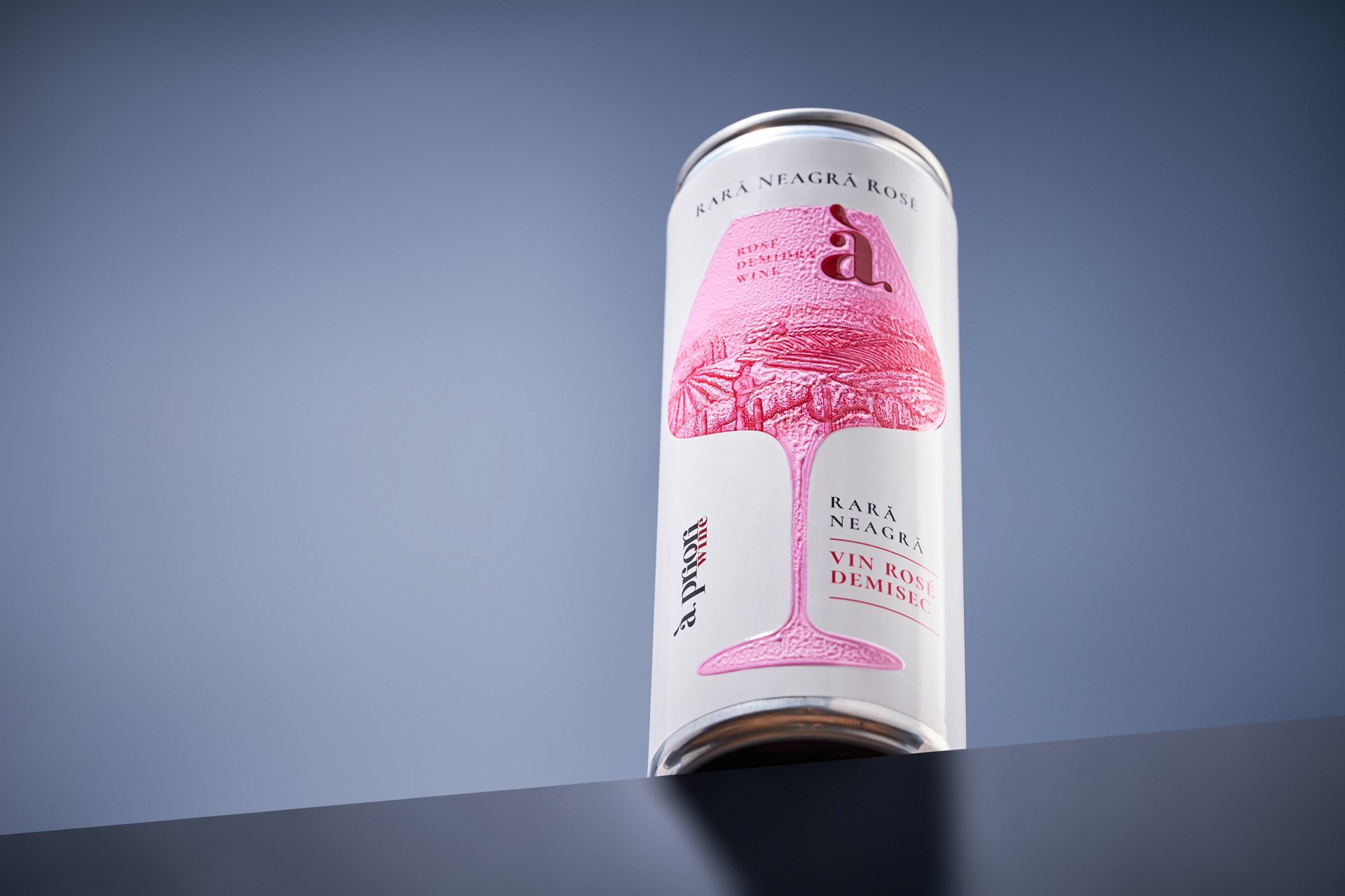
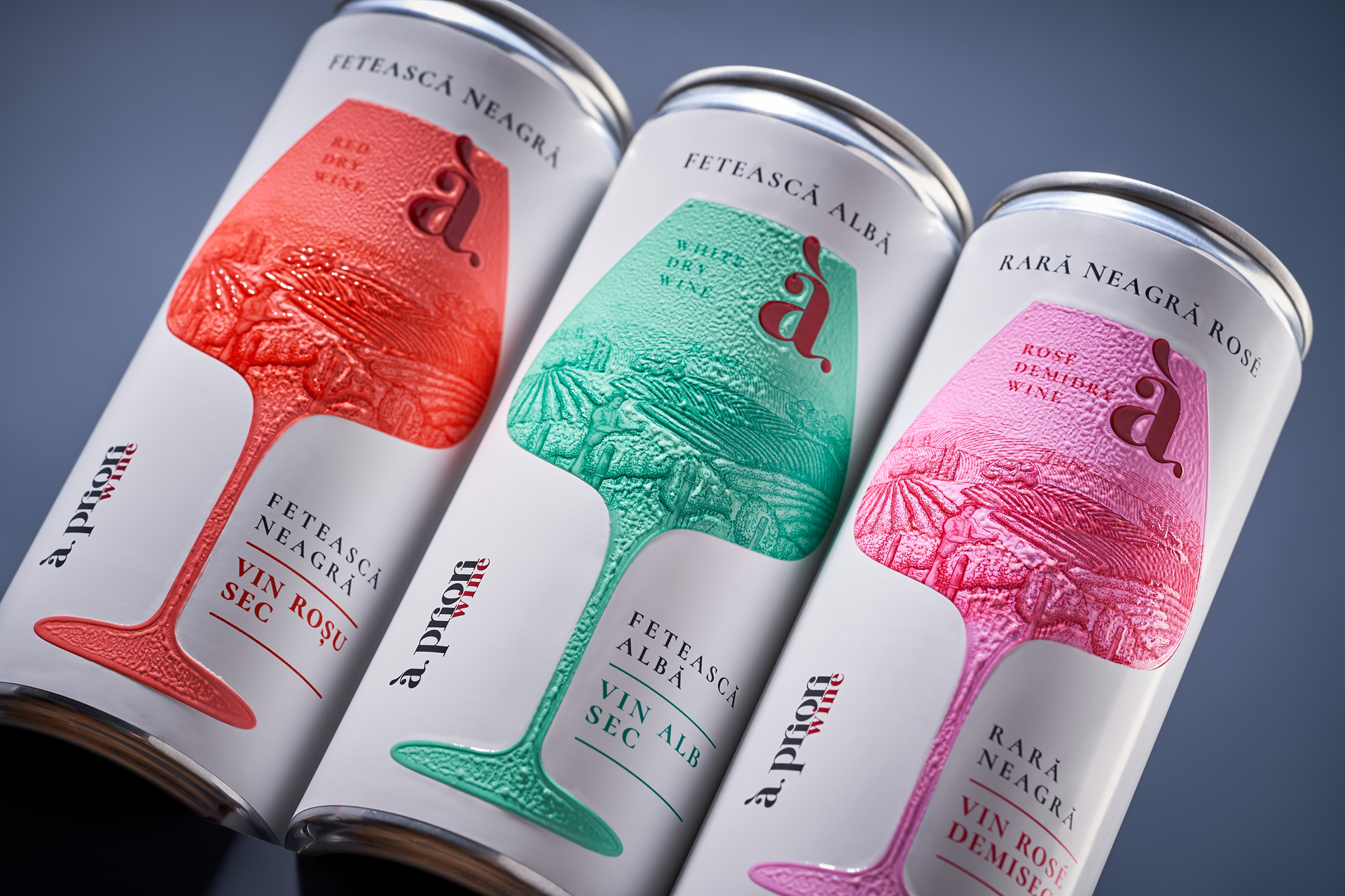
At the core of the visual solution is the wine glass - a symbol deeply rooted in the culture of wine consumption. Within its shape, a classic vineyard landscape unfolds, referencing traditional label aesthetics and the idea of terroir. This contrast between a familiar visual language and a modern format creates a new perspective on the product. The embossed texture of the glass adds a tactile dimension, enhancing the physical interaction and reinforcing the concept beyond visuals alone. The result is a design that not only communicates what’s inside, but redefines the format itself by bringing together classic wine and contemporary packaging.