- 2015
process
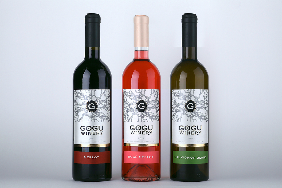
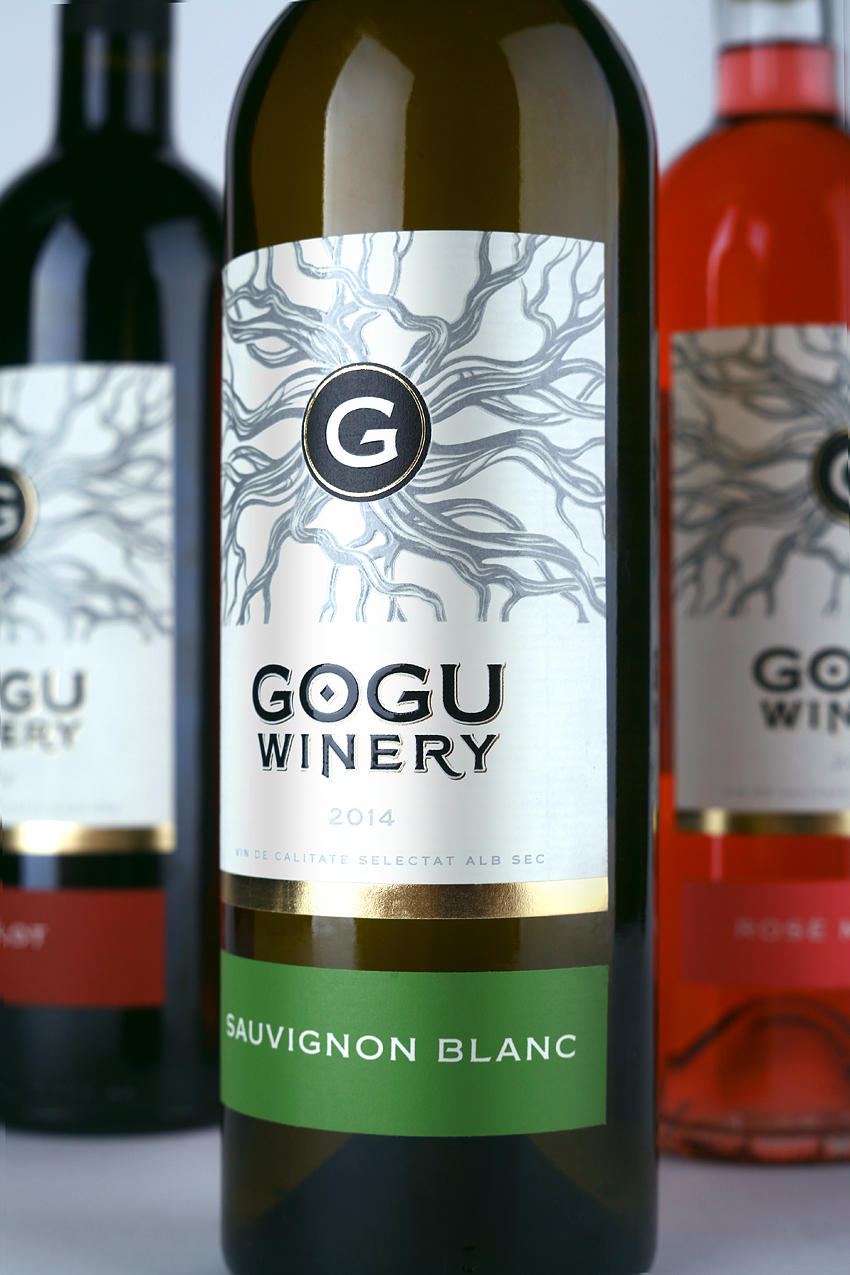
43’oz Design Studio proudly presents a new product on a market, the range of selected varietal wines "Gogu Winery". It is a niche product for a specific target audience: people who know a lot about good wine, who choose it not by chance, and to whom the name of a winemaker on the label will guarantee the quality of its product. And here's why. The history of wine-making company "Gogu Winery" is rooted in past 4 generations in a family Gogu. The company's founder - Ilie Gogu is hereditary winemaker, who realized the dream of his forefathers.
The brand "Gogu Winery" is based on a powerful image - the roots that take its rise from the monogram of Gogu family name and symbolize the authenticity, heritage and connection between generations on the one hand, and a huge, long-term experience in grape growing and contstant development on the other. Branched roots have become a key element in the design of the label that will certainly outstand it on a shelf, and provide instant recognition among consumers and connoisseurs of wines with a rich history.
This design is made on Avery Dennison paper label material.