- 2025
process
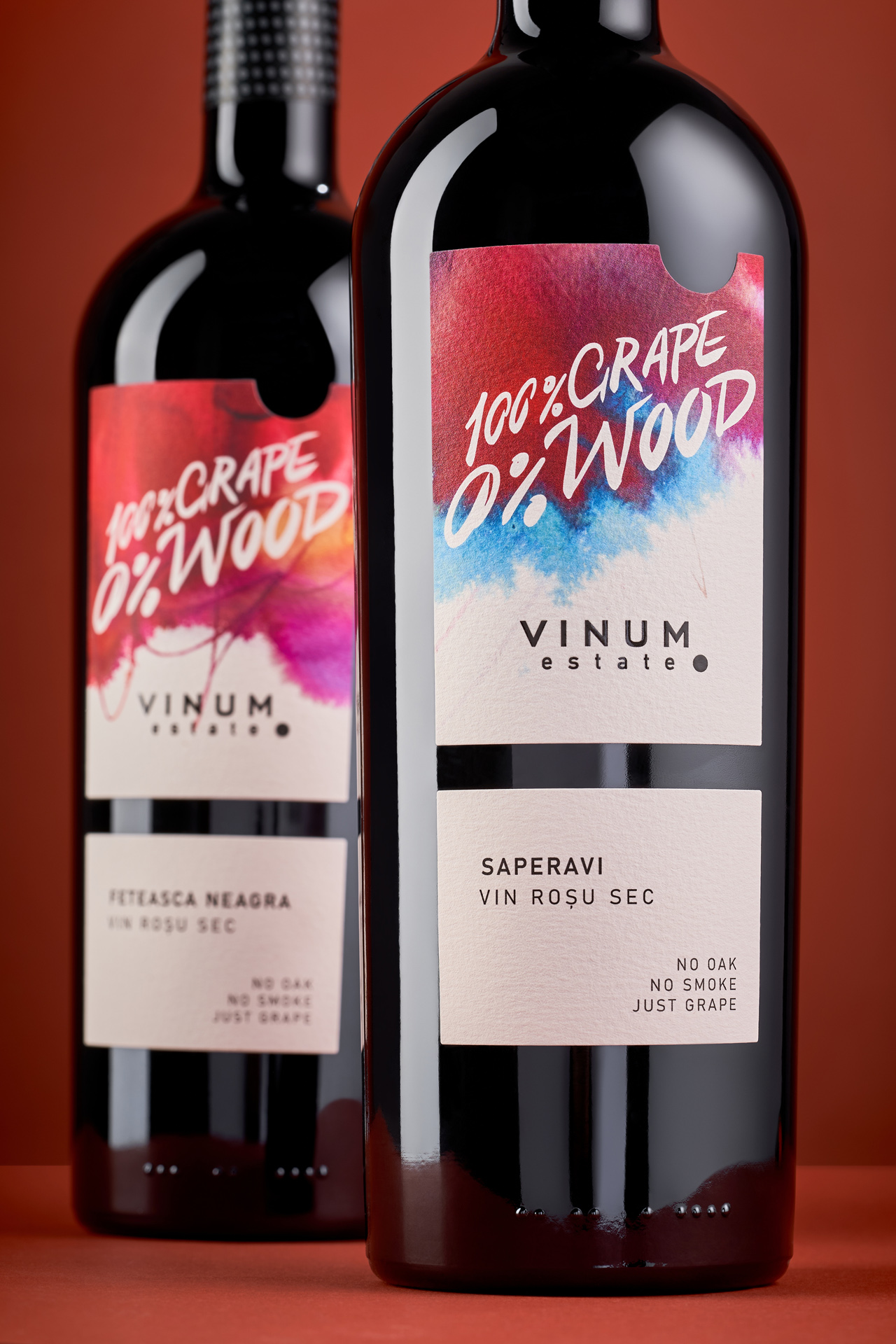
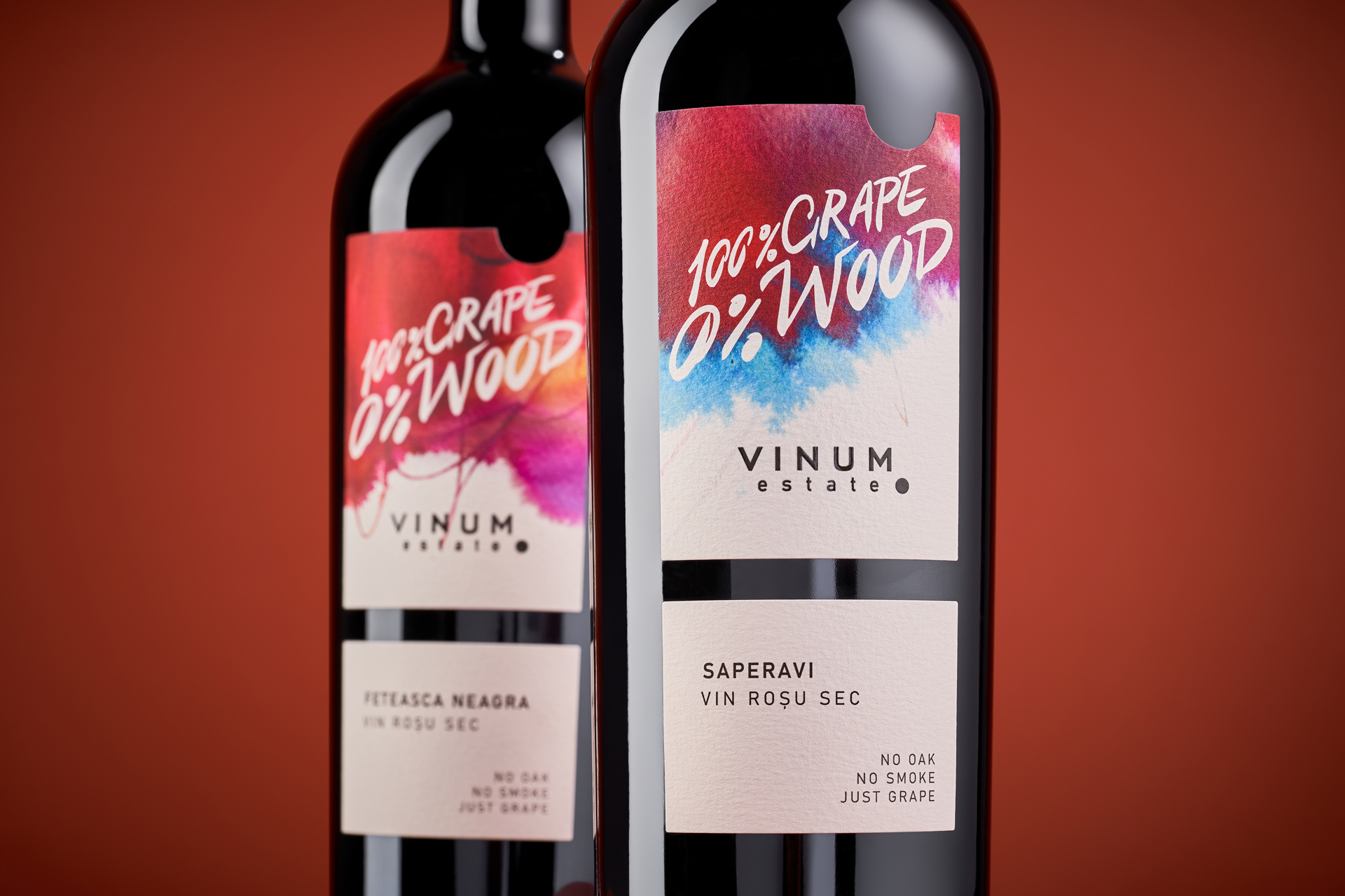
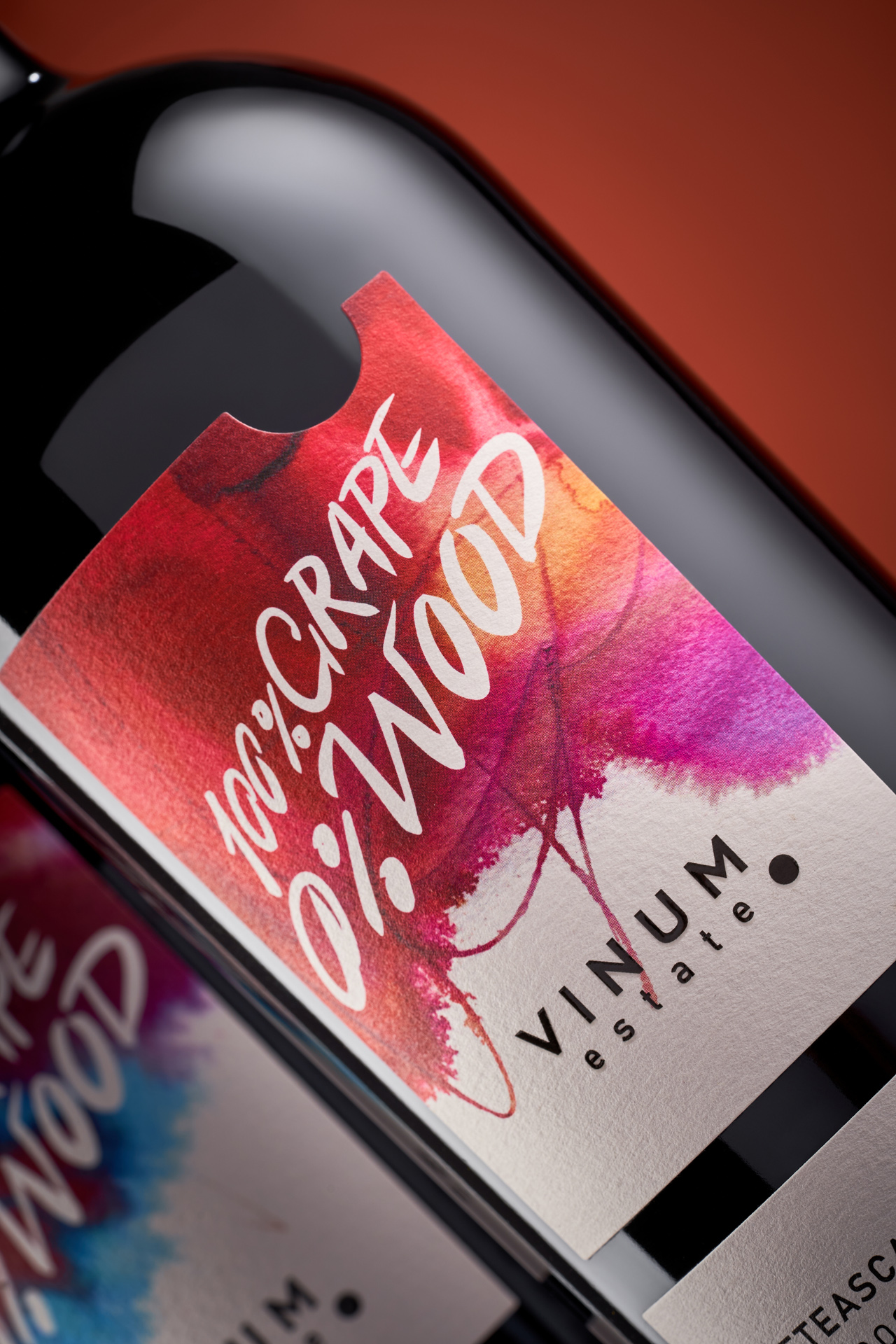
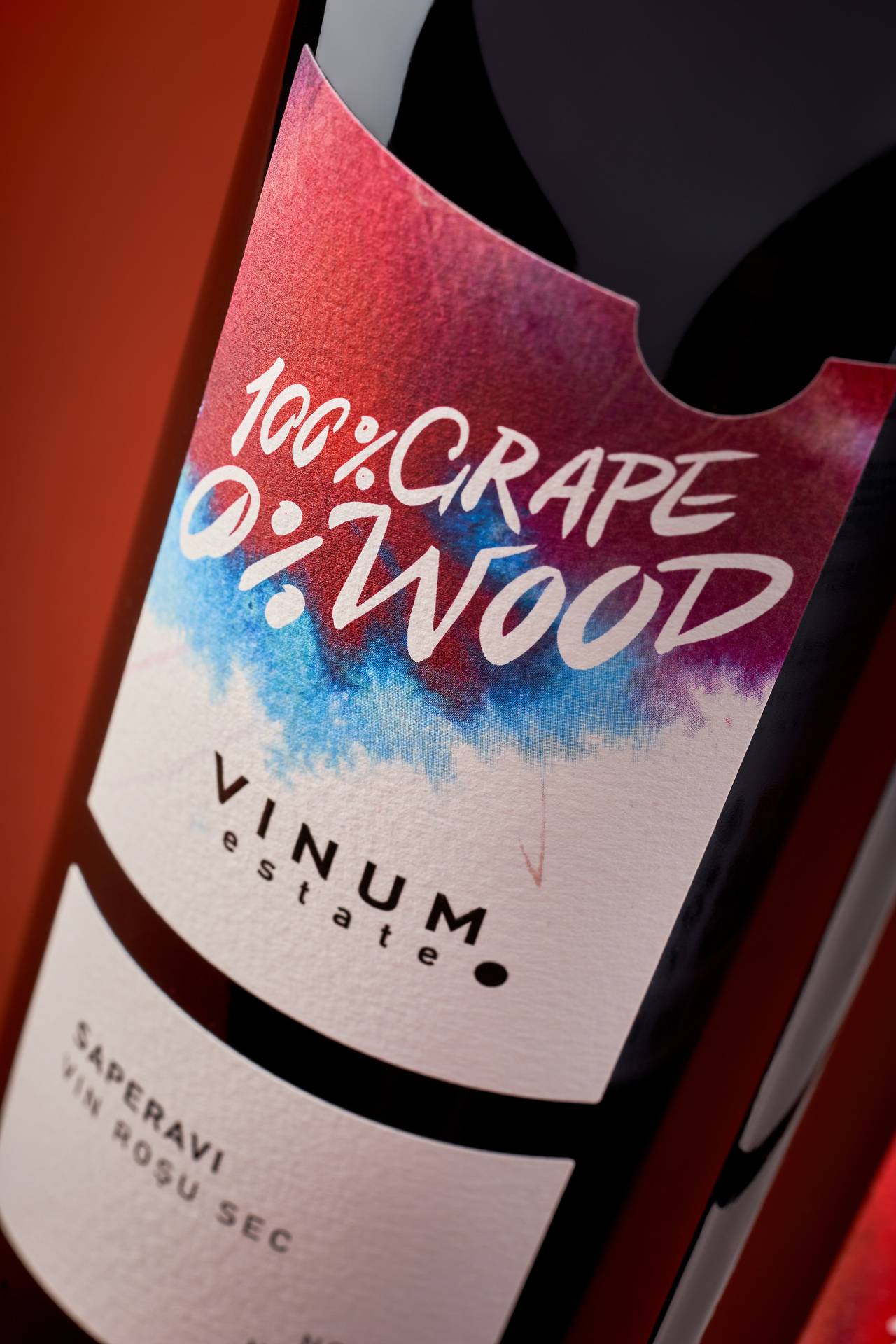
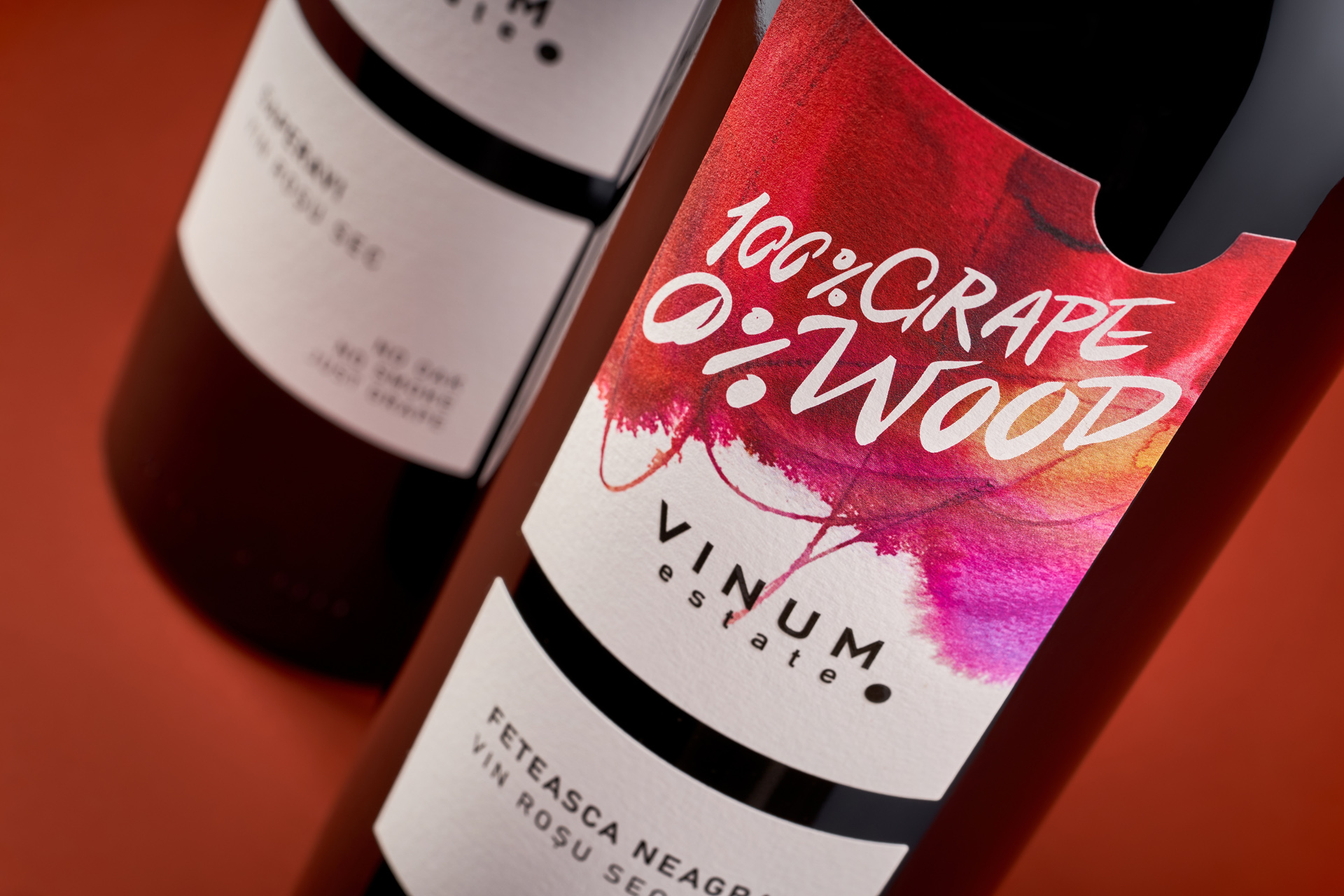
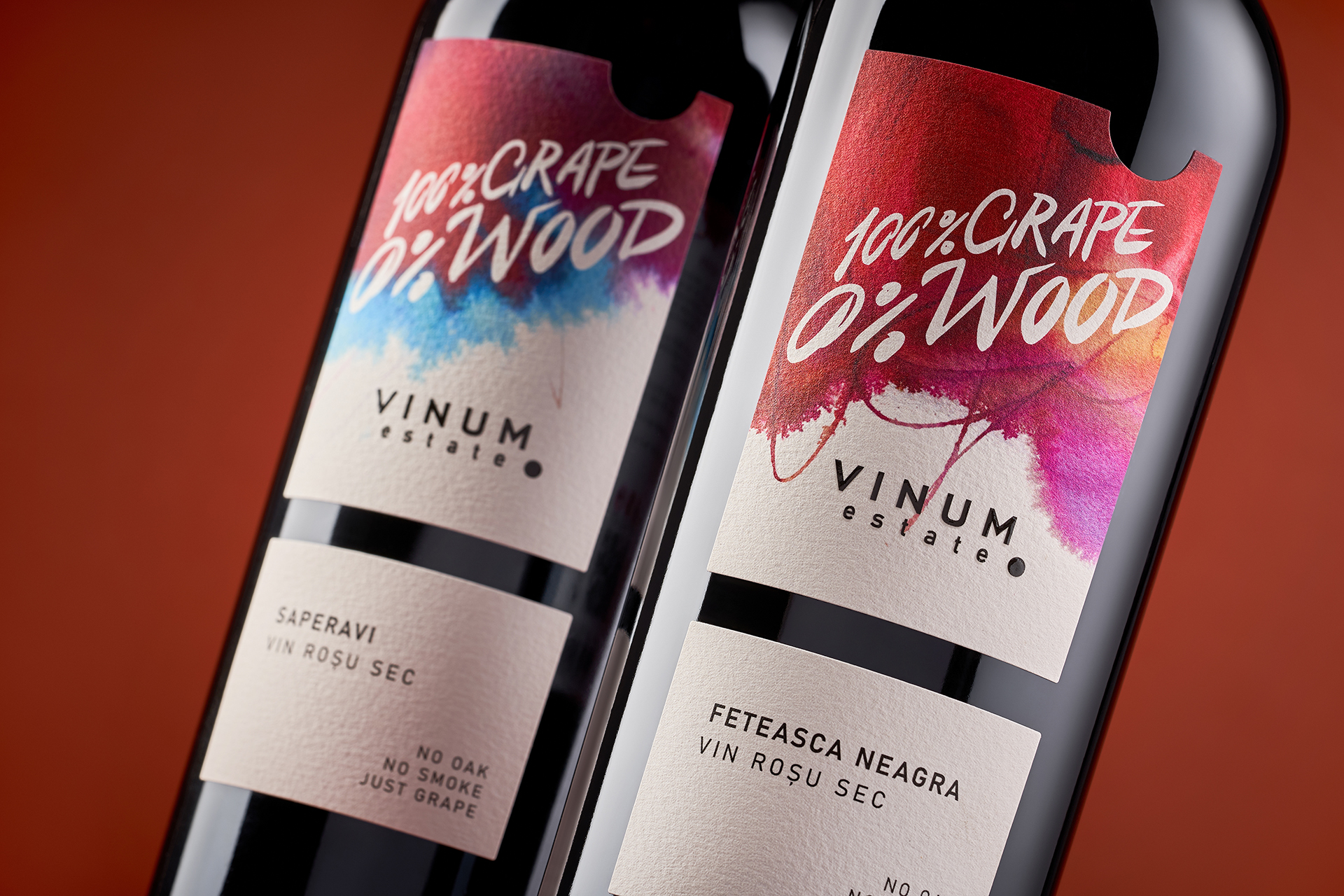
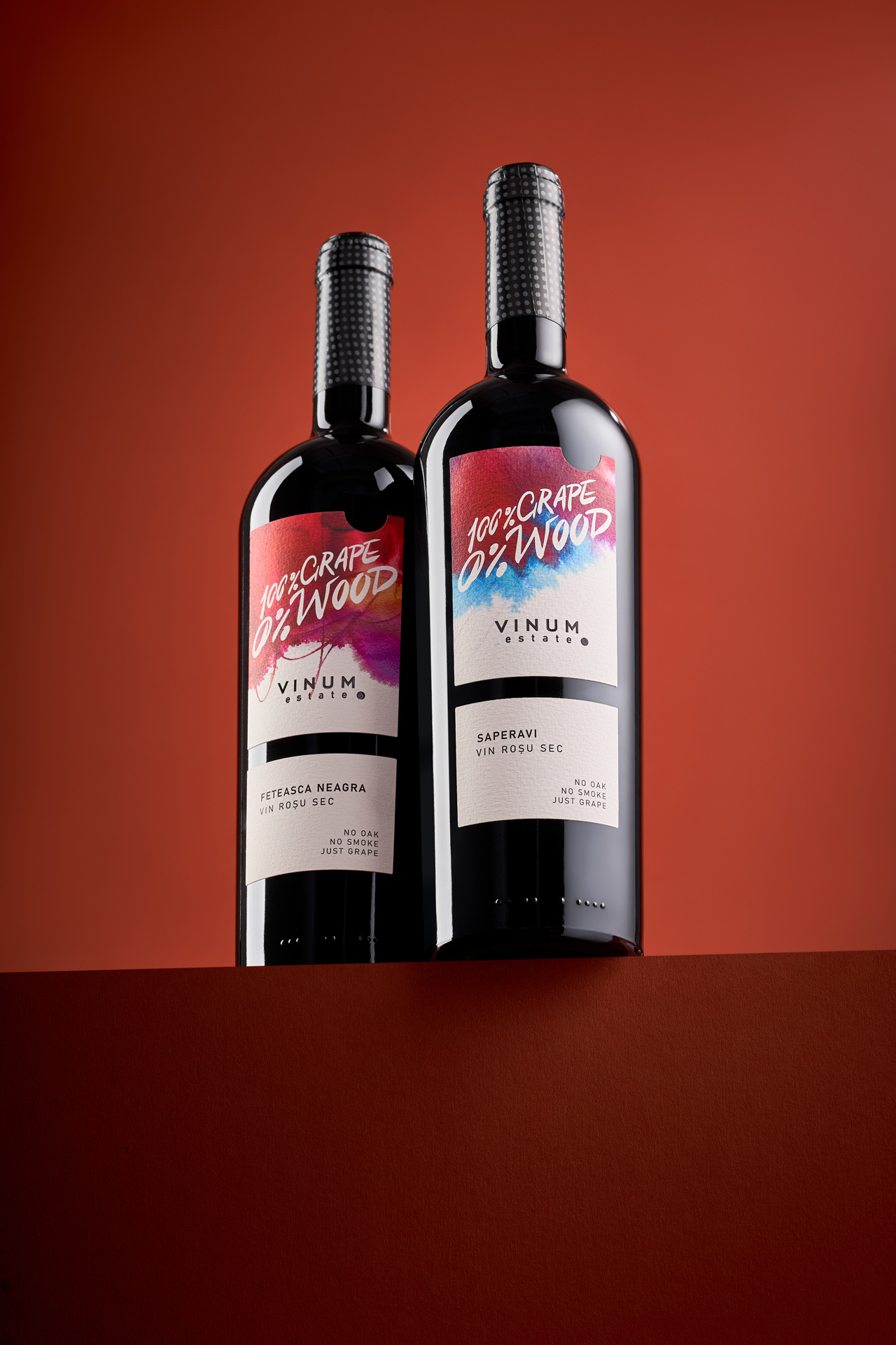
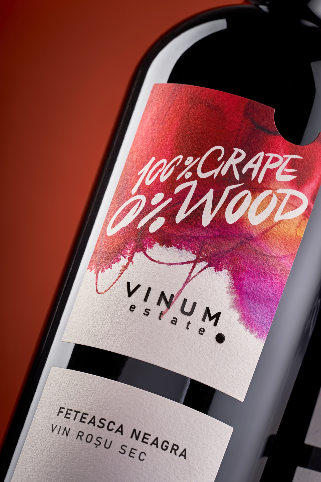
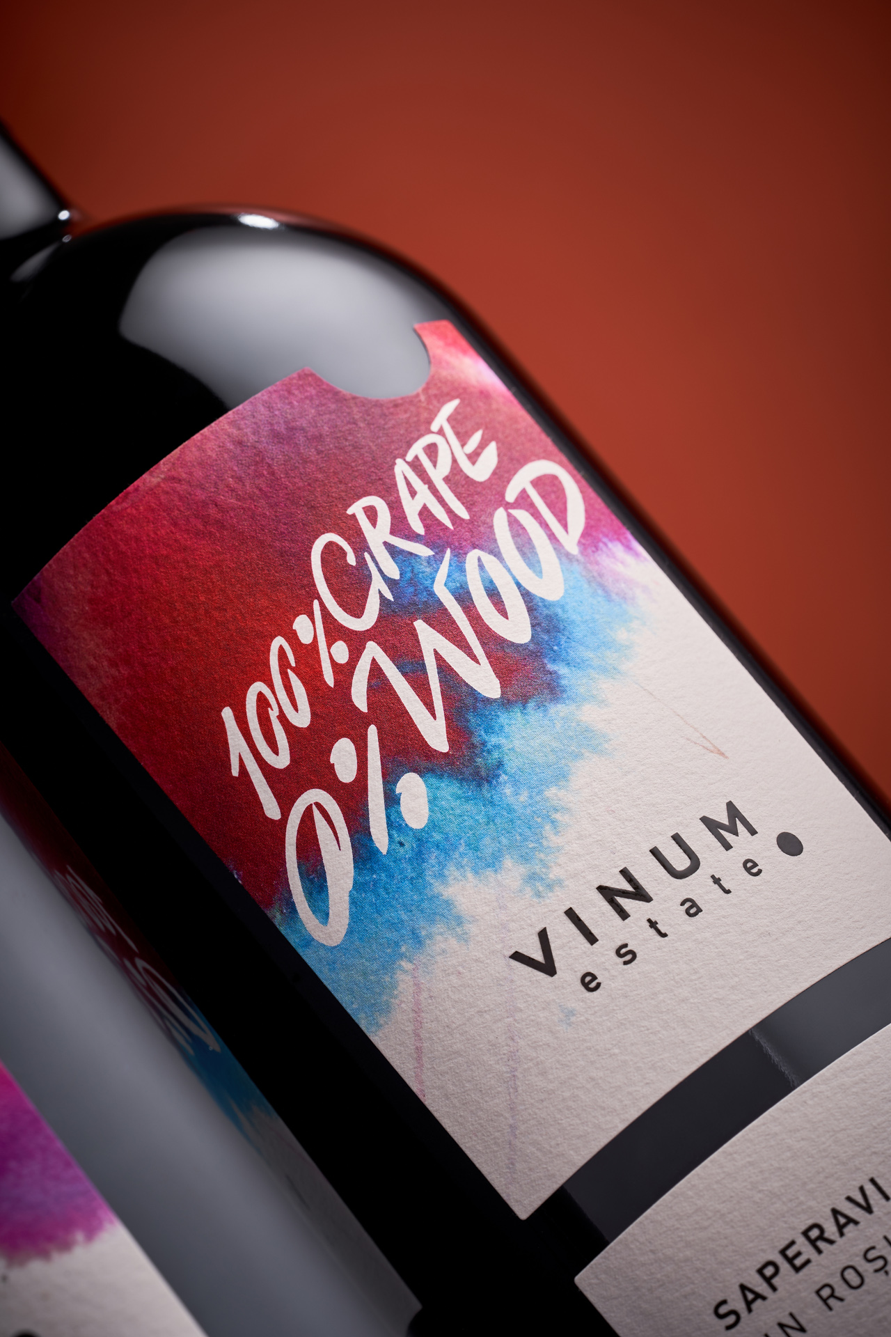
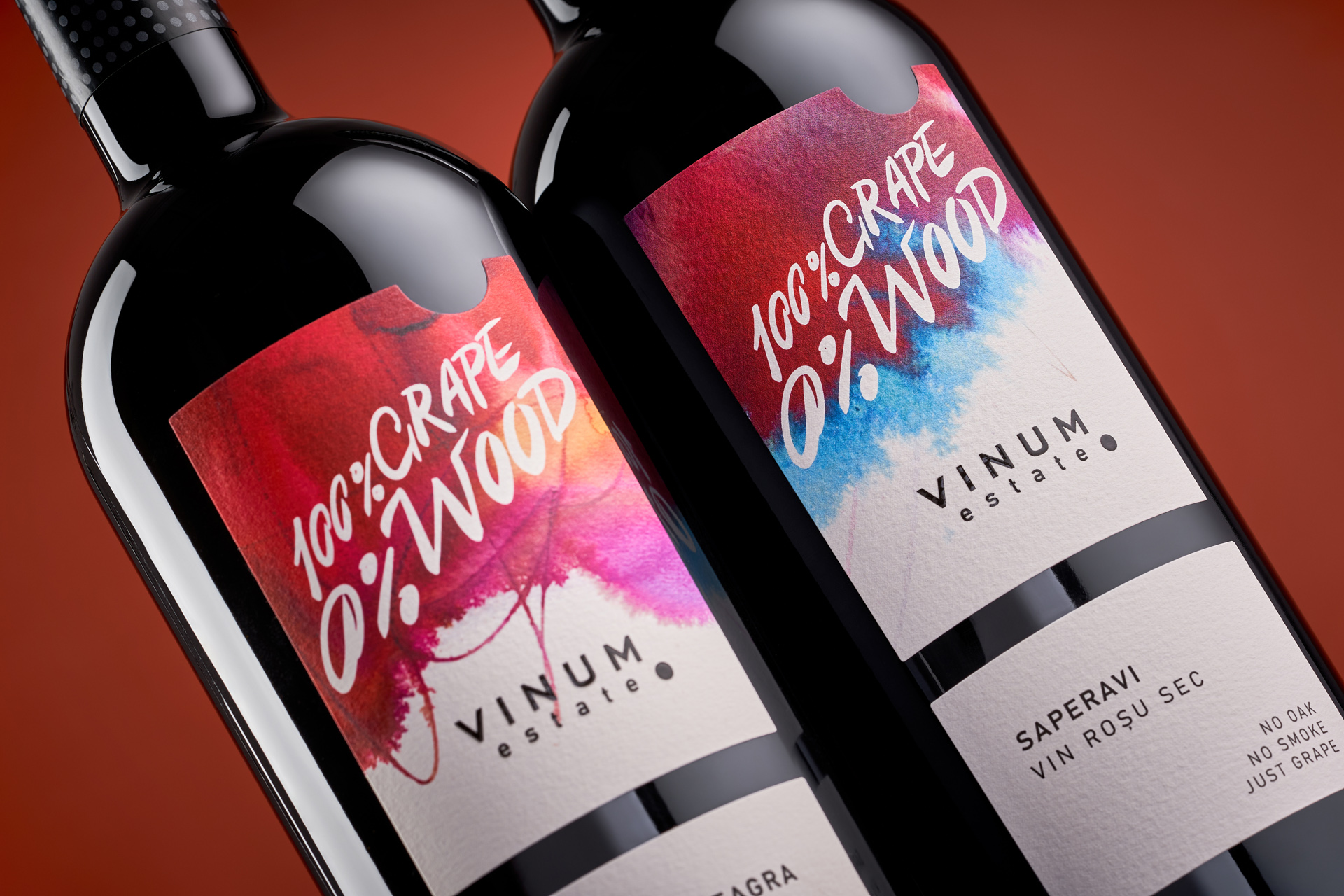
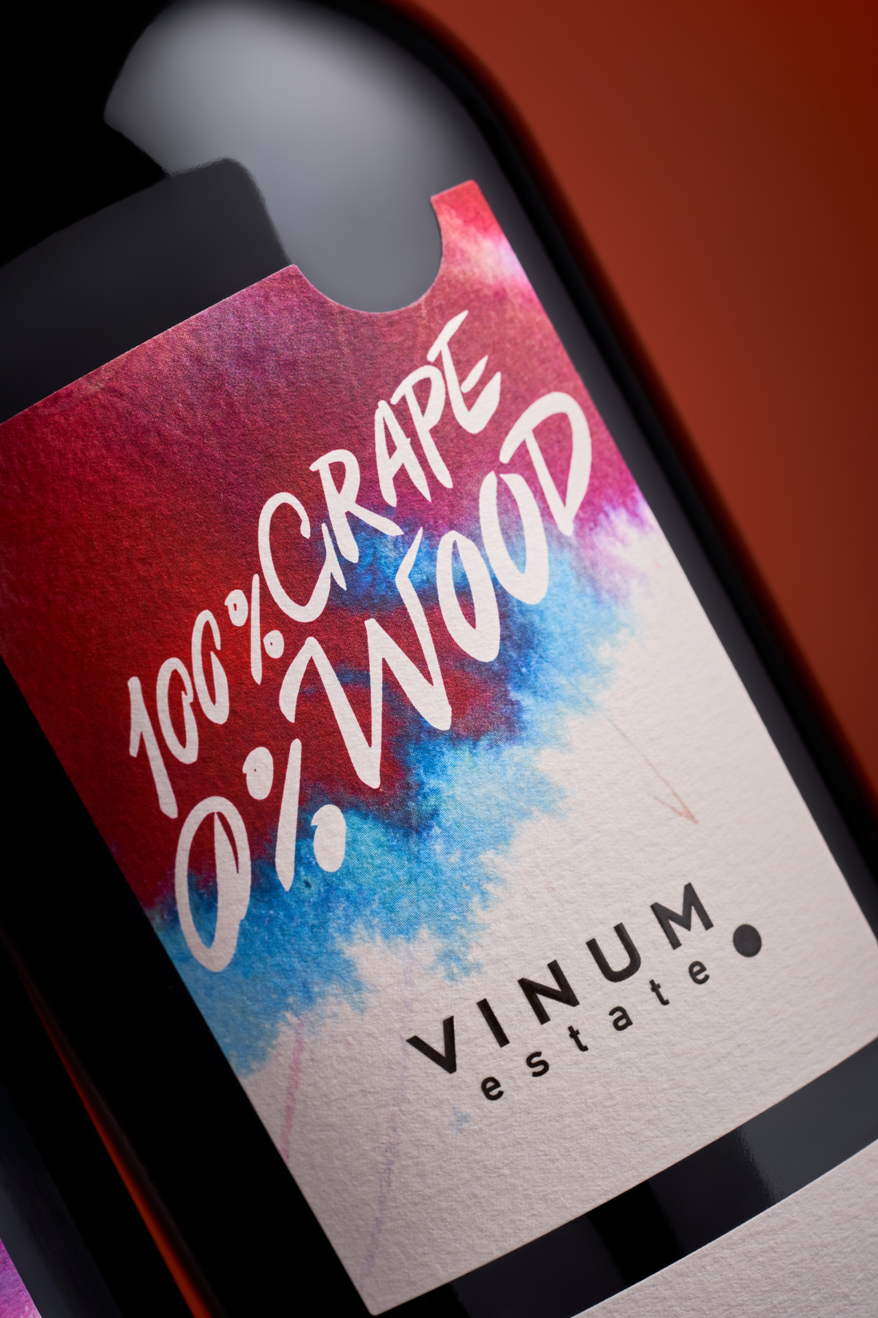
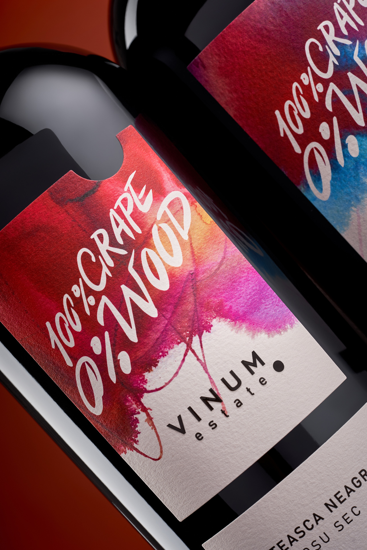
When 43oz Design Studio developed the minimalist label system for Vinum Estate, one of the key objectives was to create a flexible framework - a design that could evolve, adapt, and host future creative experiments. Among the directions envisioned early on was watercolor - an expressive, emotional medium that perfectly aligns with the winery’s philosophy of naturalness and transparency. This idea resurfaced after the Vinum team participated in a workshop dedicated to the fusion of watercolor and calligraphy. It became the creative spark behind a new project - 100% Grape 0% Wood, a collection dedicated to wines made without oak aging, capturing the pure essence of the grape itself.
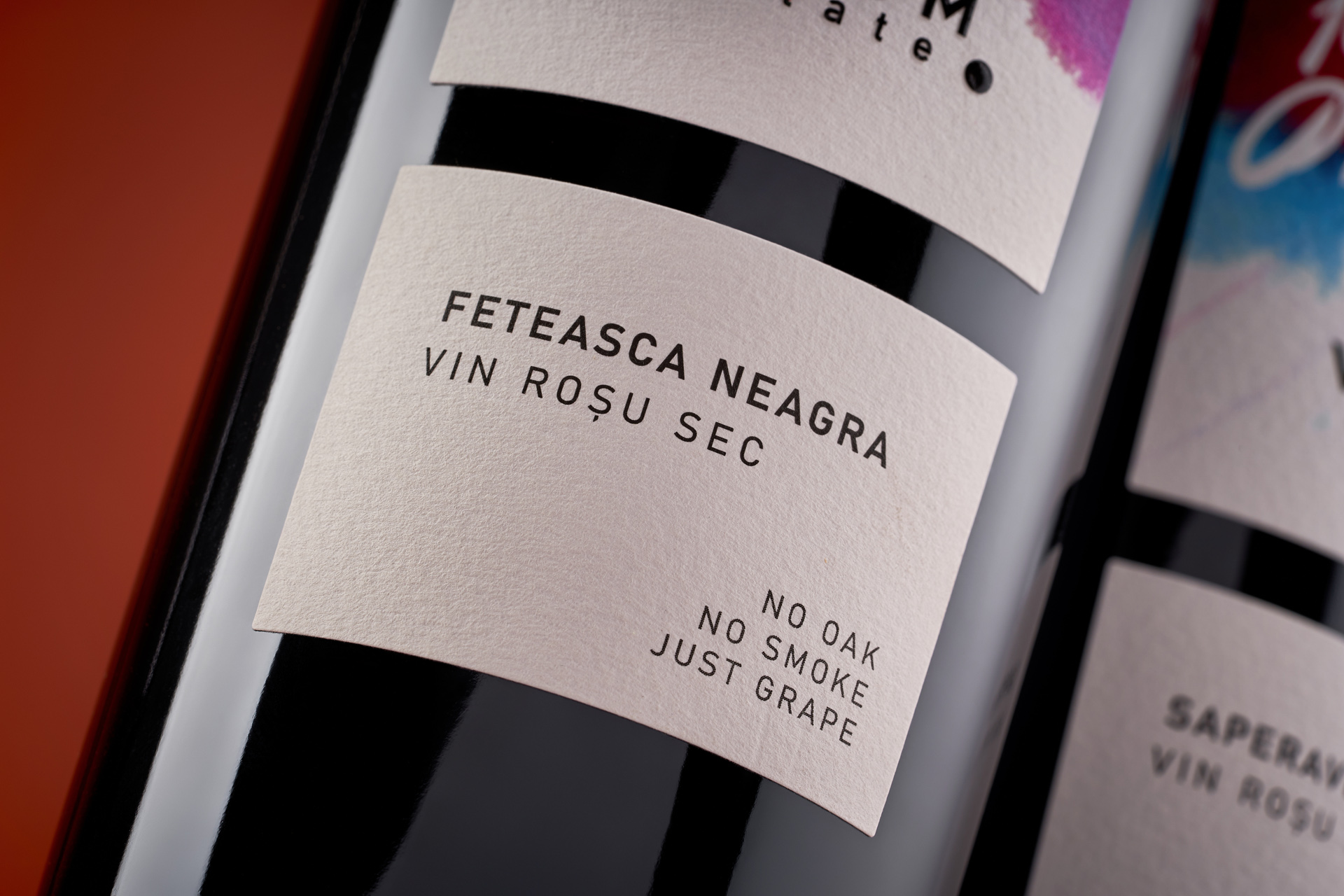
Visually, the new design preserves the clean, structured label shape of the classic Vinum line, ensuring continuity and brand recognition. Yet the central space now bursts with color: dynamic watercolor layers evoke freshness, vibrancy, and the natural flow of wine in motion. The handwritten-style title adds a personal touch, echoing the expressive spontaneity of brush strokes and reinforcing the artisanal nature of the wines.
The contrast between vivid color and minimalist typography reflects the duality at the heart of Vinum Estate - structure and freedom, precision and emotion, tradition and experimentation. The 100% Grape 0% Wood collection stands as a visual and conceptual continuation of the brand’s design philosophy, where purity and authenticity define both the aesthetics and the wine itself.