- 2020
process
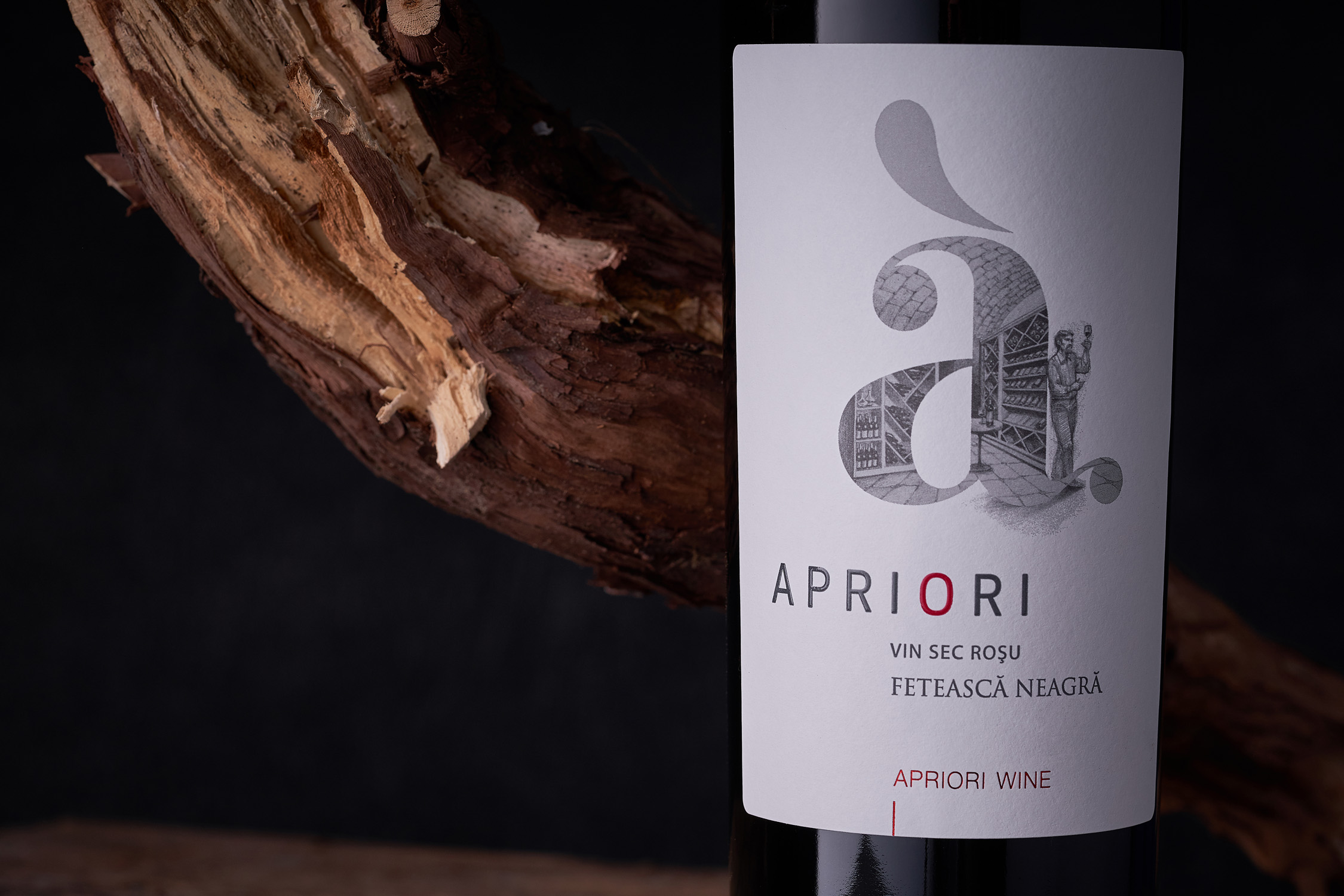
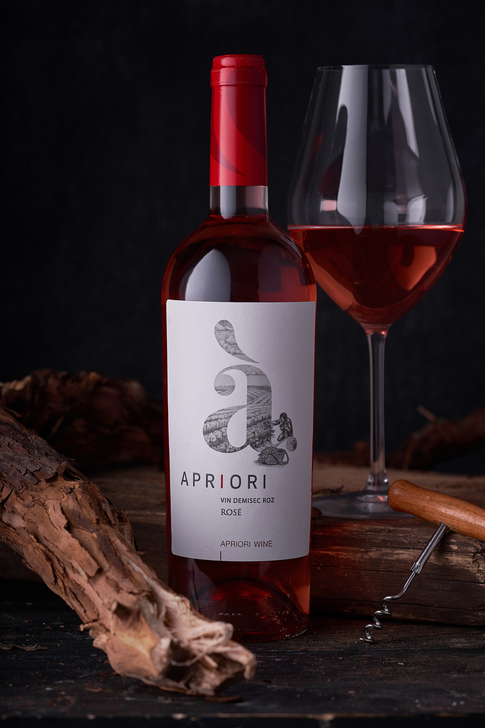
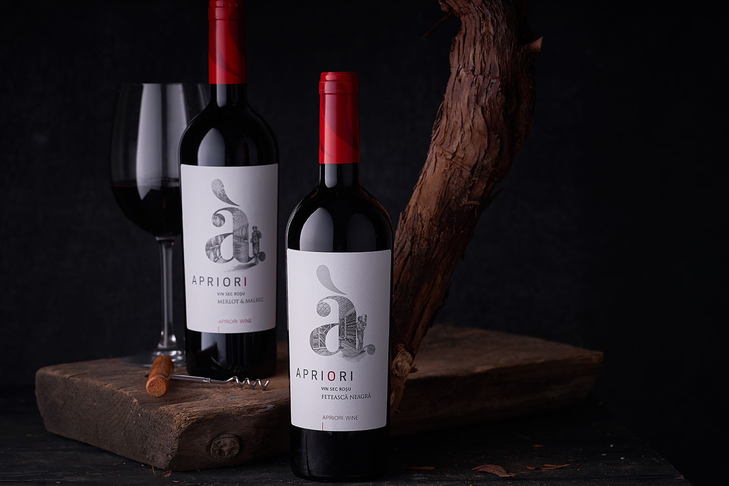
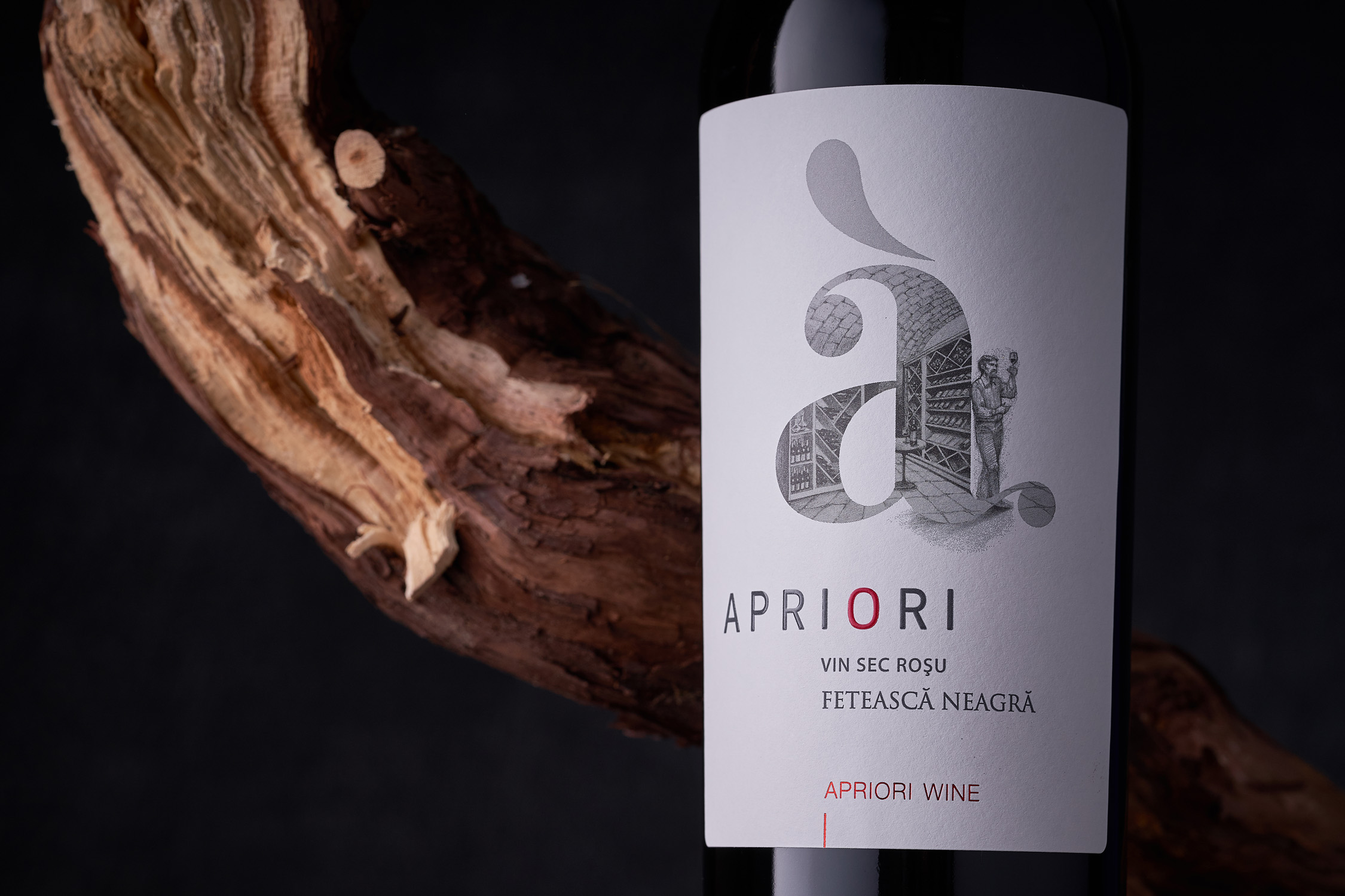
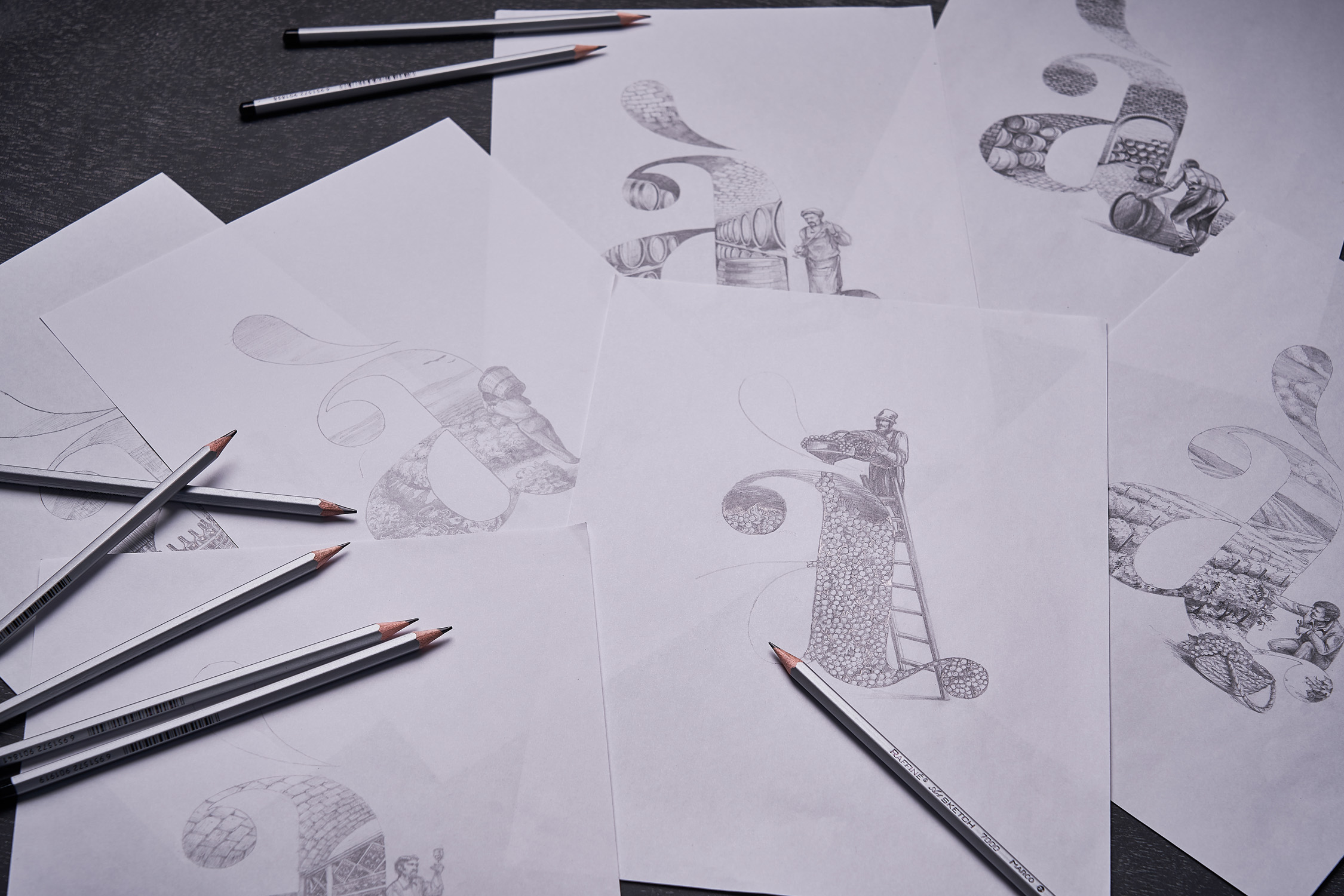
The renowned Moldovan brand Apriori is famous among local wine lovers for its excellent price to quality ratio. The company pays close attention to the high standards of quality for wines sold under this brand, and meticulously picks the products that will ultimately become Apriori wines. That’s why when it came to redesigning the label for their basic product line, the main emphasis had to be placed on the selective approach to wine, starting from picking the grapes to presenting the finished wines. Based on this, our studio has decided to fill the existing brand logo with everything that defines the company’s philosophy.
While creating the design concept for the Apriori wines core line, we wanted to shift the visual accent from the label in general to the brand’s logo and everything that fills it at the product creation level. That is why we’ve created a set of illustrations depicting various stages of wine production, which are inscribed into the familiar brand logo. This element acts as the central piece in a minimalistic label, which helps to concentrate the consumer’s attention on its main message - high quality and special approach to wine. Thus the entire product line illustrates the process of creating the drink, its path from grapes to a glass full of wine.