- 2020
process
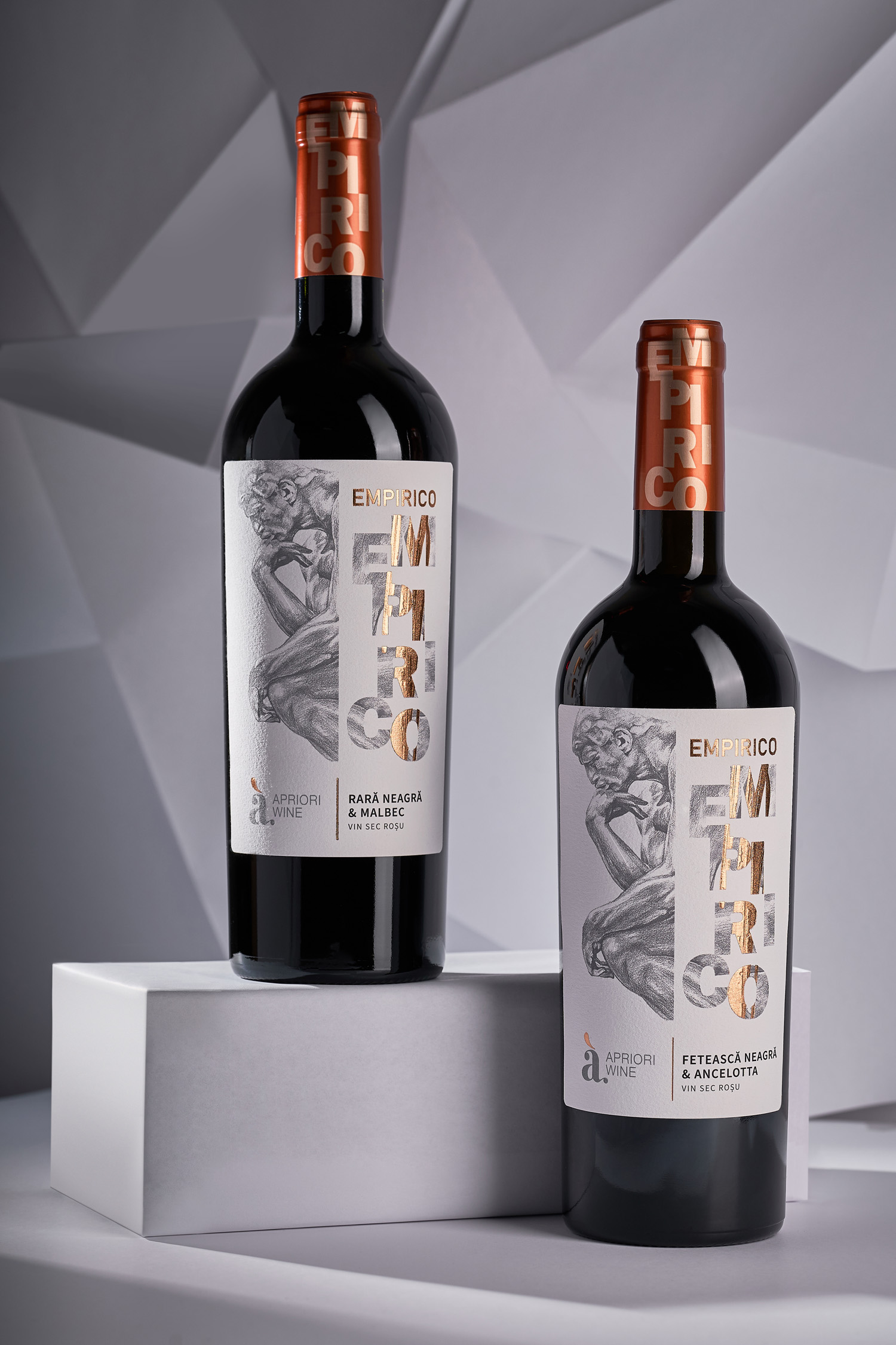
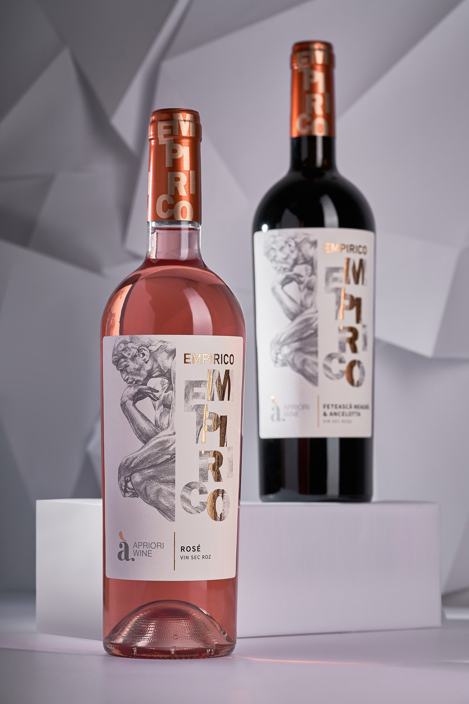
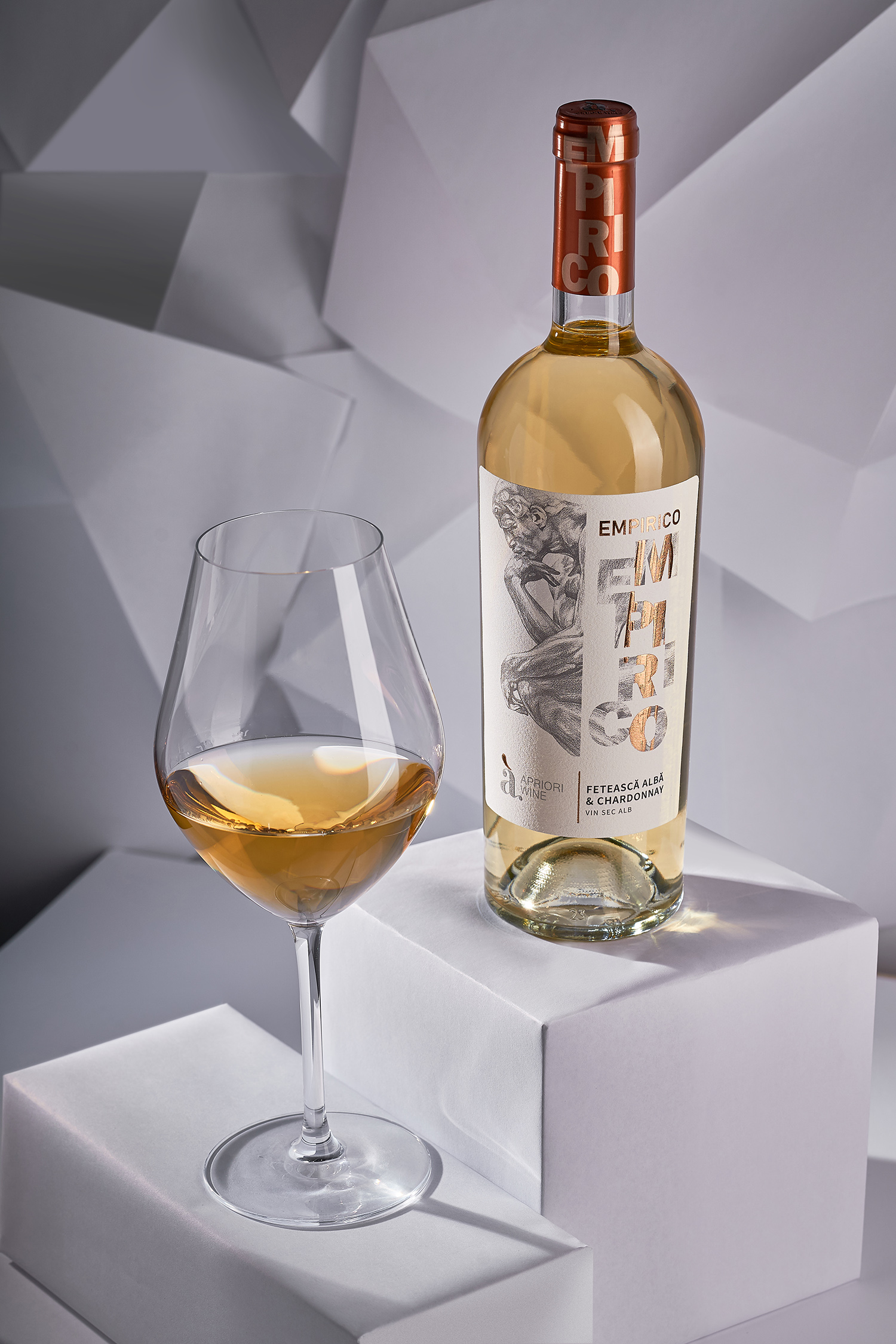
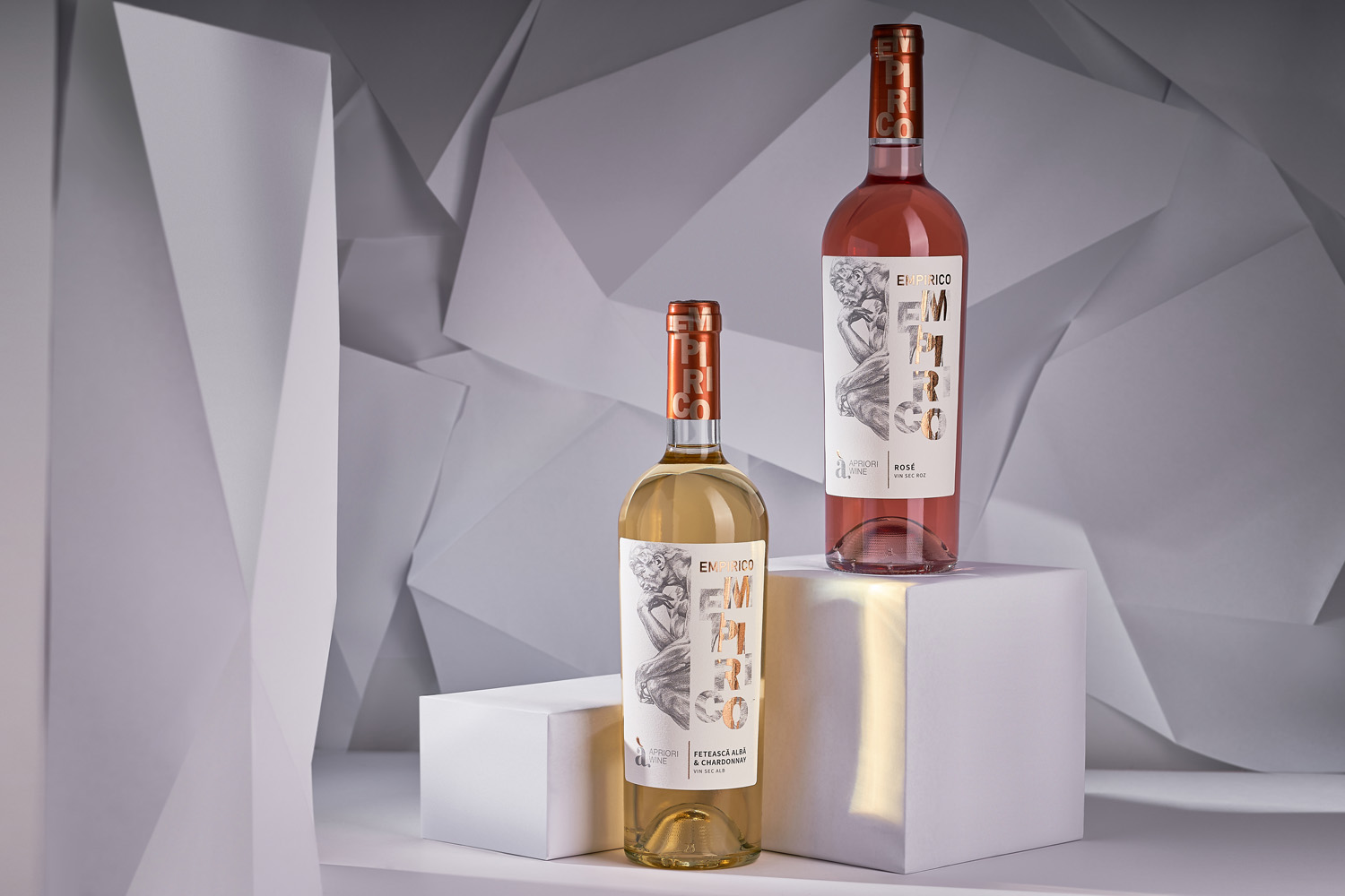
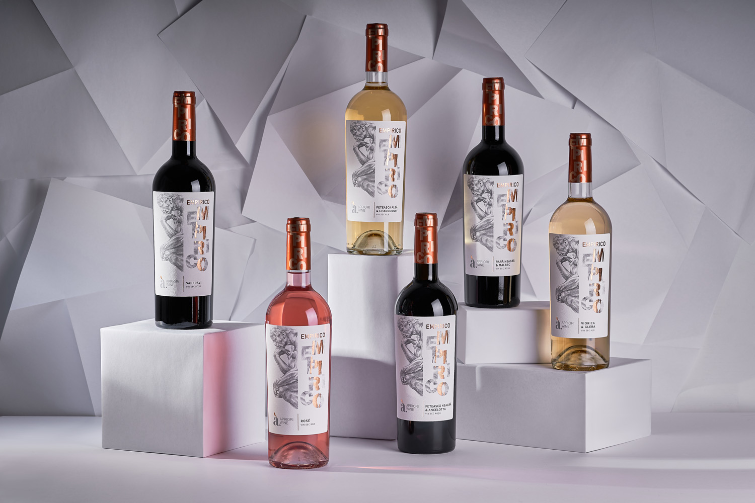
The new product line Empirico from the well-known Moldovan wine brand Apriori represents a complete rethinking of the very approach to wine-making. Because empiricism, to which the name refers, involves an accumulation of experience, its processing, and subsequent transformation into something new. In fact, this is the quintessence of wine-making: collecting experience through numerous trials, experiments, the further embodiment of this knowledge, and the long wait for the result. Undoubtedly, such a deep concept required a corresponding visual representation, which would emphasize the special status of the new product line in the company’s portfolio. So our studio dived deep into the world of philosophy and art in order to develop a design concept for the new Empirico wines.
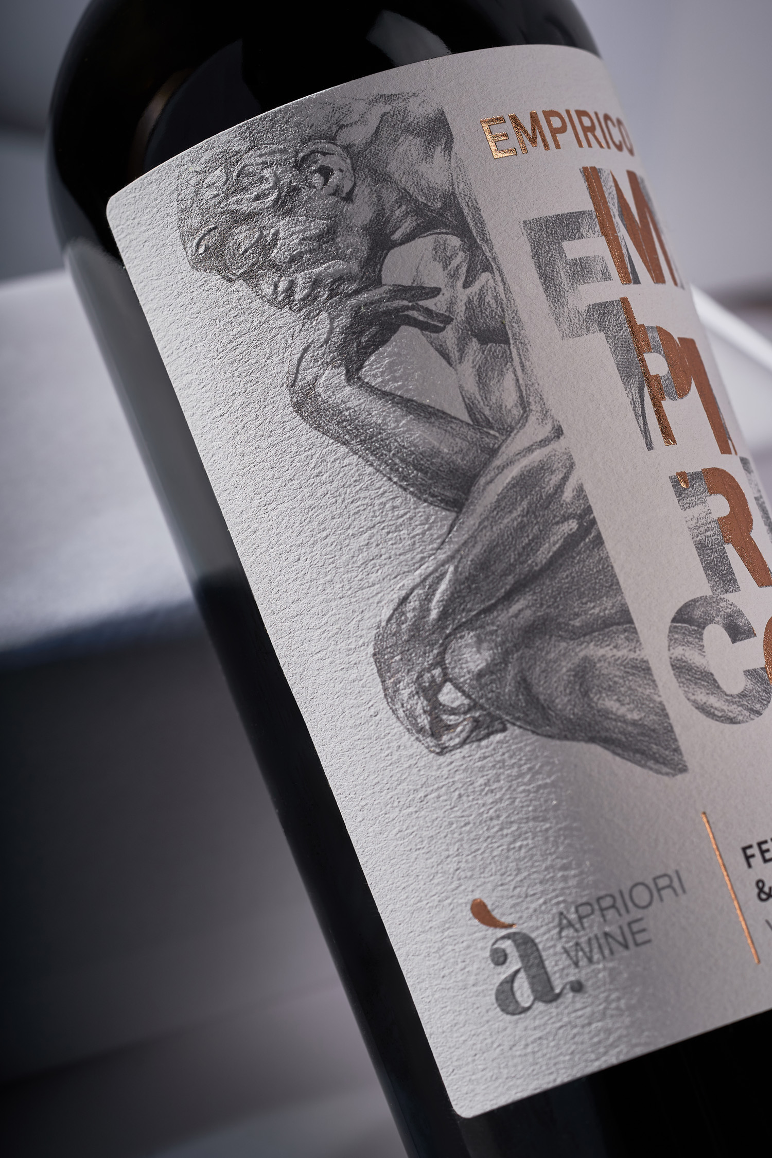
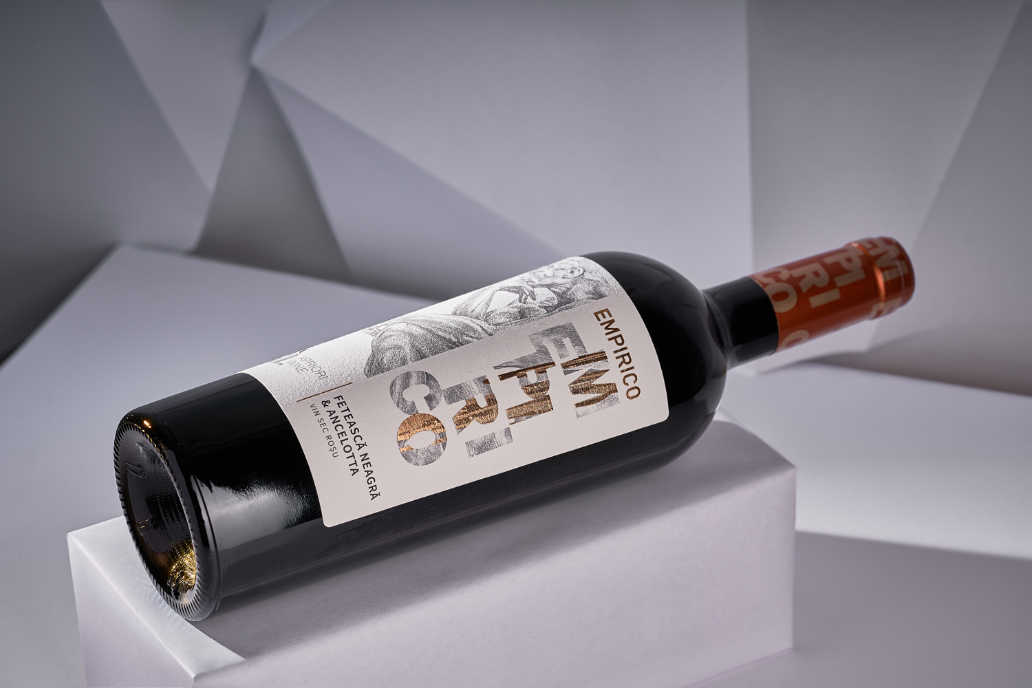
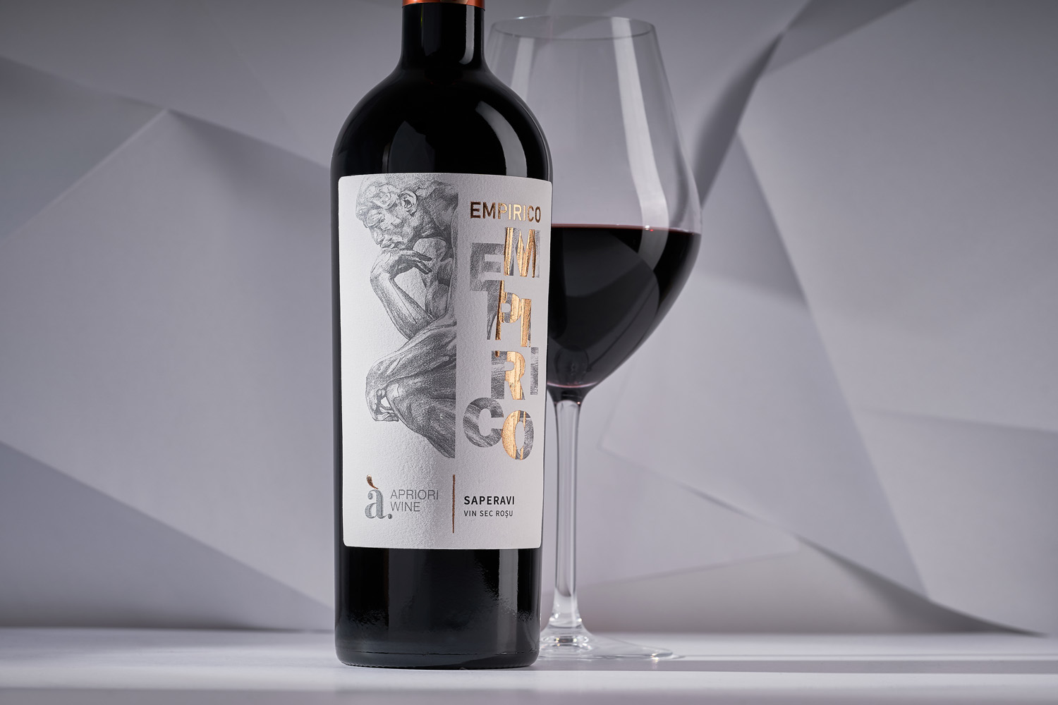
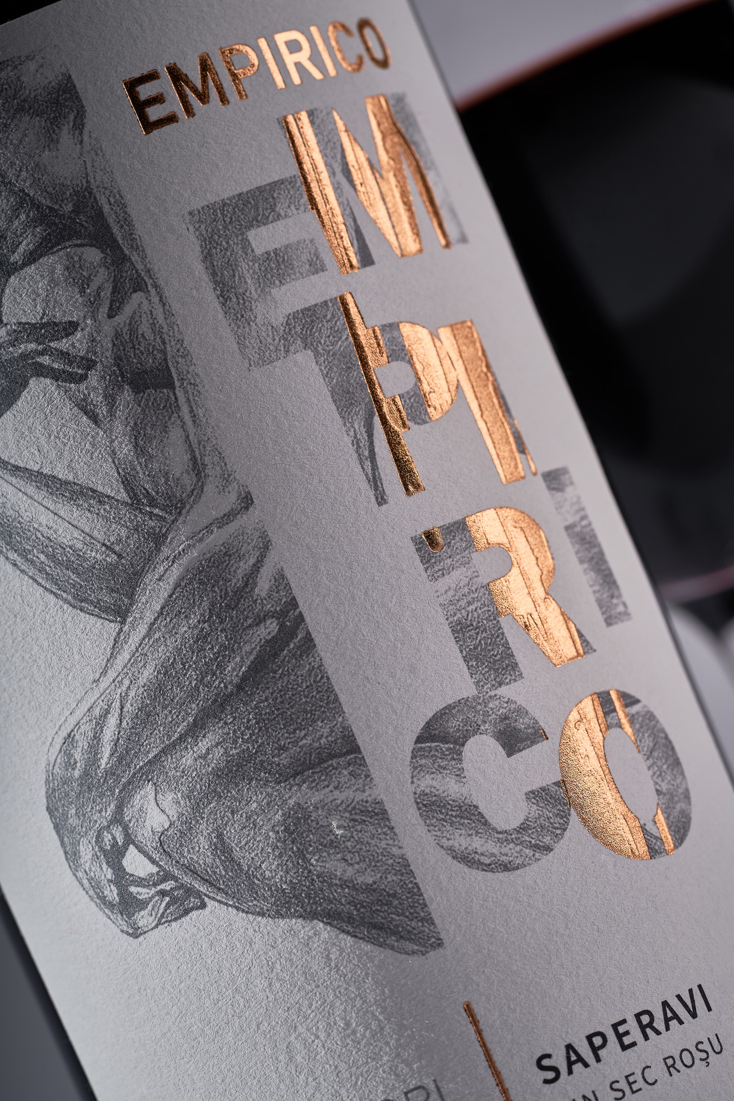
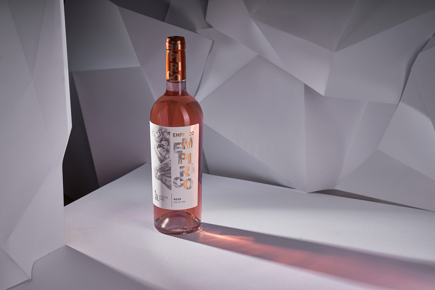
The central element in the label design for Empirico is the stylized illustration of the world-famous “Thinker” statue by August Rodin. This image was picked on purpose. For how, if not through the process of thinking, analysis and review one can transform the accumulated experience into something new, step from theory to practice? The illustration takes up exactly half of the front label, which is executed in a temperate, even minimalist style. The second half of the label features a stylized inscription of the product line’s name, which thanks to the application of post-printing techniques adds an expressive and vivid accent to the entire composition. The informative part is reduced to bare essentials, which allows one to focus on the label’s main elements.