- 2021
process
Creating a visual design for a completely new wine brand is always a serious task, which implies working closely with the client. After all, only through intense communication and exchange of ideas it is possible to develop a clear vision of the brand and set the vector for its development. And, sometimes, as a result of this process, the client’s initial concepts undergo dramatic changes, greatly changing the tone and message behind the new enterprise. Our work with Bahu Winery is a good example of just such a situation. Having initially a clear vision of what the brand was supposed to look like in the end, the owners of the company, nevertheless, decided to completely rethink their vision after a long and intensive work with our studio. And it wasn’t about simply persuading the client, but about the ability to shift their focus, to help them concentrate on the things and values that really matter to them. As it turned out, one of the main aspects for Bahu Winery was their rich roots, woven from many cultural layers and twists of fate that forced their hand to create a new winery. This is exactly what we’ve decided to convey in the packaging design for Bahu Winery.
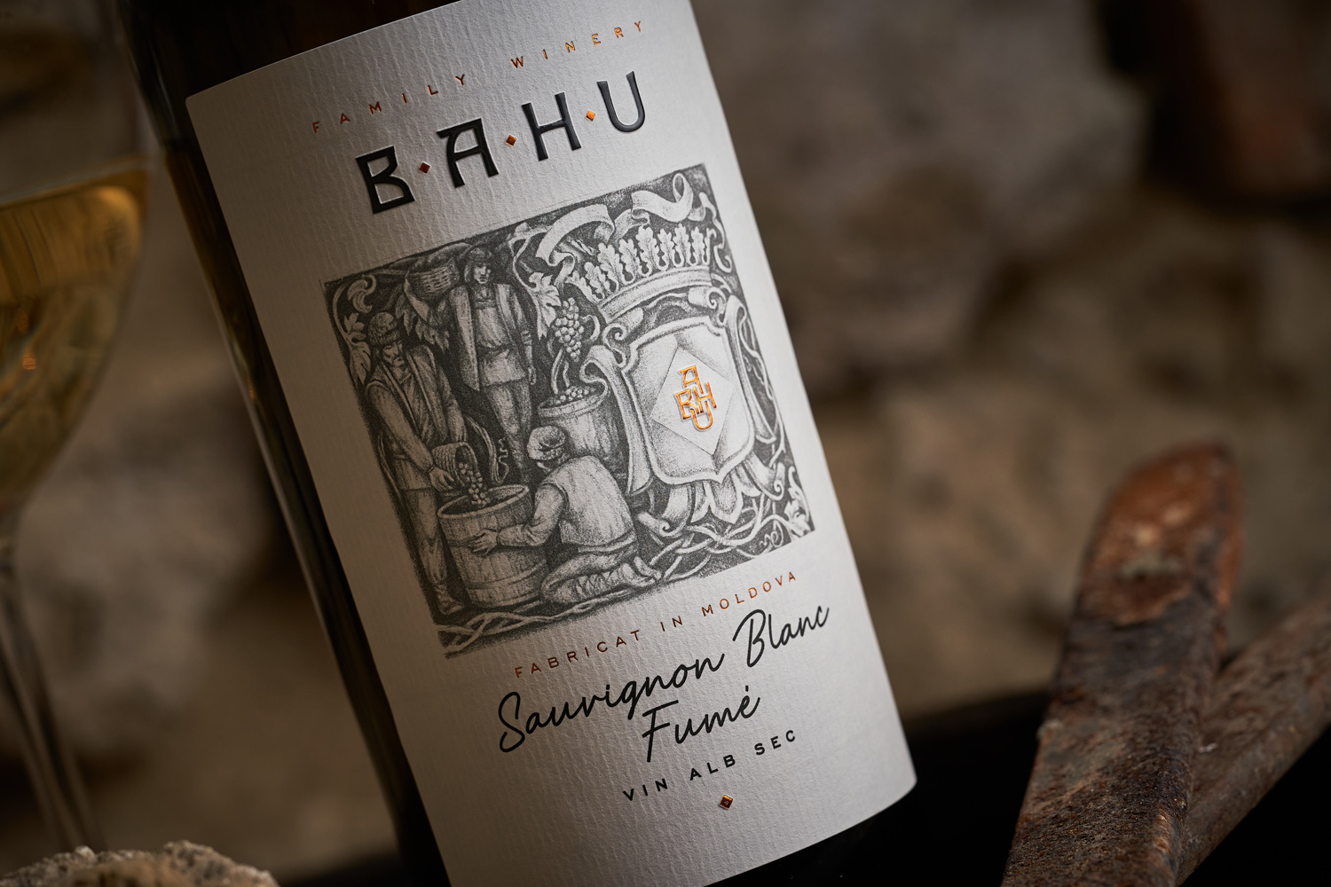
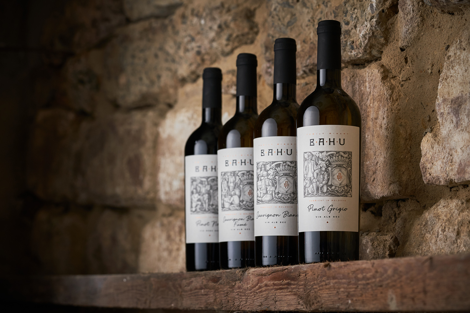
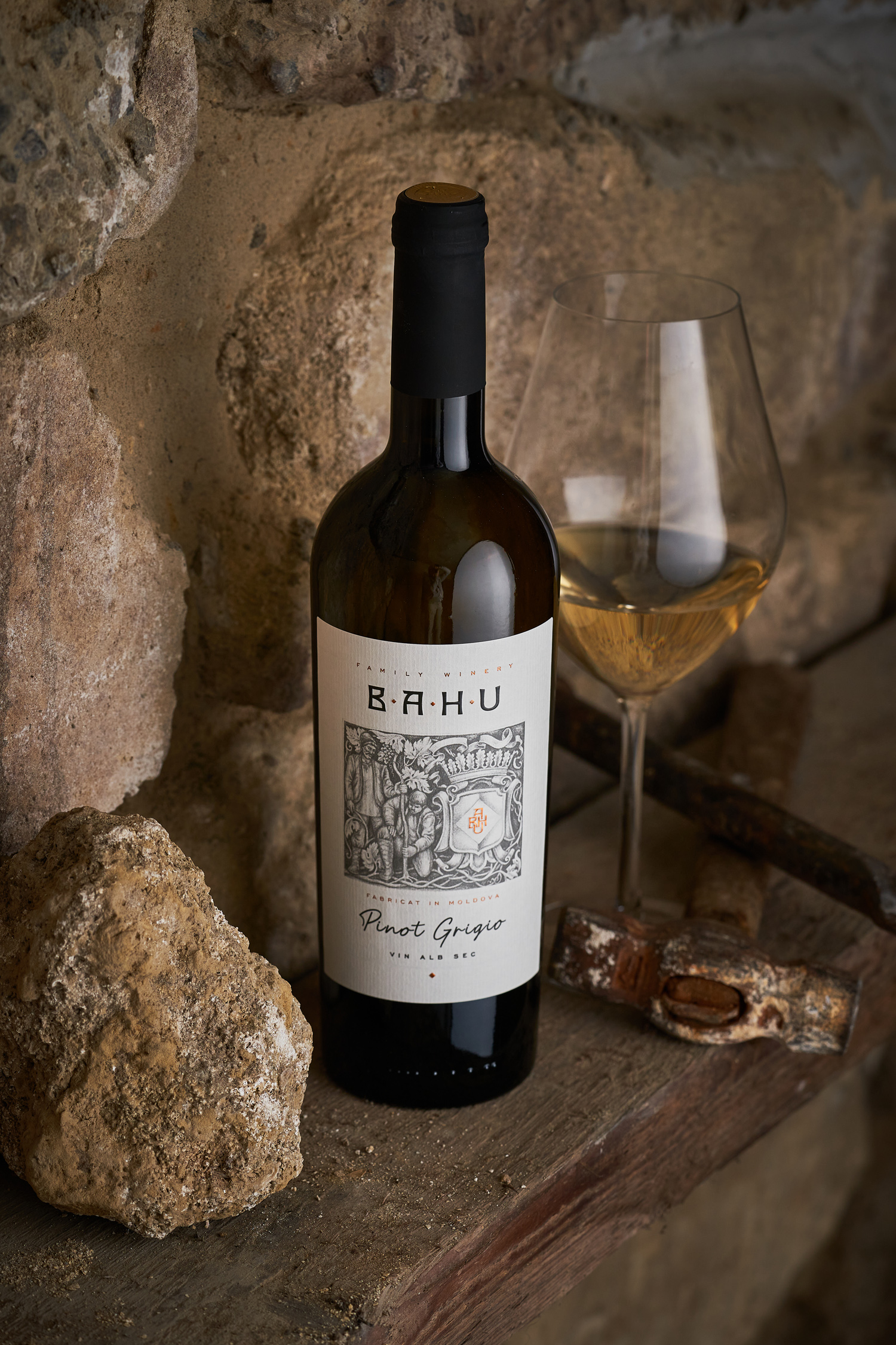
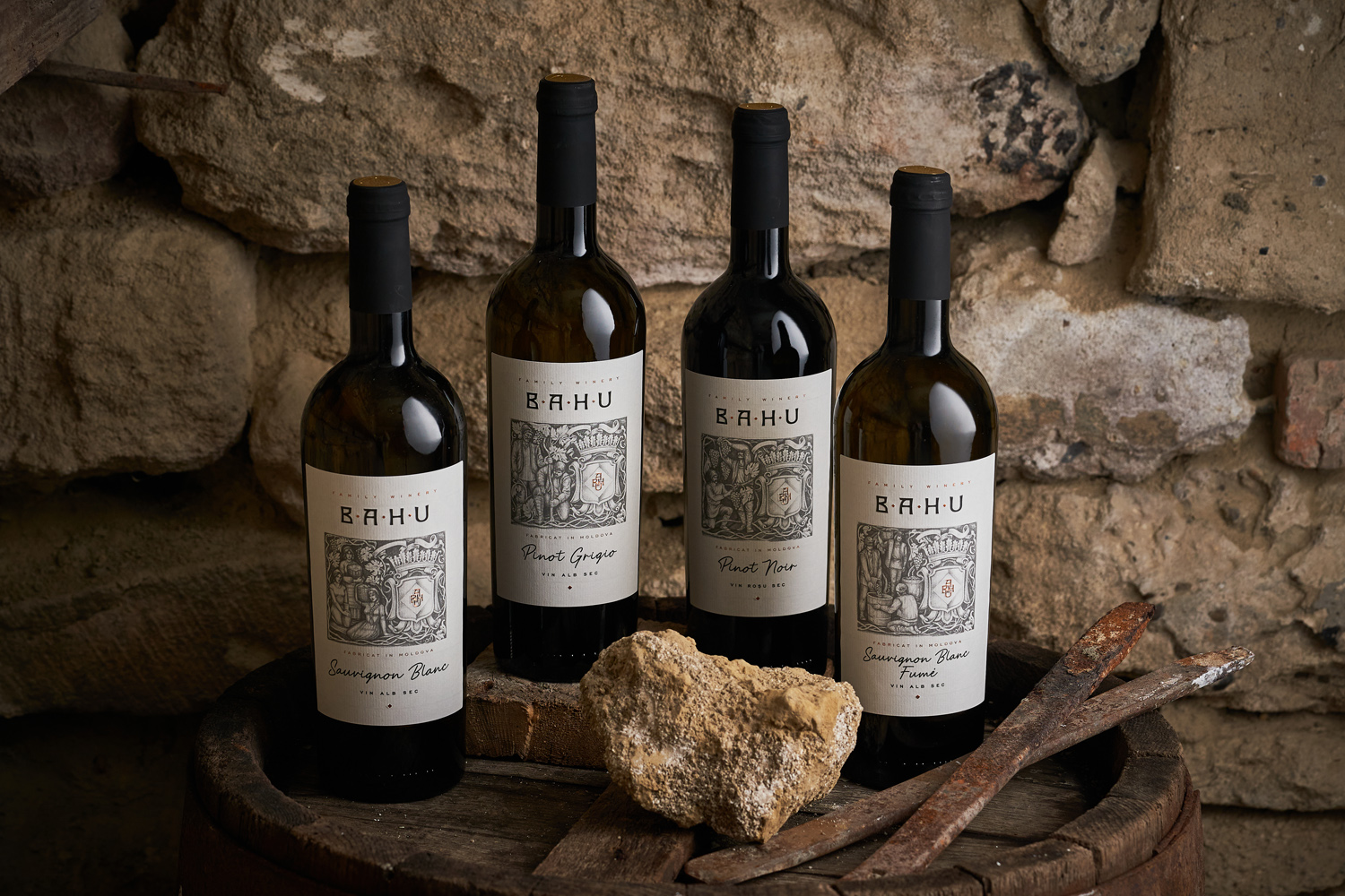
The label design for Bahu Winery is based on the traditional side of the winemaking process. Indeed, despite their short professional history, the owners of the brand are united by a very long history of home winemaking, which originated more than a century ago, when their ancestors settled in the small but very picturesque village of Bahu, in the Calarasi region, in the central part of Moldova. It was the illustrations of the various stages of traditional winemaking that formed the basis for the label design, and their special stylization echoes the type of stone carving that has long been practiced in this area. Heraldic elements, executed in the authentic style of the old coats of arms, are inscribed in the illustration to enhance the effect of antiquity. And the use of special wine paper and stylized fonts maintains the overall tone of the composition and emphasizes the vintage aspect of the design.