- 2019
process
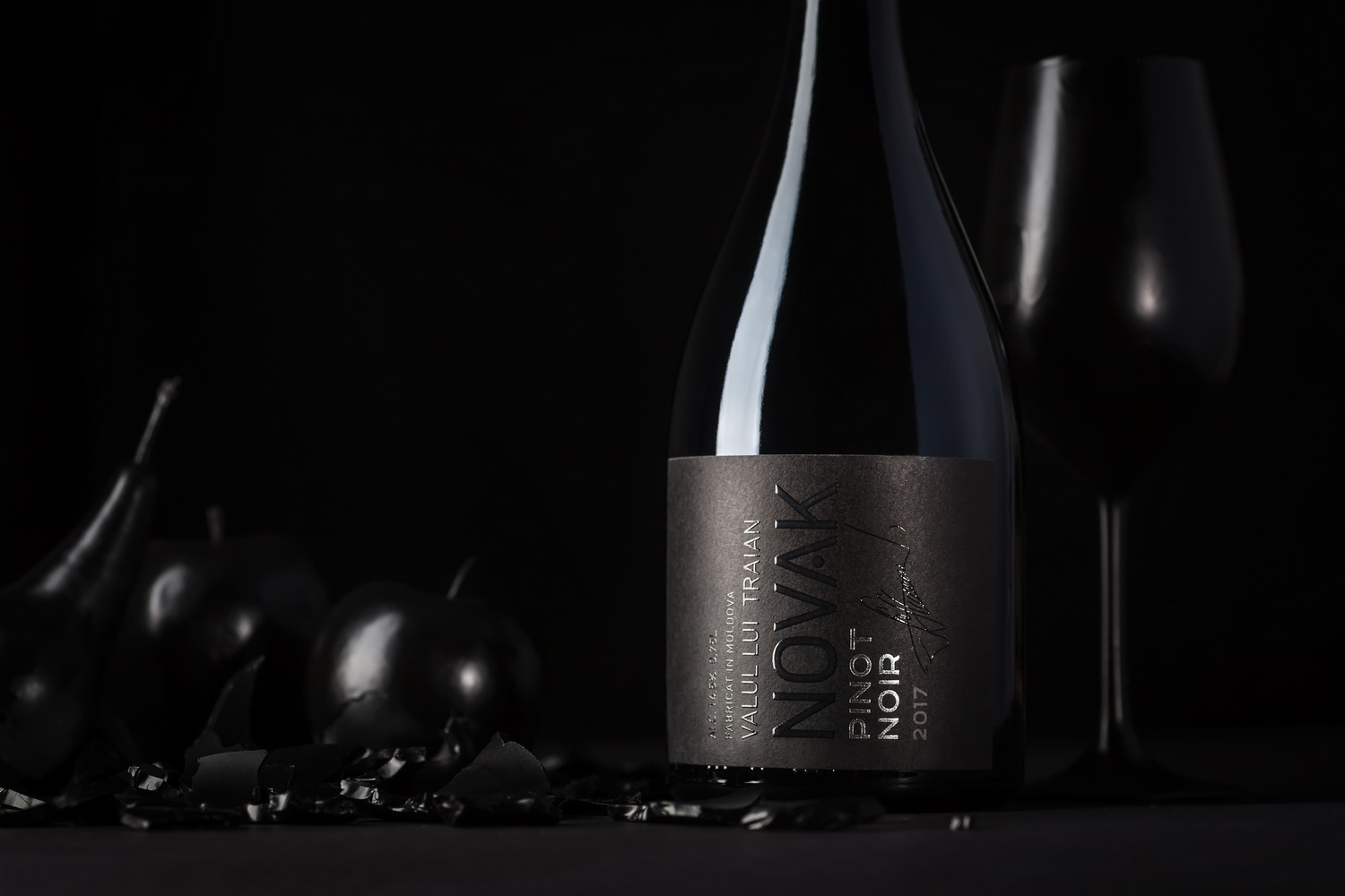
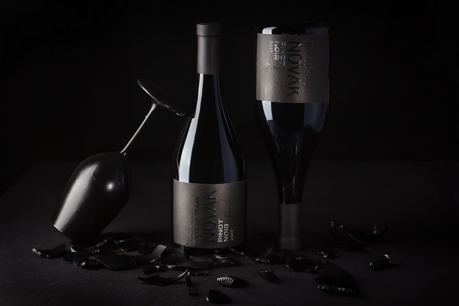
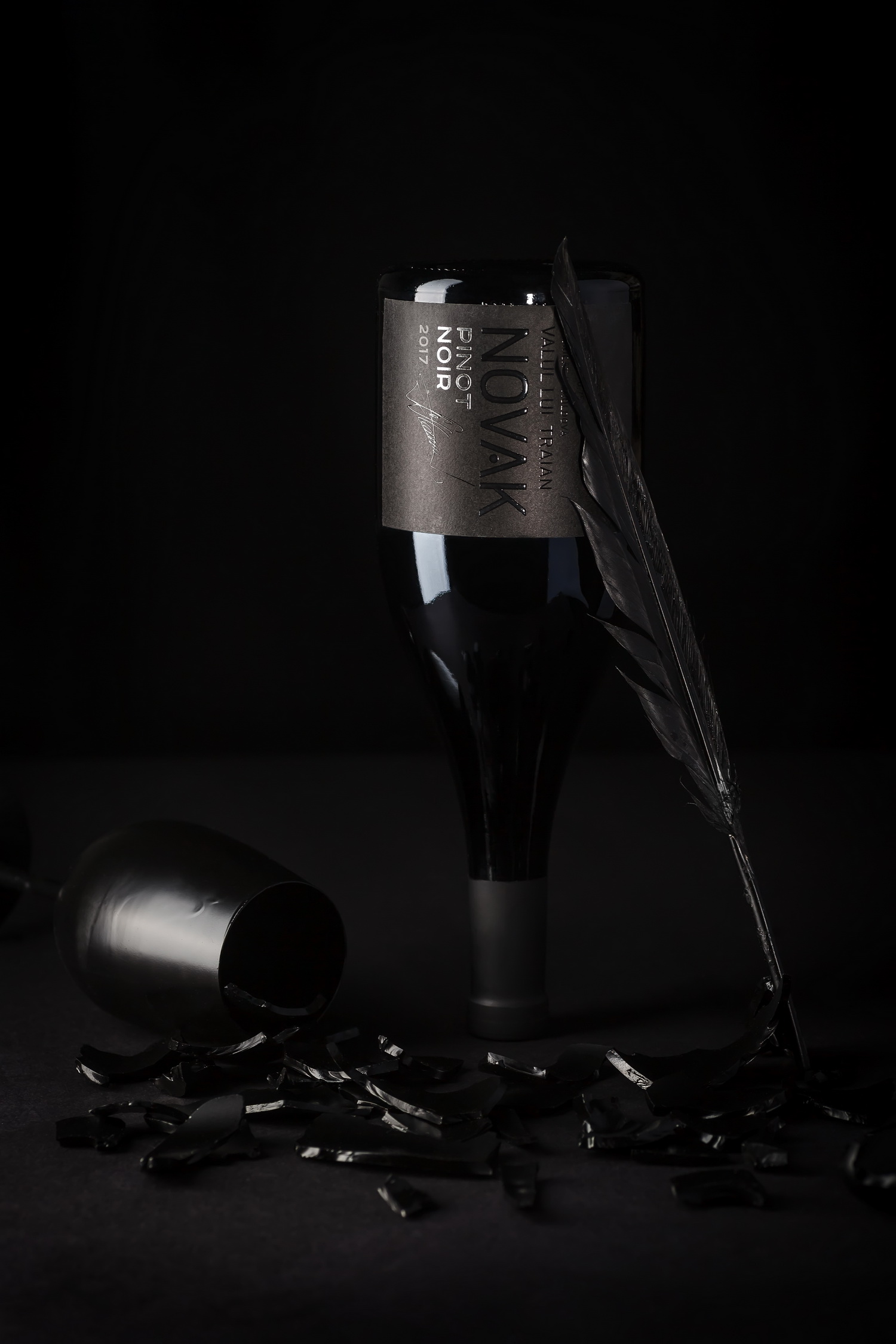
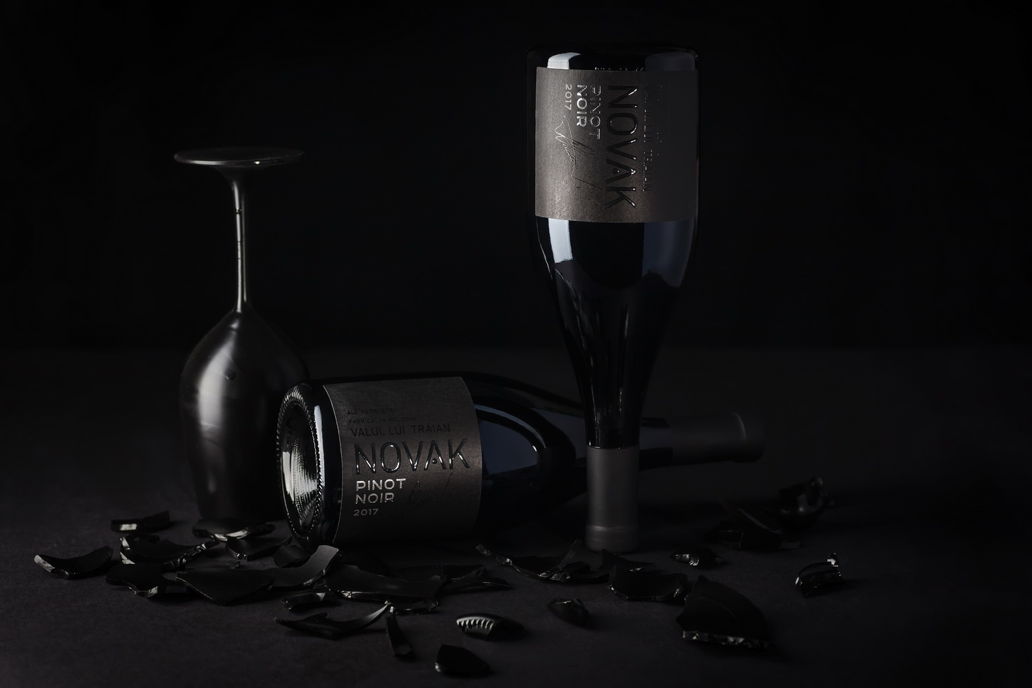
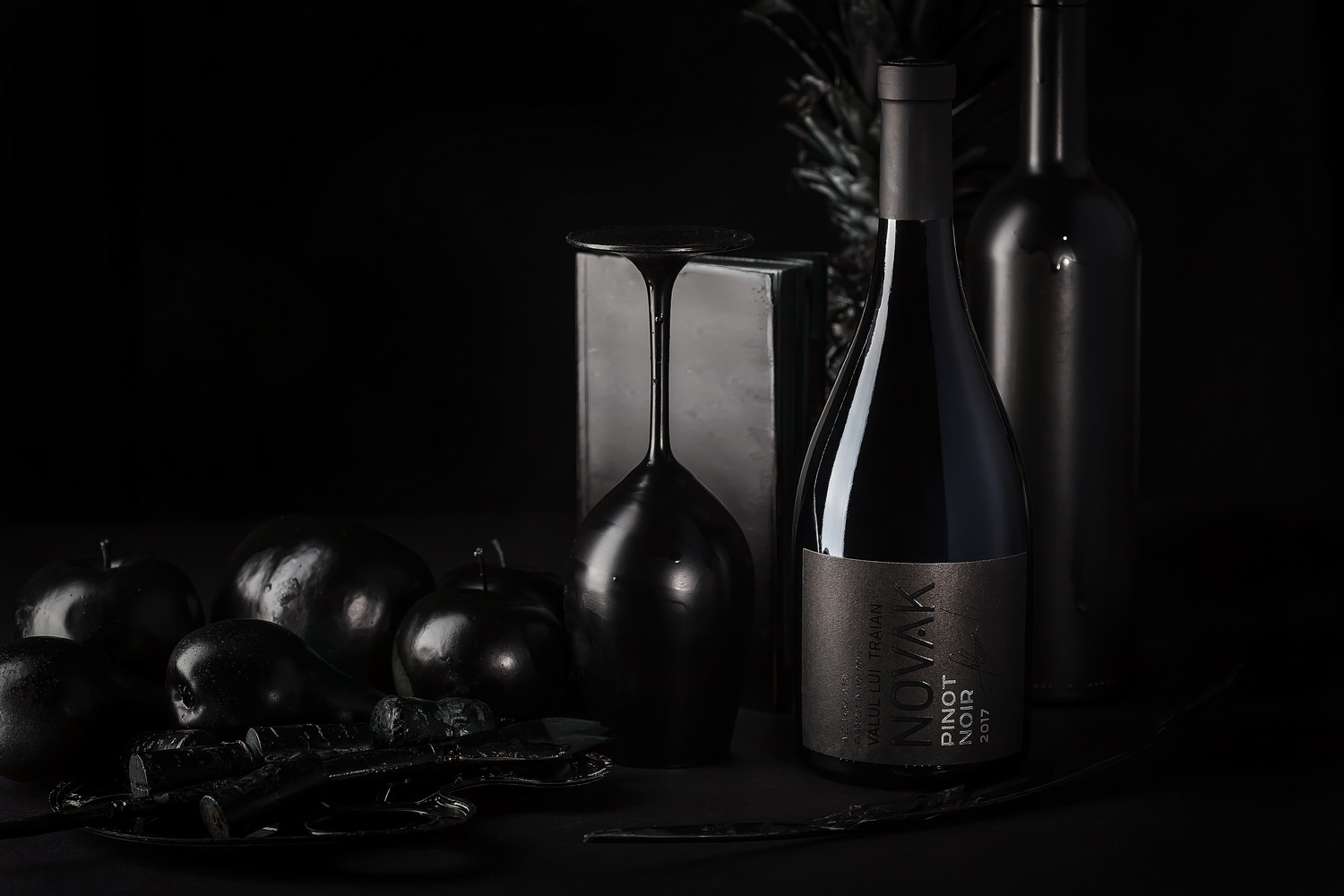
Novak Winery, despite its relatively short history, has managed to gain a strong following among wine lovers and find its own place in the competitive wine market of Moldova. Thanks to the winemaker’s enthusiasm and the unusual brand concept, Novak wines have carved a niche for themselves and became associated with a product that shouldn’t be overlooked. That’s why when the winemaker decided to launch a limited series of mature varietal wines, we were set with the task of creating a design that, on one hand, would maintain the global concept of the brand and its familiarity, and on the other - have a unique and premium look, while emphasizing the special character of the new series of Novak wines.
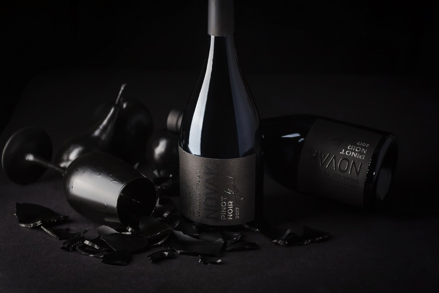
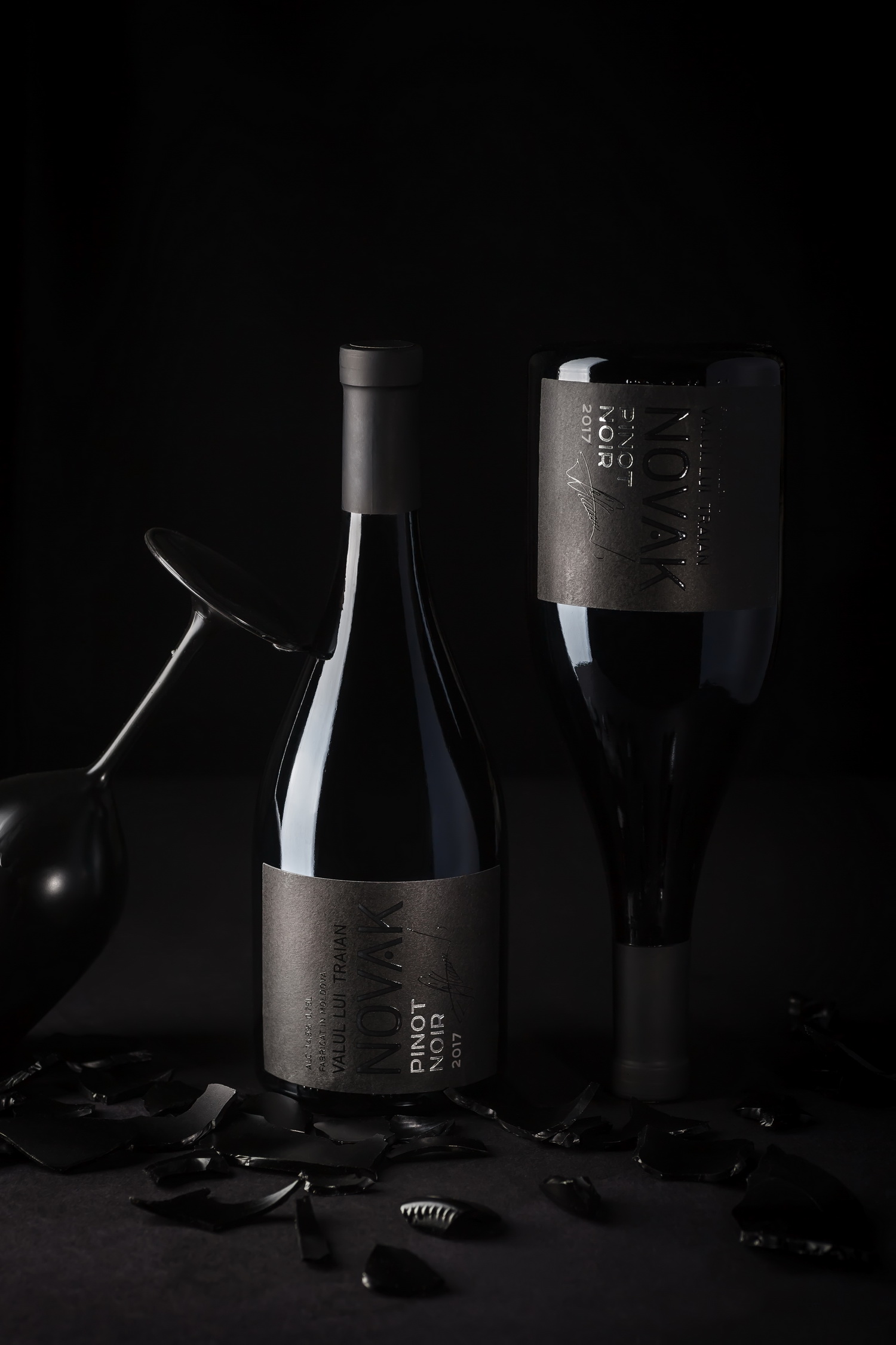
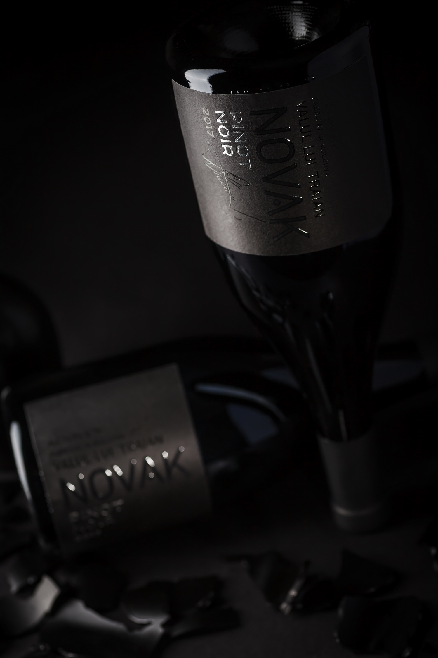
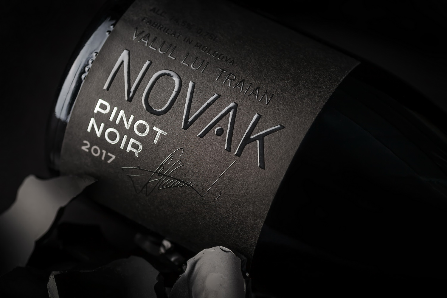
The first wine in the new series by Novak is Pinot Noir, and we’ve decided to build the label’s concept around the variety’s name while also creating a sort of intrigue from the visual standpoint, make it look a bit mysterious. As a result we’ve created an entirely black label in a minimalist setting, which is common for modern premium wines. The name of the brand, protected geographical designation, the winemaker’s signature - all graphic elements are processed with black tactile varnish. And only the name of the variety and harvest year are processed with silver foil stamping. Thus the consumer’s attention is focused at first on the main features of the product, and then, while exploring the rest of the label, is able to discover new details, which makes the contact with the bottle more prolonged, interesting and memorable.