- 2019
process
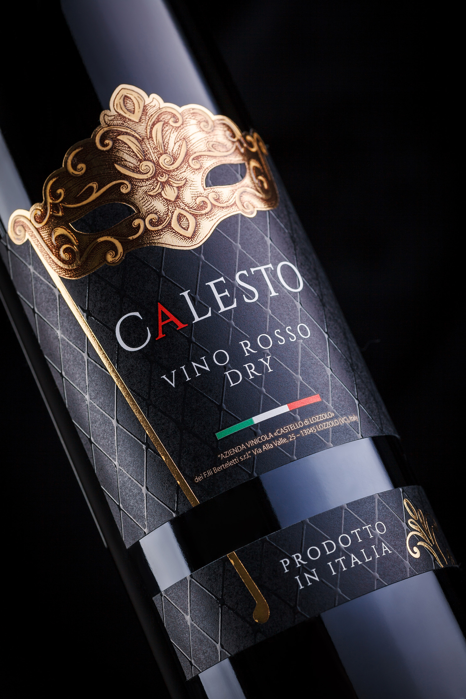
Italy - the mere name of this country invokes an entire range of vivid images tightly linked to the cradle of Western civilization. Of course, we’re talking about things like the columns of Ancient Rome, canals of Venice, green hills of Tuscany, bendy streets of Naples, opera, Vatican, DaVinci, carnival. Namely the latter image has served as the basis for the graphic design of a Italian wine collection under the brand Calesto, created exclusively for the Russian market. Holiday, mystery, peculiar traditions and playful attitude - these were the main concepts, which we’ve used when creating the design for the new product.
When we say “carnival in Venice”, the first thing that comes to mind is certainly the signature carnival mask. This image has served as the central element for the Calesto wine label, further emphasized by a custom label cut and a range of post-printing techniques. Additional graphic elements and patterns amplify the special festive feel, that blends a degree of mystery with the luxury of the traditional Venetian festivities.