- 2018
process
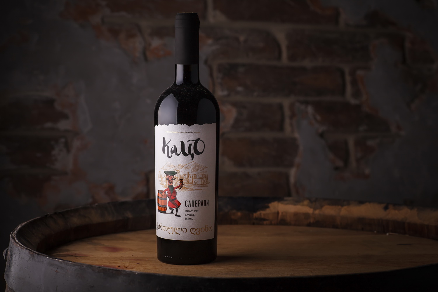
Explosive temper, respect for traditions, excellent sense of humor, unrivaled hospitality, and unique culture - these are the main associations that come to mind when one mentions the country of Georgia. That’s why when we’ve started developing the labels for Georgian wines Tatso, we instantly came up with an image of a picturesque Georgian winemaker, which embodies the main traits and some cultural stereotypes associated with the product’s country of origin. Moreover, the producer has expressed the desire to add a slightly humorous and funny feel to the label that would emphasize the festive spirit of this particular wine.
The label design for Katso wines wields two distinct features. On one hand, the packaging features a traditional Georgian wine aesthetic with a special label shape, relevant font types, and a stylized illustration that allows a precise geographic identification of the product. On the other hand, the label also features a stylized character, the very Katso, which depicts the brand and adds a humorous note to the composition. Each position in the product line features the character performing different types of work associated with winemaking, which amplifies the overall associations with traditional Georgian winemaking and emphasizes the fun spirit of the product.