- 2019
process
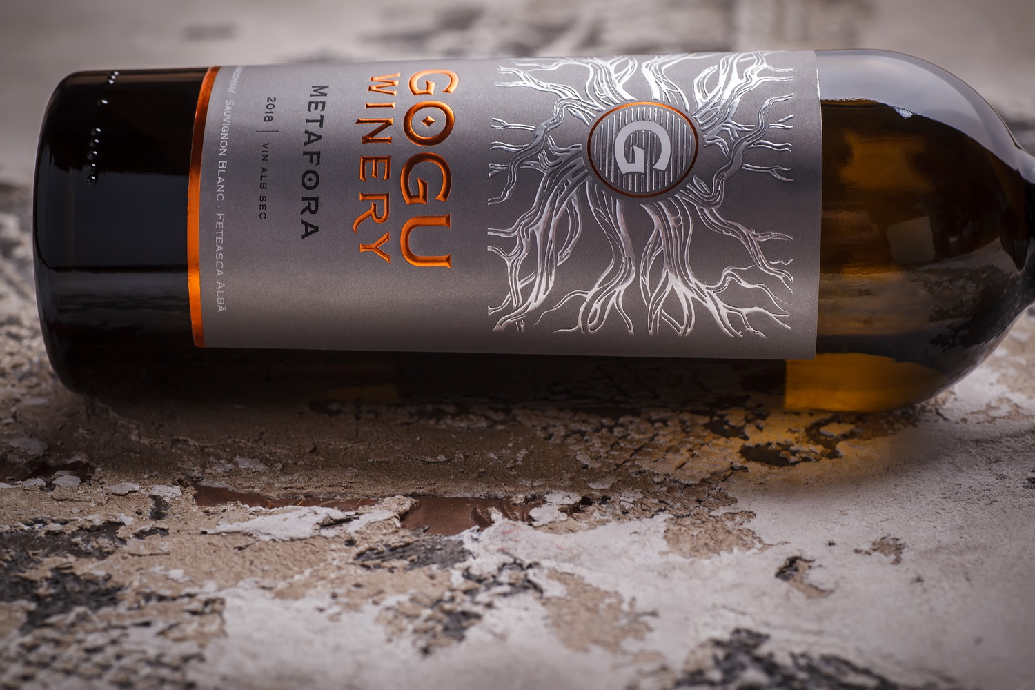
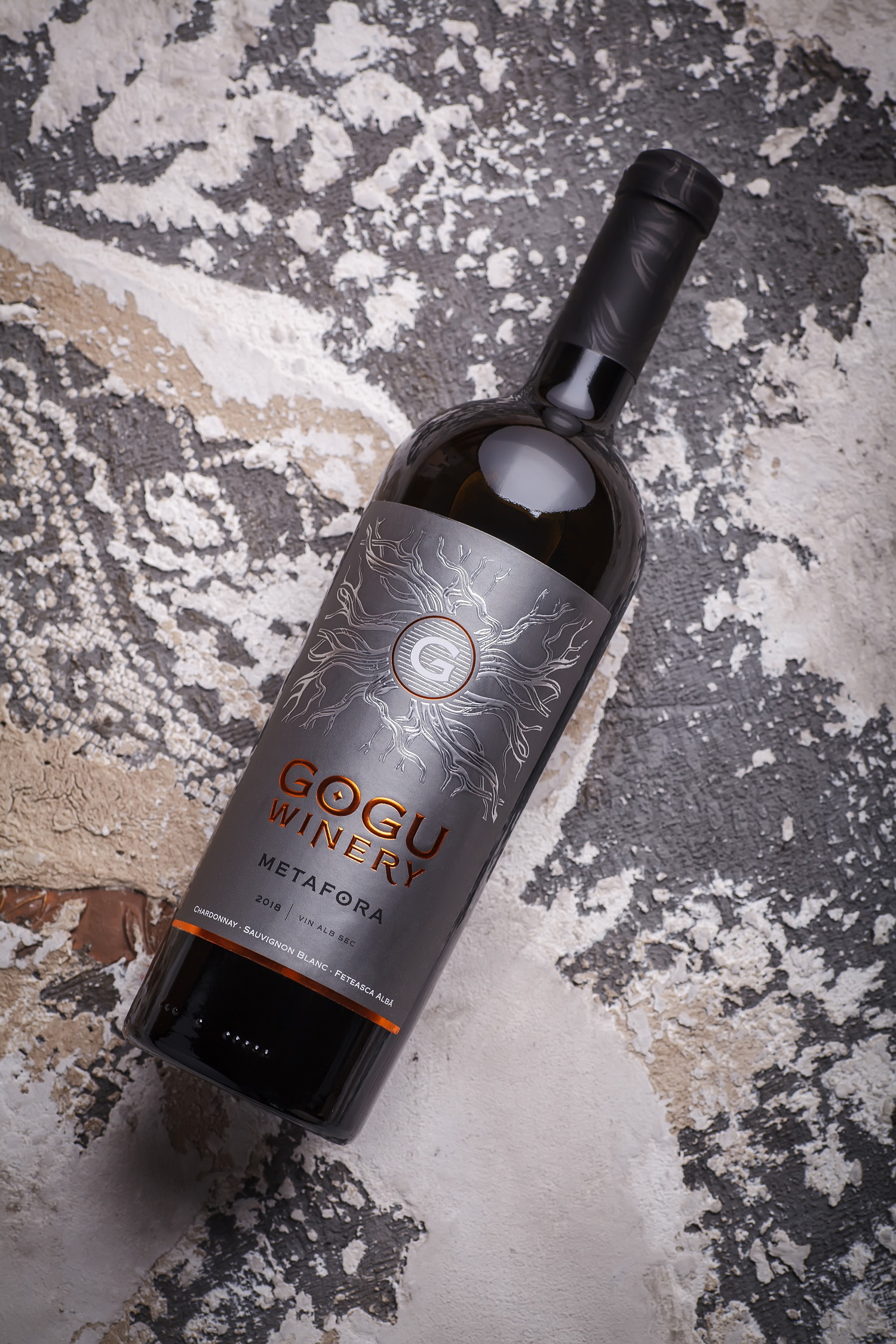
Every signature wine is a story of its own. And it’s not only about the long road the grapes take from the roots feeding them from the soil to an exquisite drink in the glass. Wine is a metaphor, allegory of the winemaker’s life story, an embodiment of their ideals, principles, and views on different things. Of course, for every person this story will be different, special, unique. Metafora Albă by Ilie Gogu is one such story, full, interesting, perhaps a little unexpected for some. And we were very happy to play a part in this story.
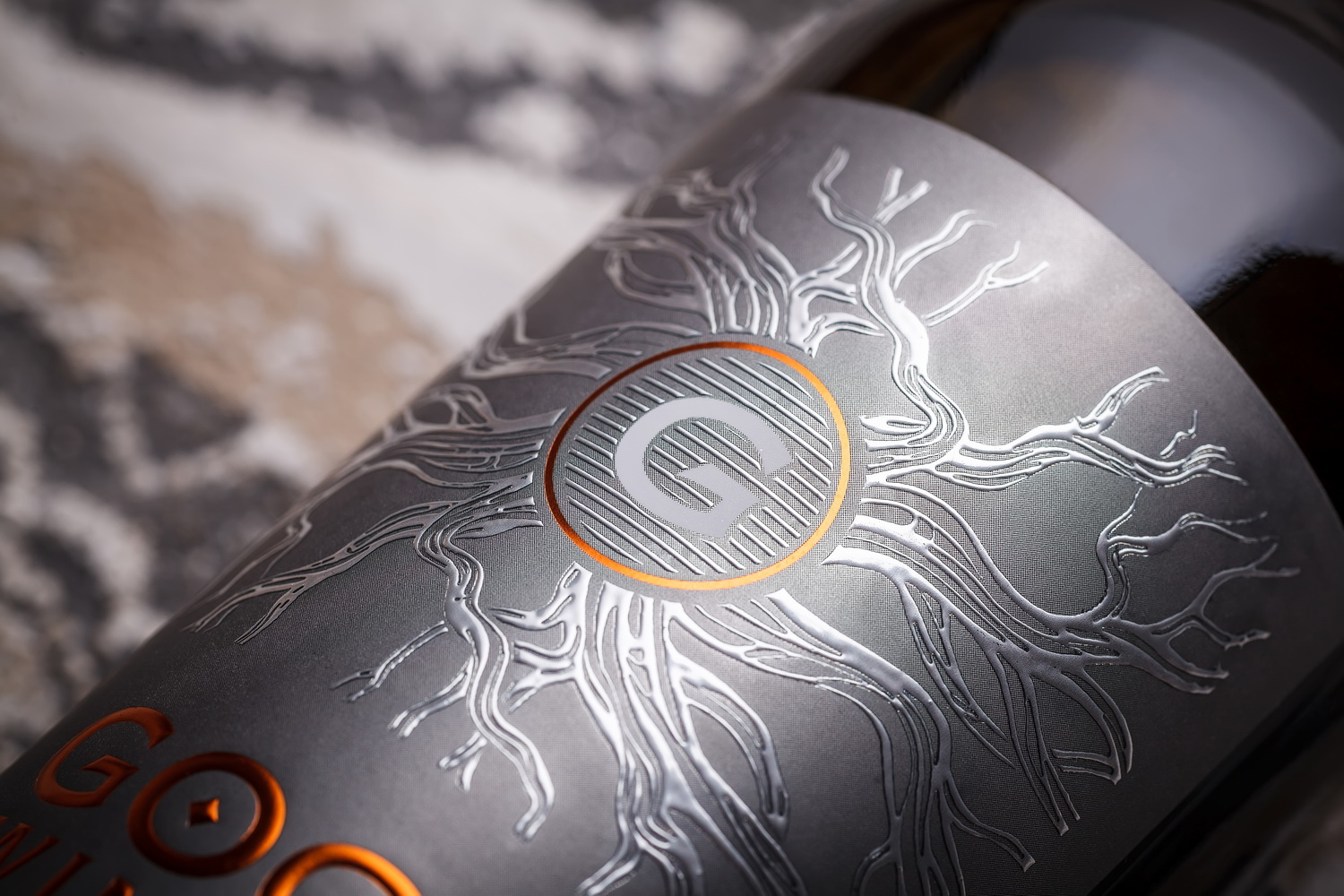
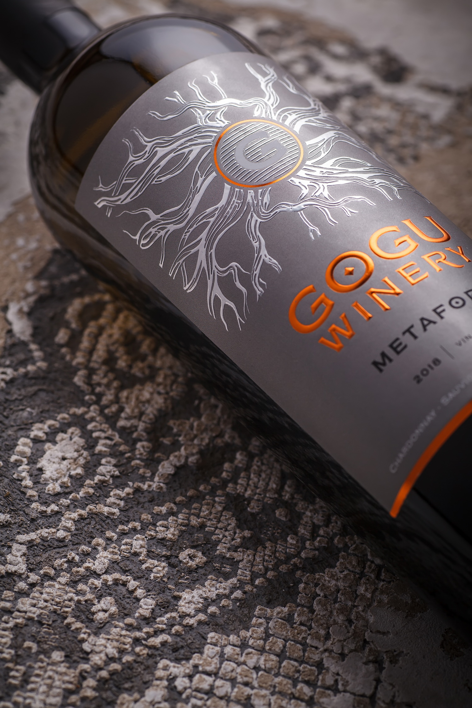
Back when we working on the label design for Gogu Metafora Roșu in 2015, it was quite clear to both the winemaker and us, that this wine sets the tone and leaves space for other variations in a line of premium wines. The white version became a logical continuation to that, and the result of work for creating a quality blend that would live up to the name Metafora while having a character of its own. From the visual standpoint, the design reflects the overall concept of the product. By taking the familiar composition as the base, we’ve reworked entirely the technical aspect of the label in order to present the character of Gogu Metafora white blend. Thanks to the input of FlexLabel printing house and the vast selection of Avery Dennison papers we’ve managed to get the right result and give the new creation by Ilie Gogu a look it deserves.