- 2019
process
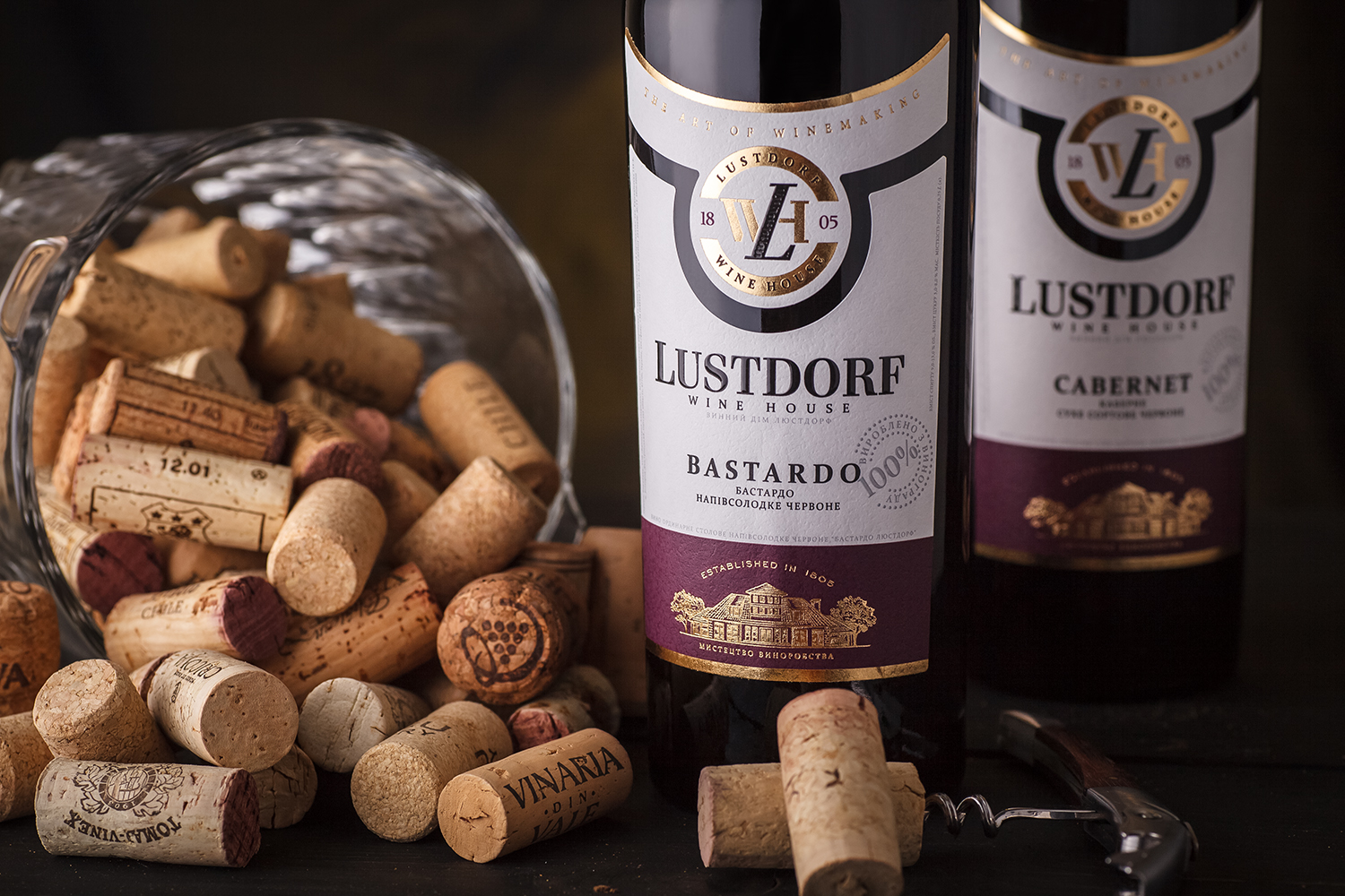
Performing the redesign for the Ukrainian brand Lustdorf was an interesting task for us. Because the initial label design for this and several other brands by this producer were also done by us, around the time when the studio was just created. Since then the trademark has earned its place on the market and became known among the Ukrainian wine connoisseurs. However, a lot has changed over the years, and the need to renew the visual aspect of Lustdorf became quite apparent. Which we’ve set out to do with this project.
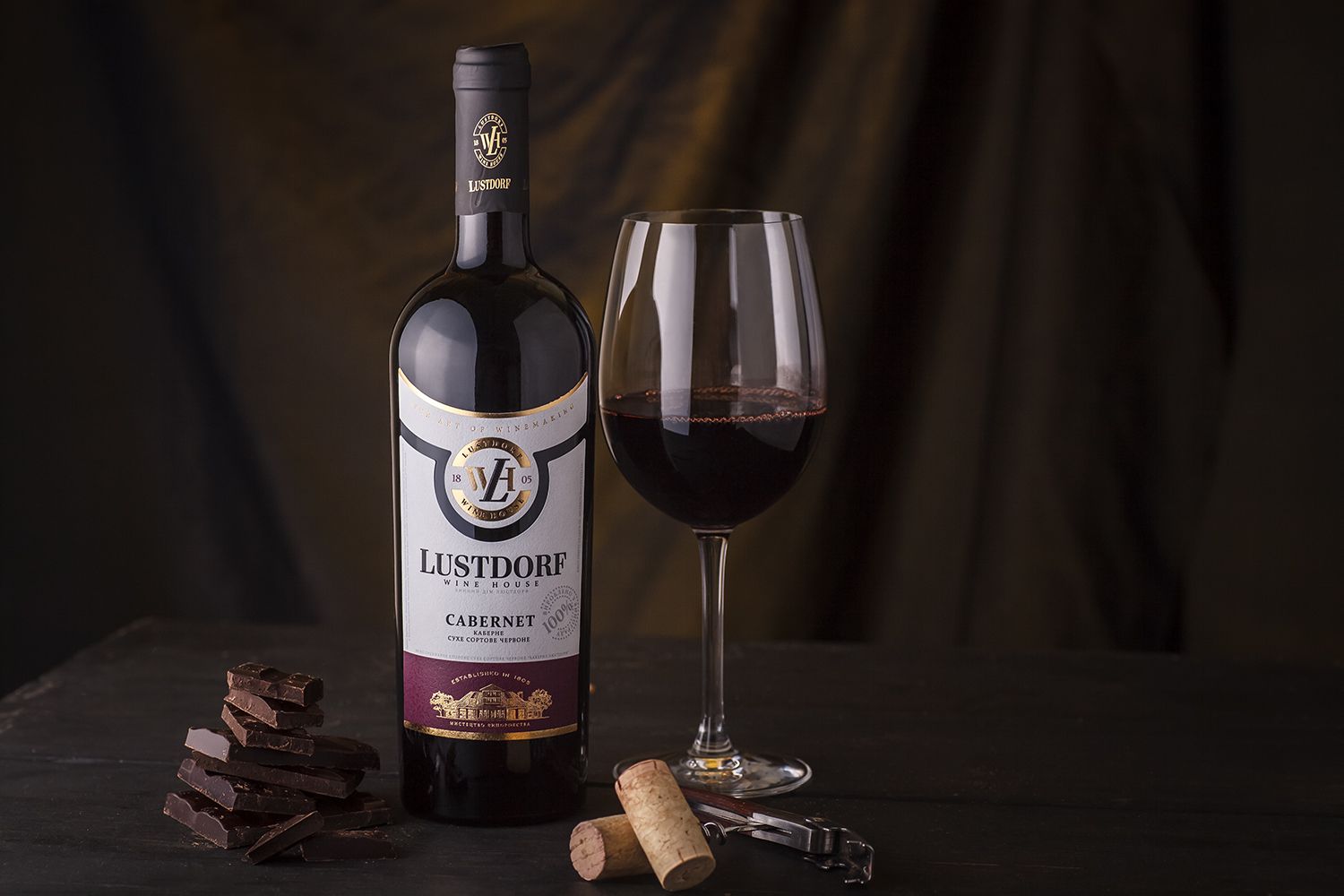
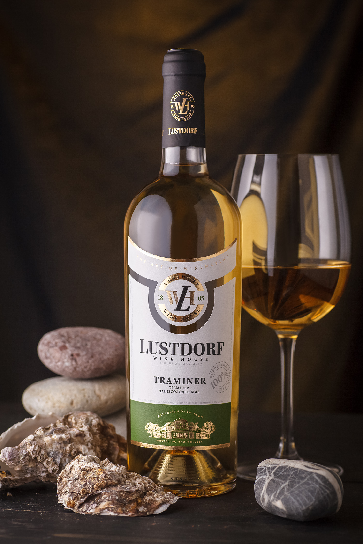
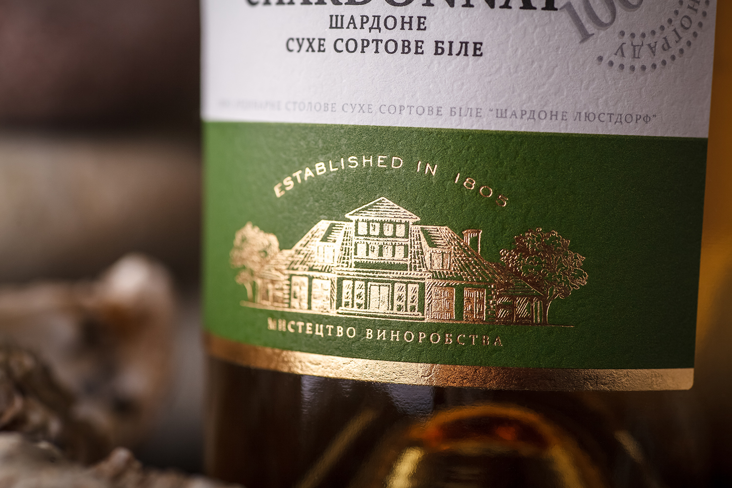
While developing the new label design for the Lustdorf wine brand, we’ve explored several visual directions and created a large number of design concepts. As a result, the client has opted to go with the “modern classic” look, which corresponds to the concept of a wine house and the general positioning of the brand. On one hand, the design is expressed through a standard set of a classic wine label, emphasizing the premium status of the product. But on the other, thanks to the custom label cut, shaped like a woman’s necklace, the classic design gets a more memorable and modern look.