- 2020
process
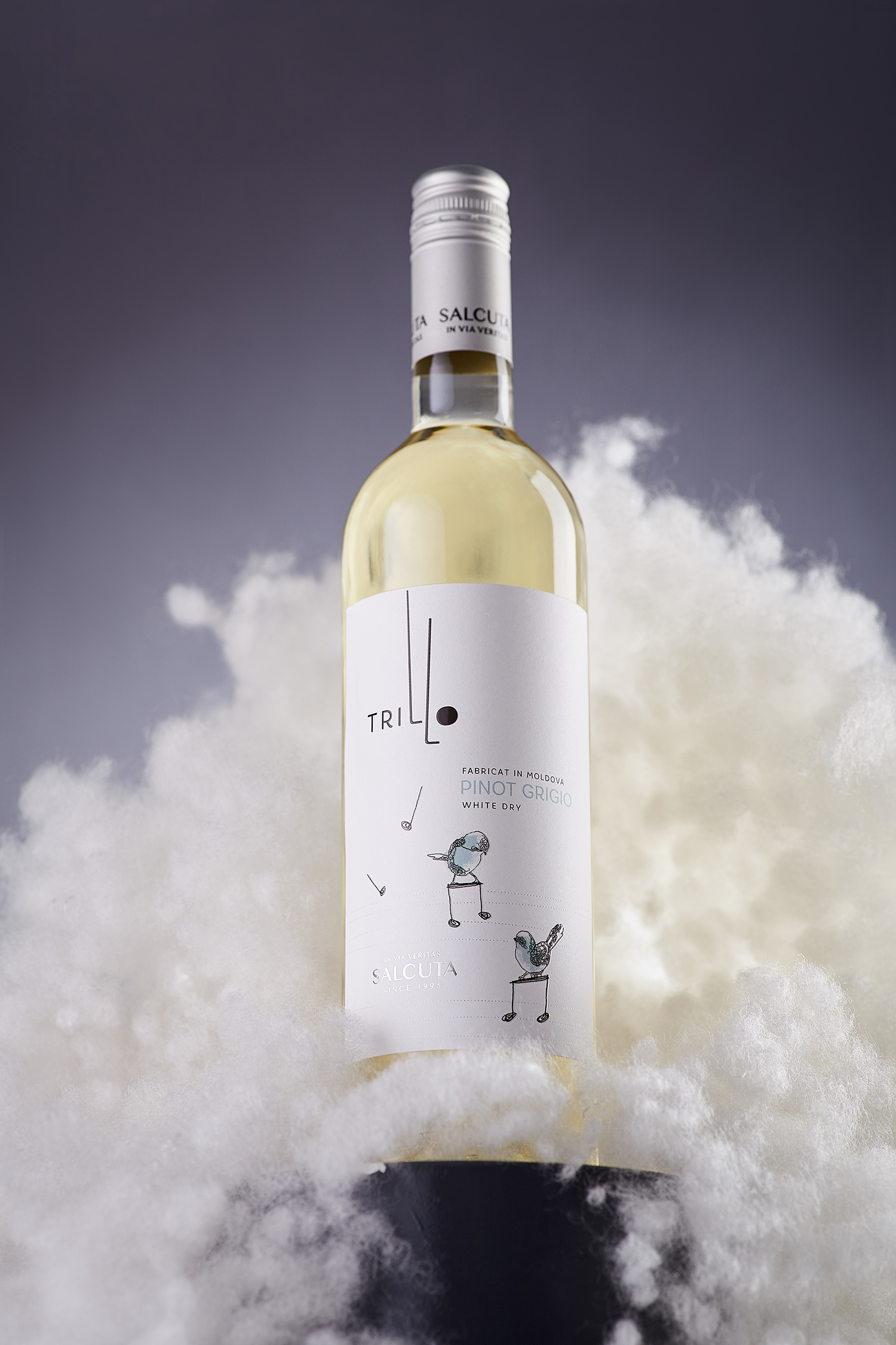
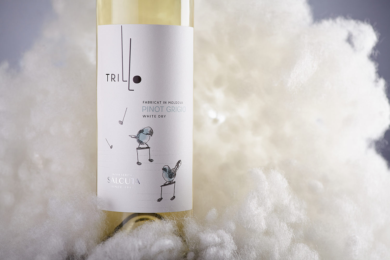
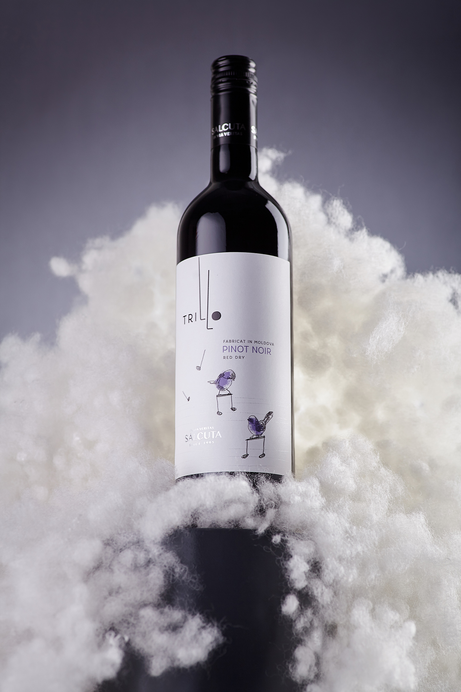
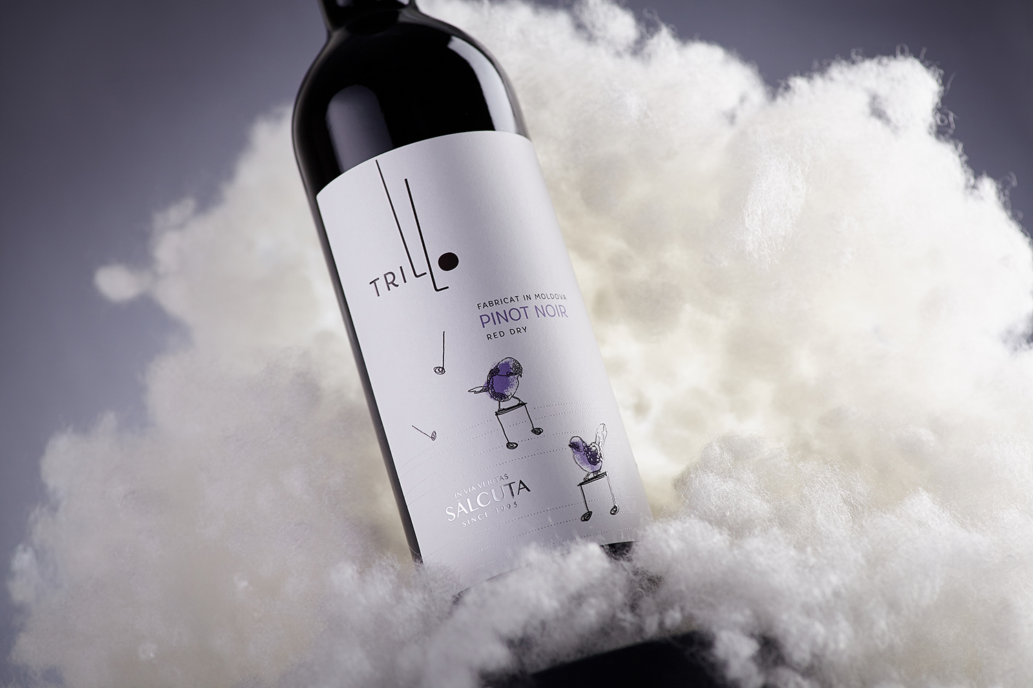
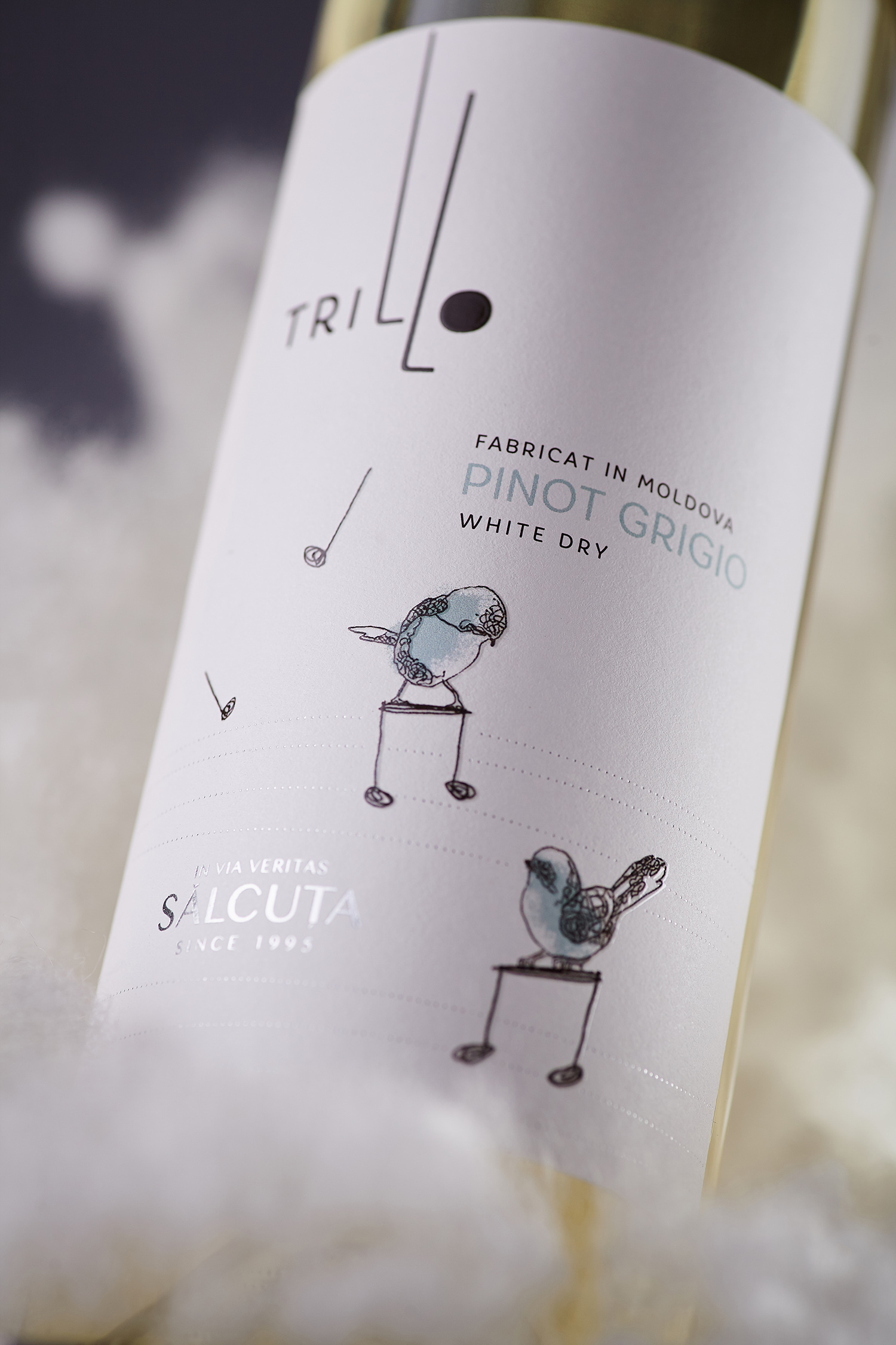
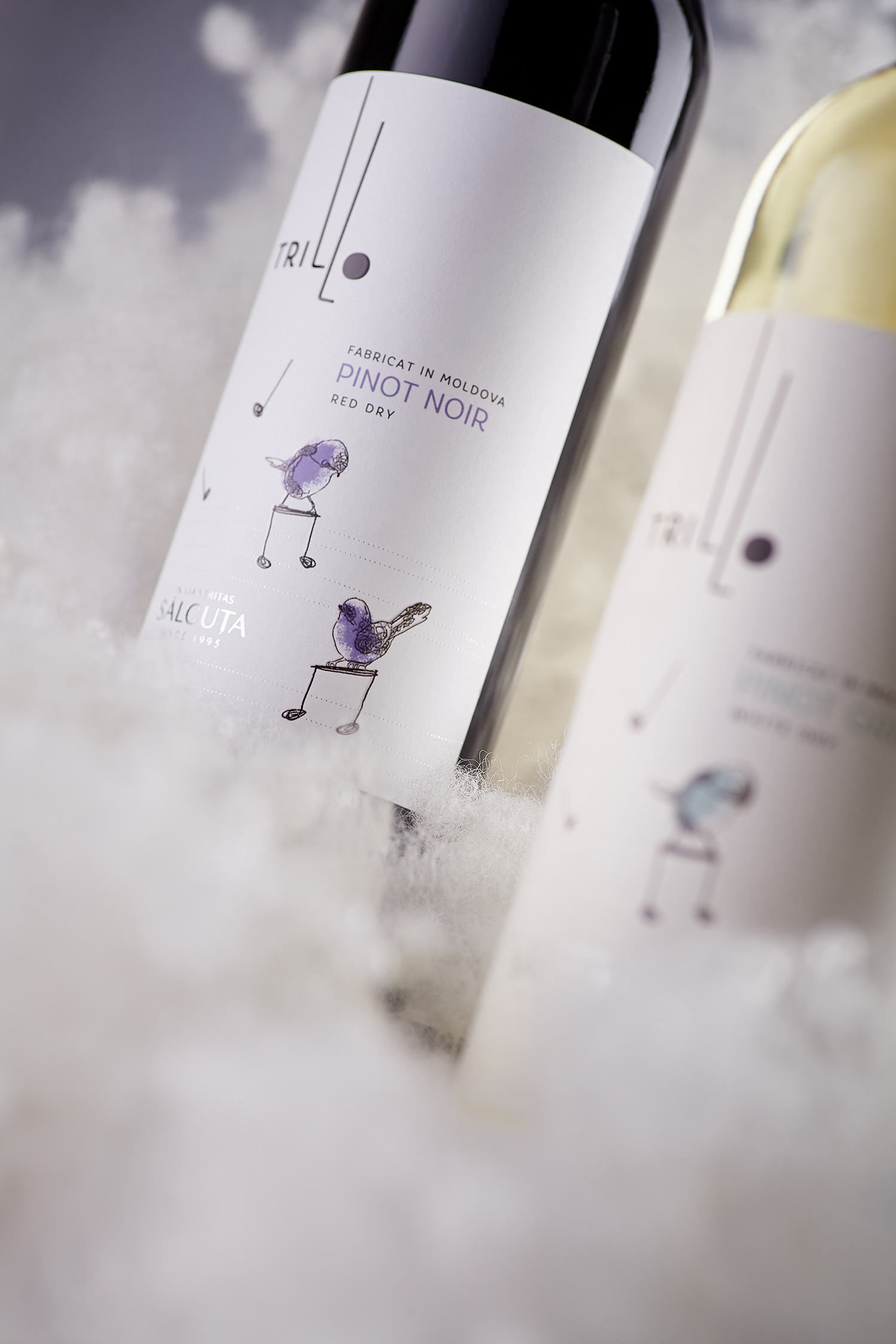
Trillo is a new product line by the renown Moldovan wine company Salcuța, which is comprised of light young wines. Due to the product’s peculiarity, the project required an airy, neat visual aspect, which would reflect the main feature of these wines. The name of the wines, Trillo - which translates as “trill” from Italian - also introduced a certain semantic context that had to be depicted in the label design. By combining the two main meanings of the word, we’ve created a design concept that reflect both the musical and ornithological aspects of the word “trill”.
Music and birds are the main motif of Trillo wines, which intertwine in a single composition. The light and airy effect, which serves the purpose of communicating the wine’s character, is obtained by using a large white field with a few graphic elements scattered over it. The illustrations of birds and music notes are stylized in a way that emphasizes the weightlessness of the entire composition. While the special font types and a restrained application of post-printing effects lend the label a feeling of neatness and lightness.