- 2019
process
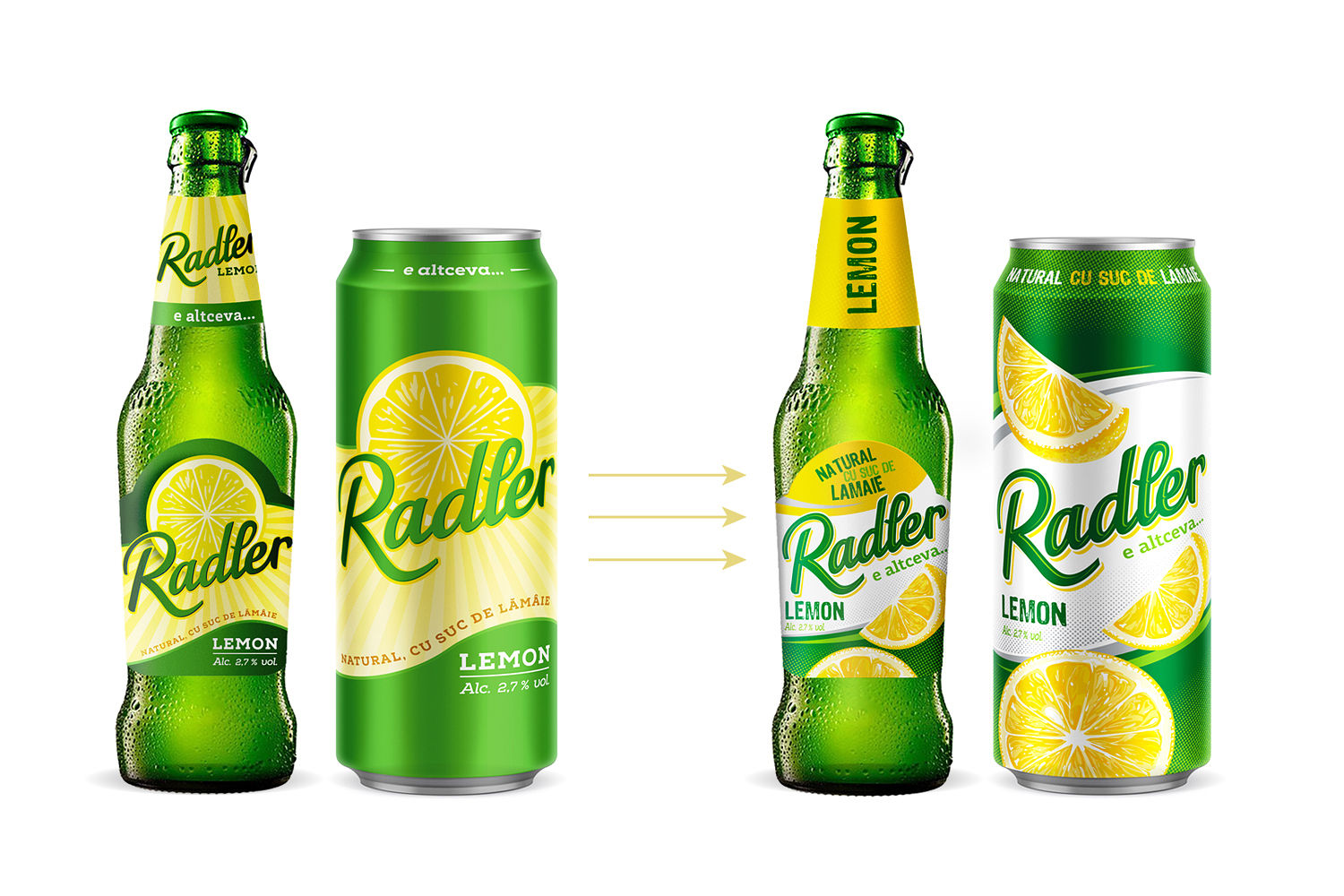
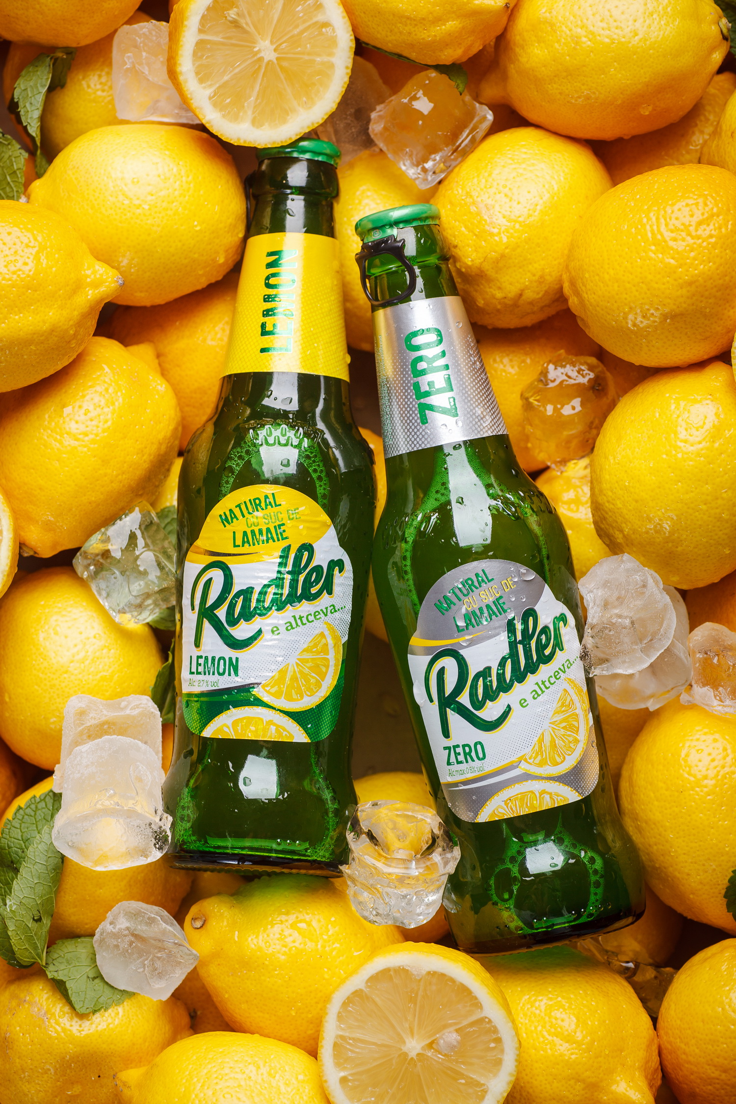
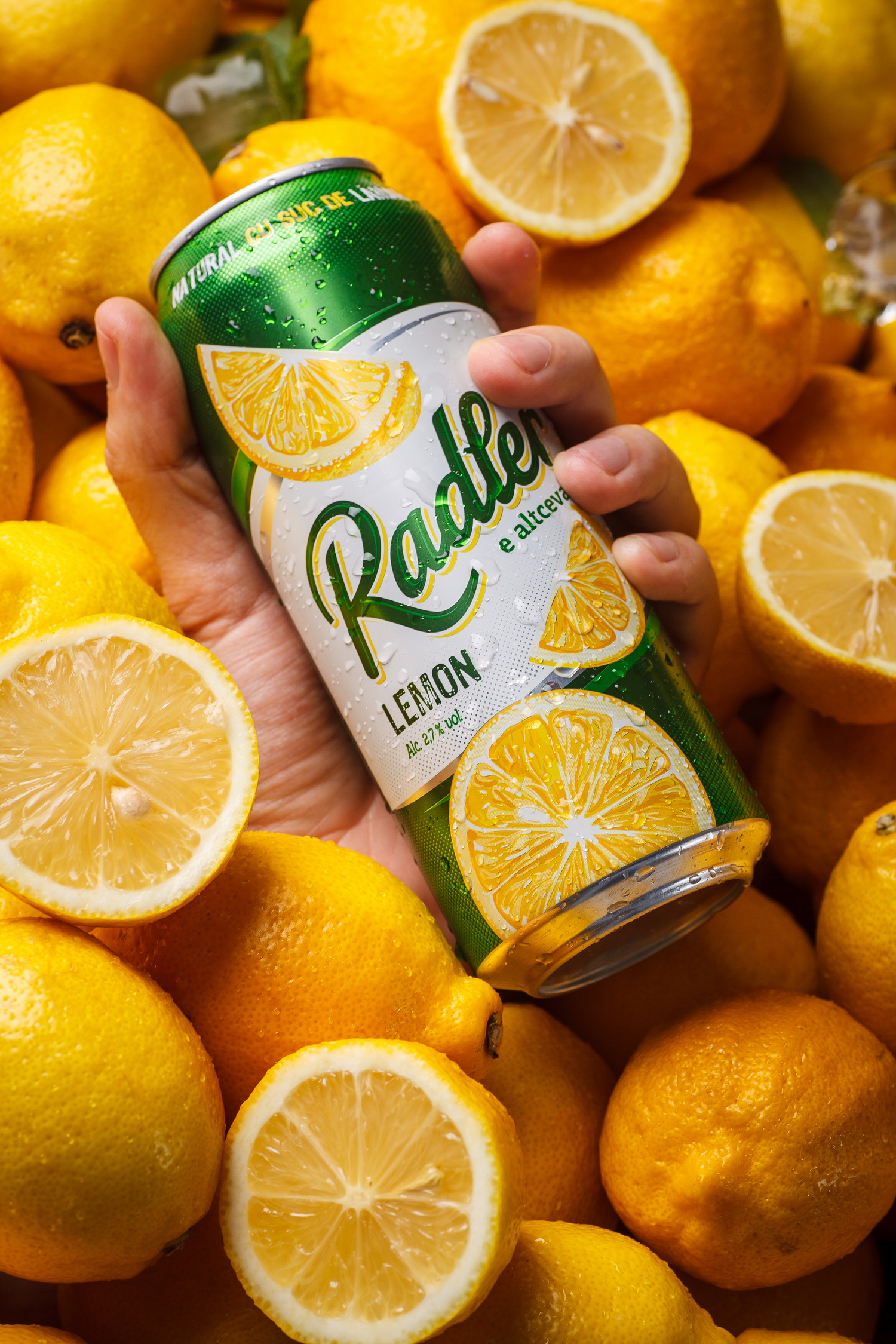
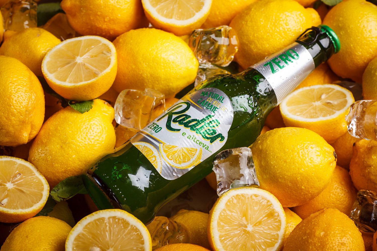
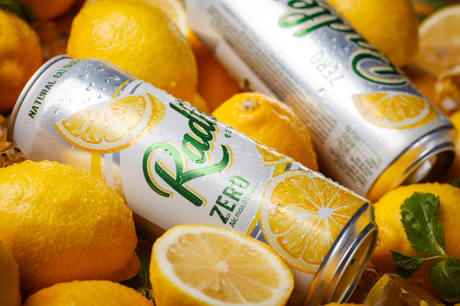
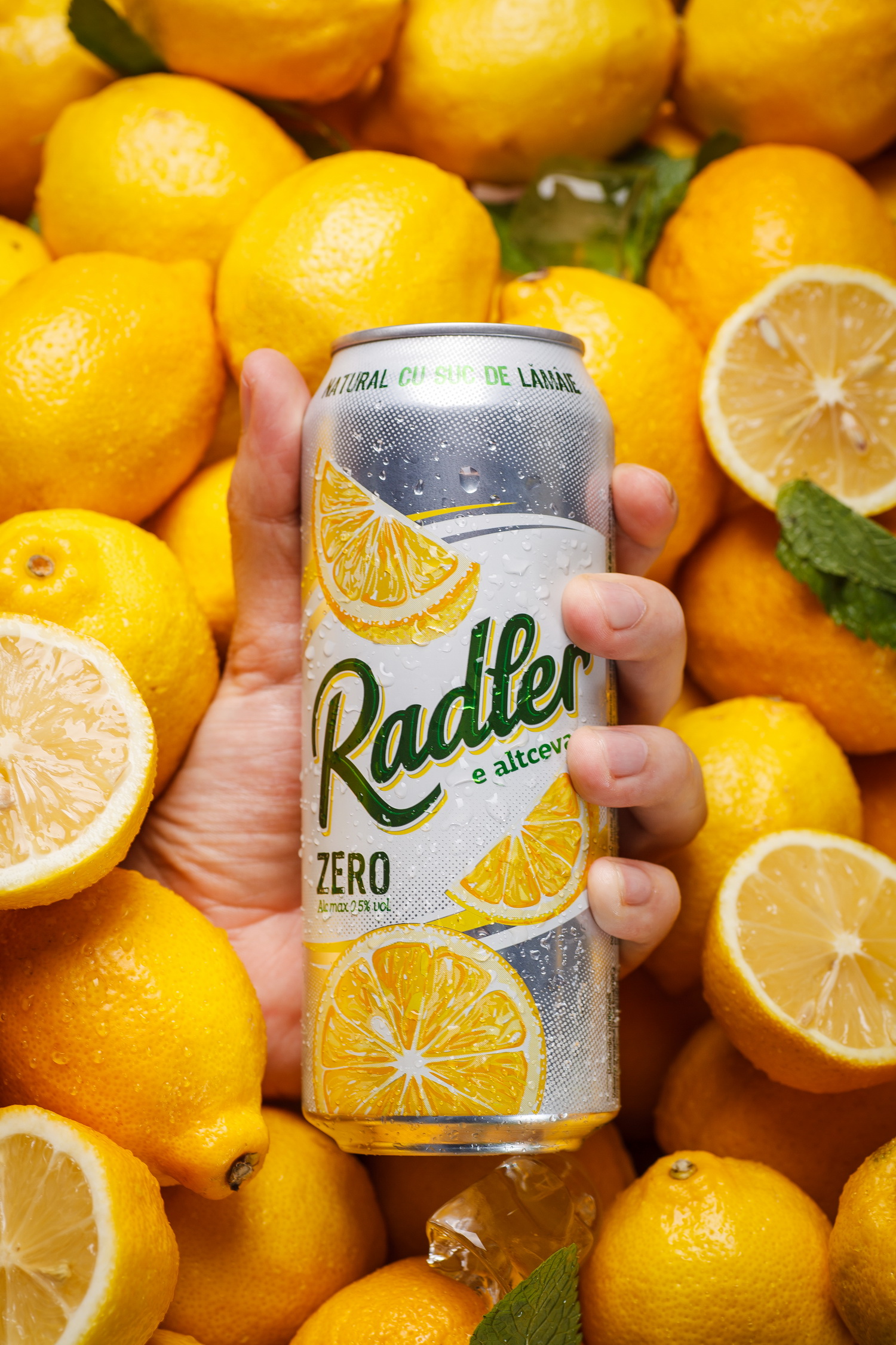
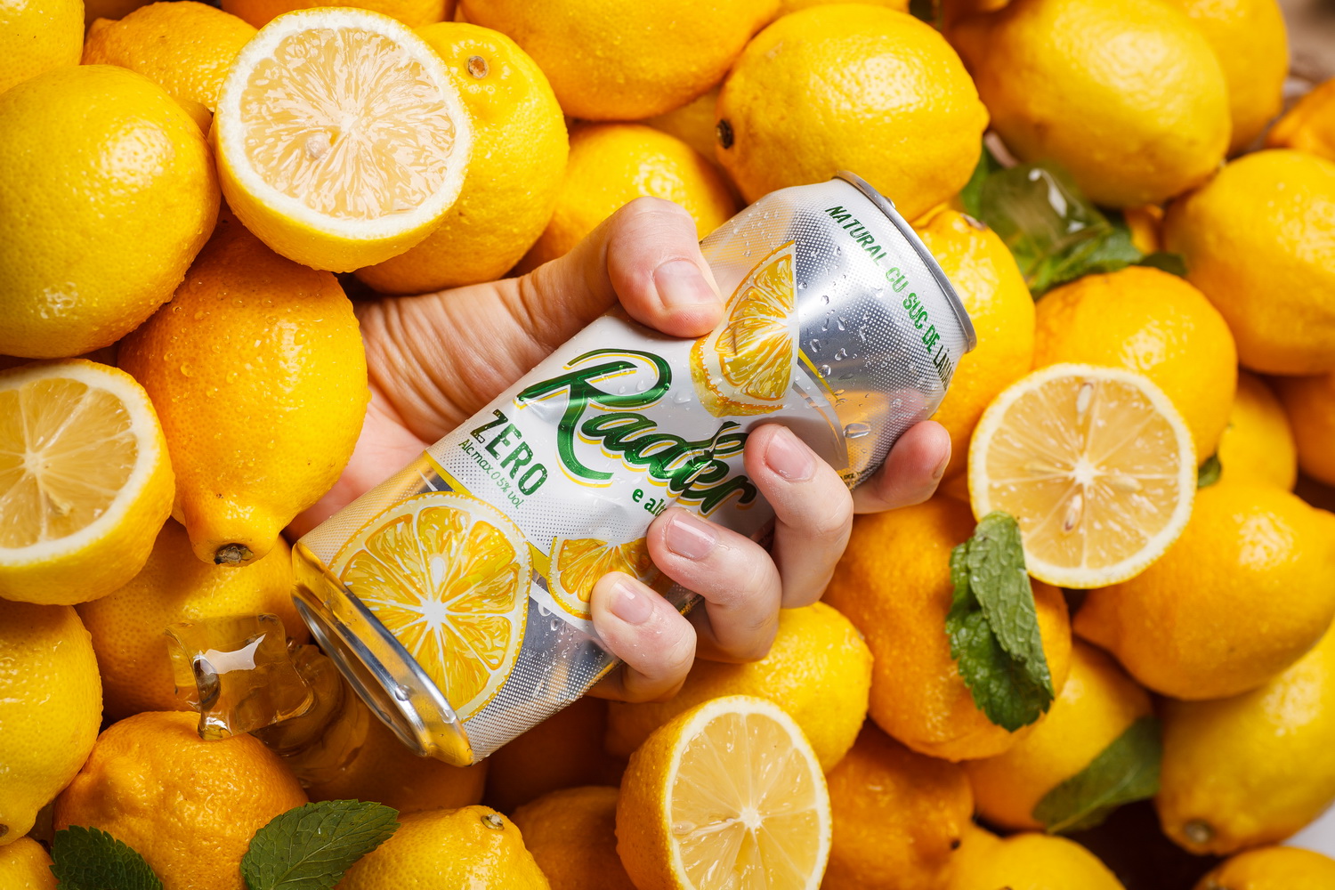
One of the most popular beer drinks was created in the beginning of the 20th century near Munich, and has rapidly gained popularity all over the world. According to legend, Radler (which means “cyclist” in German) was made from light beer and lemonade especially for the city dwellers, who used to ride bicycles, and preferred their refreshments lighter in alcohol than standard beer. Since then, the packaging for this beer drink traditionally uses lemon-like elements, which emphasize its refreshing character. And while redesigning the popular drink Radler by the Moldovan brewery Efes-Vitanta we were guided namely by these traditions.
The project for refreshing the design of the Radler drink by Efes-Vitanta Brewery involved, first and foremost, an overhaul of the general visual representation of the product. By keeping the continuity and familiarity of the popular drink, we’ve focused on reworking the main graphic elements, making them more vivid and relevant. We’ve also updated the font types in order to make the packaging more informative, as well as the genera color scheme. This way we’ve managed to make the product look more modern and relevant, without sacrificing the familiar image already present in consumer’s consciousness.