- 2022
process
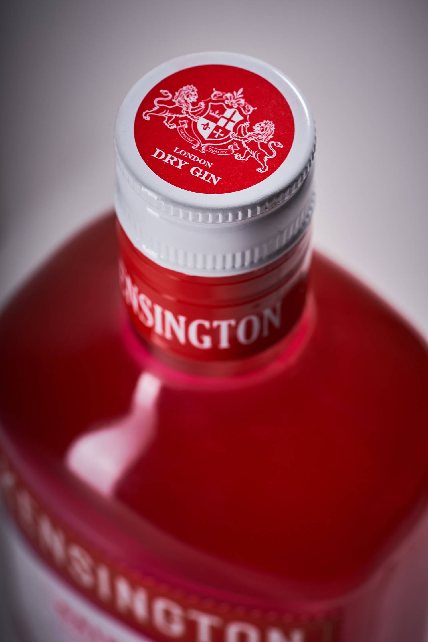
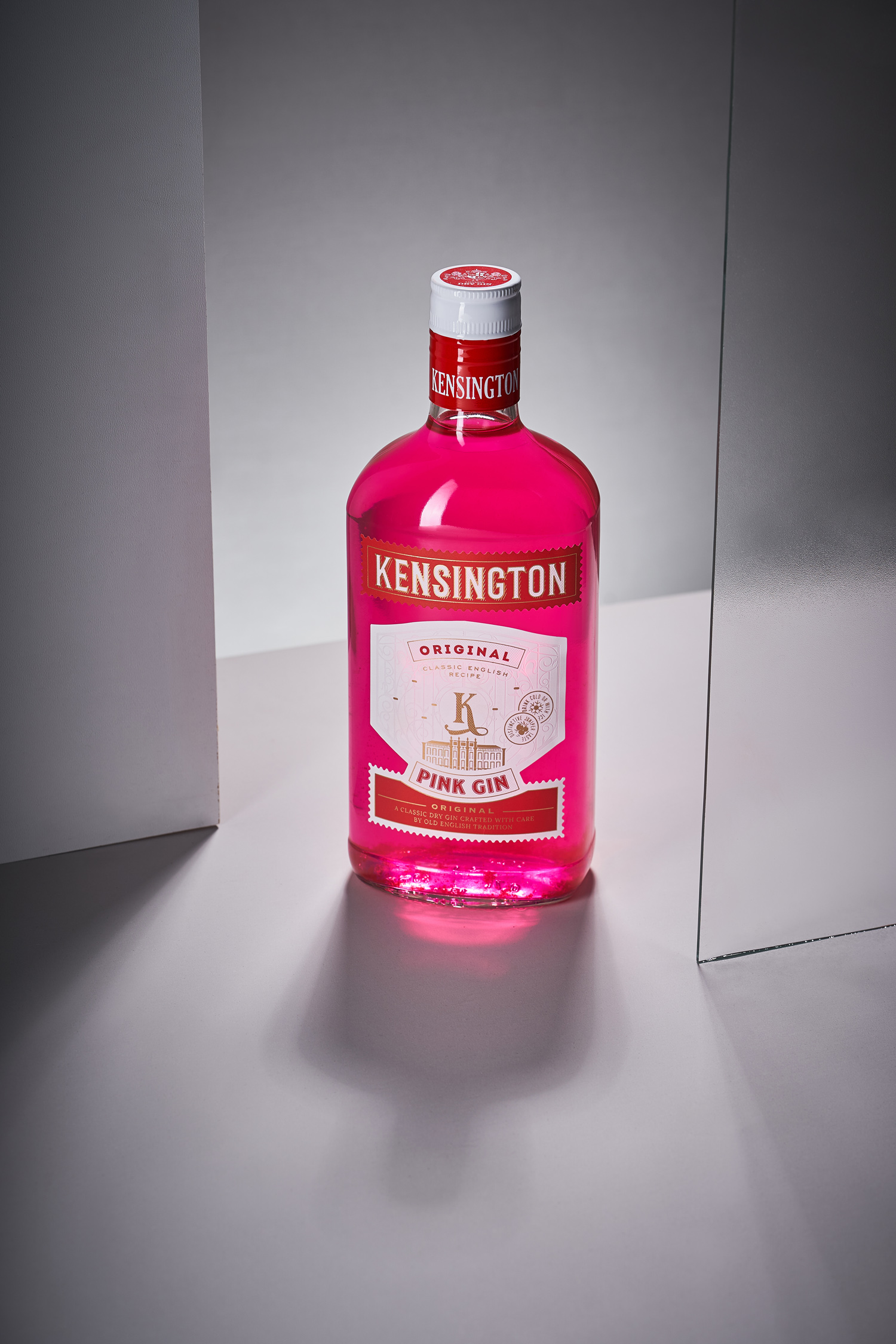
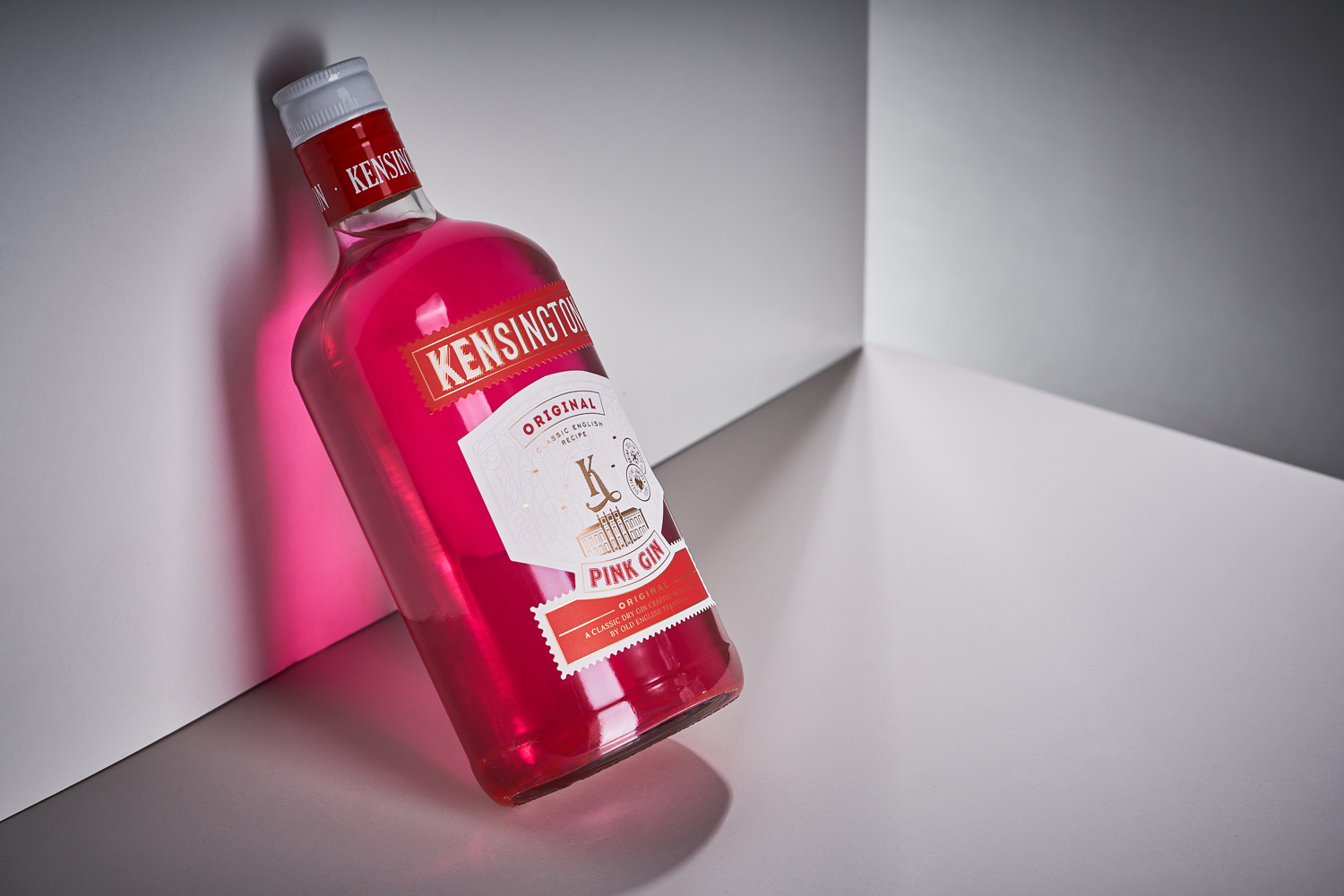
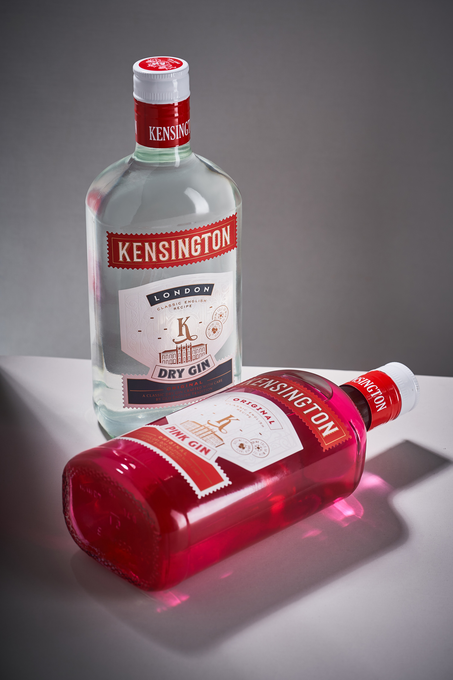
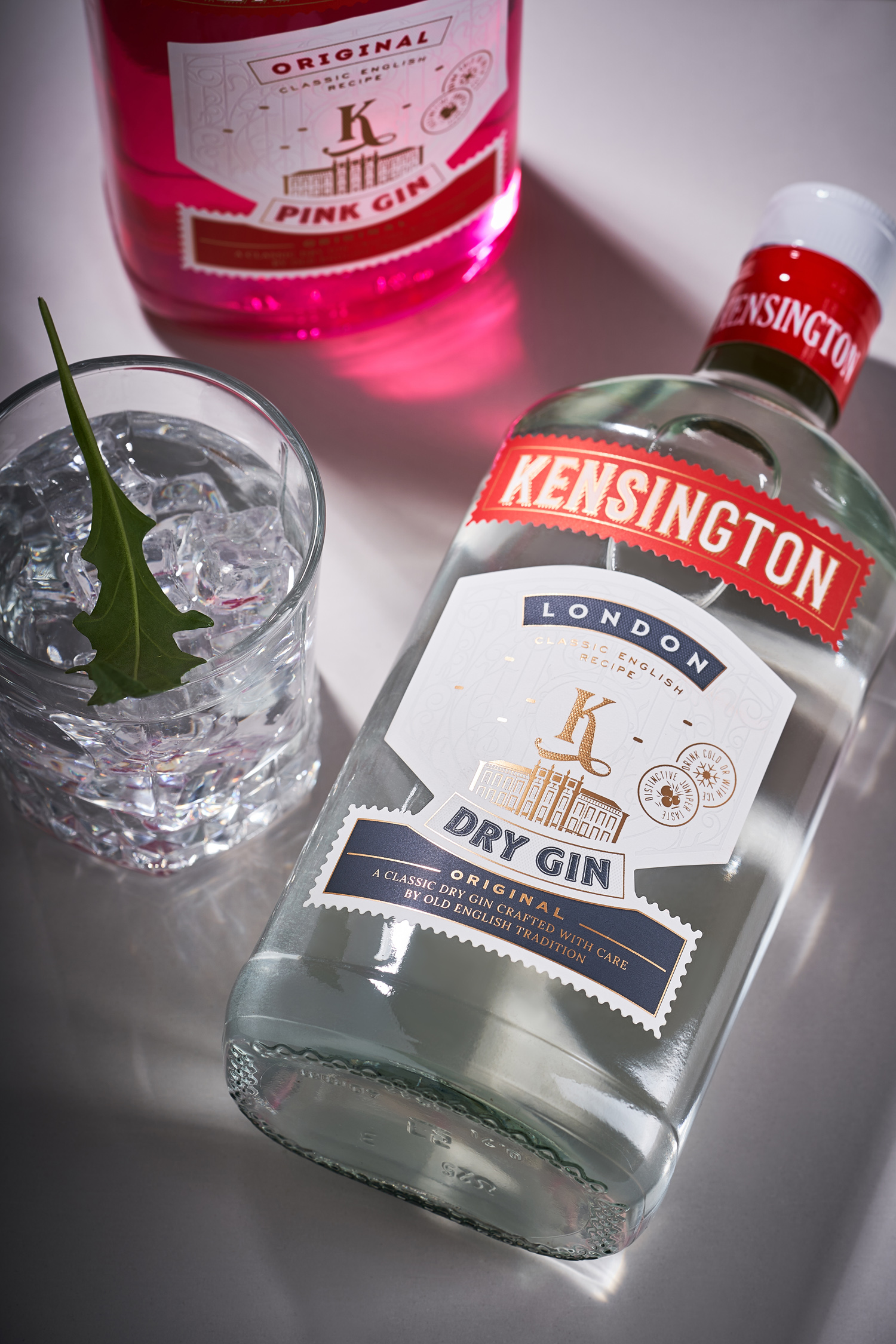
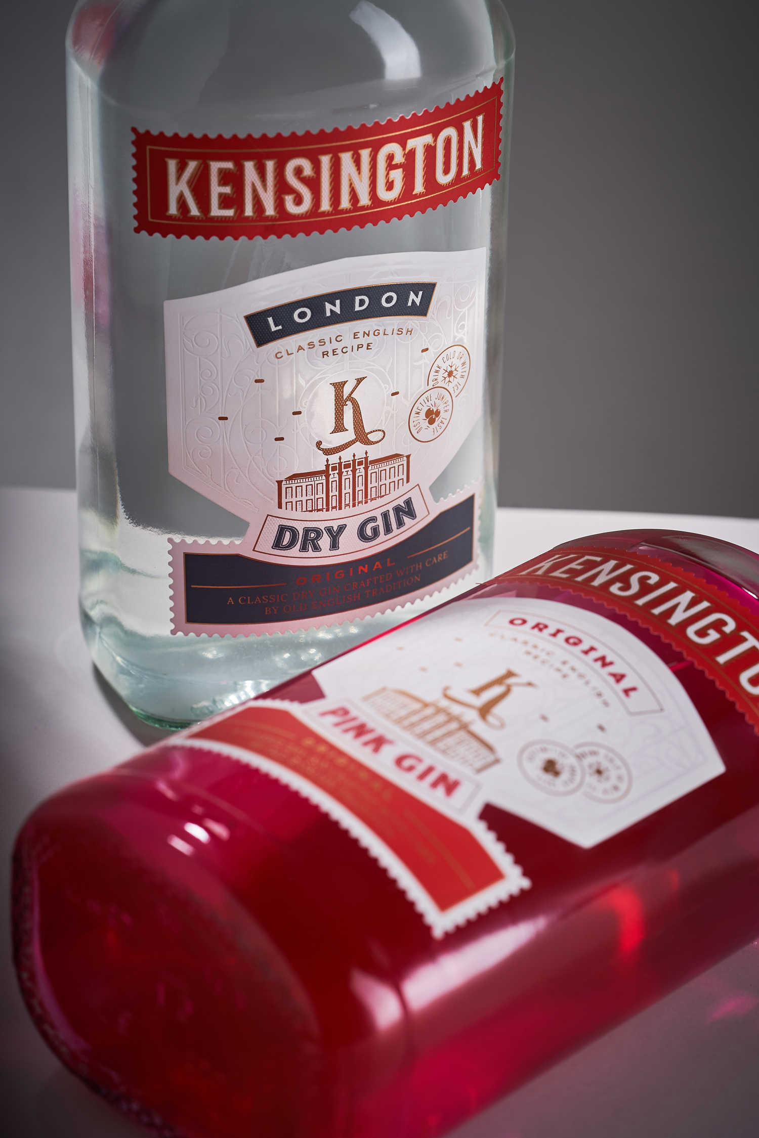
Kensington Gin is one of a wide range of brands created by Sodiko, with which our studio has been fruitfully collaborating for many years. This collection of dry gins has already done well in the market, but the packaging design needed a little update to make the product more relevant to modern trends. Therefore, we were tasked with updating the visual component of Kensington Gin, while also maintaining the overall aesthetics typical for the design of this type of drink.
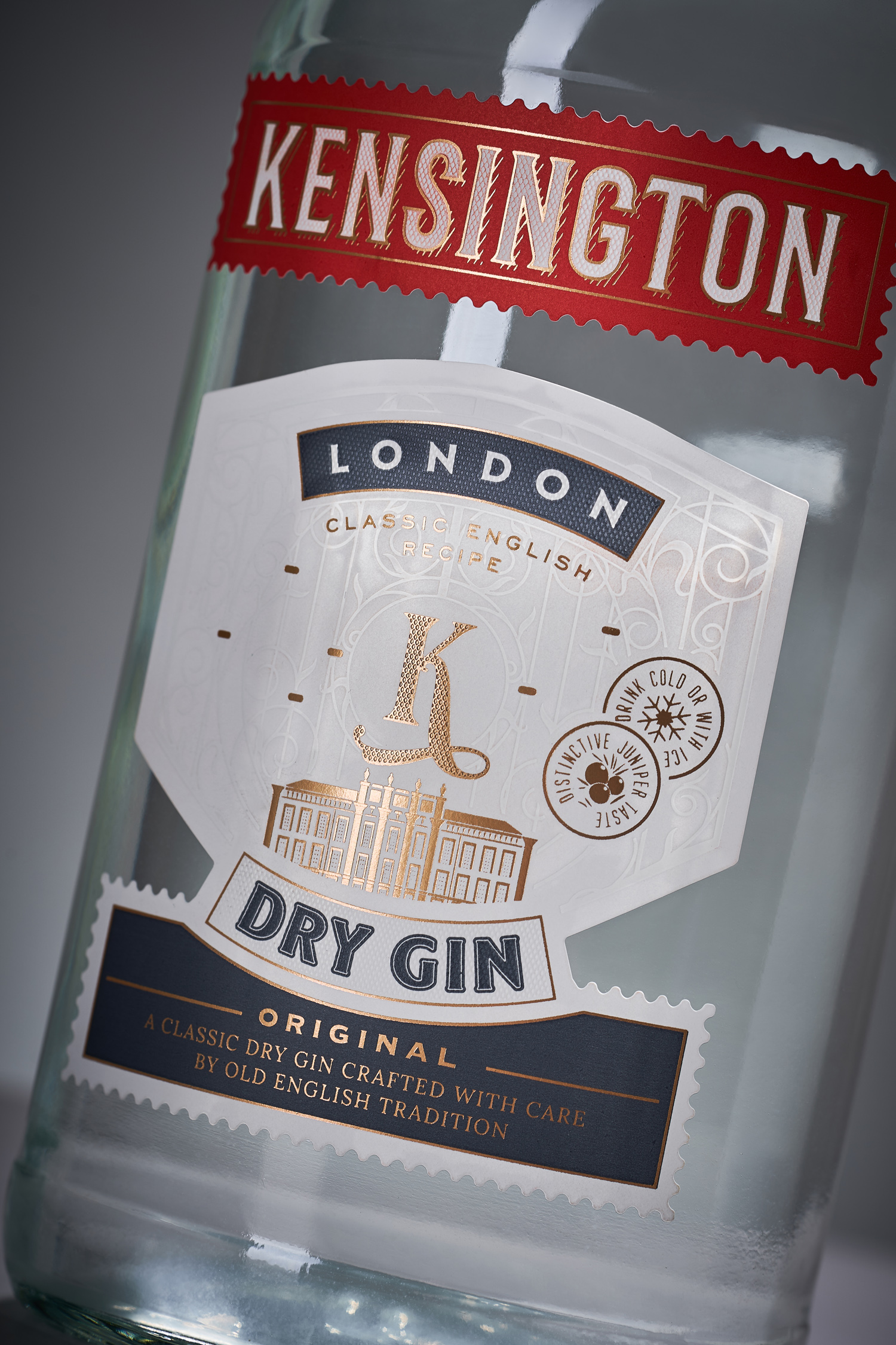
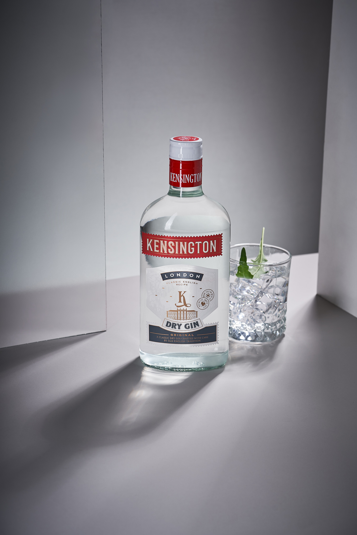
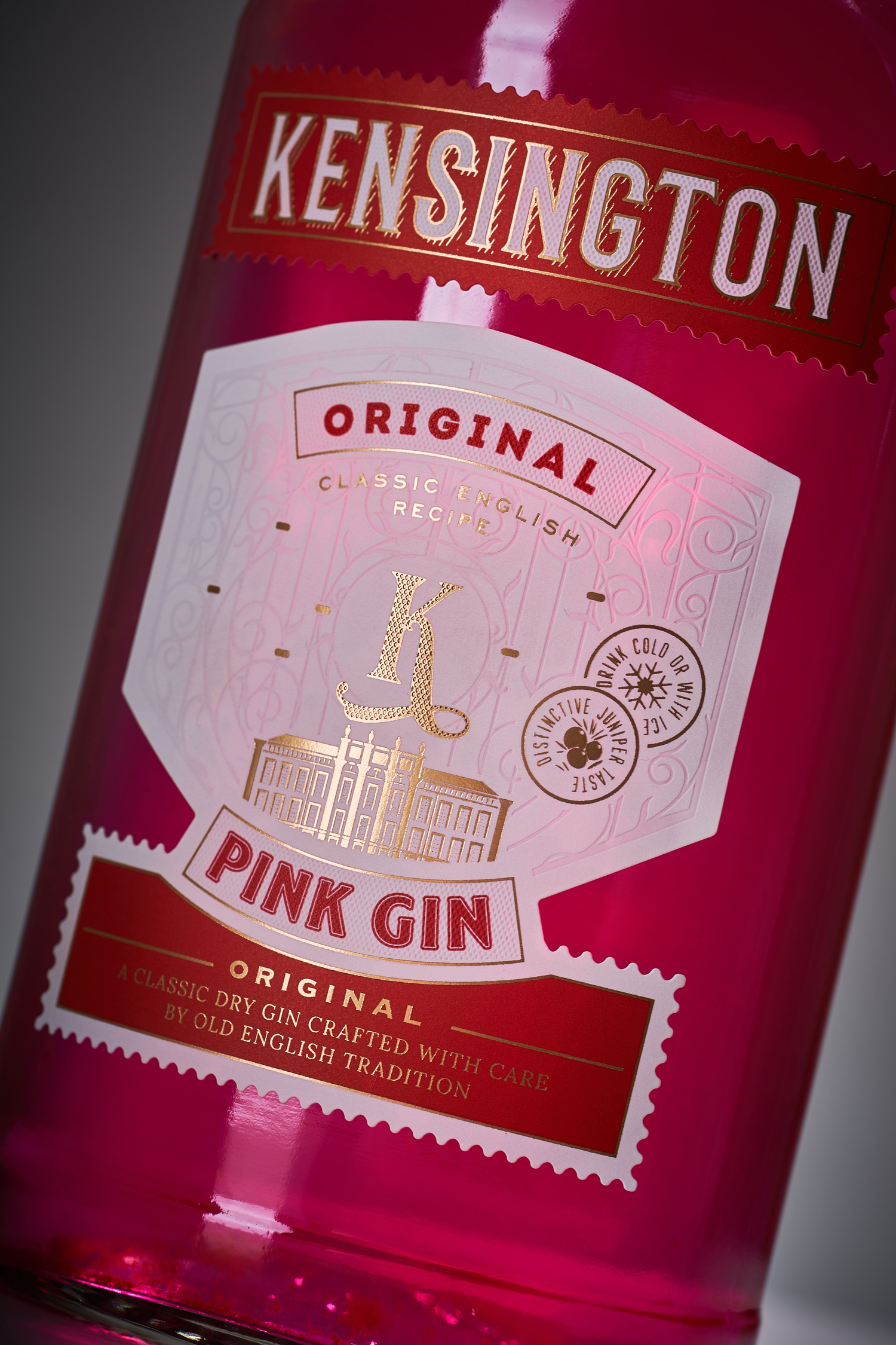
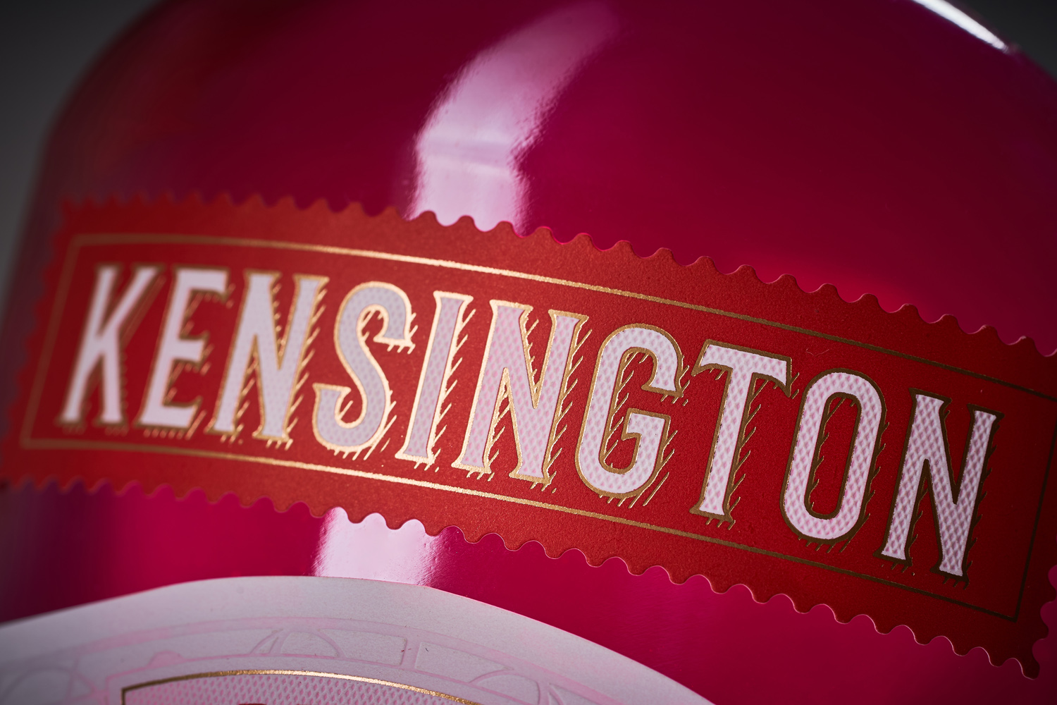
With the redesign of Sodiko's Kensington gin line, we have tried to reinforce the connection with the brand's historical aspect. This was done with a stylized image of the wrought iron gate leading to Kensington Park, by applying the technique of debossing, and additional forging elements, made with gold foil stamping. The silhouette of the castle itself complements the overall composition. With all this, the overall color scheme of the trademark was preserved in order to maintain product recognition on the shelf. As a result, the gins look fresh and relevant, without losing their character and overall aesthetics.