- 2019
process
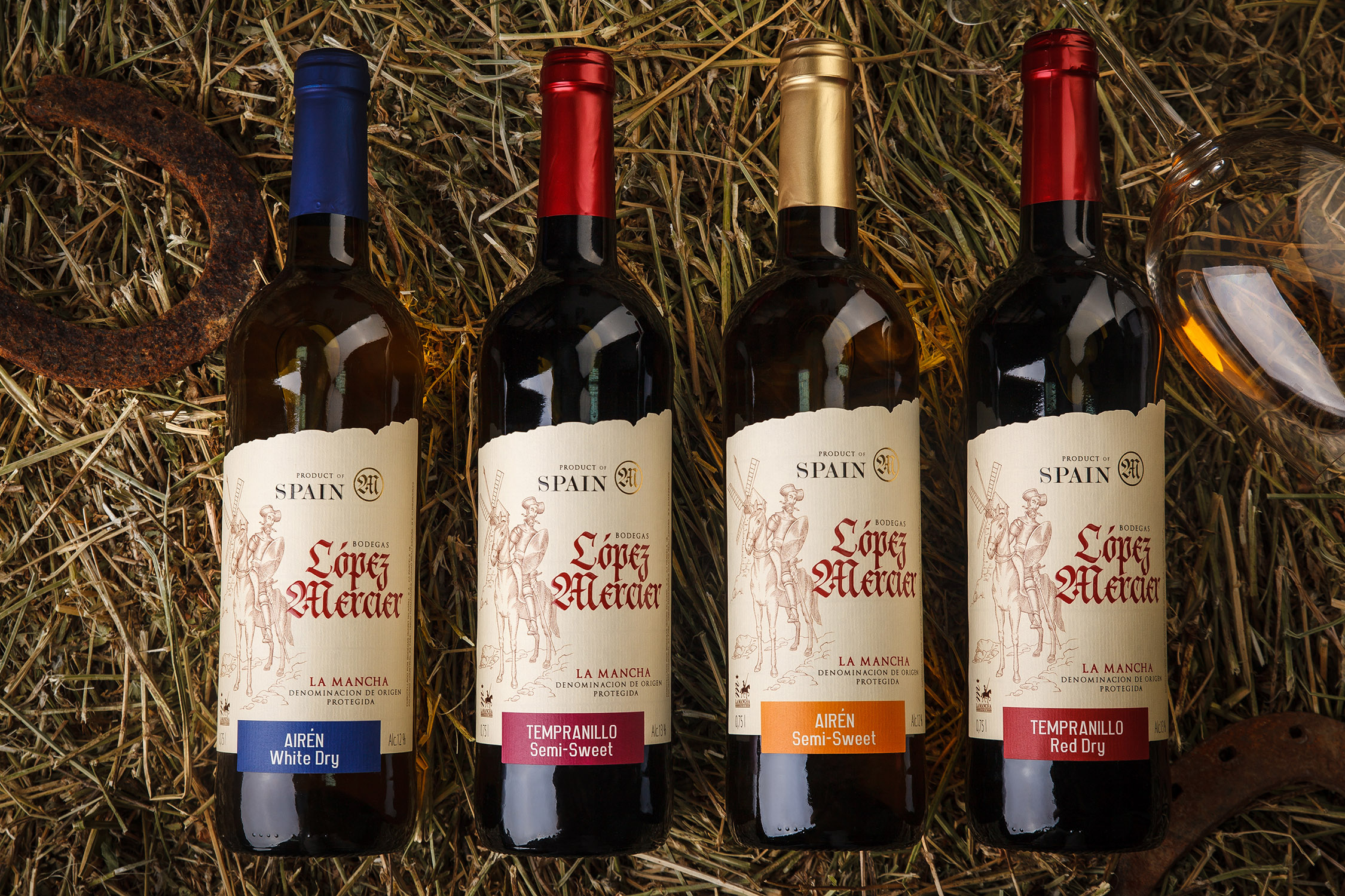
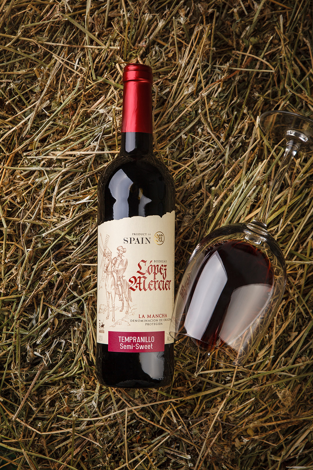
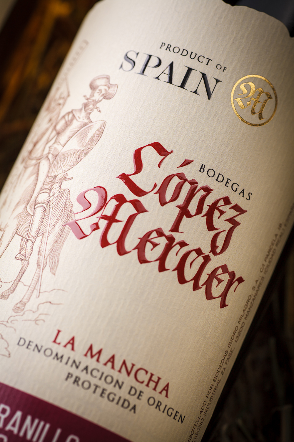
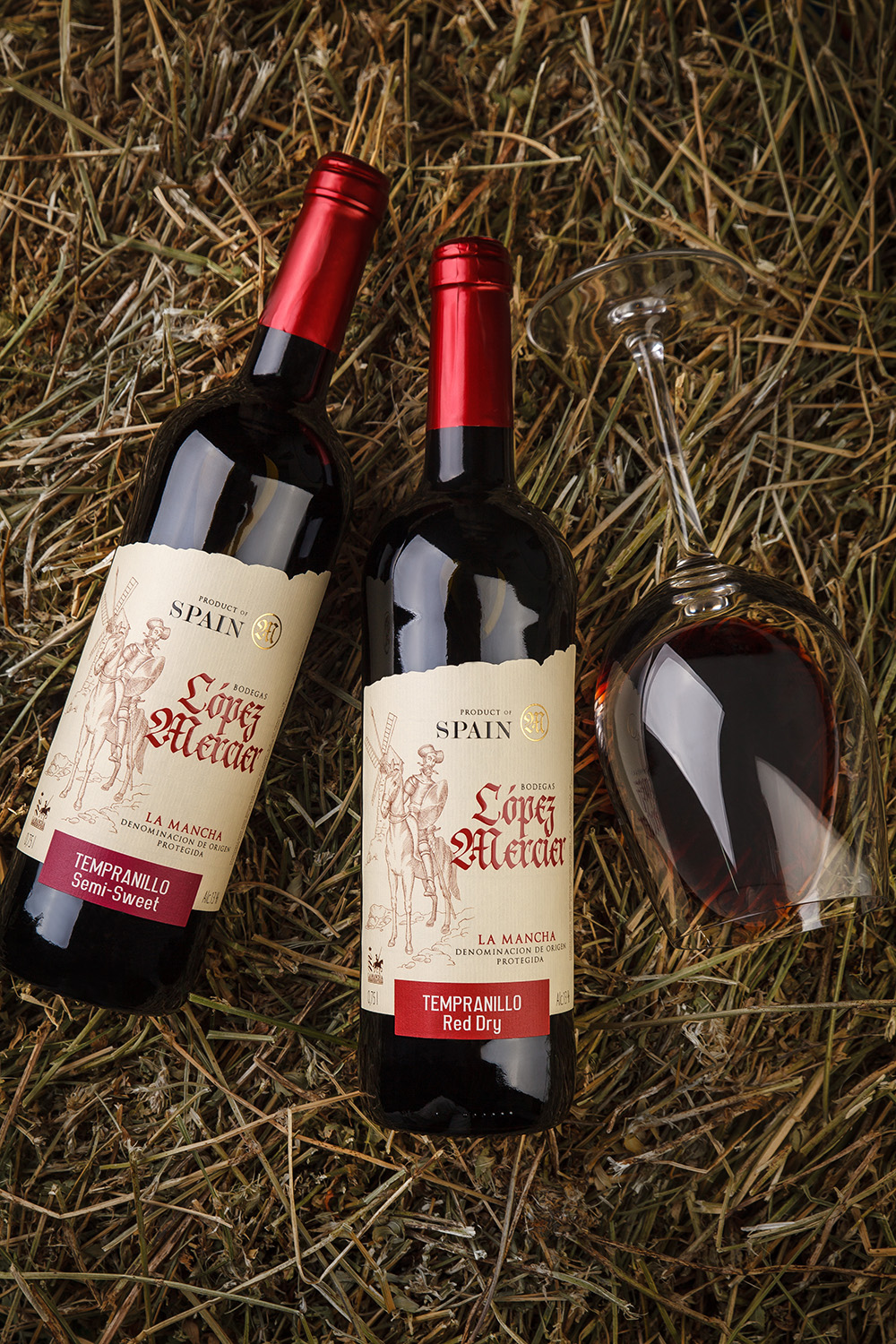
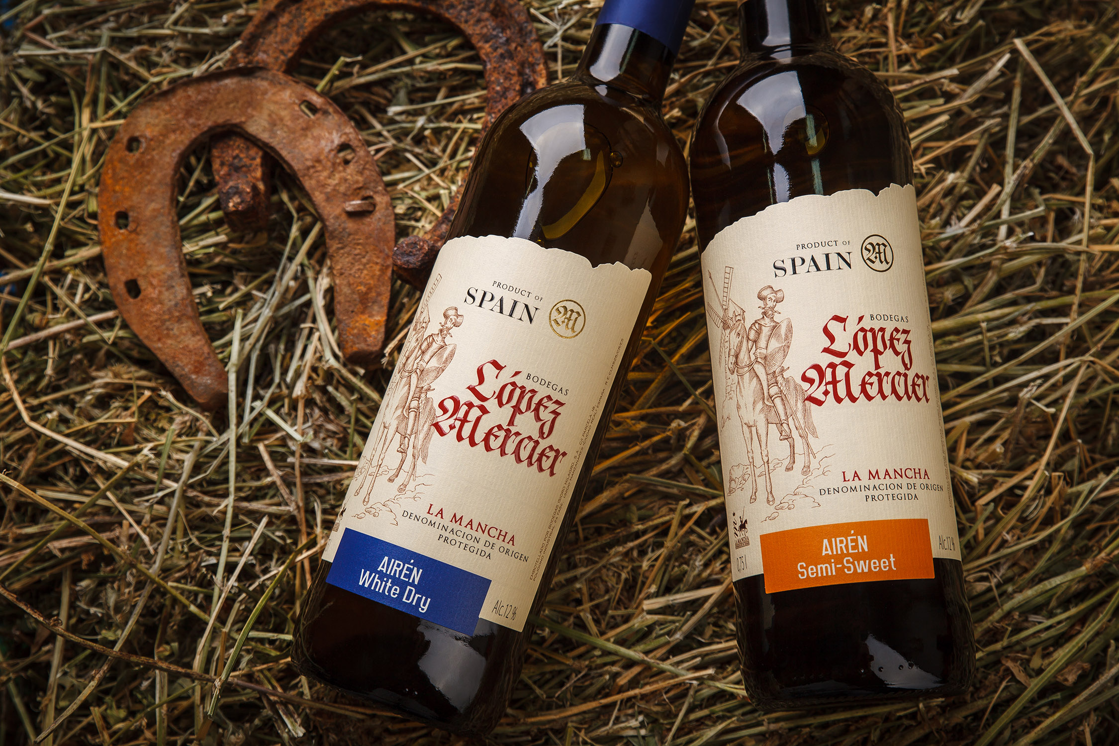
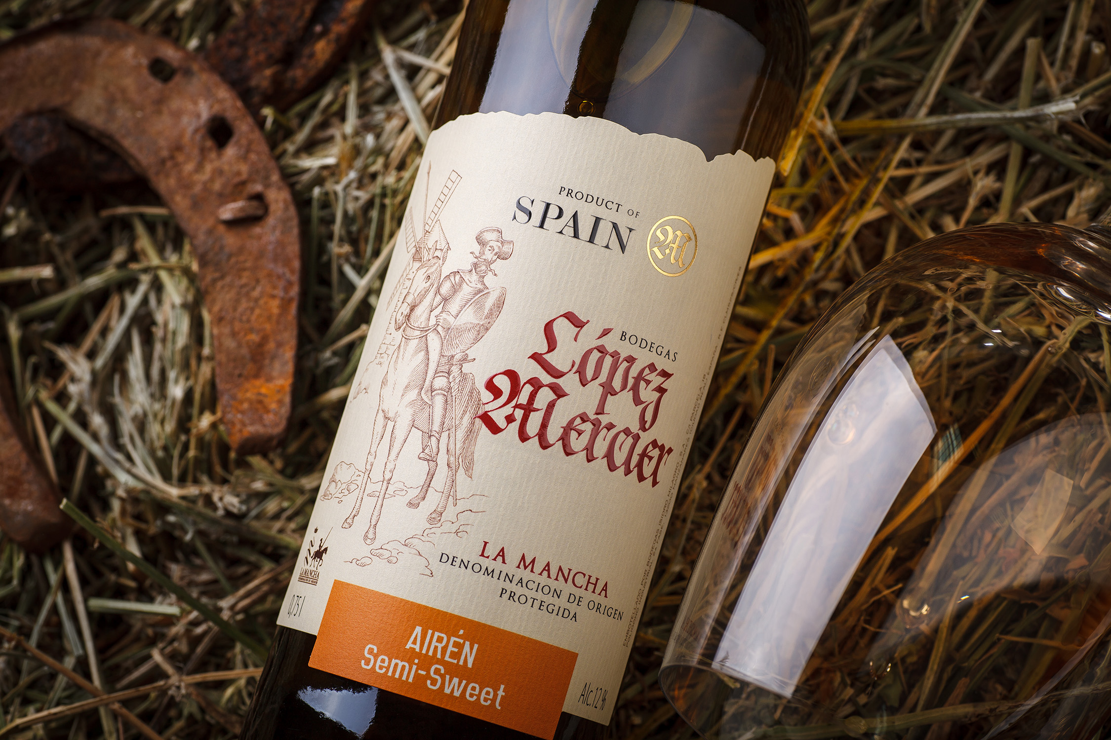
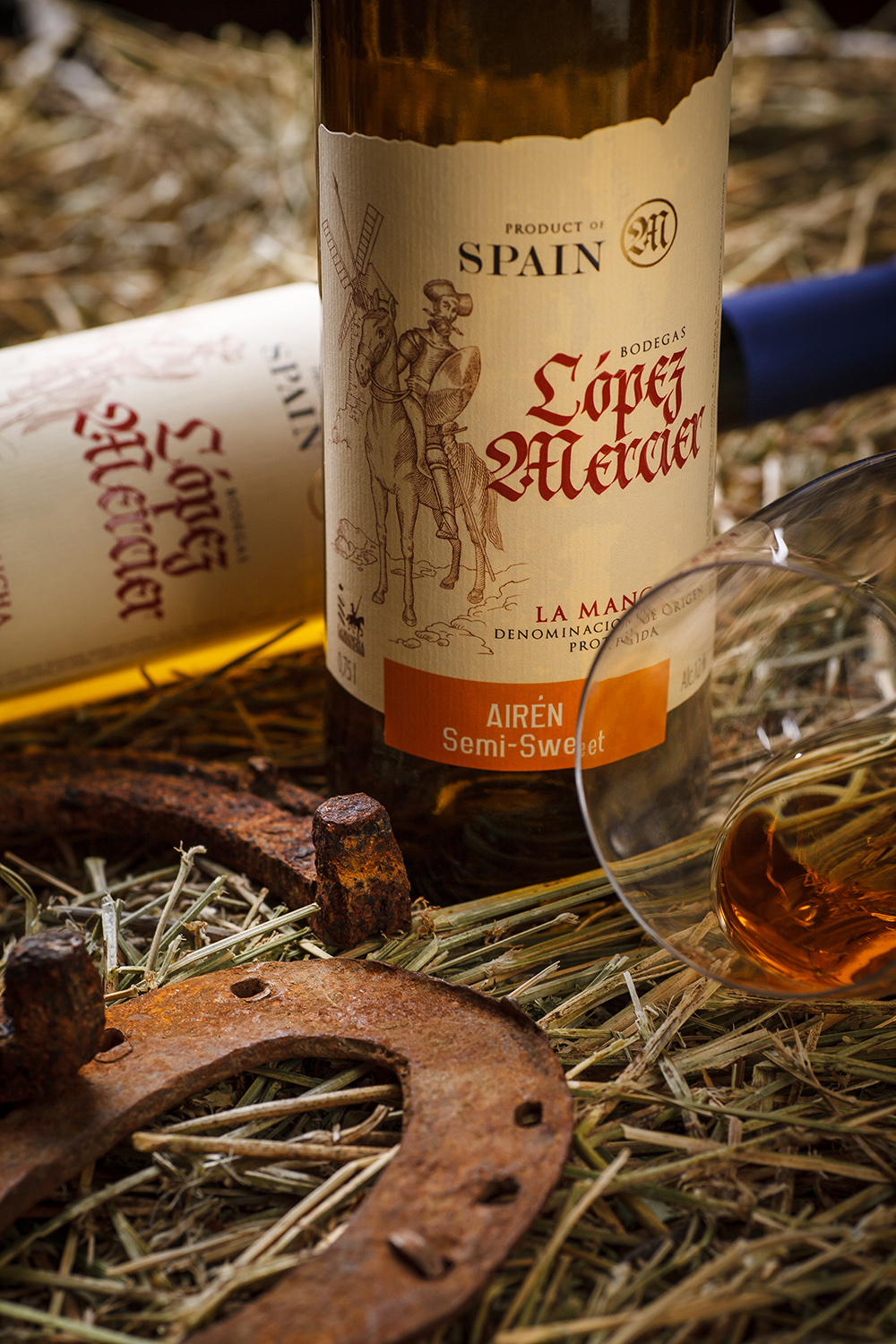
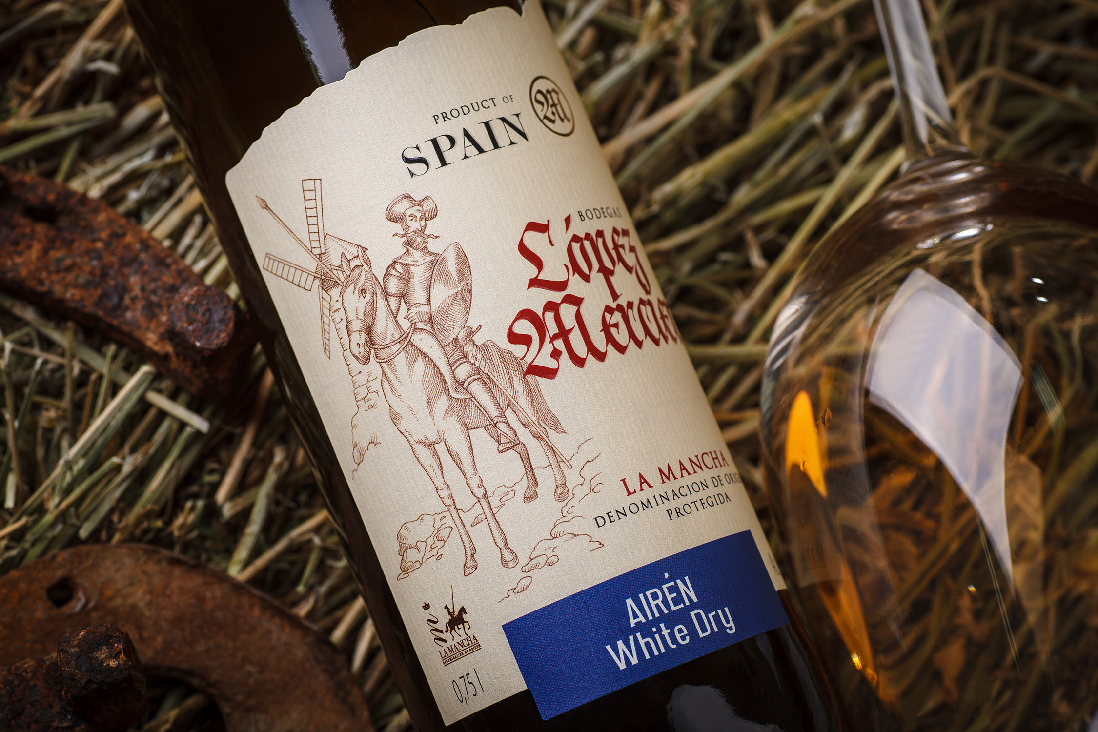
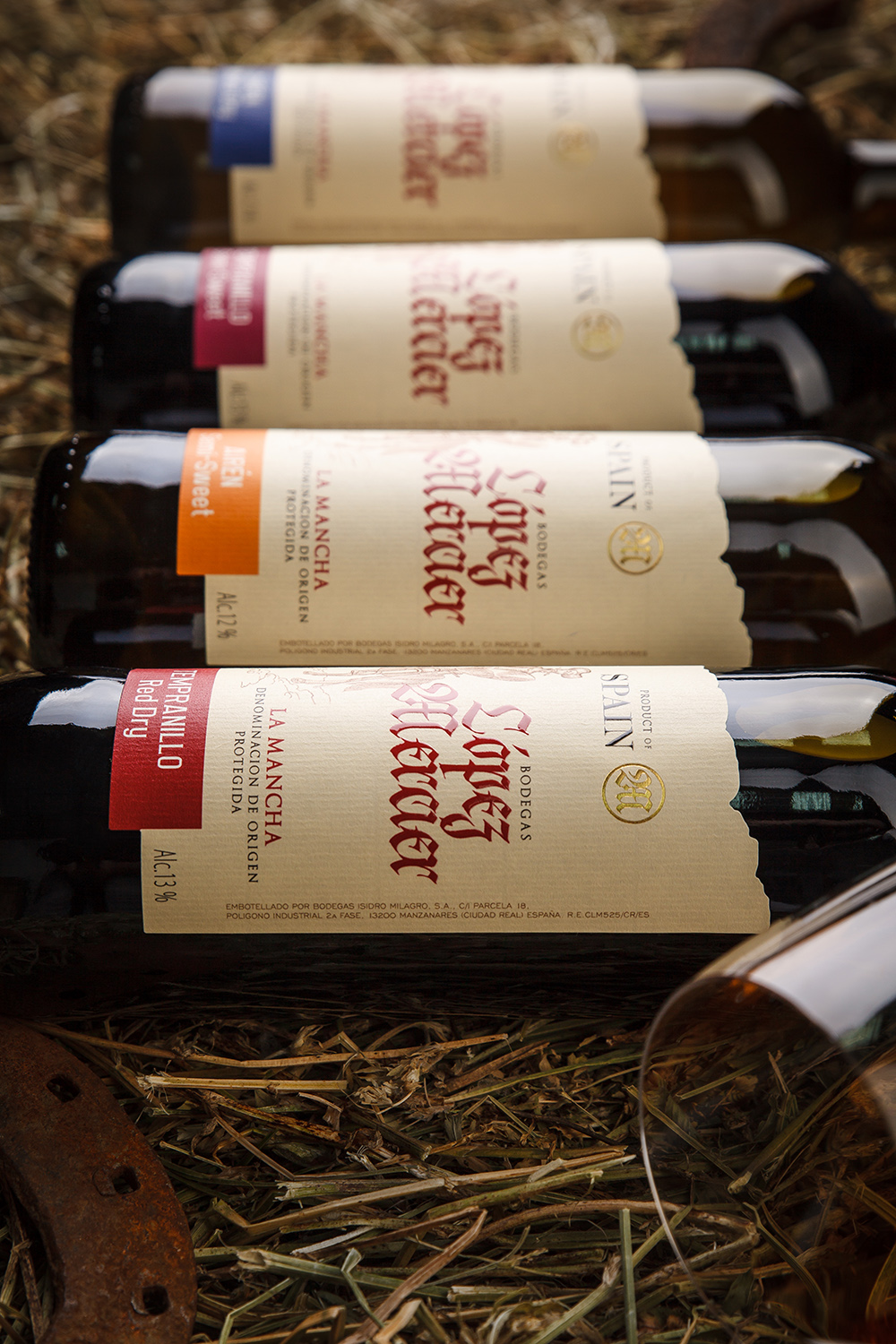
Spain - the mere name of the country itself gives life to a whole set of images in one’s head. And when knight stories are also mentioned, the picture becomes even more vivid, and the feast gets going right after the first glass. The wines from the Lopez Mercier series by the trading house Rotor Haus are all about that. When the company contracted us to create a series label designs for Spanish wines revolving around the theme of knighthood, the visual solution became apparent almost instantaneously. And we were really excited to turn this concept into a real-world composition.
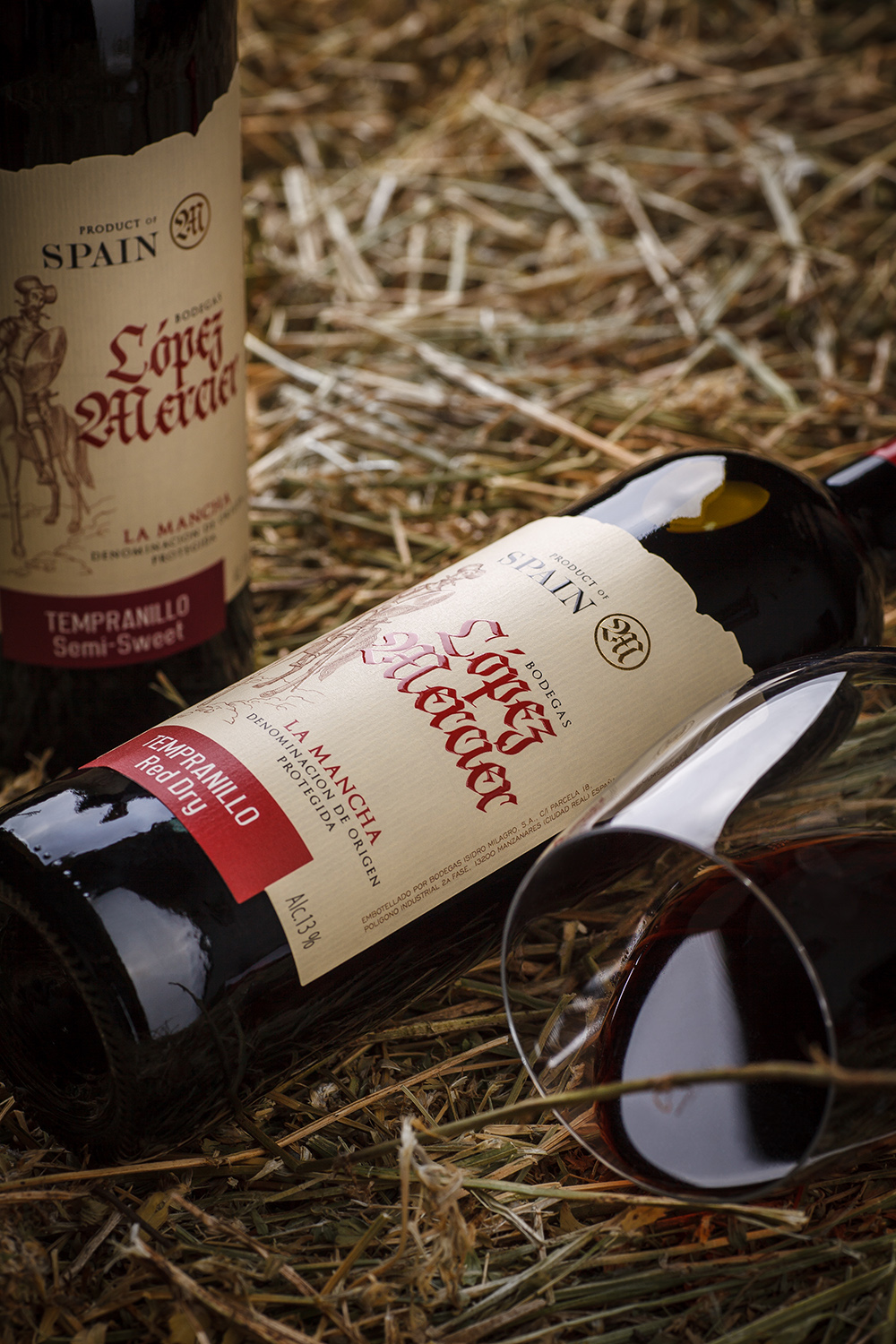
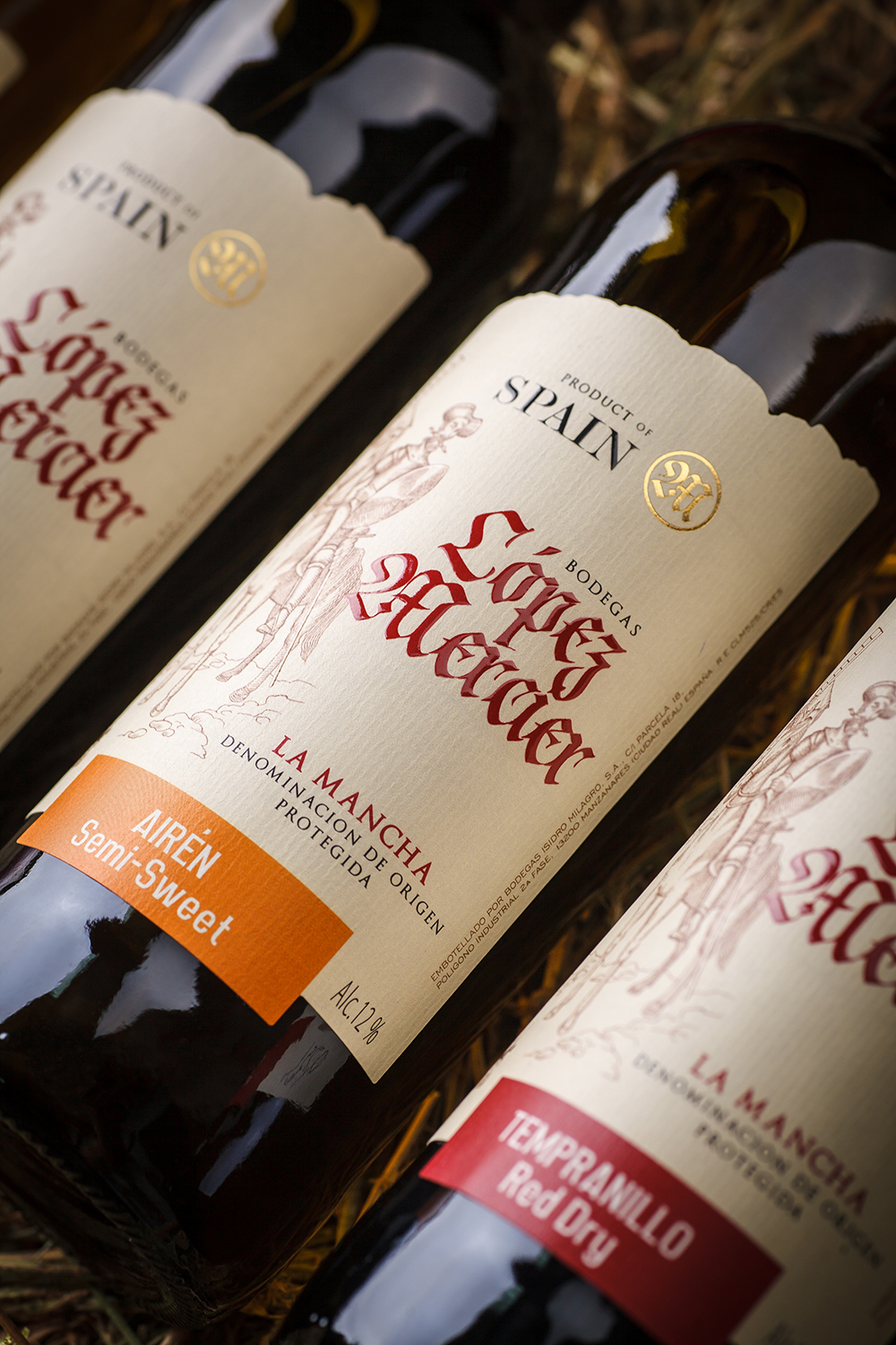
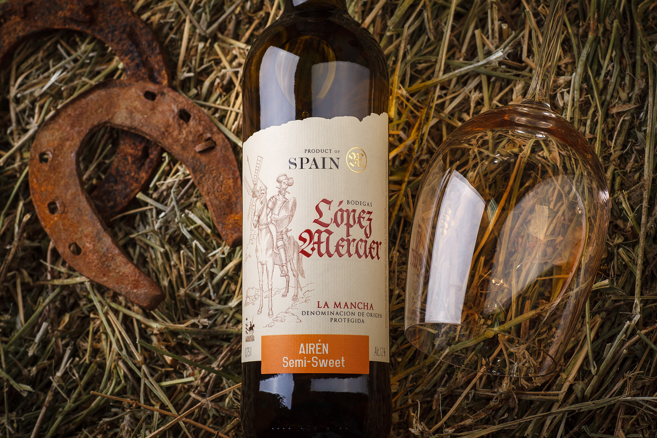
The burning Spanish character of Lopez Mercier wines is quite evident even at the first glance. The torn edges of the label and the vivid color spots on the monotonous field immediately draw the attention and communicate the passionate spirit of the product. Expressive calligraphy denoting the name of the series serves to further amplify this impression. While the stylized illustration of the mounted knight delivers an unequivocal reference to one of the most recognizable characters in Spanish literature, who has served as a source of inspiration of this series of wines. As a result, with all its seeming temperance and classic looks, this design leaves an impression of a vivid and expressive product, communicating the distinct character of Spanish wines.