Gin label design – Arlington
Graphic Design, Packaging, Product Design- 2015
process
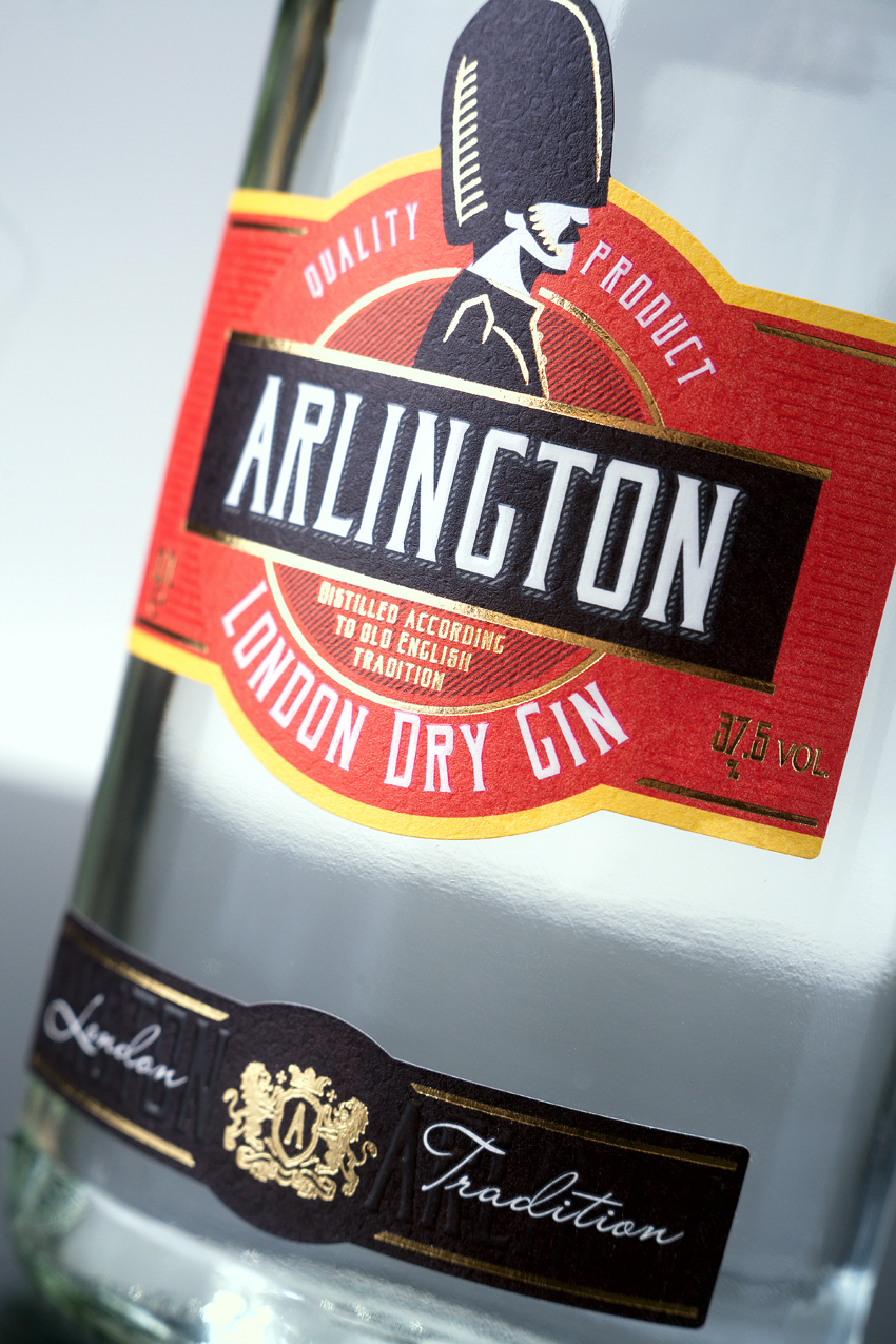
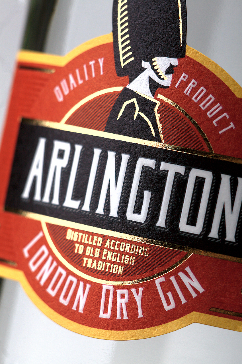
Studio 43’oz has developed label design for the new Trade Mark of gin «Arlington». The label is performed in a distinctive “English” color-scale, where the main symbols are red double-decker buses, world-famous public call boxes and certainly Queen's Life Guard.
It is guardsman’s profile which provides the basis for this product design. Thanks to the color code we managed to unite the perception of symbolic character of England and a drink that is typical for this country - Gin.